Surface Chart in WPF with Data Biding and Colour Map

This is a step-by-step guide on how to build a surface chart using MindFusion WPF Surface Chart control. The data is set with data binding. After we build the chart we’ll adjust some properties and preview how they affect the chart appearance.

Step-by-step guide on how to build a 3D surface  or scatter chart

Step-by-step guide on how to build a 3D surface or scatter chart

I. General Settings

We start with a new WPF project and add the libraries needed for the WPF surface chart: MindFusion.Charting.Wpf and MindFusion.Licensing. We create a mapping to the charting namespace like that:

xmlns:chart="http://mindfusion.eu/charting/wpf"

If you have installed the control or MindFusion WPF Pack with toolbox integration you’ll just need to drag and drop the surface chart control.

Drag and drop the surface chart control

Drag and drop the surface chart control

Next step is to declare the Surface Chart. We do this in XAML:

<chart:surfacechart x:name="surfaceChart" effect3d="ShaderEffect" scatterfacesize="1" showsurface="True" showwireframe="True" showscatters="False" title="ScatterChart3D" sidewallthickness="0.5" interpolationtype="Bezier" gridtype="Horizontal" scale="200" groundlevel="0">
</chart:surfacechart>

We use a ShaderEffect to make the chart more beautiful. The ShowSurface property means the control shall draw a surface but will not draw a wireframe or scatters – we’ll change that later. The SideWallThickness sets how the walls will look – we make them modestly thick. If we don’t set a GridType it will be more difficult to read the chart, so we set a horizontal grid. Scale determines how the chart will be zoomed and GroundLevel sets the location of the bottom or ground wall.

II. Data Binding

We’ll use a single series in the chart and we initialize it in XAML as well:

<chart:surfaceseries x:name="series1">
</chart:surfaceseries>

For the purpose of this sample we create just a List of Point3D objects, which will be the data source. We do this in code.

List Data = new List();
Point3D point3D;

for (int i = 0; i < 360; i+=10)
{
double angle_rad = i / 180.0 * Math.PI;

for (int r = 0; r <= 10; r++)
{
double radius = r * 0.2;
double x = radius * Math.Cos(angle_rad);
double z = radius * Math.Sin(angle_rad);

point3D = new Point3D(x, radius, z);
Data.Add(point3D);
 }
}

We generate the points using the algorithm for a cone. Now let’s bind the data list to the chart’s properties.

surfaceChart.DataSource = Data;
series1.XDataPath = "X";
series1.YDataPath = "Y";
series1.ZDataPath = "Z";

The DataPath properties specify the names of each data bound property.

Now that we know our data we must set the minimum and maximum value of all three chart axes to make sure data is rendered correctly:

surfaceChart.XAxisSettings.MinValue = -2;
surfaceChart.XAxisSettings.Interval = 0.4;
surfaceChart.XAxisSettings.MaxValue = 2;
surfaceChart.YAxisSettings.MinValue = 0;
surfaceChart.YAxisSettings.MaxValue = 2;
surfaceChart.YAxisSettings.Interval = 0.4;
surfaceChart.ZAxisSettings.MinValue = -2;
surfaceChart.ZAxisSettings.MaxValue = 2;
surfaceChart.ZAxisSettings.Interval = 0.4;

Each axis exposes MinValue, MaxValue and Interval properties, which are used to define the scale.

III. Colours

The colours for a surface chart are set with the Fills property. In a surface chart, if you use a gradient brush, each point will read its color mapped to the matching position on the gradient. If you want more details, you can use the TextureType and ColorMapList properties to specify the colour map. In our sample we use XAML and add a gradient brush:

<chart:surfaceseries.fills>
 	<lineargradientbrush startpoint="0,0" endpoint="0,1">
<gradientstop color="#D2D9A3" offset="0">
<gradientstop color="#023E73" offset="0.33">
<gradientstop color="#8A188C" offset="0.66">
<gradientstop color="#F24B6A" offset="1.0">
</gradientstop></gradientstop></gradientstop></gradientstop></lineargradientbrush>
</chart:surfaceseries.fills>

IV. Customizations

We can show a wire frame by setting ShowWireFrame to “true”. If we want to show scatters, we’d better turn off ShowSurface and set ShowScatters to true. A wire frame can be show no matter the surface type. You can combine all of them – scatters, wire frame and surface.

InterpolationType lets you choose among various types of interpolation. Choosing None means that the control shall simply connect the 3D points.

An important property is PointMergeThreshold – it indicates the smallest difference at which a point that comes too close to another point won’t be drawn. If we set it to 0 or a negative number all points will be drawn.

Here is a selection of images of charts with different combination of surface properties turned on: wire frame, surface, scatters.

By turning a single property you can completely change the appearance of a 3D surface chart

By turning a single property you can completely change the appearance of a 3D surface chart

You can download the sample directly from this link:

Download MindFusion Surface Chart Tutorial

Learn more about the WPF Chart & Gauge control here.

Creating custom CompositeNode components

In this post we’ll examine how CompositeNode components work in MindFusion.Diagramming for Windows Forms, and in the process create a custom radio button component. You can find the completed sample project here: RadioComponent.zip

CompositeNode was created as alternative of the ControlNode class, which lets you present any Windows Forms control as a diagram node. ControlNode has many advantages, such as letting you design the hosted user controls using Visual Studio designer, reusing them in other parts of the user interface, and including complex framework or third-party controls as their children. From the fact that each user control creates a hierarchy of Win32 windows come some disadvantages too:

  • ControlNodes cannot mix with other diagram elements in the Z order but are always drawn on top
  • performance deteriorates if showing hundreds of nodes
  • mouse events might not reach the diagram if hosted controls capture mouse input
  • print and export might not be able to reproduce the appearance of hosted controls without additional work (handling PaintControl event)

On the other hand, CompositeNode does all its drawing in DiagramView control’s canvas and is not affected by the issues listed above. CompositeNode lets you build node’s UI by composing hierarchy of components derived from ComponentBase class. Pre-defined components include layout panels, read-only or editable text fields, images, borders, buttons, check-boxes and sliders. If the UI component you need isn’t provided out of the box, you could still implement it as a custom class that derives from ComponentBase or more specific type and overriding the GetDesiredSize, ArrangeComponents and Draw methods. Lets see how that works using a RadioButtonComponent as an example.

Derive RadioButtonComponent from CheckBoxComponent so we reuse its IsChecked and Content properties:

class RadioButtonComponent : CheckBoxComponent
{
}

CompositeNode relies on a dynamic layout system that lets components determine their size by overriding GetDesiredSize method, and arranging children in allocated size by means of ArrangeComponents method. For radio button we’ll call its base class to measure content size and add enough space for drawing the radio graphics element (a circle) horizontally, while fitting it in measured height:

float RadioSize(SizeF size)
{
	return Math.Min(size.Width, size.Height);
}

public override SizeF GetDesiredSize(SizeF availableSize, IGraphics graphics)
{
	var s = base.GetDesiredSize(availableSize, graphics);
	s.Width += RadioSize(s);
	return s;
}

ArrangeComponents calls the base class to arrange its content on the right side of available space:

public override void ArrangeComponents(RectangleF availableSpace, IGraphics graphics)
{
	var radioSize = RadioSize(availableSpace.Size);
	availableSpace.X += radioSize;
	availableSpace.Width -= radioSize;
	base.ArrangeComponents(availableSpace, graphics);
}

Now override Draw and render standard radio button graphics on the left side of the component, and content on the right side:

public override void Draw(IGraphics graphics, RenderOptions options)
{
	var radioSize = RadioSize(Bounds.Size);
	var r = radioSize / 2 - 1;
	var cr = r - 1;

	graphics.FillEllipse(Brushes.White, Bounds.X + 1, Bounds.Y + 1, 2 * r, 2 * r);
	using (var pen = new System.Drawing.Pen(Color.Black, 0.1f))
		graphics.DrawEllipse(pen, Bounds.X + 1, Bounds.Y + 1, 2 * r, 2 * r);
	if (IsChecked)
		graphics.FillEllipse(Brushes.Black, Bounds.X + 2, Bounds.Y + 2, 2 * cr, 2 * cr);

	GraphicsState s = graphics.Save();
	graphics.TranslateTransform(radioSize - 1 + Bounds.X, Bounds.Y);
	Content.Draw(graphics, options);
	graphics.Restore(s);
}

We’ll want only one radio from a group to be selected. For our purposes we can count all radio buttons placed inside same stack panel as part of same group. Override the OnClick method to unselect all buttons in parent panel and select the clicked one:

protected override void OnClicked(EventArgs e)
{
	var parentStack = Parent as StackPanel;
	if (parentStack != null)
	{
		foreach (var child in parentStack.Components)
		{
			var radio = child as RadioButtonComponent;
			if (radio != null)
				radio.IsChecked = false;
		}
	}
	this.IsChecked = true;
}

That’s it, the radio button component is ready with just a screenful of code 🙂 Let’s check how it works by creating an OptionNode class that shows a group of radio buttons and exposes a property to access or change selected one:

class OptionNode : CompositeNode
{
}

You could create the stack panel and radio buttons from code if you need more dynamic configuration, e.g. one with variable number of radio buttons. For this example we’ll just load a fixed template consisting of four buttons from XML:

const string Template = @"
	<simplepanel>

        <shape name="" shape""="" shape="" roundrect""="">

		<border padding="" 2""="">

			<stackpanel name="" radiogroup""="" orientation="" vertical""="" spacing="" 1""="" horizontalalignment="" center""="">
				<radiobuttoncomponent padding="" 2""="">
					<radiobuttoncomponent.content>
						<text text="" option="" 1""="" font="" verdana,="" 3world,="" style="Bold&quot;&quot;">
					</text></radiobuttoncomponent.content>
				</radiobuttoncomponent>
				<radiobuttoncomponent padding="" 2""="">
					<radiobuttoncomponent.content>
						<text text="" option="" 2""="" font="" verdana,="" 3world,="" style="Bold&quot;&quot;">
					</text></radiobuttoncomponent.content>
				</radiobuttoncomponent>
				<radiobuttoncomponent padding="" 2""="">
					<radiobuttoncomponent.content>
						<text text="" option="" 3""="" font="" verdana,="" 3world,="" style="Bold&quot;&quot;">
					</text></radiobuttoncomponent.content>
				</radiobuttoncomponent>
				<radiobuttoncomponent padding="" 2""="">
					<radiobuttoncomponent.content>
						<text text="" option="" 4""="" font="" verdana,="" 3world,="" style="Bold&quot;&quot;">
					</text></radiobuttoncomponent.content>
				</radiobuttoncomponent>
			</stackpanel>

		</border>

    </shape></simplepanel>";

The template can be loaded using the XmlLoader class. We’ll also store a reference to the stack panel so we can access its child radio buttons:

public OptionNode()
{
	Load();
}

public OptionNode(Diagram d)
	: base(d)
{
	Load();
}

private void Load()
{
	Components.Add(XmlLoader.Load(Template, this, null));

	radioGroup = FindComponent("RadioGroup") as StackPanel;
}

StackPanel radioGroup;

Now implement a SelectedOption property that lets us select a radio button by its index. Define it as nullable integer so we can represent missing select too:

public int? SelectedOption
{
	get
	{
		for (int i = 0; i < radioGroup.Components.Count; i++)
		{
			var radioButton = (RadioButtonComponent)radioGroup.Components[i];
			if (radioButton.IsChecked)
				return i;
		}
		return null;
	}
	set
	{
		for (int i = 0; i < radioGroup.Components.Count; i++)
		{
			var radioButton = (RadioButtonComponent)radioGroup.Components[i];
			radioButton.IsChecked = value == i;
		}
	}
}

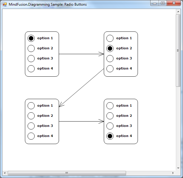
Let’s try it – create a few nodes and run the application, you’ll see the screen shown below:

var node1 = new OptionNode();
node1.Bounds = new RectangleF(20, 20, 30, 40);
node1.SelectedOption = 0;
diagram.Nodes.Add(node1);

var node2 = new OptionNode();
node2.Bounds = new RectangleF(90, 20, 30, 40);
node2.SelectedOption = 1;
diagram.Nodes.Add(node2);

var node3 = new OptionNode();
node3.Bounds = new RectangleF(20, 80, 30, 40);
node3.SelectedOption = null;
diagram.Nodes.Add(node3);

var node4 = new OptionNode();
node4.Bounds = new RectangleF(90, 80, 30, 40);
node4.SelectedOption = 3;
diagram.Nodes.Add(node4);

for (int i = 0; i < diagram.Nodes.Count - 1; i++)
	diagram.Factory.CreateDiagramLink(
		diagram.Nodes[i], diagram.Nodes[i + 1]);

Radio buttons in MindFusion diagram nodes

To be fair, this kind of nodes is simple enough to implement using standard TableNode class where radio button graphics are either custom drawn or set as Image inside table cells in first column, and text displayed in second column. However the radio buttons can be mixed with other components in CompositeNodes to implement more complex user interfaces than ones possible with tables.

For more information on MindFusion flow diagramming libraries for various desktop, web and mobile platforms, see MindFusion.Diagramming Pack page.

Enjoy!

A Bar Chart With Multiple Axes and a Legend in WPF

In this post we will create a bar chart with multiple series and two Y-axes. We will do this exclusively in XAML, with the only exception a small code snippet that assigns one of the Y-axis to one of the bar series.

I. Setup of the Project.

We create a new WPF project. The necessary libraries are MindFusion.Charting.Wpf and MindFusion.Licensing. You can add them manually or drag the Bar chart control from the Visual Studio toolbox. In both cases your Window tag should have:

 xmlns:my="clr-namespace:MindFusion.Charting.Wpf;assembly=MindFusion.Charting.Wpf" 

Then we create the bar chart. If you’ve dragged the bar chart control the XAML code has been auto generated.

<my:barchart bartype="Vertical" title="Product Statistics" name="barChart">  
</my:barchart>

II. The Axes

The chart has two Y-axes. We create a new AxesCollection and assign it to the YAxes property:

<my:barchart.yaxes>
     <my:axescollection>
         <my:axis horlabelalignment="Left" titleoffset="10" minvalue="0" maxvalue="80" tick="2" title="Cost of Raw Materials" titlerotationangle="270" interval="8" labeltype="AutoScale">
          </my:axis>
  </my:axescollection>
</my:barchart.yaxes>

Let’s explain the code above line by line. First, the HorLabelAlignment property specifies how the labels will be aligned relative to the axis. If this was an Y2-axis, we would need to set the property to “Right”. Since this is an Y-axis and we want the labels to appear left to the axis, we align them “Let”. The TitleOffset, TitleRotationANgle and Title properties all specify how the label appears – it has an offset of 10 pixels measured from the longest label at the axis (if present). It is rotated so that it doesn’t take much space and its value is “Cost of Raw Materials”.

The MinValue, MaxValue and Interval properties define the axis – it’s start and end values and the span between each pair of adjacent intervals. Tick specifies the length of the ticks – the small lines drawn at each interval point. You can hide them by setting the Tick property to 0.

Finally, the LabelType property. It takes one of the LabelType enumeration values and sets what kind of labels will be drawn at the axis. This Y-axis will show the scale labels.

Then, we add the code for the second Y-axis. We just place the following XAML:

<my:axis horlabelalignment="Left" labels="{StaticResource YLabels}" titleoffset="10" minvalue="0" maxvalue="10" title="Marketing Costs" titlerotationangle="270" interval="1" tick="2" customlabelposition="AutoScalePoints" labeltype="CustomText">
     </my:axis>   

Most of the properties are the same as with the previous axis. The first difference is the value of the LabelType property. “Custom Text” means we will provide the labels for the axis. We create them as a static resource of strings:

<x:array x:key="YLabels" type="sys:String">
        <sys:string>0%</sys:string>
        <sys:string>7%</sys:string>
        <sys:string>6.5%</sys:string>
        <sys:string>6.3%</sys:string>
        <sys:string>6.2%</sys:string>
        <sys:string>5.8%</sys:string>
        <sys:string>5.5%</sys:string>
        <sys:string>5.1%</sys:string>
        <sys:string>4.9%</sys:string>
        <sys:string>4.5%</sys:string>
        <sys:string>4.2%</sys:string>
     </x:array>

Then we assign them to the Labels property. The CustomLabelPosition defines where the labels will be drawn – at the position of the data points of the series, bound to this axis or at the intervals of the auto scale. In this case we render the labels at the auto scale points.

The X-axis is defined similarly:

<my:barchart.xaxes>
     <my:axescollection>
       <my:axis labels="{StaticResource XLabels}" titleoffset="10" minvalue="0" maxvalue="6" title="Month" interval="1" customlabelposition="ChartDataPoints" labeltype="CustomText">
       </my:axis>
      </my:axescollection>
   </my:barchart.xaxes> 

The notable difference here is that we want the labels to appear at the location of chart data. That is why we will need to add a few lines of code later. But now let’s move to the series.

III. The Series

The series in this sample are two. Here is the markup for the first one:

<my:barseries xdata="1, 2, 3, 4, 5, 6" ydata="23, 34, 12, 45, 77, 19" fills="{StaticResource BrushCollection1}" title="Shoes" tooltiptype="ChartData">
     <my:barseries.effect>
           <dropshadoweffect shadowdepth="3" opacity="0.7">
     </dropshadoweffect></my:barseries.effect>
   </my:barseries>

The series are added directly within the tag, because Series is the default content property of the chart control. The Title, though not visible at the series itself is important for the legend as we will see later. The fills for the series are a collection of brushes, which we have defined as a static resource just like we defined the labels. The data for the series is set with the XData and YData properties. We add a visual effect to make the chart more appealing.

The second series is similar to this one, so we won’t deal with it now.

IV. The Legend

The control supports unlimited number of legends. They are of two types – SeriesLegend and ChartLegend. In our case we use the ChartLegend. This legend defines the legend labels and brushes based on a list of ChartSeries, that were assigned to it. Both types of legends are ItemsControl-s.

<my:barchart.legends>
  <my:chartlegend x:name="Legend" background="#FFFAFAFA" my:layoutpanel.dock="Bottom" orientation="Horizontal" horizontalalignment="Center" margin="5" cornerradius="5" borderthickness="1" borderbrush="#FFCECEFF" itemssource="{Binding ElementName=barChart}">
     <my:chartlegend.effect>
          <dropshadoweffect shadowdepth="3" opacity="0.7">
     </dropshadoweffect></my:chartlegend.effect>
   </my:chartlegend>
 </my:barchart.legends>

As you can see, the ItemsSource for the legend is the chart. This means it takes all ChartSeries, which are the default content property of the chart and renders their labels.

V. Binding the X-Axis to a ChartSeries

As you might remember the custom labels at the X-axis are bound to the location of the chart data. This means, we must tell the ChartSeries that it should use exactly the X-axis where we want the labels to appear. This is done with the ChartSeries.XAxis property. We do this in the code behind file.

   if (barChart.XAxes.Count > 0 && barChart.Series.Count > 0)
    {
       Axis xAxis = barChart.XAxes[0];
       BarSeries series = (BarSeries)barChart.Series[0];

       series.XAxis = xAxis;
    }

And this is everything. Here is the final chart:

WPF Chart Control: Bar Chart With Multiple Axes

WPF Chart Control: Bar Chart With Multiple Axes

The sample can be downloaded from here.

Learn more about MindFusion Chart Control for WPF here.

ContainerNode fold / unfold animations

In this post we’ll show how to animate container’s fold and unfold operations using some event handling and custom drawing. You can download the complete project here:

AnimatedFold.zip

The sample code will demonstrate several features of the Diagram control and .NET:

  • use LINQ to collect contained items
  • handle fold/unfold events
  • custom draw from DrawForeground event
  • draw items from custom drawing code

Let’s start by creating some items and containers when the form loads:

private void Form1_Load(object sender, EventArgs e)
{
    var ctr = diagram.Factory.CreateContainerNode(20, 20, 100, 100, true);
    var node1 = diagram.Factory.CreateShapeNode(30, 35, 15, 15);
    var node2 = diagram.Factory.CreateShapeNode(80, 45, 15, 15);
    diagram.Factory.CreateDiagramLink(node1, node2);

    ctr.Add(node1);
    ctr.Add(node2);

    var ctr2 = diagram.Factory.CreateContainerNode(20, 20, 100, 100, true);
    ctr2.Add(ctr);
}

We’ll use LINQ extensions methods to find all items within a ContainerNode, including ones contained recursively in child containers:

List GetDescendents(ContainerNode container)
{
    var nodes = diagram.Nodes.Where(
        container.ContainsRecursively);

    var links = diagram.Links.Where(l =>
        nodes.Contains(l.Origin) ||
        nodes.Contains(l.Destination));

    return
        nodes.Cast().Concat(
        links.Cast()).ToList();
}

Add handlers for ContainerFolded and ContainerUnfolded events that will start animation for the container:

void OnContainerFolded(object sender, NodeEventArgs e)
{
    var container = (ContainerNode)e.Node;
    StartAnimation(container, true);
}

void OnContainerUnfolded(object sender, NodeEventArgs e)
{
    var container = (ContainerNode)e.Node;
    StartAnimation(container, false);
}

The StartAnimation method stores a list of items that should be redrawn during animation and a few other animation attributes:

void StartAnimation(ContainerNode container, bool fold)
{
    var bounds = container.Bounds;
    var scaleCenter = new PointF(
        (bounds.Left + bounds.Right) / 2, bounds.Top);

    // collect items that will be unfolded
    animatedItems = GetDescendents(container);

    // animation will also draw this rectangle as background
    ctrBounds = bounds;
    ctrBounds.Size = container.UnfoldedSize;
    ctrBounds.Y += container.CaptionHeight;
    ctrBounds.Height -= container.CaptionHeight;

    // start animation timers
    Animate(scaleCenter, fold);

    if (!fold)
    {
        // temporarily fold back when animating unfold operation
        // so that contained items stay invisible
        container.Folded = true;
        toUnfold = container;
    }
}

The Animate method starts a timer whose Tick event invalidates the DiagramView and stops the timer when final frame has been reached:

void Animate(PointF scaleCenter, bool scaleDown)
{
    if (scaleDown)
    {
        frameCounter = maxFrames;
        frameIncrement = -1;
    }
    else
    {
        frameCounter = 0;
        frameIncrement = +1;
    }
    this.scaleCenter = scaleCenter;

    animationTimer = new Timer();
    animationTimer.Tick += OnAnimationTimer;
    animationTimer.Interval = duration / maxFrames;
    animationTimer.Start();
}

void OnAnimationTimer(object sender, EventArgs e)
{
    frameCounter += frameIncrement;
    diagramView.Invalidate();
    if (frameCounter == 0 || frameCounter == maxFrames)
    {
        animationTimer.Stop();
        animationTimer.Dispose();
        animationTimer = null;
        animatedItems = null;

        if (toUnfold != null)
        {
            toUnfold.Folded = false;
            toUnfold = null;
        }
    }
}

Add a DrawForeground event handler that applies scale transform proportional to current frame of animation and draws the container’s descendants stored in animatedItems list:

void OnDrawForeground(object sender, DiagramEventArgs e)
{
    if (animatedItems != null && frameCounter > 0)
    {
        var options = new RenderOptions();
        var g = e.Graphics;

        // apply scale corresponding to current frame
        var scale = (float)frameCounter / maxFrames;
        g.TranslateTransform(scaleCenter.X, scaleCenter.Y);
        g.ScaleTransform(scale, scale);
        g.TranslateTransform(-scaleCenter.X, -scaleCenter.Y);

        // draw container background
        g.FillRectangle(Brushes.White, ctrBounds);
        g.DrawRectangle(Pens.Black, ctrBounds);

        // draw contained items
        foreach (var item in animatedItems)
            item.Draw(e.Graphics, options);
    }
}

Same technique can be applied to animate collapse and expand operations on tree branches. To implement that, handle NodeExpanded and NodeCollapsed events instead, and collect items reachable recursively from the branch’ root by following outgoing links.

The code above uses MindFusion’s .NET API and can be used with Windows Forms, WPF, Silverlight and ASP.NET diagramming components. The Java API for Android and desktop Swing application will look similar, with setter method calls instead of property assignments.

You can download the trial version of any MindFusion.Diagramming component from this page.

Enjoy!

Line Chart With Multiple Axes in WPF

A common scenario when building charts is the ability to render multiple series bound to multiple axes, each one with its own scale. To deal with this issue, MindFusion.Charting for WPF control has added support for multiple axes of all types – X, Y, Y2, X2 and in this post we’ll look how to add and customize them and how to create series bound to a given axis.

The sample imitates a production chart, where three different scales measure three different values – work output, capital and energy consumption – all of which presumably participate in producing a single unit of a product. On the right side we have a single Y2 axis, which measures the amount of units produced. The X-axis displays the time scale. Let’s look at the chart elements, one by one.

I. The Y-Axes

The Y-axes, as all axes in the chart are an instance of the Axis class and are added to the appropriate collection property. The Axis class defines all types of useful properties needed to customize an axis. We define the three axes in XAML:

<chart:linechart.yaxes>
    <chart:axescollection>
        <chart:axis minvalue="0" interval="5" maxvalue="60" labelformat="F0" tick="3" title="kWh/day" titlerotationangle="270" labelstroke="Red" titlestroke="Red"></chart:axis>
        <chart:axis minvalue="0" interval="300" maxvalue="2100" title="Capital (USD)" tick="3" titlerotationangle="270" labelstroke="Purple" titlestroke="Purple"></chart:axis>
        <chart:axis minvalue="100" interval="2.5" maxvalue="130" title="Work Productivity (%)" customlabelposition="AutoScalePoints" axiscrossingpoint="100.0" labeltype="CustomText" tick="3" titlerotationangle="270" labelstroke="Green" titlestroke="Green"></chart:axis>
    </chart:axescollection>
</chart:linechart.yaxes>

The property names easily describe what is set: the minimum and maximum values on each of the three axes, the title, the stroke for the labels and the title, the interval and the length of the axis ticks. Let’s note that the type of labels for the last Y-axis is “CustomText” – this means we will specify the labels explicitly rather than allow the control to generate them as with the other two axes – they don’t set a label type and the default value (the auto scale) is rendered.

Here is how we define the labels:

double start = 100.0;

    //130 is the last number at the axis
    while (start <= 130)
    {
        string l = start.ToString("F1") + "%";
        chart.YAxes[2].Labels.Add(l);
        start += 2.5;
    }

II. The Y2 Axis

The Y2-axis is just one and it is entirely declared in XAML:

<chart:linechart.y2axes>
    <chart:axescollection>
        <chart:axis minvalue="0" interval="1000" maxvalue="12000" tick="3" labelformat="F0" titlerotationangle="270" title="Units"></chart:axis>
     </chart:axescollection>
</chart:linechart.y2axes>

The label format is set with the standard .NET numeric strings – in this case it is a floating number without trailing zeros. In this axis, as well in the other Y-axes you might have noticed that we use the TitleRotationAngle property. This property rotates the title label at an arbitrary angle between 0 and 360. In our case we want the label drawn vertically, to conserve space.

III. The Series

The series are created in code. They specify scatter type because we want each series to have markers at data points. The YAxis property specifies the Y-axis, which a given Series is bound to. Finally, we specify the tool tip type because we want to have a tool tip when the mouse hovers a data point.

 LineSeries series0 = new LineSeries();
 series0.YAxis = chart.YAxes[0];
 series0.ScatterType = ScatterType.Square;
 series0.ScatterFills = new BrushCollection() { Brushes.Pink };
 series0.ScatterStrokes = new BrushCollection() { Brushes.Red };
 series0.Strokes = new BrushCollection() { Brushes.Red };
 series0.ToolTipType = ToolTipType.ChartData;

The data is random generated numbers. We use the Axis.XData and Axis.YData properties to set it.

 for (int i = 0; i < 30; i++)
     {
        series0.XData.Add(i * 6);
        data1.Add(rand.NextDouble() * 60.0);     
      }

      data1.Sort();
      series0.YData = new DoubleCollection(data1);
      //don't forget to add the series
      chart.Series.Add(series0);

Last but not least – don’t forget to add the series to the Series collection property of the chart. With that our chart is ready – here is the result:

Charting for WPF: Multiple Axes and Series

Charting for WPF: Multiple Axes and Series

You can download the sample with the chart libraries from here:

WPF Chart With Multiple Axes Sample Download

If you have any questions regarding the chart component use the forum, email or the help desk to contact MindFusion. More information about Charting for WPF, which includes a premium 3D charting library and a Real time charting library optimized to handle huge data sets can be found here.