In this blog post we will build a photo album application. The application shows pictures organized in folders and allows the user to add new pictures, new folders as well add/delete/rearrange the photos that are already added to the folders.
Here is a screenshot of the application:
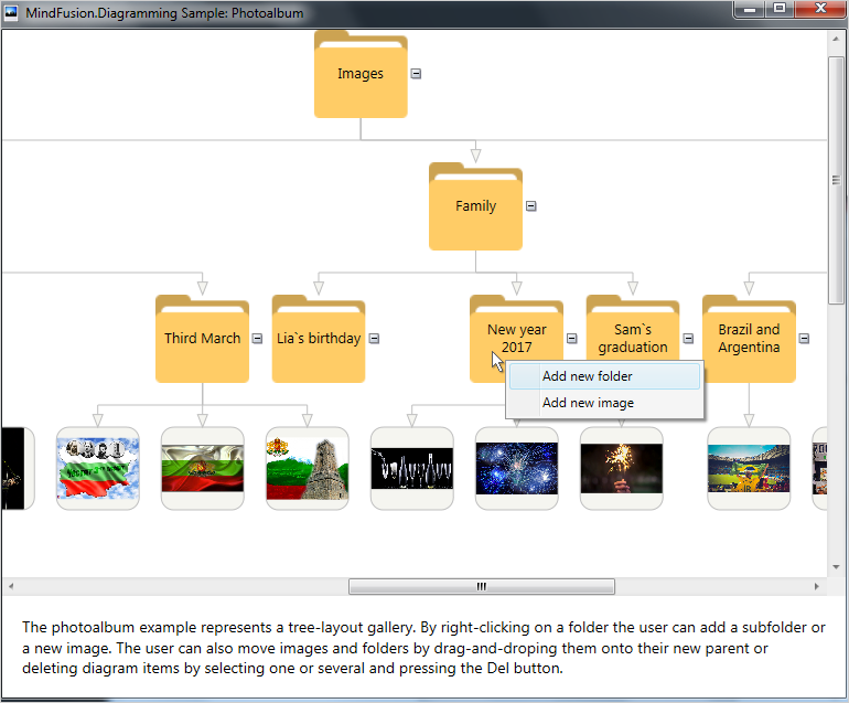
Photo Album with the WPF Diagram Control
The app is built with the diagramming for WPF component.
I. General Settings
We create a new WPF application in Visual Studio. There, in the main window, the Window.Resources section we add a new item – a context menu:
 <contextmenu x:key="ContextMenu">
         <menuitem x:name="FolderMenuItem" header="Add new folder" click="AddFolderMenuItem_Click">
         <menuitem x:name="ImageMenuItem" header="Add new image" click="AddImageMenuItem_Click">
 </menuitem></menuitem></contextmenu>
The context menu shows up every time we right-click on a node.
We leave the default Grid layout panel and add there a ScrollViewer. The ScrollViewer would hold the diagram. Let’s add a XAML mapping to the Diagram class in the Window element:
xmlns:diag="http://mindfusion.eu/diagramming/wpf" xmlns:common="http://mindfusion.eu/common/wpf"
We need a reference to the common namespace as well because the Diagram class uses it. Now, in the ScrollViewer we can add the markup for the Diagram:
<diag:diagram x:name="diagram" bounds="0, 0, 1000, 1000"  DefaultShape="Ellipse" aligntogrid="False" behavior="Modify" NodeModified="diagram_NodeModified" NodeClicked="diagram_NodeClicked">
</diag:diagram>
The application needs reference to the following MindFusion.Diagramming libraries:
- MindFusion.Diagramming.Wpf
- MindFusion.Common.Wpf
- MindFusion.Licensing
II. Styling
In the code-behind file we create a Theme and add two Style-s to it: one for the links and one for the nodes.
 //create a new theme
 Theme theme = new Theme();

 //create a style for the links
 Style linkStyle = new Style();
 linkStyle.Setters.Add(new Setter(DiagramLink.BrushProperty, new SolidColorBrush(Color.FromRgb(245, 245, 240))));
 linkStyle.Setters.Add(new Setter(DiagramLink.StrokeProperty, new SolidColorBrush(Color.FromRgb(191, 191, 191))));
 linkStyle.Setters.Add(new Setter(DiagramLink.HeadStrokeProperty, new SolidColorBrush(Color.FromRgb(191, 191, 191))));
 //register the style with the theme
 theme.RegisterStyle(typeof(DiagramLink), linkStyle);
The link style sets the brush and stroke for the links as well the stroke for the link’s head. The brush is used to fill the head shape of the link. Finally we register the style with the theme. Here is what the node style looks like:
//create a style for the nodes
Style nodeStyle = new Style();
nodeStyle.Setters.Add(new Setter(ShapeNode.StrokeProperty, new SolidColorBrush(Color.FromRgb(191, 191, 191))));
nodeStyle.Setters.Add(new Setter(ShapeNode.FontFamilyProperty, new FontFamily("Lato")));
//register the style with the theme
theme.RegisterStyle(typeof(ShapeNode), nodeStyle);
We specify the stroke that would outline each node and the font that would be used when labels on nodes are painted. The final step is to assign the new Theme to the Theme property of the diagram:
 //assign the theme
  diagram.Theme = theme;
We also change the default head shape of the link and its size:
 //set link styling
 diagram.LinkHeadShapeSize = 12;
 diagram.LinkHeadShape = ArrowHeads.Triangle;
III. Create Diagram Items
When you run the application it shows a diagram that is a tree with folders and images. We will create this diagram in code. First, we create a new array that would hold the names of the folders:
string[] labels = new string[] {"Images", "Events", "Family", "Tourism",
                "Autoexibition 2014 Detroit", "Depeche Mode Concert 2016", "Third March",
                "Lia`s birthday", "New year 2017", "Sam`s graduation",
                "Brazil and Argentina", "Italy 2013", "Summer 2017"};
Then we must create a node for each label:
 //create the initial nodes for the album
 for(int i = 0; i < labels.Length; i++)
   {
     var node = CreateFolder(labels[i]);
     diagram.Nodes.Add(node);
   }
Each node is created by calling the CreateFolder method. This method creates and styles a DiagramNode. It sets a Folder image as background for the node and adjusts its text alignment. The node is drawn transparent:
 //creates a new folder with the specified text.
 private ShapeNode CreateFolder(string text)
    {
       var node = new ShapeNode();
       node.Text = text;
       node.Tag = "Folder";
       node.Transparent = true;
       node.TextAlignment = TextAlignment.Center;
       node.TextVerticalAlignment = AlignmentY.Center;
       node.Expandable = true;
       BitmapImage image = this.FindResource("Folder") as BitmapImage;
       node.Image = image;
       node.ResizeToFitImage();
       return node;
     }
Note that we use the Tag property of a DiagramItem to assign the text “Folder”. We will use this identification string later in the sample, to recognize that the user has clicked on a folder.
The image is declared as a resource in XAML, in the Window.Resources section:
<bitmapimage x:key="Folder" urisource="Folder.png">
</bitmapimage>
Each major folder has subfolders and they contain images. The subfolders with images are located in the Images directory. We declare a global variable that points to the Images folder:
private const string path = @".\Images";
Then we need to cycle through all directories in “Images” and create subfolders for them.
 int length = 0;
 // reads the initial subfolders for the album
 string[] subfolders = System.IO.Directory.GetDirectories(path);
 string[] folders = new string[9];
Once we have the subfolders we must cycle through their subfolders as well because each one has several subfolders in it. Those second level subfolders actually contain the images:
 //goes one level deeper into the hierarchy
 for (int i = 0; i < subfolders.Length; i++)
    {
       string[] subsubfolders = System.IO.Directory.GetDirectories(subfolders[i]);
       for(int j = 0; j < subsubfolders.Length; j++)
       {
          folders[length] = subsubfolders[j];
          length++;
        }
    }
Once we’ve created nodes for each folder it is time to create the nodes that represent the images:
 //loads the images for each folder
 for(int i = 0; i < folders.Length; i++)
    {
      string[] filenames = System.IO.Directory.GetFiles(folders[i]);
      LoadImages(filenames, diagram.Nodes.GetAt(i + 4) as ShapeNode);
    }
We go through all folders that actually contain images and use a new method LoadImages to create DiagramNode-s for each image file. The LoadImages method needs the names of the files that would be places in the children nodes and the parent node:
private void LoadImages(string[] filenames, DiagramNode parent)
  {
     for (int i = 0; i < filenames.Length; i++)
     {
         var node = CreateImage(filenames[i]);
         diagram.Nodes.Add(node);
         diagram.Factory.CreateDiagramLink(parent, node);
      }
   }
The method creates an Image node and adds it to the collection of diagram nodes accessible through the diagram.Nodes property. hen it creates a link from the parent to the new node. Note that when we create diagram items through the diagram.Factory helper object they are added automatically to the respective nodes or links collections. Now let’s look at the CreateImage method:
private ShapeNode CreateImage(string path)
  {
      var node = new ShapeNode();
      //customize the node appearance
      node.Shape = Shapes.RoundRect;
      node.Brush = new SolidColorBrush(Color.FromRgb(245, 245, 240));
      node.Tag = "";
      //assign the image
      Uri imageUri = new Uri(path, UriKind.Relative);
      BitmapImage image = new BitmapImage(imageUri);
      node.Image = image;
      return node;
   }
The method creates a node and applies some styling to it. It gets the relative Uri to the image and assigns it to the node.Image property.
The last thing to do is to create links between the three major subfolders and the root folder:
//create links between the root and all subfolders
diagram.Factory.CreateDiagramLink(diagram.Nodes.GetAt(0) as ShapeNode, diagram.Nodes.GetAt(1) as ShapeNode);
diagram.Factory.CreateDiagramLink(diagram.Nodes.GetAt(0) as ShapeNode, diagram.Nodes.GetAt(2) as ShapeNode);
diagram.Factory.CreateDiagramLink(diagram.Nodes.GetAt(0) as ShapeNode, diagram.Nodes.GetAt(3) as ShapeNode);
Then we have to create links between those subfolders and their subfolders in similar way:
diagram.Factory.CreateDiagramLink(diagram.Nodes.GetAt(1) as ShapeNode, diagram.Nodes.GetAt(4) as ShapeNode);
diagram.Factory.CreateDiagramLink(diagram.Nodes.GetAt(1) as ShapeNode, diagram.Nodes.GetAt(5) as ShapeNode);
..........
IV. Arrange the Diagram
We use the TreeLayout algorithm to arrange our nodes in the right order. This layout is the perfect match for what we want – a hierarchy of nodes that is exactly a tree.
private void Rearrange()
  {
     if (layout == null)
     {
        layout = new TreeLayout(diagram.Nodes.GetAt(0),
        TreeLayoutType.Centered,
        false,
        TreeLayoutLinkType.Cascading3, TreeLayoutDirections.TopToBottom,
        40, 20, true, new Size(15, 15));
      }
      layout.Arrange(diagram);
   }
The TreeLayout like all other automatic layouts available in MindFusion diagramming controls is pretty easy to use. It requires the call of a single Arrange method that takes as a parameter the instance of the diagram being arranged. The constructor lets you customize the layout, in our case we use this TreeLayout constructor. The constructor requires the root node, the TreeLayoutType, the next argument specifies if links are reversed, then comes the TreeLayoutLinkType, the TreeLayoutDirections and several numbers that indicate level distance, node distance and whether root position is kept. The last argument is the margins between the tree and the diagram’s bounding rectangle.
We call the Rearrange method every time we modify the diagram – when nodes are added/deleted or modified.
V. Events
We handle the NodeClicked event, which we use to show the context menu:
private void diagram_NodeClicked(object sender, NodeEventArgs e)
   {
      //gets the node that was clicked
      SelectedNode = e.Node as ShapeNode;
      if (e.MouseButton == MindFusion.Diagramming.Wpf.MouseButton.Right && SelectedNode.Tag.ToString().Length > 0)
       {
         //renders the context menu
         ContextMenu cm = this.FindResource("ContextMenu") as ContextMenu;
         cm.Placement = System.Windows.Controls.Primitives.PlacementMode.Mouse;
         cm.IsOpen = true;
        }
    }
The important part in this code is to get the selected node. We will need it to specify the parent node for any new folders or image nodes that we create. Then, based on the menu selected by the user we either create a new folder node or a new image node calling the CreateFolder or CreateImage method that we listed above.
What happens when the user modifies a node? That happens when the user drags a node from one folder into another folder. In this case the diagram link between the former parent and the node is deleted and a new one is created – between the new parent and the node:
private void diagram_NodeModified(object sender, NodeEventArgs e)
 {
   //gets the nodes at the specified mouse position
   if (diagram.GetNodesAt(e.MousePosition).Count != 1)
    {
      ShapeNode child = e.Node as ShapeNode;
      ShapeNode parent = null;
      bool parentIsFolder = false;

      foreach (ShapeNode node in diagram.GetNodesAt(e.MousePosition))
           {
               //check if the node is a folder
               if (node.Tag.ToString().Length > 0 && node != child)
               {
                   parent = node;
                   parentIsFolder = true;
               }
           }
           //removes the current link between the node and its parent
           if (parentIsFolder)
           {
               if (child.IncomingLinks.GetAt(0) as DiagramLink != null)
                   diagram.Links.Remove(child.IncomingLinks.GetAt(0) as DiagramLink);
           }
           //creates a new link
           diagram.Factory.CreateDiagramLink(parent, child);
       }
          Rearrange();
      }
Remember that we have assigned “Folder” to the Tag property of all nodes that are folders. We use this to identify them and to move the node from one folder to the other.
And with this our tutorial is over, here is a screenshot from the final application:
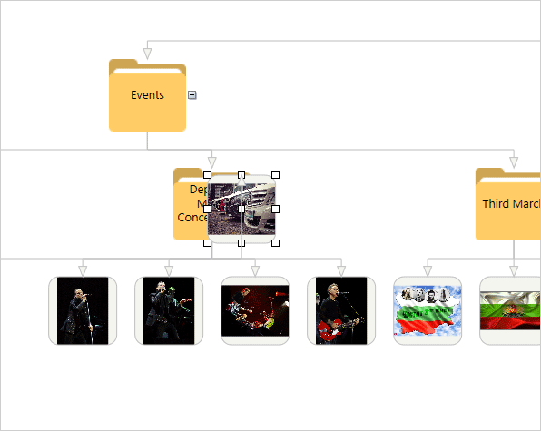
Photo Album App with the WPF Diagram: User Interaction
The link to download the sample is below:
Download Wpf Diagramming Sample: Photoalbum
About Diagramming for WPF: This is the right tool to create flowcharts in WPF that always meet your requirements. The library offers more than 100 predefined node shapes, extensive event set and more than 15 exporters and importers. Each diagram that you build has a completely customizable look through styles, themes and appearance properties for each part of the flowchart. The numerous samples and detailed documentation help you learn quickly how to integrate the component into your own application. You can download the trial version, which has no feature restrictions and does not expire from the WPF Diagram Page on MindFusion website.