MindFusion has released a new version of its diagramming component for ASP.NET. Here is a list of the most important new features:
Canvas Mode Improvements
- Glass and Aero effects
- radial gradients
- multiple labels per link
- NodeSelectedScript and LinkSelectedScript client-side events
- more new methods and events

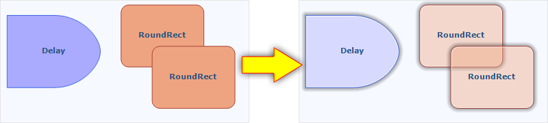
Node visual effects.
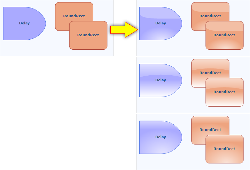
ContainerNode Improvements
- Child nodes are now drawn by their containers; when containers overlap, the children of a lower container cannot appear in front of the upper container anymore
- the ClipChildren property specifies whether to clip child items to container’s boundaries
- the ZIndex property no longer changes automatically when dropping nodes into a container
- and more

Container nodes.
Improvements in the PdfExporter
- improved handling of clip regions in custom drawing code
- PdfExporter now honors the target Rectangle property of linear gradients
- PDF shadings now include all colors from a ColorBlend
- more precise character widths set when text includes both eastern glyphs and Latin characters
- as well other improvements
Detailed information about the release is posted at the forum. If you are interested in the component, use the following link to get the trial version:
Download MindFusion.Diagramming for ASP.NET 5.0.2 Trial Version
Technical support
MindFusion support team is happy to assist you with any questions you might have about Diagramming for ASP.NET or any other of our products. You can leave a message at the discussion board, use the help desk or e-mail support@mindfusion.eu.. We strive to provide competent and detailed answers to your questions within hours of receiving them.
About Diagramming for ASP.NET: An advanced WebForms programming component that offers all the functionality that is needed for creating, styling and presenting attractive flowcharts, hierarchies, trees, graphs, schemes, diagrams and many more. The control offers numerous utility methods, path finding and cycle detection, rich event set and many useful user interaction features like tool tips, multiple selection, copy/paste to/from Windows clipboard and many more.
NetDiagram offers 87 predefined node shapes, scrollable tables, 13 automatic layouts and many more. You can check the online demo to see some of the features in action. The control includes many samples, detailed documentation and step-by-step tutorials. Every features is duly documented and there’s plenty of code to copy. We have done our best to make the component not only powerful and scalable, but easy to learn and fun to use.