MindFusion Pack for ASP.NET, V2013.R2

MindFusion has released Pack for ASP.NET, V2013.R2. Here is an overview of the most important new features in the components within the pack:

diagram16x16 MindFusion.Diagramming for WebForms

Import of OpenOffice Draw files

The new DrawImporter class lets you import *.odg files created by the OpenOffice Draw Vector graphics editor. You just need to add a reference to the MindFusion.Diagramming.Import.Draw.dll assembly and are ready to use it. You can use various overloads of the Import method to import the OpenOffice drawing into a DiagramDocument whose pages correspond to the Draw pages, or into a single Diagram whose content is merged from all imported pages.

Import any type of diagram from

Import any type of diagram from an *.odg file

Canvas Mode Improvements

ContainerNode Improvements

  • Child nodes are now drawn by their containers; when containers overlap, the children of a lower container cannot appear in front of the upper container anymore
  • The ClipChildren property specifies whether to clip child items to container’s boundaries
  • The ZIndex property no longer changes automatically when dropping nodes into a container
  • and others

Miscellaneous

  • The MeasureUnit property now supports Centimeter and WpfPoint values. The latter allows loading diagram files saved by WPF and Silverlight versions of the control with their default units.
  • SwimlaneLayout now honors the Anchoring.Keep property value.
  • New line and quote characters in Tag strings are now escaped when passed to client-side click events in ImageMap mode, avoiding script errors.
  • As well a few bug fixes and API changes

chartMindFusion.Charting for WebForms

Themes

Chart themes are now XML files that you can save and load with the SaveTheme and LoadTheme methods. You can use the theme editor tool provided with the control to edit, save and load themes in a fast and intuitive way. The control provides an initial set of 8 predefined themes.

Major/Minor Axis Ticks

Use the new MajorTickLength and MinorTickLength properties to divide a chart axis in a more precise and accurate manner. The number and pen for the ticks are set with MinorTicksPerInterval, MajorTickPen and MinorTickPen.

Major and minor axis ticks

Major and minor axis ticks

ToolTips

You can apply tooltips on all chart types. Area charts in particular can show a different tooltip for every region between two adjacent data points.

Interactive Editing of Data

Line and bar chart elements can be dragged with the mouse. Bars can be dragged either in horizontal or vertical direction according to their orientation. Line chart points can be dragged in any direction. The dragging behavior is set with the Behavior property.

As well other useful new features.

You can read more about the new features of the components in the ASP.NET Pack at the forum. The new version is available for download from this link:

Download MindFusion Pack for WebForms, VR2.2013

About MindFusion.WinForms Pack: A set of WebForms components that add great variety of features to your ASP.NET application with a few mouse clicks. The pack contains advanced components for diagramming, scheduling, charting and UI (Accordion, ColorPicker, TabControl, Window, WindowHost, DockControl, Button, Slideshow, Zoom and more). Each tool boasts easy to learn and use API and is quickly integrated into any web application that targets the ASP.NET platform. The controls support numerous options for styling, data import / export, user interaction and offer rich event set. There are plenty of samples and step-by-step tutorials as well detailed documentation.

Use the features page for each of the tools to find out more about its capabilities and
the numerous ways it can boost your performance and speed up the development of your application:

Visit the buy page for details on the licensing scheme and prices. If you have questions please contact us. We shall be happy to assist you.

ASP.NET Bar Chart with Custom Labels

In this blog post we will look on how to build a bar chart with multiple series, custom X-labels and inner labels using MindFusion.Charting for ASP.NET control.

1. General Appearance of the Chart

We want to show three data series and we want to show the first values of each series in a cluster, then second cluster with the second values of each series etc. In order to render the bars in this order we set the BarType property to BarType.Clustered3D. We correct the Depth3D to make the bars less thick and increase the distance between each series with DistBtwBars. We make the bars wider, setting BarWidth to 30.

    //general appearance
    BarChart1.BarType = MindFusion.Charting.BarType.Clustered3D;
    BarChart1.BarWidth = 30f;        
    BarChart1.Depth3D = 15f;
    BarChart1.DistBtwBars = 10f;

2. Grid

Our bars are vertical e.g. it is a column chart, so we would like to have a horizontal grid. We set the GridType property to GridType.HorScale and we set the AltGridBrush and GridBruh to different gray colors to give us nice alternating grid stripes. For the outlining of the whole plot area we use the PlotAreaOutlinePen.

    //grid settings
    BarChart1.GridBrush= new MindFusion.Drawing.SolidBrush(System.Drawing.Color.FromArgb(242, 239, 224));
    BarChart1.GridPen= new MindFusion.Drawing.Pen(System.Drawing.Color.FromArgb(204, 196, 185));
    BarChart1.GridType = MindFusion.Charting.GridType.HorScale;
    BarChart1.PlotAreaOutlinePen = new MindFusion.Drawing.Pen(System.Drawing.Color.FromArgb(204, 196, 185));

3. Labels Inside Bars

The labels inside bars show the data of each bar – this is done by setting the InnerLabelType property to LabelType.Data. We use a white LabelBrush to draw the labels and set their InnerLabelBorder to Border.RoundedRect. The background of the inner labels is set to gray.

    //inner labels settings
    BarChart1.InnerLabelBackground = new MindFusion.Drawing.SolidBrush(System.Drawing.Color.FromArgb(112, 128, 144));
    BarChart1.InnerLabelBorder = MindFusion.Charting.Border.RoundedRect;
    BarChart1.InnerLabelType = MindFusion.Charting.LabelType.Data; 
    BarChart1.LabelBrush = new MindFusion.Drawing.SolidBrush(System.Drawing.Color.FromArgb(255, 255, 255));

4. Title

We want not only title but also second title – or a subtitle. That’s why we use both the TitleText and SubTitleText properties. We leave no distance between them – we set SubTitleOffset to 0. But we would like the two titles to be well above the plot area, that’s why we set bigger TitleOffset.

    //title and subtitle
    BarChart1.SubTitleOffset = 30;
    BarChart1.SubTitleText = "all major continents";
    BarChart1.TitleOffset = 0;
    BarChart1.TitleText = "Sales";

5. Labels at the Axes

The X-labels are custom text – we set them with XLabels. The title of the Y-axis is rotated, so we use LabelOrientation.BottomToTop.

    //axes labels settings
    BarChart1.XAxisSettings.LabelSeriesIndex = 1;
    BarChart1.XLabels.Clear();
    BarChart1.XLabels.Add(new List(){ "Europe", "Asia", "North America", "South America"});
    
    BarChart1.YAxisSettings.TitleLabel = "in mlns. USD";
    BarChart1.YAxisSettings.TitleLabelOrientation = MindFusion.Charting.LabelOrientation.BottomToTop;

Here is a screenshot of the final chart:

ASP.NET Bar Chart with Custom Labels

ASP.NET Bar Chart with Custom Labels

The sample can be downloaded from here:

Download ASP.NET Bar Chart with Labels Sample

The trial version of MindFusion.Charting for ASP.NET can be downloaded directly from the link below. It contains many more samples and tutorials:

Download MindFusion.Charting for WebForms Trial Version

About MindFusion.Charting for WebForms: A powerful WebForms control that lets programmers add compelling charts in any ASP.NET application. With the component you can design and create any bar, column, line, area, scatter, bubble, radar, polar, doughnut and pie chart. Its elegant API includes data binding, themes, hit-testing, zoom, drill-down, wizards and many more.

The control takes advantage of the rich capabilities of Microsoft WebForms but its functionality does not bring excess complexity. The API is very easy to understand, all the features are duly documented. Numerous samples and step-by-step tutorials let you learn quickly how to tailor the tool in order to meet best your needs.

Details about the various features of the control are provided here. The online demo will give you an overview of the control’s rich capabilities. Licenses, prices and discounts are listed at the buy page.

Diagramming for ASP.NET 5.0.2

MindFusion has released a new version of its diagramming component for ASP.NET. Here is a list of the most important new features:

Canvas Mode Improvements

  • Glass and Aero effects
  • radial gradients
  • multiple labels per link
  • NodeSelectedScript and LinkSelectedScript client-side events
  • more new methods and events
Node visual effects.

Node visual effects.

ContainerNode Improvements

  • Child nodes are now drawn by their containers; when containers overlap, the children of a lower container cannot appear in front of the upper container anymore
  • the ClipChildren property specifies whether to clip child items to container’s boundaries
  • the ZIndex property no longer changes automatically when dropping nodes into a container
  • and more
Container nodes.

Container nodes.

Improvements in the PdfExporter

  • improved handling of clip regions in custom drawing code
  • PdfExporter now honors the target Rectangle property of linear gradients
  • PDF shadings now include all colors from a ColorBlend
  • more precise character widths set when text includes both eastern glyphs and Latin characters
  • as well other improvements

Detailed information about the release is posted at the forum. If you are interested in the component, use the following link to get the trial version:

Download MindFusion.Diagramming for ASP.NET 5.0.2 Trial Version

Technical support

MindFusion support team is happy to assist you with any questions you might have about Diagramming for ASP.NET or any other of our products. You can leave a message at the discussion board, use the help desk or e-mail support@mindfusion.eu.. We strive to provide competent and detailed answers to your questions within hours of receiving them.

About Diagramming for ASP.NET: An advanced WebForms programming component that offers all the functionality that is needed for creating, styling and presenting attractive flowcharts, hierarchies, trees, graphs, schemes, diagrams and many more. The control offers numerous utility methods, path finding and cycle detection, rich event set and many useful user interaction features like tool tips, multiple selection, copy/paste to/from Windows clipboard and many more.

NetDiagram offers 87 predefined node shapes, scrollable tables, 13 automatic layouts and many more. You can check the online demo to see some of the features in action. The control includes many samples, detailed documentation and step-by-step tutorials. Every features is duly documented and there’s plenty of code to copy. We have done our best to make the component not only powerful and scalable, but easy to learn and fun to use.

Line Chart with DateTime Data in ASP.NET

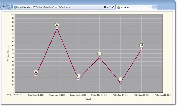
In this post we demonstrate how to use MindFusion.Charting for ASP.NET component to create a line chart that shows the number of unique visitors to a store/website in a period of 6 weeks.

Data

The data for the X-axis are DateTime values. We create an array with the DateTime values that we’ll use and add it to the XData property of our chart. Before that we have to delete the predefined array that is added when the control is dropped at the form:

DateTime dt1 = new DateTime(2013, 6, 14);
DateTime dt2 = new DateTime(2013, 6, 7);
DateTime dt3 = new DateTime(2013, 5, 31);
DateTime dt4 = new DateTime(2013, 5, 24);
DateTime dt5 = new DateTime(2013, 5, 17);
DateTime dt6 = new DateTime(2013, 5, 10);

ArrayList data = new ArrayList() { dt1, dt2, dt3, dt4, dt5, dt6 };
LineChart1.XData.Clear();
LineChart1.XData.Add(data);

Next, we must make some adjustments in the settings for the X-axis to tell the control that DateTime data is used. We set the DataFormat property to DateTime and we specify the time range for the axis. This is how we do this:

LineChart1.XAxisSettings.DataFormat = MindFusion.Charting.DataFormat.DateTime;

LineChart1.XAxisSettings.StartDateTime = new DateTime(2013, 5, 3);
LineChart1.XAxisSettings.EndDateTime = new DateTime(2013, 6, 20);
//set the interval to one week - 7 days
LineChart1.XAxisSettings.TimeSpan = new TimeSpan(7, 0, 0, 0);

The data for the Y-axis are numbers. We can set them through the property grid or set them in code.

LineChart1.YData.Clear();
ArrayList data1 = new ArrayList() { 56, 13, 45, 17, 82, 22 };
LineChart1.YData.Add(data1);

The X-axis

First, we must change the LabelType property of XAxisSettings from “ChartData”, which is the default to “AutoScale”. This will make the axis show the time range we’ve set in code above. Then, we change how the DateTime values will be formatted. The Default DateTimeFormat shows the full time and date and is not suitable. We change it to “LongDate”, which does not draw any time.

XAxisSettings-DateTimeFormat="LongDate" 
XAxisSettings-DrawTicksUniformly="False" XAxisSettings-DrawZero="True" 
XAxisSettings-LabelBrush="s:#FF696969" XAxisSettings-LabelOffset="10" 
XAxisSettings-LabelType="AutoScale" XAxisSettings-TitleLabel="Week" 
XAxisSettings-TitleLabelBrush="s:#FF696969" XAxisSettings-TitleLabelOffset="10"

We type “Week” as TitleLabel for the axis and set the DrawZero property to true to show the first label, which is otherwise omitted.

Upon preview we notice that the labels are too close to the axis, that’s why we use LabelOffset and TitleLabelOffset to add some space before them. Finally, we change the color of the labels, to make them dark gray rather than black.

The Y-axis

Customizing the Y-axis is rather simple. We change the interval with AxisDelta to 5 and increase the MaxValue to 100. We don’t need decimal fractions for the labels, that’s why we change the NumberFormat. We add a TitleLabel and change its orientation with TitleLabelOrientation. Finally we use LabelBrush and TitleLabelBrush to change the colors of the labels – we use the same brushes as for the X-axis.

YAxisSettings-AxisDelta="5" 
YAxisSettings-LabelBrush="s:#FF696969" 
YAxisSettings-MaxValue="100" YAxisSettings-NumberFormat="Fixed_point_0Digits" 
YAxisSettings-TitleLabel="Unique Visitors" 
YAxisSettings-TitleLabelBrush="s:#FF696969" 
YAxisSettings-TitleLabelOrientation="BottomToTop"

The Grid

Initially the chart shows no grid – but we want to show a grid. That’s why we change GridType to “Crossed” and set a GridPen. The dark gray background of the plot area together with its outlining are set with PlotAreaOutlinePen and PlotAreaBrush.

GridPen="n:0/#FFE1E1E1/0/0/0//0/0/10/" GridType="Crossed" PlotAreaBrush="s:#FFC0C0C0" 
PlotAreaOutlinePen="n:0/#FF787878/0/0/0//0/0/10/"

This is the code that was generated by the designer because we set the properties through the property grid. If we set them with code, it will be:

LineChart1.GridPen = new MindFusion.Drawing.Pen(Color.FromArgb(225,225,225));
LineChart1.GridType = MindFusion.Charting.GridType.Crossed;
LineChart1.PlotAreaBrush = new MindFusion.Drawing.SolidBrush(Color.FromArgb(192, 192, 192));
LineChart1.PlotAreaOutlinePen = new MindFusion.Drawing.Pen(Color.FromArgb(120, 120, 120));


The Line Series

We want scatters at data points and we want to show labels above those scatters. The LabelType property lets us set the type to be both line and scatters:

LineChart1.LineType = MindFusion.Charting.LineTypes.Line | MindFusion.Charting.LineTypes.Scatter;

This is the default type, so you don’t need to set it if you have not changed it before. We use ShapeBrushes, ShapePens and ShapeSizes to set the brushes and size of the scatters. We can do this in the property grid or in code. Finally, we want to show labels above scatters. We use LabelType and LabelFormat to set what kind of labels are drawn and since our labels are numbers – how they are formatted.

LabelBorder="RoundedRect" LabelBorderBackground="s:#FFFFFFE0" LabelBorderOutline="n:0/#FF787878/0/0/0//0/0/10/" LabelFormat="Fixed_point_0Digits" LabelType="Data"

In code you write:

LineChart1.LabelBorder = MindFusion.Charting.Border.RoundedRect;
LineChart1.LabelBorderBackground = new MindFusion.Drawing.SolidBrush(Color.FromArgb(255, 255, 224));
LineChart1.LabelBorderOutline = new MindFusion.Drawing.Pen(Color.FromArgb(120, 120,120));
LineChart1.LabelFormat = MindFusion.Charting.NumberFormat.Fixed_point_0Digits;
LineChart1.LabelType = MindFusion.Charting.LabelType.Data;

Here is the final chart:

Line chart with DateTime values in ASP.NET

Line chart with DateTime values in ASP.NET

You can download the sample from this link:

Download Line Chart for ASP.NET Sample

The trial version of the component is available from here:

MindFusion.Charting for ASP.NET Trial Version Download

MindFusion.Scheduling Pack R1.2013

MindFusion has just released a new version of its Scheduling Pack. Here are details about the new features in the components that are included in the pack:

Visual Studio 2012 support

MindFusion.Scheduling Pack R1.2013 supports Visual Studio 2012. The installer can create VS2012 toolbox palette for the components, and can optionally install VS2012 sample projects. In addition, toolbox palettes are now created for all .NET target frameworks supported by the respective Visual Studio versions.

ASP-Net-16x16MindFusion.Scheduling for ASP.NET

  • Interactive resize of items in all views.
  • Some of the CSS classes have been renamed to provide better consistency across themes. Check the updated CSS Classes topic for details.
  • The bundled jQuery version has been upgraded to 1.9.
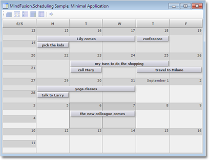
A sample monthly schedule.

A sample monthly schedule.

NET-WinForms-16x16MindFusion.Scheduling for WinForms

Exporting
You can now export calendars to PDF files with the new PdfExporter.

Improved Custom Drawing
Items, including their shadows, can now be completely custom-drawn through the new ItemDrawing event. The
ItemDrawing event is raised before the item is rendered by the system and can be used to prevent the default item rendering. Two new events added to the Calendar class signal the start and end of the item drawing phase respectively – BeginItemDrawing and EndItemDrawing.

Miscellaneous

  • All resource collections now implement IList where T is the type of resources in the collection.
  • The GetExactDateAt method works more consistently in various scenarios.
  • Custom texts and icons can be supplied to the Print Preview form of the scheduling reports.
  • All texts within the calendar can be customized explicitly through the new CustomizeText event of the Calendar class.

WPF-16x16Silverlight-16x16MindFusion.Scheduling for Silverlight / WPF

Improved item presenter
The ItemPresenter class now provides the start and end time of the represented item fragment through the new StartTime and EndTime properties. In addition, derived classes can override the new OnStartTimeChanged, OnEndTimeChanged, and OnItemPropertyChanged methods to get notified when the StartTime or EndTime properties change or when any property of the underlying item changes.

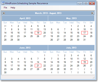
Item recurrence

Item recurrence

Improved recurrence
The Recurrence class exposes a new event – ValidateOccurrence, which can be used to validate and customize the occurrences of a recurrence pattern.