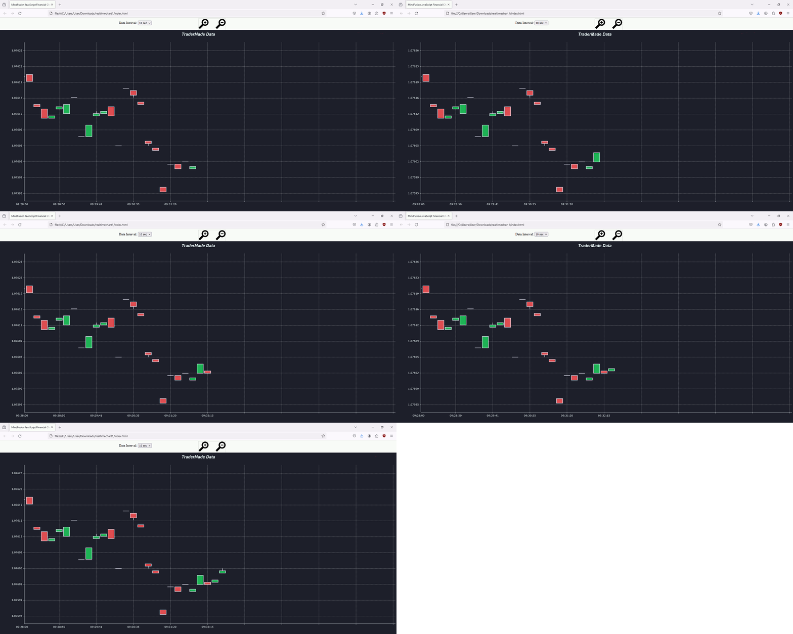
In this blog post we will build the financial chart that you see below. This is a candlestick chart created with MindFusion Charting for JavaScript. We use data from the platform TraderMade. The data comes in a continuous stream as a WebSocket. The blog post explains how to get the data, how to parse it and how to create and customize the chart. The chart also offers the user to change the data interval and to zoom in/out the chart.
Continue readingTag Archives: javascript chart
Horizontal Full Bar Chart in JavaScript
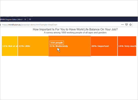
We use here MindFusion JavaScript library for Charts and Gauges to build this horizontal stacked bar chart that renders custom tooltips:
Run the sample from this link.
You can download the source code together with the libraries used from the link at the bottom of the post.
I. General Setup
We split our chart in two files – one is the web page that hosts an HTML Canvas element that will render the chart. The other file is a JavaScript code-behind file that contains the code for the chart.
We need to add reference to two JavaScript library files that provide the charting and drawing functionality that we need:
MindFusion.Common.js
MindFusion.Charting.js
We place them in a Scripts folder at the same level as our web page and JavaScript code behind file.
<script type="text/javascript" src="Scripts/MindFusion.Common.js"></script> <script type="text/javascript" src="Scripts/MindFusion.Charting.js"></script>
We also add a reference to the code-behind file that we call StackedBarChart.js:
<script type="text/javascript" src="StackedBarChart.js"></script>
Now we need to create an HTML Canvas element and we must provide it with an id so we can reference it in our JS code:
<canvas id="barChart" width="600px" height="400px"></canvas>
The size of the Canvas determines the size of the chart.
II. Chart Instance and General Settings
We add some namespace mappings that allow us to reference classes from the Chart library in a more consice manner:
var Charting = MindFusion.Charting; var Controls = MindFusion.Charting.Controls; var Collections = MindFusion.Charting.Collections; var Drawing = MindFusion.Charting.Drawing; var GridType = MindFusion.Charting.GridType; var ToolTip = Charting.ToolTip;
Then we create an instance of the BarChart control. We need to get the Dom Element that corresponds to the Canvas that we’ve prepared for the chart:
var chartEl = document.getElementById('barChart'); chartEl.width = chartEl.offsetParent.clientWidth; chartEl.height = chartEl.offsetParent.clientHeight; var chart = new Controls.BarChart(chartEl, Charting.BarLayout.Stack);
The BarChart constructor supports a second argument that indicates the type of the bar chart to render.
We set the bar chart to horizontal with the horizontalBars property. We also make the bars thicker than normal – the property for this is barSpacingRatio It measures the thickness of the bars as a percente of the bar width.
chart.horizontalBars = true; chart.barSpacingRatio = 0.2;
III. The Data Series
We want our chart to render labels as tooltips, inside the bars and also we want custom labels at the Y-axis. The predefined BarSeries class accepts 4 lists with data: one for bar data and three with labels inside the bars, at the top of the bars and at the X-axis. So, it is not an exact match for what we want to do and we need to customize it.
We will create our own custom BarSeries that we will call SeriesWithLabels. We will inherit the BarSeries class and override its constructor and getLabel members to provide the desired data for the desired type of labels.
We override the constructor by creating three new variables, which receive the data for the bars and the labels:
var SeriesWithLabels = function (barValues, innerLabels, yLabels) { Charting.BarSeries.apply(this, [barValues, innerLabels, yLabels]); this.yLabels = yLabels; this.innerLabels = innerLabels; this.values = barValues; }; SeriesWithLabels.prototype = Object.create(Charting.BarSeries.prototype);
Note that before we do anything else in the new constructor we need to call the apply method of the BarSeries class to transfer the provided data to the base class. We also need to create a prototype of the new series and also define its constructor:
Object.defineProperty(SeriesWithLabels.prototype, 'constructor', { value: SeriesWithLabels, enumerable: false, writable: true });
Next we will override the getLabel method. This is the method that returns the correct label according to the requested label kind and the index of the label. We said we want to support inner labels, tooltips and Y-axis labels. So, we make sure our implementation of getLabel returns exactly those labels:
SeriesWithLabels.prototype.getLabel = function (index, kind) { if ((kind & Charting.LabelKinds.YAxisLabel) != 0 && this.yLabels) return this.yLabels.items()[index]; if ((kind & Charting.LabelKinds.InnerLabel) != 0 && this.innerLabels) return this.innerLabels.items()[index]; if ((kind & Charting.LabelKinds.ToolTip) != 0) return getPercentLabel(index, this); return ""; };
Getting the correct inner and top label is easy – we just return the label at the requested position. What is more work is building the tooltip. We want our tooltip to calculate the portion of the part in the stacked bar the mouse currently is over, to the entire bar. This means we need to calculate the data of all bar portions, which is a combination of the values at the requested position in all three bar series. We do this calculation in a separate method called getPercentLabel.
Before we get to the getPercentLabel method let’s create 3 instances of our custom SeriesWithLabels class:
var labels = new Collections.List([ "POSITION", "SALARY", "LOCATION", "COLLEAGUES", "WORKTIME" ]); // create sample data series var series1 = new SeriesWithLabels(new Collections.List([123, 212, 220, 115, 0.01]), new Collections.List([123, 212, 220, 115, 0]), labels); var series2 = new SeriesWithLabels(new Collections.List([53, 132, 42, 105, 80]), new Collections.List([53, 132, 42, 105, 80]), null); var series3 = new SeriesWithLabels(new Collections.List([224, 56, 138, 180, 320]), new Collections.List([224, 56, 138, 180, 320]), null);
The third argument in the SeriesWithLabels constructor is the lists with labels at the Y-axis. We need just one list with labels and we set it with the first series. The other series take null as their third argument.
We need to create a collection with the series and assign it to the series property of the chart:
var series = new Collections.ObservableCollection(new Array(series1, series2, series3)); chart.series = series;
There is a special property called supportedLabels that is member of Series and tells the chart, what type of labels this Series needs to draw. In our case we need to indicate that the first series renders labels at the Y-axis, the inner labels and tooltips. The other two series render inner labels and tooltips:
series1.supportedLabels = Charting.LabelKinds.YAxisLabel | Charting.LabelKinds.InnerLabel | Charting.LabelKinds.ToolTip; series2.supportedLabels = Charting.LabelKinds.InnerLabel | Charting.LabelKinds.ToolTip; series3.supportedLabels = Charting.LabelKinds.InnerLabel | Charting.LabelKinds.ToolTip;
Now let’s get back to the method that calculates the tooltip:
function getPercentLabel(index, series) { var value1 = series1.values.items()[index]; var value2 = series2.values.items()[index]; var value3 = series3.values.items()[index]; var theValue = series.values.items()[index]; var result = theValue/(value1+value2+value3) * 100; return Number(result).toFixed(0) + "%"; };
In it we calculate the sum of all data that is rendered by the stacked bar at the specified index. Then we convert the data to percent and format it to have no numbers after the decimal point. That gives us a little inacurracy sometimes, when the value gets rounded to the next number and the sum of all percents actually is 101. You might want to change the formatting to toFixed(2) if you want to see the exact number rendered.
IV. Axes and Tooltip
By default the X-axis shows a title and both axes render the auto scale for the data of the chart. We need to hide the scale and we also hide the ticks that are rendered at the interval values:
chart.xAxis.title = ""; chart.yAxis.title = ""; chart.showXCoordinates = false; chart.showYCoordinates = false; chart.showXTicks = false; chart.showYTicks = false;
We don’t want our chart to render axes at all, so we will draw them with the color of the chart background. You can also draw them with a transparent brush:
chart.theme.axisStroke = new Drawing.Brush(Drawing.Color.knownColors.White);
The tooltip renders automatically when the user hovers a bar. We can customize it with the properties of the static Tooltip class:
ToolTip.brush = new Drawing.Brush("#fafafa"); ToolTip.pen = new Drawing.Pen("#9caac6"); ToolTip.textBrush = new Drawing.Brush("#5050c0"); ToolTip.horizontalPadding = 6; ToolTip.verticalPadding = 4; ToolTip.horizontalOffset = 76; ToolTip.verticalOffset = 34; ToolTip.font = new Charting.Drawing.Font("Verdana", 12);
We add some padding to the tooltip text and increase its font size. We also render the tooltip with a little offset that will place it inside the bar, ater the inner label.
V. Styling and Legend
Styling o the charts is done through instances of SeriesStyle derived classes. The instance is assigned to the seriesStyle property of the Chart In our case we want to color each bar in three sections. That means the portion of the bar that corresponds to the same series is colored in the same color for all its members. That kind of styling is supported by the PerSeriesStyle class. It accepts a list with brushes and strokes and paints all elements of the series corresponding to the index of the brush in the list with this brush:
// create bar brushes var thirdBrush = new Drawing.Brush("#97b5b5"); var secondBrush = new Drawing.Brush("#5a79a5"); var firstBrush = new Drawing.Brush("#003466"); // assign one brush per series var brushes = new Collections.List([firstBrush, secondBrush, thirdBrush]); chart.plot.seriesStyle = new Charting.PerSeriesStyle(brushes, brushes);
The theme property is the main property for styling the chart. The Theme class exposes fields for customizing the appearance of all chart elements. We first adjust the font and size of the axis labels – remember we have labels only at the Y-axis:
chart.theme.axisTitleFontSize = 14; chart.theme.axisLabelsFontSize = 11; chart.theme.axisTitleFontName = "Verdana"; chart.theme.axisLabelsFontName = "Verdana"; chart.theme.axisLabelsFontSize = 14; chart.theme.axisStroke = new Drawing.Brush(Drawing.Color.knownColors.White);
The labels inside the bars are called data labels and there are dataLabels*** properties that regulate their appearance:
chart.theme.dataLabelsFontName = "Verdana"; chart.theme.dataLabelsFontSize = 14; chart.theme.dataLabelsBrush = new Drawing.Brush("#ffffff");
The dataLabelsBrush is also used when the legend labels are rendered. In order to make them visible we need to set a darker background for the legend:
chart.theme.legendBackground = new Drawing.Brush("#cccccc"); chart.theme.legendBorderStroke = new Drawing.Brush("#cecece");
The labels inside the legend are taken from the title property of the Series instances:
series.item(0).title = "CAREER START"; series.item(1).title = "MIDDLE OF CAREER"; series.item(2).title = "CAREER END";
Finally we should not forget to call the draw method that actually renders the chart:
chart.draw();
With this our costimization of the chart is done. You can download the source code of the sample and the MindFusion JavaScript libraries used from this link:
Download the Horizontal Stacked Bar Chart Sample: Source Code and Libraries
About Charting for JavaScript: MindFusion library for interactive charts and gauges. It supports all common chart types including 3D bar charts. Charts can have a grid, a legend, unlimitd number of axes and series. Scroll, zoom and pan are supported out of the box. You can easily create your own chart series by implementing the Series interface.
The gauges library is part of Charting for JavaScript. It supports oval and linear gauge with several types of labels and ticks. Various samples show you how the implement the gauges to create and customize all popular gauge types: car dashboard, clock, thermometer, compass etc. Learn more about Charting and Gauges for JavaScript at https://mindfusion.eu/javascript-chart.html.
New Release for the Free JS Chart Library
MindFusion Free JS Chart has a new release with the following new features:
– All Series can accept now simple JavaScript array-s as arguments instead of Collections.List instances
– The ToolTip class is greatly extended with many new properties that allow you to customize the apparance and position of tooltips
– The Color.knownColors field lists all standard CSS color names
– Brush and Pen instances can be created with simple strings that specify the HTML code of the color as argument instead of Color objects.
– The yLabelAlignment property of BiaxialChart specifies horizontal alignment of Y-axis labels.
– Texts are now properly underlined when FontStyle.Underline is set.
Free JS Chart is MindFusion charting library that is offered free of charge for commercial use. No attribution is required.
More about MindFusion Free JS Chart at https://mindfusion.eu/free-js-chart.html
Multi Series Line Chart With Custom ToolTips in JavaScript
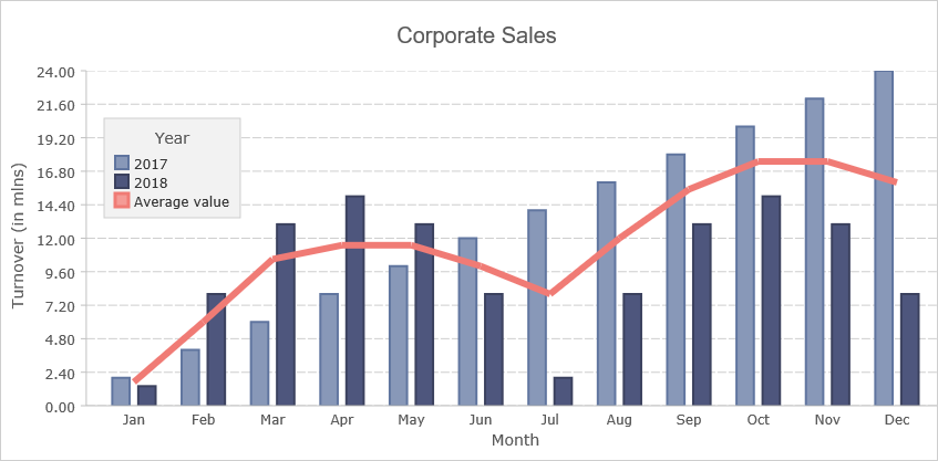
In this blog post we will build a line chart with 4 different series and custom labels on both axes. The chart renders tooltips with custom formatting. You can see the chart online here:
I. Initial Setup
We start by creating a blank HTML page and there we initialize the HTML Canvas element that will be needed by the Js Chart library.
<canvas id="chart" style="width: 100%; height: 100%; display: block;">
You can initialize the canvas as you want – there are no special requirements as to the size, position, scroll settings or anything else. What is important is that you add an id for that canvas – it will be used by the chart library. At the bottom of the page, right before the closing BODY tag we add a reference to the charting JavaScript files that represent the chart library:
<script type="text/javascript" src="Scripts/MindFusion.Common.js"></script> <script type="text/javascript" src="Scripts/MindFusion.Charting.js"></script>
We also add a reference to another JavaScript file called LineChartTooltips.js. We haven’t created it yet, but this will be the file that will hold the JavaScript code for our chart.
<script type="text/javascript" src="LineChartTooltips.js">
II. Initializing the Line Chart In the LineChartTooltips JavaScript file we first include a reference to the Intellisense file so we can use code completion.
/// <reference path="Scripts/jspack-vsdoc.js"></reference>
Then we add mappings to the namespaces that we want to use:
var Controls = Charting.Controls; var Collections = Charting.Collections; var DateTimeSeries = Charting.DateTimeSeries; var Drawing = Charting.Drawing; var ToolTip = Charting.ToolTip;
Now we create the JavaScript chart object. We need a reference to the HTML canvas element, which we get using its id:
var chartEl = document.getElementById('chart'); chartEl.width = chartEl.offsetParent.clientWidth; chartEl.height = chartEl.offsetParent.clientHeight;
We use the clientWidth and clientHeight properties of the offsetElement for the chart to give the chart its size.
Next we create the LineChart control and set its title and subtitle.
// create the chart var lineChart = new Controls.LineChart(chartEl); lineChart.title = "Women as a percentage in all S&E occupations"; lineChart.subtitle = "1993-2010";
III. Labels
The labels for the X and Y axes are set with two lists:
var xlabels = new Collections.List([ "1993", "1995", "1997", "1999", "2003", "2006", "2008", "2010"]); var ylabels = new Collections.List([ "0%", "10%", "20%", "30%", "40%", "50%", "60%", "70%"]);
By default the labels at the axes are the intervals. We can replace them with the labels of a given chart series by using the supportedLabels property. This property tells the control at which chart element the labels of the series should be rendered – X or Y axis, tooltip, data labels etc. The members are from the LabelKinds enumeration.
The LineChart control uses series that support X and Y values. The best match is the Series2D class. This class supports one list with labels, which are always drawn at the data points. The easiest thing for us to do is to customize the Series2D and make it accept two lists with labels, which we will show them on both axes. Here is how we create the custom class by inheriting from Series2D
SeriesWithAxisLabels = function (xValues, yValues, xLabels, yLabels) { this.yLabels = yLabels; Charting.Series2D.apply(this, [xValues, yValues, xLabels]); }; SeriesWithAxisLabels.prototype = Object.create(Charting.Series2D.prototype);
Our custom class is called SeriesWithAxisLabels. It accepts two lists with labels in the constructor. With one of them we call the constructor of the base class. The other we assign to a new property called yLabels.
Now we need to override the getLabel method and return the right label for the X and Y axis.
SeriesWithAxisLabels.prototype.getLabel = function (index, kind) { if ((kind & Charting.LabelKinds.XAxisLabel) != 0 && this.labels) return this.labels.items()[index]; if ((kind & Charting.LabelKinds.YAxisLabel) != 0 && this.yLabels) return this.yLabels.items()[index]; return ""; };
The getLabel method is responsible for providing the correct label according to the kind of labels that is requested. Here we check if we are asked for a label at the X or Y axis and return the label with the correct index from the xLabels or yLabels arrays. Here is how we create that series, which serves only to provide labels for the axes:
var series0 = new SeriesWithAxisLabels( new Collections.List([1, 2, 3, 4, 5, 6, 7, 8]), new Collections.List([0, 10, 20, 30, 40, 50, 60, 70]), xlabels, ylabels ); series0.supportedLabels = Charting.LabelKinds.XAxisLabel | Charting.LabelKinds.YAxisLabel; lineChart.series.add(series0);
Note that the data for the X and Y values of series0 corresponds to the positions on the axes where the labels should be rendered.
IV. Data
The data for the chart is provided by two series. They are also of type Series2D However, we do not want them to render the labels at the data points, which is their default behaviour. We would customize once again the Series2D class and make the labels be used for tooltips and not the data points.
We define a new SeriesWithToolTip class that overrides Series2D
SeriesWithToolTip = function (xValues, yValues, labels) { Charting.Series2D.apply(this, [xValues, yValues, labels]); }; SeriesWithToolTip.prototype = Object.create(Charting.Series2D.prototype);
The difference is the getLabel method. When asked for a label for the tooltip it returns the label at the given position from the series’ labels list:
SeriesWithToolTip.prototype.getLabel = function (index, kind) { if ((kind & Charting.LabelKinds.ToolTip) != 0 && this.labels) return this.labels.items()[index]; return Charting.Series2D.prototype.getLabel.apply(this, [index, kind]); };
We create a data series from the SeriesWithToolTip kind this way:
//first series var series1 = new SeriesWithToolTip( new Collections.List([1, 2, 3, 4, 5, 6, 7, 8]), new Collections.List([21.3, 21.5, 21.7, 23, 26.3, 26.1, 26.3, 27.5]) ); series1.title = "All S&E occupations"; var tooltips = new Collections.List(); for (let step = 0; step < series1.yData.count(); step++) { tooltips.add(series1.title + " for " + xlabels.items()[step] + ": " + series1.yData.items()[step] + "%"); } series1.labels = tooltips; series1.supportedLabels = Charting.LabelKinds.ToolTip; lineChart.series.add(series1);
We generate the tooltip in a list, because we want the text to combine data from the xLabels and its yData list.
V. Styling the Chart
the JavaScript Chart library supports several styles to be applied on the chart depending on what you want to achieve. In our case the best choice is the PerSeriesStyle class, which colours all the elements of a Series with the subsequent brush from its strokes and fills collections.
// create line brushes var firstBrush = new Drawing.Brush("transparent"); var secondBrush = new Drawing.Brush("#EA3F36"); var thirdBrush = new Drawing.Brush("#1A3D95"); var fourthBrush = new Drawing.Brush("#717173"); var fifthBrush = new Drawing.Brush("#407D39"); var style = new Charting.PerSeriesStyle(); style.fills = style.strokes = new Collections.List([firstBrush, secondBrush, thirdBrush, fourthBrush, fifthBrush]); style.strokeDashStyles = new Collections.List([Drawing.DashStyle.Dash, Drawing.DashStyle.Dash, Drawing.DashStyle.Dash, Drawing.DashStyle.Dash, Drawing.DashStyle.Dash]); style.strokeThicknesses = new Collections.List([2, 2, 2, 2, 2]); lineChart.plot.seriesStyle = style;
The PerSeriesStyle class also provides us with properties to specify the DashStyle and the strokeThickness of the brushes.
The styling of the axes and the fonts is done via the properties of the Theme class. Each chart has a theme property of type Theme. You can use it to customize many properties of the chart:
lineChart.legendTitle = ""; lineChart.gridType = Charting.GridType.Horizontal; lineChart.theme.axisTitleFontSize = 14; lineChart.theme.axisLabelsFontSize = 12; lineChart.theme.subtitleFontStyle = Charting.Drawing.FontStyle.Bold; lineChart.theme.titleFontStyle = Charting.Drawing.FontStyle.Bold; lineChart.theme.subtitleFontSize = 16; lineChart.theme.dataLabelsFontSize = 12;
Note the dataLabelsFontSize property here. It regulates the font not only for the data labels but for the labels of the legend. That is why we set it, though we do not render data labels. There are several dataLabels properties like dataLabelsFontName, which customize different aspects of the labels at chart series and legend.
VI. Legend
You can show the legend with showLegend property, which is true by default. The legendTitle property sets the title of the legend, which we set to an epty string. The labels for each series are taken from the series’ title property:
lineChart.legendTitle = ""; series1.title = "All S&E occupations"; ................. series2.title = "Computer/mathematical scientists"; .................. series3.title = "Engineers";
We can customize the background and border of the legend through properties of the theme or the LegendRenderer:
lineChart.legendRenderer.background = new Drawing.Brush("#f2f2f2"); lineChart.legendRenderer.borderStroke = new Drawing.Brush("#c0c0c0");
VII. ToolTips
The tooltips are automatically rendered when the user hovers over a data point. We make the data points visible by setting showScatter to true:
lineChart.showScatter = true;
Then we set different properties of the TooltTip class to achieve the desired look of the tooltips:
ToolTip.brush = new Drawing.Brush("#fafafa"); ToolTip.pen = new Drawing.Pen("#9caac6"); ToolTip.textBrush = new Drawing.Brush("#717173"); ToolTip.horizontalPadding = 6; ToolTip.verticalPadding = 4; ToolTip.horizontalOffset = -6; ToolTip.verticalOffset = -4; ToolTip.font = new Charting.Drawing.Font("Arial", 12, Charting.Drawing.FontStyle.Bold);
The ToolTip class is a static class and we can set the properties directly.
At the end, we should always call draw() to see the chart correctly rendered on the screen:
lineChart.draw();
You can download the sample with the JavaScript chart libraries and the Intellisense file from this link:
https://mindfusion.eu/samples/javascript/chart/JsLineChartTooltips.zip
About Charting for JavaScript: MindFusion library for interactive charts and gauges. It supports all common chart types including 3D bar charts. Charts can have a grid, a legend, unlimitd number of axes and series. Scroll, zoom and pan are supported out of the box. You can easily create your own chart series by implementing the Series interface.
The gauges library is part of Charting for JavaScript. It supports oval and linear gauge with several types of labels and ticks. Various samples show you how the implement the gauges to create and customize all popular gauge types: car dashboard, clock, thermometer, compass etc. Learn more about Charting and Gauges for JavaScript at https://mindfusion.eu/javascript-chart.html.
A JavaScript Application for Server Load Monitoring
In two blog posts we will look at the main steps to create a sample server load web application. We will use the chart, gauge and diagram libraries. The data is simulated with random numbers.
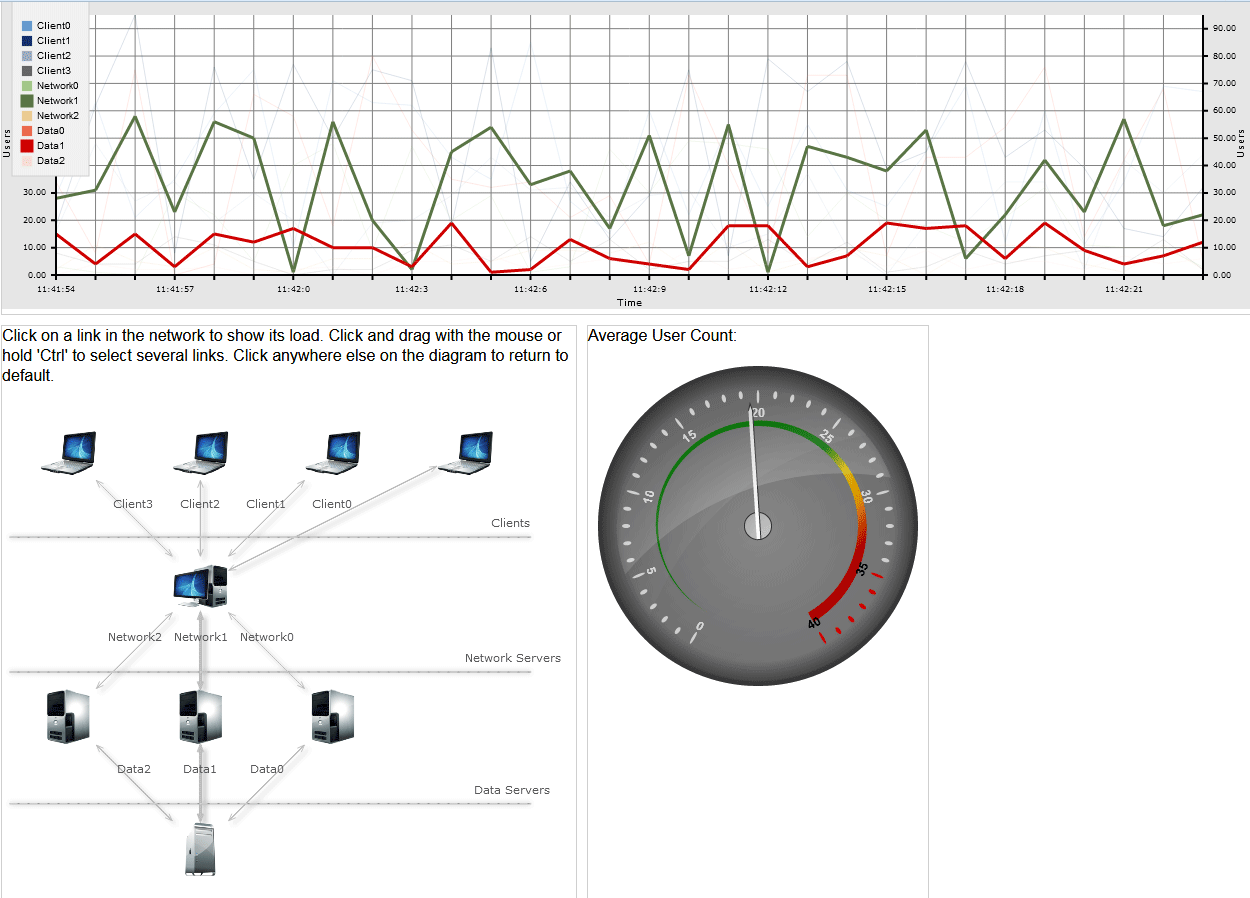
The chart shows number of users on a given connection between two stations in the network at each moment. The graphic includes data for the last 30 seconds. The diagram shows the servers and clients that build the network. By default the charts shows data only for the two most important connections, out of total 10. Users can select different connections and view their graphics. The gauge control provides data for the average count of users at any given moment.
I. Project Setup
We create an empty website and add a Scripts folder with the necessary files:
MindFusion.Gauges.js MindFusion.Diagramming.js MindFusion.Common.js MindFusion.Charting.js require.js
and a reference to jQuery or the jQuery library itself:
jquery.js
We create a blank HTML file and we create three HTML Canvas elements – one for each of the controls: chart, diagram, gauge.
We use the Flexbox layout and we create a CSS file referenced by the index.html file where we write the CSS settings for the layout:
We initialize a section region that would have a Flexbox layout:
section { display: flex; max-width: 700px; }
The CSS class used for <div> elements inside <section>:
.column { margin: 10px 10px 0px 0px; flex: 1 1 0; border: 1px solid #cecece; } section:first-of-type .column:first-of-type { flex: 1 1 auto; }
We specify that the first column on the second row would be twice wider than the other column. This is the diagram, and the other column is occupied by the gauge.
section:nth-of-type(2) .column:first-of-type { flex: 2 2 22; }
That’s how the HTML uses the CSS attributes:
<section> <div class="column"></div> </section>
Note the id=”lineChart” attribute – we will use the id to initialize the LineChart object in the *.js file. The diagram and gauge Canvas instances also have id-s.
At the end of the index.html we include a reference to the require.js file to load the chart and gauge libraries this way:
<script src="Scripts/diagram.js" type="text/javascript"></script> <script data-main="charts" src="Scripts/require.js"></script>
Note: Internet Explorer might not load properly the JavaScript libraries if they are declared at the beginning of the file, (in the head section) before the initialization of the Canvas-es. Therefore it is best to put the script references at the bottom, right before the closing </body> tag.
II. The Gauge
The code for the OvalGauge and the LineChart is in a single method:
var lineChart = null; define(["require", "exports", 'MindFusion.Common', 'Scripts/MindFusion.Charting', 'MindFusion.Gauges'], function (require, exports, MindFusion_Common_1, m, g) { "use strict"; ......... ......... }
Before the method we declare a global variable for the LineChart. We need to access it in the diagram file so it must have a global visibility.
The OvalGauge control is created using the id of the HTML Canvas:
var userCounter = g.OvalGauge.create($('#userCounter')[0], false);
We will use two Events – raised before the background was painted and before the pointer was painted – to customize how the gauge background and pointer look.
//use custom painting of the background and of the pointer userCounter.addEventListener(g.Events.prepaintBackground, onGaugerepaintBackground.bind(this)); userCounter.addEventListener(g.Events.prepaintPointer, onPrepaintPointer.bind(this));
The gauge needs a scale – we create an OvalScale and set its min and max value:
var scale = new g.OvalScale(userCounter); scale.setMinValue(0); scale.setMaxValue(40); ................
We will also set all three types of settings on the scale – MajorTickSettings, MiddleTickSettings and MinorTickSettings
//initialize the major settings var majorSettings = scale.majorTickSettings; majorSettings.setTickShape(TickShape.Ellipse); ..........................
A CustomInterval at the MajorTickSettings indicates a special range. We will use one to paint in red the portion on the scale that corresponds to the high amount of users:
var interval = new g.CustomInterval(); interval.setMinValue(35); interval.setFill('Red'); majorSettings.addCustomInterval(interval);
Then we customize the MajorTickSettings, the MiddleTickSettings and MinorTickSettings:
//initialize the middle settings var middleSettings = scale.middleTickSettings; middleSettings.setShowLabels(false); ............... //initalize the minor settings var minorSettings = scale.minorTickSettings; minorSettings.setShowLabels(false); minorSettings.setShowTicks(false);
The scale shows a Range: that is a visual indication of regions on the gauge. It is determined by its setMinValue and setMaxValue values and in our case we will show it on the whole gauge:
//add a range in gradient colors var range = new g.Range(); range.setMinValue(0); range.setMaxValue(40); range.setFill(g.Utils.createLinearGradient(320, [1, '#ce0000', 0.8, '#ce0000', 0.7, '#FFA500', 0.6, '#FFD700', 0.5, '#008000', 0, '#008000'])); ............... scale.addRange(range);
That’s how we handle the PrepaintBackground event to draw custom background for the gauge:
//paint the background in gradient function onGaugerepaintBackground(sender, args) { args.setCancelDefaultPainting(true); var context = args.getContext(); var element = args.getElement(); var size = sender.getSize(); var ellipse = new g.Ellipse(); ellipse.setFill('gray'); ellipse.setStroke('transparent'); args.paintVisualElement(ellipse, size); var ellipse = new g.Ellipse(); ellipse.setFill(g.Utils.createLinearGradient(300, [0, '#808080', 0.2, '#808080', 0.8, '#909090', 1, '#909090'])); ellipse.setStroke('transparent'); ellipse.setMargin(new g.Thickness(0.015)); args.paintVisualElement(ellipse, size); }
The code that handles the prepaint pointer event is similar. The value of the Pointer is set this way:
//add some initial value pointer.setValue(26);
When the last chart values changes – each second – we update the pointer value:
var pointer = userCounter.scales[0].pointers[0]; pointer.setValue(sum/10);
III. The Chart
First we create the LineChart object from the Canvas that we have initialized in the HTML. We take the width and height of the control from its parent container:
var lineChartEl = document.getElementById('lineChart'); lineChartEl.width = lineChartEl.offsetParent.clientWidth; lineChartEl.height = lineChartEl.offsetParent.clientHeight; lineChart = new Controls.LineChart(lineChartEl);
The data for the line series is stored in 10 Series2D instances. For each of them we need a list with the X and Y values. The X-values are the same for all series, the Y-values are randomly generated numbers. All of them are instances of the List class:
var values1 = new Collections.List(); var values2 = new Collections.List(); ...................................... var xValues = new Collections.List(); var xLabels = new Collections.List();
Here we fill the xValues list with numbers:
//initialize x-values and labels, generate sample data for the series for (var i = 0; i < 30; i++) { xValues.add(i); setXLabels(false); generateData(); }
The setXLabels method takes care of the custom labels at the X-axis. At each 3rd call, it removes the first three values and adds three new ones: one with the current time stamp and two more as empty strings.
if (d.getSeconds() % 3 == 0) { //clear the first three values //if the count of the labels is more than 30 if (removeFirst) { xLabels.removeAt(0); xLabels.removeAt(0); xLabels.removeAt(0); } //add a label and two empty strings xLabels.add(d.getHours() + ":" + d.getMinutes() + ":" + d.getSeconds()); xLabels.add(""); xLabels.add(""); }
We create the Series2D instances and add them to the Series property of the line chart:
//the series for the chart var series = new Collections.ObservableCollection(new Array( new Charting.Series2D(xValues, values1, xLabels), new Charting.Series2D(xValues, values2, null), ........... new Charting.Series2D(xValues, values10, null)));
The xLables are assigned just to the first series, they will serve as labels source for the X-axis.To show them, we must first hide the coordinates and assign them to the xAxis:
lineChart.xAxis.labels = xLabels; lineChart.showXCoordinates = false;
then we must “tell” the first series that its labels are used for the XAxis:
//tell the series that the labels are for the X-axis. series.item(0).supportedLabels = m.MindFusion.Charting.LabelKinds.XAxisLabel;
We use the title property of a Series object to identify the series. That’s why we assign to them unique labels:
//series titles are important - we identify the series with them for (var i = 0; i < 4; i++) series.item(i).title = "Client" + i; for (var i = 0; i < 3; i++) series.item(i + 4).title ="Network" + i; for (var i = 0; i < 3; i++) series.item(i + 7).title ="Data" + i;
Since it is going to be a long chart, we want a second Y-axis to appear to the right. That can be done by adding another YAxisRenderer with the same yAxis to the components rendered by default by the LineChart control. We add the new YAxisRenderer to a vertical StackPanel:
var y2Stack = new m.MindFusion.Charting.Components.StackPanel(); y2Stack.orientation = m.MindFusion.Charting.Components.Orientation.Vertical; y2Stack.gridRow = 0; //add the stack panel to the last grid column y2Stack.gridColumn = lineChart.chartPanel.columns.count() - 1; lineChart.chartPanel.children.add(y2Stack);
The layout manager for a LineChart is a Grid panel. We add a new column to it, where the second Y-axis will be rendered. Then we add the StackPanel with the YAxisRenderer to this column. Next we add the yAxis and we specify that the plot is not to the left side of it:
//create the second Y-axis var secondYAxis = new Charting.YAxisRenderer(lineChart.yAxis); secondYAxis.plotLeftSide = false; lineChart.yAxisRenderers.add(secondYAxis); y2Stack.children.add(secondYAxis);
Then we customize the grid and trigger the timer that will update the data values at each second:
lineChart.gridType = Charting.GridType.Crossed; lineChart.backColor = new Drawing.Color.fromArgb(230, 230, 230); lineChart.theme.gridColor1 = Drawing.Color.fromArgb(1, 255, 255, 255); lineChart.theme.gridColor2 = Drawing.Color.fromArgb(1, 255, 255, 255); lineChart.theme.gridLineColor = Drawing.Color.fromArgb(0.5, 240, 240, 240); //start the timer setInterval(setTime, 1000);
Finally, let’s look at the styling of the series. We keep the brushes in a list. The colors for those brushes are stored in a list with lists – each one with three elements for the red, green and blue values of the color.
//the colors for the brushes var brushes = new Collections.List(); var rgbColors = new Collections.List(); rgbColors.add(new Array(102, 154, 204)); ..............
What we actually do to show the graphics of the connections that are selected in the diagram is thicken the strokes for those line graphics and set the thickness to the rest to 0.15 to make them barely visible.
We do that by using the thicknesses property of the PerSeriesStyle class that we use for styling the chart.
lineChart.plot.seriesStyle = new Charting.PerSeriesStyle(brushes, brushes, thicknesses);
And here is how we create the thicknesses and the brushes:
//create brushes for the chart var thicknesses = new Collections.List(); for (var i = 0; i < 10; i++) { var a = rgbColors.item(i); brushes.add(new Drawing.Brush(new Drawing.Color.fromArgb(a[0], a[1], a[2]))); if (i == 5 || i == 8) thicknesses.add(3.0); else thicknesses.add(0.15); }
Only the 5th and 8th thickness are set to 3, the others are almost zero – enough to draw the silhouettes of the graphics.
And that’s all for this part I of the tutorial on how to build the client side of a sample server load monitor application in JavaScript. In part II we will look at the diagram control. You can run the sample from here:
Run the online server load monitor application
Here is the link to download the full source code for the application:
You can also fork it from GitHub.
Find out more about the chart, gauge and diagram JavaScript libraries from their official pages on the MindFusion website.