A Monthly Calendar in Java Swing that Ends at a Given Date

In this blog post we will build a monthly calendar in Java Swing using the scheduler library. We will use the monthly view of the calendar but we will make it render only 3 months after the current month. By default there are no limits how far users can scroll the months in Single month view both back- and forth-wards. We will let our users scroll as many months they want in the past but only scroll 3 months ahead.

Continue reading

Custom Painting of Resources in Java Scheduler

In this blog post we will explain how to color cells and resources in the Resource view of the calendar based on a certain criteria. In our case we take the “Resource Table” sample from the Samples for the Java Swing Scheduler and we will edit its code to color the header and background of cells that correspond to given resources, in our sample it is an employee:

We will also add tooltips that show when the mouse is over cells that correspond to this employee:

Continue reading

Ski School Scheduler in JavaScript

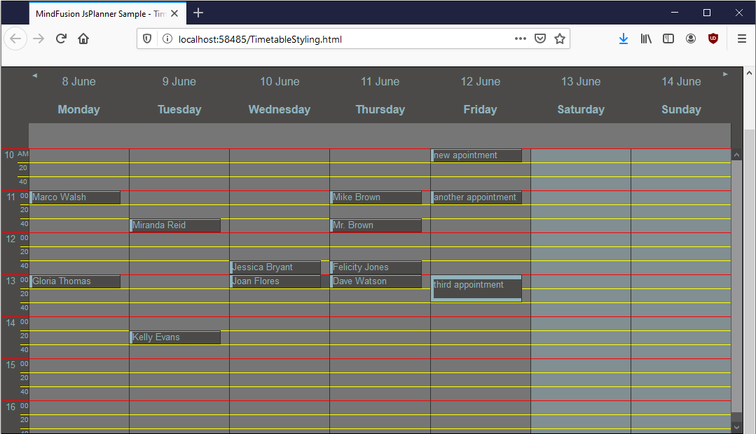
In this blog post we will create the following timetable that shows the registered ski classes for a ski school week per week:

Ski School Scheduler

We use MindFusion JavaScript Scheduler to create the timetable. We use the BaseForm class to create the custom form that allows us to choose the level of the skier.

This is not possible in the standard appointment form that comes with the scheduling library.

I. General Settings

We need to add a DIV element with an id at the location where we want the timetable to appear on the page. Note that the size of the DIV determines the size of the calendar:


MindFusion.Scheduling requires a reference to MindFusion.Scheduling:

<script src="MindFusion.Scheduling.js" type="text/javascript"></script>
<script src="SkiSchoolSchedule.js" type="text/javascript"></script>
<script src="SkiStudentForm.js" type="text/javascript"></script>

We also add a reference to two JavaScript files that will contain the source code for our application: SkiSchoolSchedule and SkiStudentForm. Finally we add a reference to the CSS file that defines the theme used by the timetable – business.css:

<link rel="stylesheet" type="text/css" href="themes/business.css">

The Scheduling library offers a variety of CSS themes, which you can customize or use as a template to create new ones.

II. The Timetable

In the code-behind file we add a mapping to MindFusion.Scheduling namespace and then create the Calendar instance using the id of the DIV element that will render it:

var p = MindFusion.Scheduling;

// create a new instance of the calendar
calendar = new p.Calendar(document.getElementById("calendar"));

// set the view to Timetable, which displays the allotment of resources to distinct hours of a day
calendar.currentView = p.CalendarView.Timetable;

//set the theme to business as referenced calendar.theme = "business";

We also set the currentView property to CalendarView and specify the theme – business as the name of the CSS file that we referenced.

The timetableSettings class exposes a dates property where we add the initial dates that will appear in the view:

//get the current date
var currDay = p.DateTime.today();
calendar.timetableSettings.dates.clear();

/* add dates to the timetable in such manner that always a full week
rom Mo to Su will be visible */
for(var i = 1; i < 8; i++)
{
    calendar.timetableSettings.dates.add(currDay.addDays(-1 * currDay.dayOfWeek + i));
}

We get the current date and add in a cycle all 7 days of the week that contains it. We set the scrollStep property to 7, which indicates the number of days that will appear by initial click on one of the navigation arrows in the header:

// set the number of days to scroll with when a navigation button is clicked
calendar.timetableSettings.scrollStep = 7;

We will also use the startTime and endTime properties to indicate the start and and time of the timetable for each day. Those properties show the time as interval added to the start of the current day, in minutes. Thus a startTime value of 300 means the timetable starts 5 hours (5*60 min.) after midnight of the respective day:

// set the start time to 8:00 AM
calendar.timetableSettings.startTime = 480;
// set the end time to 18:00 PM
calendar.timetableSettings.endTime = 1020;

III. The Custom Form

We don’t want to use the standard form for creating appointments. We will create a custom one, you can see the difference between them at this image:

Ski School Scheduler

The left one is the custom form while to the right you can see the standard New Appointment form for calendar events.

The custom form for creating and editing ski lessons derives from the BaseForm class. Here is its constructor:

var SkiStudentForm = function (calendar, item, type)
{
    p.BaseForm.call(this, calendar, item);

    this._id = "SkiStudentForm";
    this._type = type;
	
    if(type == "new")
        this.headerText = "New Skiing Class";
    else
	this.headerText = "Edit Skiing Class";

    this.levels = [
{ value: 0, text: "beginner" },
{ value: 1, text: "intermediate" },
{ value: 2, text: "advanced" }
]; }

We want each form to have a reference to the Calendar, to the Item that was created and a type. The type is simply a string and we recognize two types: new and edit e.g. whether we create a new class or edit an existing one.

Note that in the constructor we initialize a new variable called levels, which will provide data for the combo box with options for the skiing level of the student.

Then we call the prototype methods of the class and the constructor so we can initialize instances of SkiStudentForm:

SkiStudentForm.prototype = Object.create(p.BaseForm.prototype);
SkiStudentForm.prototype.constructor = SkiStudentForm;

The two methods that are responsible for drawing the contents of a custom BaseForm and its buttons are drawContent and drawButtons

We start with the drawContent method, where we create the first row:

SkiStudentForm.prototype.drawContent = function ()
{
    p.BaseForm.prototype.drawContent.call(this);

    var content = this.content;

    var row = this.row();
    row.className = "header-row";
    row.innerText = "From";
    content.appendChild(row);

    row = this.row();
    row.className = "data-row";
    row.innerHTML = this.item.startTime.toString("dddd, MMMM d,  HH:00", this.formatInfo);
    content.appendChild(row);
    ........................
}

We call the prototype of the drawContent method and we add a new row element. The row is an empty DIV. Then we add another row, this one contains a string. The string represents the start time of the Item .

We create the combo box using the createDropDownList method. Before we create the combo box we add a new DIV with the label. Then we add another DIV and the dropDownList element to it:

// create a drop-down list for status
row = this.row();
row.className = "header-row";
row.innerHTML = "Level";
content.appendChild(row);

var control = this.createDropDownList({ id: "level", items: this.levels, initValue: this.item.tag, addEmptyValue: false });
control.element.style.width = "200px";
this.addControl(control);

row = this.row();
row.className = "input-row";
row.appendChild(control.element);
content.appendChild(row);

The drawButtons method that we implement overrides the buttons of the BaseForm with new ones, styled as we want. Here the code for the Save button:

// override BaseForm's drawButtons method to create form buttons
SkiStudentForm.prototype.drawButtons = function ()
{
    var thisObj = this;

    var btnSave = this.createButton(
{ id: "btnSave", text: "✔", events: {
"click": function click(e) { return thisObj.onSaveButtonClick(e); } } }); btnSave.element.className = "form-button-save";

We use the createButton method to create the button, give it an id and assign a text to it. We also indicate the the click event will be handled by an implementation of the default onSaveButtonClick event for BaseForm

The Cancel button is the same, just the CSS styling for it is different. Both buttons use custom CSS class, which are assigned to them through the className property of HTML Dom elements. Here is the code for the appearance of the two buttons:

.form-buttons
{
	color: #fff;
	font-size: x-large;
	text-align: center;
	margin-top: 20px !important;
}
.form-button-save
{
	width: 80%;
	padding: 10px;
	background-color: #31bd41 !important;
}
.form-button-cancel
{
	width: 20%;
	padding: 10px;
	background-color: #ce0000 !important;
}

We create and render an instance of the form with the following lines of code:

var form = new SkiStudentForm(sender, item, "new");
form.showForm();

Here we create the form from an event handler for the Calendar class – we will look at that in the next section.

IV. Events

We show the student appointment form when a selection of cells is make. In order to do this we handle the selectionEnd method of the Calendar class:

// handle the selectionEnd event to show the custom form for item creation
calendar.selectionEnd.addEventListener(handleSelectionEnd);
function handleSelectionEnd(sender, args)
{	
    // we create a new item with the selected start and end time
    var item = new p.Item();
    item.startTime = args.startTime;
    item.endTime = args.endTime;	
    item.tag = 0;	

    // create and show the custom form
    var form = new SkiStudentForm(sender, item, "new");
    form.showForm();
}

We create a new Item and we set its startTime and endTime to the start and end of the selected cell range. Then we use the current Calendar, which is provided as a sender, the newly created Item and “new” as type to create an instance of the SkiStudentForm and render it.

What shall we do if we want to use the custom form to edin an existing appointment? We will handle the itemDoubleClick event of the Calendar and show the SkiStudentForm. In this case we will get the Item that we want to edit and provide it as a parameter to the SkiStudentForm instance. We also change the type to be “edit”:

function handleItemDoubleClick(sender, args)
{	
    // show the custom form with data from the clicked item
    var form = new SkiStudentForm(sender, args.item, "edit");
    form.showForm();
}

These were the most important parts of the ski school scheduler application. The application has a few more, which we did not mention here but you can check them in code. The complete code, together with the themes and libraries used is available at:

Download the Ski School Scheduler Application

You can post technical questions, comments and recommendations about MindFusion Scheduling for JavaScript at the library online forum.

About Scheduling for JavaScript: MindFusion Js Scheduler is the right solution for all applications that need to render interactive timetables, rich event calendars, lists with appointments or resources. Fully responsive, highly customizable and easy to integrate, you can quickly program the JavaScript scheduling library according to your needs. The library supports a variety of export options, styling through themes, 6 calendar views and much more. Find out more at https://mindfusion.eu/javascript-scheduler.html

The Different Ways to Style a Schedule

In this blog post we will look at the different levels of sty‌ling the elements and items of a schedule made with a MindFusion scheduling library. In our sample we use the Java Scheduling Library, but the API members that we use and the cascading levels of styling a schedule are universal across all MindFusion Scheduling components.

I. Top Level: Theme

At the top level of styling you have themes. The scheduling library has a set of predefined themes: Light, Lila, Silver, Standard, Vista, Windows2013. You apply one of the predefined themes this way:

calendar.setTheme(ThemeType.Vista);

Here is what the calendar looks like styled with the vista theme:

In JavaScript, the themes are defined in CSS styles and you must reference the desired file and set the name of the theme to the calendar instance. In the other libraries, they are built-in and usually are available as members of an enum.

You have the option to create a custom theme, which you can save and apply this way:

calendar.setCustomTheme(new MyTheme());

Another way to apply the custom theme in Java Scheduling is:

calendar.setCustomTheme(new MyTheme());

Here is the look of the calendar with the custom theme:

The custom theme has changed some of the colors, widened the header so that the week days could be seen and set some borders on the cells.

Creating a custom Theme requires that you override a strict set of methods. They are the public members of the Theme class. You should override all of them. Among the methods that style the calendar for each view – getMonthRangeSettings getMonthSettings etc. You could override in detail only the method that is responsible for styling the view you would use – if it is only one. For the rest of the methods you could just write:

private void initialize_MyTheme_ListViewSettings()
{
	_listViewSettings = super.createListViewSettings();
}

Every method in the Theme class must be dutifully implemented and all settings set. That comes from the fact that a Theme is the last and topmost styling instrument and it must know how to style any element that might not be explicitly styled down the tree.

The online and offline documentations of the Java Scheduling library come with topics that list in details the styling settings for each of the predefined themes. Our advice is that you get the code of the Theme that looks closest to what you want to have as a structure and modify it.

The sample project that you can download at the bottom of this post implements a custom Theme based on the Vista theme and lists all members in a theme that you must set with all details.

II. View and Item Settings

One level down the tree are the view settings properties. They are available for any view. You can access those settings with the getMonthSettings getMonthRangeSettings etc. methods. Each one of those methods returns the styling settings of a particular view. You should use the one that corresponds to the view you’ve chosen:

//set the view to SingleMonth
calendar.setCurrentView(CalendarView.SingleMonth);
//get the styling settings for SingleMonth view
calendar.getMonthSettings().getDaySettings().setTodayFillColor(Color.green);

You can style the items, regardless of the view used, with the ItemSettings object:

calendar.getItemSettings().setPadding(20);

The *Settings properties define the appearance of items in terms of alignment, spacing, padding, shadow, date format. The coloring of the elements is left to Style instances. Thus, if you want to change the color of items, you will use:

//customize just the items through the itemSettings field
calendar.getItemSettings().setPadding(20);
		
Style itemStyle = new Style();
itemStyle.setBrush(new SolidBrush(Color.white));
itemStyle.setHeaderTextColor(Color.DARK_GRAY);		
itemStyle.setHeaderTextShadowStyle(ShadowStyle.None);
calendar.getItemSettings().setStyle(itemStyle);

This styles all items on the calendar. For styling a particular item, you should use on of the methods listed underneath.

Our calendar now has green header on the current day, the background of events is white and there is a bit of a padding added to the events.

III. Using Events to Style Particular Items

When you want to select items that you want to style based on some distinct characteristics, you can use events. In our sample we handle the itemCreated event, where we check if the start date of an appointment happens to be during the weekend:

// Listen for item creation and for draw events
calendar.addCalendarListener(new CalendarAdapter(){
	//apply custom styling to selected items
	public void itemCreated(ItemEvent e) {
		onItemCreated(e);
	}				
});

The Java Scheduler provides various events, which are accessible through a CalendarListener and CalendarAdapter instances. We handle the itemCreated event this way:

//color in red events that are scheduled to start on weekends
protected void onItemCreated(ItemEvent e) {

	Item item = e.getItem();
	if(item.getStartTime().getDayOfWeek() == DayOfWeek.Saturday || 
		item.getStartTime().getDayOfWeek() == DayOfWeek.Sunday)
		{
			item.getStyle().setBrush(new SolidBrush(new Color(213, 28, 32)));
			item.getStyle().setHeaderTextColor(Colors.White);
			item.getPointedStyle().setBrush(new SolidBrush(new Color(100, 100, 100)));
		}	
}

The ItemEvent class provides the item that was created and you can use the instance to apply any particular styling to the item.

Here is our scheduler, which now colors the items on weekends in red:

In JavaScript, the items have a special field that allows you to assign to them a custom CSS style that you’ve defined. The style will be applied to the particular item only. The field is called ‘cssClass’.

IV. Custom Drawing

When you need to style in a very unique way calendar elements and nothing else helps, you have the option to draw them the way you want. Custom drawing can be made for many parts of the calendar. The available elements are identified as members of the CustomDrawElements enumeration.

You tell the control that you want to use custom drawing this way:

//specify that we will use custom drawing	
calendar.setCustomDraw(EnumSet.of(CustomDrawElements.CellContents));

The custom drawing must be part of the draw method, which is also a member of CalendarListener:

// Listen for item creation and for draw events
calendar.addCalendarListener(new CalendarAdapter(){
				
			
//add custom drawing to CellContents
@Override()
public void draw(CalendarDrawEvent e) {
	onDraw(e);
	} 
			
});

The event handler method looks like this:

//apply custom drawing to selected items
private void onDraw(CalendarDrawEvent e)
{
	if (e.getElement() == CustomDrawElements.CellContents)
	{
		DateTime date = e.getDate();		
		
		//color in light yellow the background of the first 10 days of a month
		if (date.getDay() < 11)
		{
			// Do the custom drawing
			Rectangle2D bounds = new Rectangle2D.Double(
			e.getBounds().getX(), e.getBounds().getY(),
			e.getBounds().getWidth() - 1, e.getBounds().getHeight() - 1);
			new AwtGraphics(e.getGraphics()).fillRectangle(Brushes.LightYellow, bounds);
		}
	}
}

The Calendar’s drawEvent class gives us useful methods to learn more about the item that is being drawn. In our case we want to draw the cell contents, so we check if draw was called for the cell contents, and if yes, we get the bounds of the element. We need the check, because draw is called for all elements that support custom drawing and we need to identify which one is drawn at the moment.

Thanks to the custom drawing, the monthly schedule now has a light yellow background on the first ten days of the month:

With this our review of the methods to style a schedule is finished. You can download the complete source code of the sample together with all MindFusion libraries used from this link:

How to Style a Java Schedule: Download Project Source Code

You can post questions about Mindusion Scheduling components at MindFusion online forums.

About MindFusion Scheduling Components MindFusion Scheduling components are available for a variety of platforms for web, mobile and desktop programming. All of them include a robust feature set that includes 6 calendar views, predefined themes, various events, predefined forms for creating appointments and recurrence. The components are fully interactive, easy to customize and style and are the ideal choice for any application that needs to implement time management features. You can learn more about MindFusion Scheduling tools at https://mindfusion.eu/scheduling-pack.html.