Tree with Nodes that Have Multiple Parents

Most tree structures are built as hierarchies: the number of nodes increases at each level. In our sample we will look at a tree, where not all branches have a higher number of nodes than their predecessors. In our tree some nodes will have multiple parents e.g. there are nodes that have several ancestors.

You can try the sample online:

In order to build this application we use MindFusion Diagramming for JavaScript library.

I. General Settings

In a web page we add the code that initializes a Canvas. We give the Canvas an id:

<div style="overflow: visible; height: 100%; margin: 1px; padding: 0px;">
    <canvas id="diagram" width="2100" height="2500">
        This page requires a browser that supports HTML 5 Canvas element.
    </canvas>
</div>

We add references to the two JavaScipt files that provide the diagramming functionality: MindFusion.Diagramming and MindFusion.Common. We also add a reference to a code-behind file that contains the JavaScript code for our application:

<script src="Scripts/MindFusion.Common.js" type="text/javascript"></script>
<script src="Scripts/MindFusion.Diagramming.js" type="text/javascript"></script>
<script src="MultipleParentNodes.js" type="text/javascript"></script>

We have placed those files in a subfolder called Scripts, which is located in our main application folder.

II. Diagram Settings

We create the diagram in the window.onload event handler. We want to be sure that all scripts are loaded:

window.onload = function(e)
{
    var diagramEl = document.getElementById('diagram');
    // create a Diagram component that wraps the "diagram" canvas
    diagram = AbstractionLayer.createControl(Diagram, null, null, null, diagramEl);
    diagram.setAllowInplaceEdit(true);
    diagram.setRouteLinks(true);
    diagram.setShowGrid(true);
    diagram.setRoundedLinks(true);
    diagram.setBounds(new Rect(0, 0, 2000,2500));
}

We create the Diagram using a reference to the DOM element of the Canvas from the web page. We set its allowInplaceEdit property to true, which lets users edit interactively nodes and links. We use showGrid to render a background grid that helps to align nodes and links. We setRoundedLinks and give the diagram a big work are with the setBounds method.

II. Creating the Diagram Nodes

We create the DiagramNode -s in a separate method, which we call after the control is created and all settings are made:

function onLoaded()
{
    var nodes = {};

    for(var i = 0; i < 5; i++)
    {
        nodes[i] = diagram.getFactory().createShapeNode(new Rect(20, 20, 20, 12));
        nodes[i].setShape('Rectangle');
        nodes[i].setBrush({ type: 'SolidBrush', color: '#567939' });
    };

We initialize a list, where we will store dynamically those nodes that we want to have reference to. At first we create 5 ShapeNode -s that are the first level of the tree. We use the createShapeNode method of Factory to create the ShapeNode -s and DiagramLink -s. Note that we will create all nodes with equal bounds. We don’t have to worry about their location because we will apply an automatic layout at the end.

Factory is available through the getFactory method of Diagram You do not usually create the class but get an instance of it through the Diagram instance.

We use setShape to provide the id af the diagram shape that we want the node to take. A list with the diagram shapes available, together with their id-s can be found in the online help.

We also use setBrush to specify the fill of the ShapeNode . In our case we use a SolidBrush ,but there are other options to choose from.

We create then a single ShapeNode that will be the next level:

var node5 = diagram.getFactory().createShapeNode(new Rect(20, 20, 20, 12 ));
node5.setShape('Rectangle');
node5.setBrush({ type: 'SolidBrush', color: '#6f9c49' });

We color it in a slightly lighter shade of green than the nodes at the first level. We then use the Factory class once again to create the DiagramLink -s between the 5 nodes at the first level and this one single node at the second level:

    for(var i = 0; i < 5; i++)
    { 
        var link = diagram.getFactory().createDiagramLink(nodes[i], node5);	
        link.setHeadShape("Triangle");
        link.setText("20%");
        link.setHeadShapeSize(3.0);
        link.setHeadBrush({ type: 'SolidBrush', color: '#7F7F7F' });
    };

The setText and setHeadShape methods of the DiagramLink class allow us to specify the label of the link and its shape at the end. There is also setBaseShape that allows us the specify the shape at the start of the DiagramLink.

The lovely thing about the Factory class is that it adds automatically the newly created DiagramItem -s, such as nodes and links, to the items collection of the diagram. You can find the newly created DiagramNode -s and DiagramLink -s also as members of the nodes and links collections respectively.

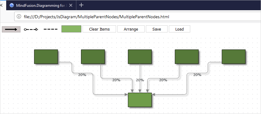
Now we have 5 links coming from all 5 nodes from the first level that point to the second level:

Node with Multiple Parents

We go on doing the rest of the diagram in the same way. We create ShapeNode -s with Factory and then bind the nodes with Factory .

III. Layout

We use the LayeredLayout to arrange all nodes of the diagram. Since the diagram is not a typical tree, we prefer the LayeredLayout to the TreeLayout

var lLayout = new MindFusion.Graphs.LayeredLayout();
diagram.arrange(lLayout);

It is really easy to apply any other algorithm on the diagram – you just need to create an instance of it and call the arrange method of your diagram to apply this instance. You can quickly change layouts and experiment to see which one provides the best result.

In our case the LayeredLayout looks fine and with this we are done building the tree.

You can download the sample together with all libraries used from the following link:

A JavaScript Graph with Nodes that Have Multiple Parents

Technical support is available through MindFusion forum here.

About Diagramming for JavaScript: This native JavaScript library provides developers with the ability to create and customize any type of diagram, decision tree, flowchart, class hierarchy, graph, genealogy tree, BPMN diagrams and much more. The control offers rich event set, numerous customization options, animations, graph operations, styling and themes. You have more than 100 predefined nodes, table nodes and more than 15 automatic layout algorithms. Learn more about Diagramming for JavaScript at https://mindfusion.eu/javascript-diagram.html.
Different-size Icons in the Js Diagram NodeListView

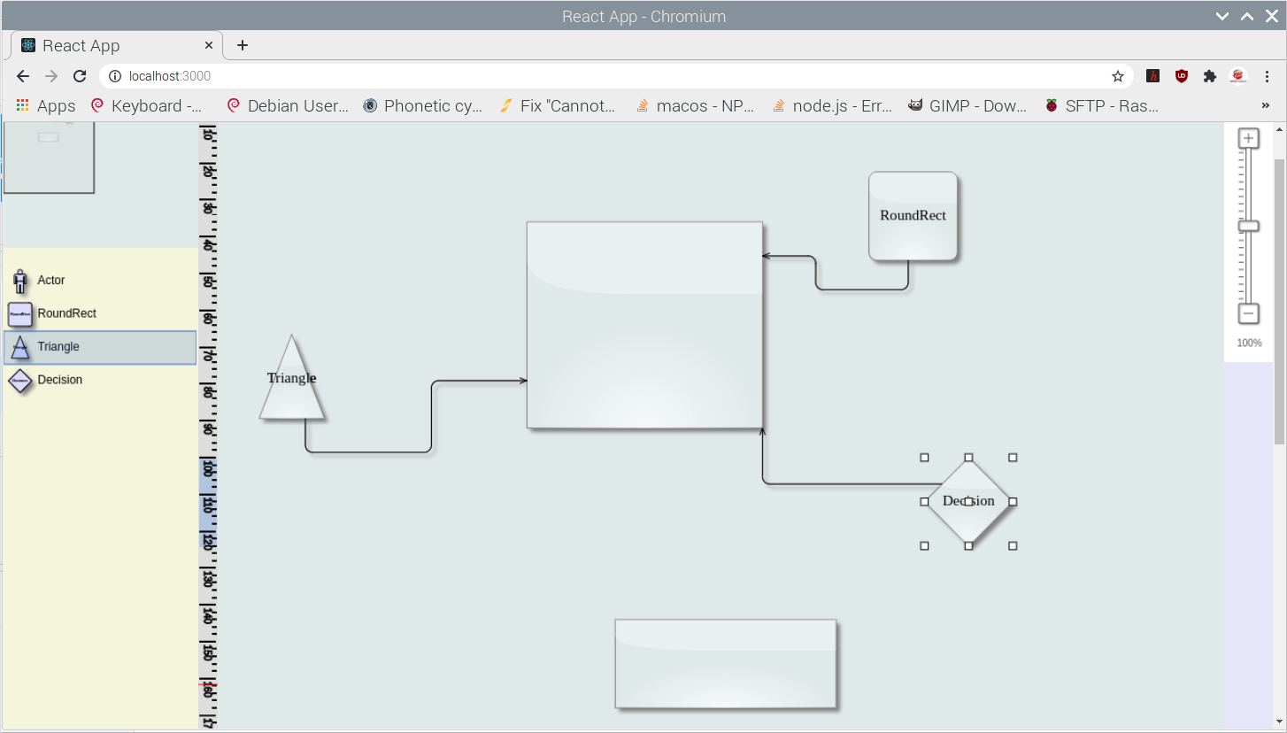
In this blog post we will learn how to add a NodeListView control to a Diagram and how to set its ShapeNode -s to a different size. When ShapeNode -s are dragged from the NodeListView the instances that will be created are proprtional in size to the size of the ShapeNode that was dragged. Here is a screenshot of the final application:

I. General Settings

We create an HTML page and add to it references to the MindFusion JavaScript files that represent the diagramming library:

<script src="MindFusion.Common.js" type="text/javascript"></script>
<script src="MindFusion.Diagramming.js" type="text/javascript"></script>
<script src="Controls.js" type="text/javascript"></script>

The last reference is to the Controls JavaScript file, where the code for the application is located.

Then we create two Canvas-es: one is for the NodeListView and the other is for the Diagram The NodeListView component is bound to the canvas element below:

<div style="width: 200px; height: 100%; overflow-y: auto; overflow-x: hidden; position: absolute; top: 201px; left: 0px; right: 0px; bottom: 0px;">
    <canvas id="nodeList" width="200"></canvas>
</div>
......
<!-- The Diagram component is bound to the canvas element below -->
<div style="position: absolute; left: 0px; top: 0px; right: 0px; bottom: 0px; overflow: auto;"> <canvas id="diagram" width="2100" height="2100">
This page requires a browser that supports HTML 5 Canvas element.
</canvas>
</div>

Both the Diagram and NodeListView controls require Canvas elements to render themselves onto.

II. Initializing the Controls

We create the Diagram using the id that we’ve provided to its Canvas in the web page:

// create a Diagram component that wraps the "diagram" canvas
diagram = Diagram.create(document.getElementById("diagram"));
diagram.setBounds(new MindFusion.Drawing.Rect(0, 0, 500, 500));

We set a bigger size to the diagram in order to make it fill the web page.

We create the NodeListView instance the same way we created the diagram:

// create a NodeListView component that wraps the "nodeList" canvas
var nodeList = MindFusion.Diagramming.NodeListView.create(document.getElementById("nodeList"));
nodeList.setTargetView(document.getElementById("diagram"));

Now we need to add the settings that will make the ShapeNode -s different in size when rendered onto the list:

nodeList.setIconSize(null);

The setIconSize method is used to specify the default size of nodes in the NodeListView When we set the size to null, the control draws each node in the NodeListView with the size that was assigned to it:

function initNodeList(nodeList, diagram)
{
    // add some nodes to the NodeListView
    var shapes = ["Actor", "RoundRect", "Triangle", "Decision"];
    for (var i = 0; i < shapes.length; ++i)
    {
        var node = new MindFusion.Diagramming.ShapeNode(diagram);
        node.setText(shapes[i]);
        node.setShape(shapes[i]);
        node.setBounds(new MindFusion.Drawing.Rect(0, 0, (i+1)*10, (i+1)*10));
        nodeList.addNode(node, shapes[i]);
    }
}

Here we increase the size of wach ShapeNode with 10 points on each itereation. This makes the icons with various size but does not create them with different size when dropped on the diagram. In order to do this we must set:

nodeList.setDefaultNodeSize (null);

setDefaultNodeSize specifies the size of those nodes that are created when a ShapeNode is dropped on the Diagram area. By setting this size to null we tell the control to read the size of the new ShapeNode from the instance in the NodeListView control.

With that our sample is ready. You can download the source code from this link:

JavaScript NodeListView with Various Size Nodes: Download Sample

About Diagramming for JavaScript: This native JavaScript library provides developers with the ability to create and customize any type of diagram, decision tree, flowchart, class hierarchy, graph, genealogy tree and more. The control offers rich event set, numerous customization options, animations, graph operations, styling and themes. You have more than 100 predefined nodes, table nodes and more than 15 automatic layout algorithms. Learn more about Diagramming for JavaScript at https://mindfusion.eu/javascript-diagram.html.
Multi-tabs Form in JavaScript with Validation

In this blog post we will create a form that spans over several tabs. Each tab contains input fields for a specific type of information. There are placeholders and restrictions for each input field. If the provided data is not correct we display a guiding message and select the first tab that has wrong data. All incorrect fields are outlined with red.

I. General Settings

We will use two files for our form – one is a web page and the other a JavaScript file that will hold all JavaScript code for the sample. They both are names TabForm.

In the web page we add references to the css file that holds the theme we’ve chosen:

<link rel="stylesheet" type="text/css" href="themes/light.css">

This is the CSS for the light theme of the MindFusion JavaScript UI controls. There are various themes provided out-of-the-box with the library and you can choose another one.

Then, at the bottom of the web page, before the closing BODY tag we add references to the three JavaScript files that we want to use:

<div style="position: absolute; top: 0px; left: 0; right: 0; bottom: 0;">
    <div id="host">
    </div>
</div>

The first two of them point to the libraries of the UI controls: MindFusion.Common and MindFusion.UI. The other is a reference to the JS code-behind file.

In order to render the TabControl we need a DIV element. So, we create one and give it an id – that is important:

We also add a paragraph with an id and red stroke – it will render text, that describes the error fields and the validation message for each one – if the user has provided wrong data.

II. Creating the Tab Control and the Tab Pages

In the code-behind file we first add mappings to the two namespaces we want to use:

var ui = MindFusion.UI;
var d = MindFusion.Drawing

Then we create an instance of the TabControl in code this way:

// Create a new TabControl.
var host = new ui.TabControl(document.getElementById("host"));
host.width = new ui.Unit(70, ui.UnitType.Percent);
host.height = new ui.Unit(70, ui.UnitType.Percent);
host.theme = "light";

We use the id of the DIV element in the constructor of the TabControl Then we use the theme property to refer to the theme that we want to use. The value of the theme property should be the same as the name of the CSS ile that we referenced in the web page. It can point to a custom theme that you have created as long as the names of the file and the property value match.

We create the first TabPage as an instance of the TabPage class:

// Create four templated tab pages and add them to the host's tabs collection.
var tab1 = new ui.TabPage("Owner Details");
// The HTML of the specified page will be set as the innerHTML of a scrollable div inside the tab content element.
tab1.templateUrl = "page1.html";
host.tabs.add(tab1);

We provide the string that will render in the title of the TabPage in the constructor. Then we set the content that the TabPage will have as a url to the web page that contains it e.g. the TabPage loads a content from a page specified with templateUrl Here is the code for the first page:


In terms of HTML, we have provided each input element with an id, a placeholder value and the necessary restrictions that will validate its content. We strictly use and follow the Validation API of JavaScript, which you can check here: https://www.w3schools.com/js/js_validation_api.asp and here https://developer.mozilla.org/en-US/docs/Web/Guide/HTML/HTML5/Constraint_validation.

III. Data Submission and Validation

On the last tab of the form, we have placed a submit button:

We wire the event handler of the click action for this button in the contentLoad event of the fourth tab, where the button is:

tab4.contentLoad.addEventListener(tabLoad);
..........................
..........................
function tabLoad(sender, args) {

    let current_datetime = new Date();
    let formatted_date = current_datetime.getFullYear() + "-" + (current_datetime.getMonth() + 1) + "-" + current_datetime.getDate();
    sender.element.querySelector("#start").value = formatted_date;
    sender.element.querySelector("#submit").addEventListener("click", function () {
    submitData(sender);
    });
}

In the event handler we get the current date and format it the way the default DateTime picker HTML control expects to get it. We get each input control through its id and the querySelector of the HTML Document object. The sender in this case is the fourth tab or tab4.

The method that validates the content is submitData:

function submitData(sender) {
    var txt = "";

    var inputObj = tab4.element.querySelector("#start");

    if (!inputObj.checkValidity()) {
        txt += inputObj.name + ": ";
        txt += inputObj.validationMessage + "
";
        inputObj.style["border-color"] = "red";
        host.selectedItem = tab4;
        dataIsCorrect = false;
    } else
        inputObj.style["border-color"] = "gray";
        ....................................

We use querySelector once again to get the input fields on each page one by one. For each one we see if the validity check has failed. If yes, we outline this field in red and append the validation message to a text variable.

We walk through all tabs and all input fields in this same manner and in reverse order. Our aim is that the first tab with error gets selected, even if there are errors in fields further in the form.

Note that if the field is OK we set its border to the default color. This way we reset the appearance of fields that were previously wrong but the user has corrected.

Finally, we assign the text to the content of the paragraph that renders text in red:

...............................
document.getElementById("error").innerHTML = txt;  

    if (txt.length === 0)
        confirmData();

If no errors have been detected – that means the error text is an empty string – we submit the data. The data submission is handled by the confirmData method:

function confirmData() {

    //first tab
    tab1.element.querySelector("#fname").value = "";
    tab1.element.querySelector("#lname").value = "";
    tab1.element.querySelector("#citizen_id").value = "";
    ........................................
    ........................................
     //fourth tab
    tab4.element.querySelector("#duration").value = "";
    let current_datetime = new Date();
    let formatted_date = current_datetime.getFullYear() + "-" + (current_datetime.getMonth() + 1) + "-" + current_datetime.getDate();
    tab4.element.querySelector("#start").value = formatted_date;

    ui.Dialogs.showInfoDialog("Confirmation", "Your info has been submitted!", null, host.element, host.theme);

}

We reset the values of all input fields and we show an instance of MindFusion InfoDialog to inform the user that their data has been successfully collected.

You can download the source code of the sample and all MindFusion themes and libraries used from this link:

https://mindfusion.eu/samples/javascript/ui/TabForm.zip

You can ask technical question about MindFusion JavaScript developer tools at the online forum at https://mindfusion.eu/Forum/YaBB.pl.

About MindFusion JavaScript UI Tools: MindFusion UI libraries are a set of smart, easy to use and customize JavaScript UI components. Each control boasts an intuitive API, detailed documentation and various samples that demonstrate its use. The rich feature set, multiple appearance options and numerous events make the UI controls powerful tools that greatly facilitate the programmers when building interactive JavaScript applications. MindFusion UI for JavaScript is part of MindFusion JavaScript Pack. You can read details at https://mindfusion.eu/javascript-pack.html.

Cost Meter Gauge in JavaScript

In this post we will look at the steps we need to make if we want to create this beautiful gauge below:

The gauge is done with MindFusion Charts and Gauges for JavaScript library. You can download the sample together with all needed libraries from this link.

I. Project Setup

We will build the gauge using the OvalGauge library from MindFusion JS Charts and Gauges control. We add two references, needed for the control to work properly:

<script type="text/javascript" src="Scripts/MindFusion.Common.js"></script>
<script type="text/javascript" src="Scripts/MindFusion.Gauges.js"></script>

We have placed those files in a Scripts folder. We will write the JavaScript code for the gauge in a separate file, which we call ValueGauge.js. This file is at the same directory where the web page is. We add a reference to it as well:

<script type="text/javascript" src="ValueGauge.js"></script>

The web page with our sample contains a table. We use the table to place the control together with a text box. The text box is not needed, but we will use it to give the user the option to set the value of the gauge by typing it not only by dragging the pointer.

<table cellpadding="10">
    <tbody>
        <tr>
            <td>Project Cost (in thousands)</td>
        </tr>
        <tr>
            <td><canvas id="value_meter" width="300" height="300"></canvas></td>
        </tr>
        <tr>
            <td>Cost <input id="cost" style="width: 80px"></td>
        </tr>
    </tbody>
</table>

The gauge will be rendered through an HTML Canvas element. The location and size of the Canvas determine the location and the size of the gauge. It is important that we add an id the Canvas – this way we can reference it in the JavaScript code page, which will be necessary.

II. The Control

Now we start editing the ValueGauge.js file and there we first add mappings to the namespaces of Mindusion.Gauges.js that we will use:

/// 
var Gauges = MindFusion.Gauges;

var d = MindFusion.Drawing;
var OvalScale = Gauges.OvalScale;
var Length = Gauges.Length;
var LengthType = Gauges.LengthType;
var Thickness = Gauges.Thickness;
var Alignment = Gauges.Alignment;
var LabelRotation = Gauges.LabelRotation;
var TickShape = Gauges.TickShape;
var PointerShape = Gauges.PointerShape;

The first line is a reference to the Intellisense file that allows us to use code completion of the API members, if supported by our JavaScript IDE.

Now we need to get the DOM Element that corresponds to the gauge Canvas and use it to create an instance of the OvalGauge class:

var value_meter = Gauges.OvalGauge.create(document.getElementById('value_meter'), false);

III. Gauge Scales

Gauge scales depend on the type of the gauge. For oval gauges we use OvalScale The OvalScale needs to be associated with a gauge and here is how we create it:

var valueScale = new Gauges.OvalScale(value_meter);
valueScale.setMinValue(0);
valueScale.setMaxValue(100);
valueScale.setStartAngle(120);
valueScale.setEndAngle(420);

The OvalScale class offers the full set of properties needed to customize the scale. We use the setMinValue and setMaxValue methods to specify the value range o the gauge. The setStartAngle and setEndAngle specify the arc of the gauge and we set them to 120 and 420 respectively. You see that the arc is 300 degrees, which is less than a full circle – exactly how we want it to be.

We continue our customization by setting the fill and stroke of the scale. We actually do not want the default scale to be rendered at all, so we use setFill and setStroke to specify transparent colors:

valueScale.setFill('Transparent');
valueScale.setStroke('Transparent');
valueScale.setMargin(new Gauges.Thickness(0.075, 0.075, 0.075, 0.075, true));

Now we can continue with the ticks. Each gauge can have major, middle and minor ticks. Those ticks are not rendered by default.

var majorSettings = valueScale.majorTickSettings;
majorSettings.setTickShape(Gauges.TickShape.Line);
majorSettings.setTickWidth(new Gauges.Length(10, Gauges.LengthType.Relative));
majorSettings.setTickHeight(new Gauges.Length(10, Gauges.LengthType.Relative));
majorSettings.setFontSize(new Length(14, LengthType.Relative));
majorSettings.setNumberPrecision(0);
majorSettings.setFill('rgb(46, 52, 66)');
majorSettings.setStroke('rgb(46, 52, 66)');
majorSettings.setLabelForeground('rgb(175, 175, 175)');
majorSettings.setLabelAlignment(Alignment.InnerCenter);
majorSettings.setLabelRotation(LabelRotation.Auto);
majorSettings.setLabelOffset(new Length(6, LengthType.Relative));
majorSettings.setStep(20);
majorSettings.setTickAlignment (Alignment.OuterOutside);

We start the customization with the majorTickSettings They will render labels and want to have one tick with a tep of 20. So, we use setStep to specify 20 as an interval and use setTickWidth and setTickHeight to set the size of the ticks. Those properties can be set to an absolute or relative value – see the LengthType enumeration. We also need to change the default shape of the pointer – we use TickShape rest of the settings are intuitive – setFill and setStroke specify how the ticks are colored. We also use setLabelAlignment to position the labels outside the ticks. setTickAlignment is also an important property -it allows us to change the alignment of the ticks, so they can be drawn inside the scale.

The TickSettings object is similar to MajorTickSettings

var middleSettings = valueScale.middleTickSettings;
middleSettings.setTickShape(TickShape.Line);
middleSettings.setTickWidth(new Gauges.Length(10, Gauges.LengthType.Relative));
middleSettings.setTickHeight(new Gauges.Length(10, Gauges.LengthType.Relative));
middleSettings.setTickAlignment (Alignment.OuterOutside);
middleSettings.setShowTicks(true);
middleSettings.setShowLabels(false);
middleSettings.setFill('rgb(46, 52, 66)');
middleSettings.setStroke('rgb(46, 52, 66)');
middleSettings.setCount(5);

We should note here that setShowLabels is false because we want the labels to appear only at intervals of 20. We also use setCount to specify how many ticks we want between each two adjacent major ticks. The rest of the settings are the same as for MajorTickSettings.

IV. Custom Painting

The painting of the colored sections at the edge of the gauge is custom code. The gauges library provides various events that allow the developer to replace the default gauge drawing with custom drawing – see the Events section of the OvalGauge class.

In our sample we will handle two events:

value_meter.addEventListener(Gauges.Events.prepaintBackground, onPrepaintBackground.bind(this));
value_meter.addEventListener(Gauges.Events.prepaintForeground, onPrepaintForeground.bind(this));

prepaintBackground is raised before the background is painted. We can cancel the default painting or add some custom drawing to it. The same is true for prepaintForeground

function onPrepaintBackground(sender, args)
{
	args.setCancelDefaultPainting(true);

	var context = args.getContext();
	var element = args.getElement();
	var bounds = new d.Rect(0, 0, element.getRenderSize().width, element.getRenderSize().height);
        ..................................
}

In the prepaintBackground event handler we first get the handler to the CanvasRenderingContext2D instance. Then we get the bounds of the painted element. This is the inside of the gauge. Each o the colored segments is pained as an arc. We do not create a path figure to fill – instead we set a very thick lineWidth of the stroke:

context.lineWidth = 25;
var correction = context.lineWidth / 2;
	
//light green segment
context.beginPath();
context.strokeStyle = 'rgb(0, 205, 154)';
context.arc(bounds.center().x, bounds.center().y, bounds.width / 2-correction, 0.665*Math.PI, 1*Math.PI, false);	
context.stroke();

We go on painting this way all colored sections of the gauge, only changing the start and end angles. When we are ready we paint the inside of the gauge. We do it with a full arc:

context.beginPath();
bounds.x += 25;
bounds.y += 25;
bounds.width -= 50;
bounds.height -= 50;
context.fillStyle = '#2e3442';

context.arc(bounds.center().x, bounds.center().y, bounds.width / 2, 0*Math.PI, 2*Math.PI, false);
context.fill();

The complete drawing is done inside the prepaintBackground event handler. So, in the prepaintForeground handler we only need to cancel the default painting:

function onPrepaintForeground(sender, args)
{
    args.setCancelDefaultPainting(true);

};

V. The Gauge Pointer

We need to add a Pointer to the OvalScale of the gauge instance if we want to show one:

var pointer = new Gauges.Pointer();
pointer.setFill('white');
pointer.setStroke("#333333");

pointer.setPointerWidth(new Gauges.Length(90, Gauges.LengthType.Relative));
pointer.setPointerHeight(new Gauges.Length(20, Gauges.LengthType.Relative));

pointer.setShape(Gauges.PointerShape.Needle2);
pointer.setIsInteractive(true);

valueScale.addPointer(pointer);

The size of the pointer is also set in LengthType units. This allows us to have the same pointer size relative to the size of the gauge even if we change the size of the Canvas. We use the PointerShape enumeration to specify the type of pointer we want and then we make it interactive with setIsInteractive As an addition to the default needle of the pointer we want to render a circle at the base of the pointer. We do it with custom drawing:

value_meter.addEventListener(Gauges.Events.prepaintPointer, onPrepaintPointer.bind(this));

First we need to handle the prepaintPointer event. In the event handling code we do the drawing:

function onPrepaintPointer(sender, args)
{	
	//args.setCancelDefaultPainting(true);

	var context = args.getContext();
	var element = args.getElement();
	var size = element.getRenderSize();
	var psize = new d.Size(0.2 * size.width, size.height);

	context.save();
	context.transform.apply(context, element.transform.matrix());

	context.beginPath();
	context.arc(psize.width / 2, psize.height / 2, psize.height*0.75, 0, 2 * Math.PI, false);
	var fill = element.getFill();
	context.fillStyle = Gauges.Utils.getBrush(context, fill, new d.Rect(0, 0, size.width, size.height), false);
	context.fill();
	context.strokeStyle = '#333333';
	context.stroke();

	context.restore();
};

Note that in this case we do not cancel the default painting – we will add to it, rather than replace it. Then we get the CanvasRenderingContext2D and size of the rendered element. What is new here is the transform of the CanvasRenderingContext2D object to the center of the gauge. Then we get the Brush that is used to paint the rest of the pointer and use it to fill the custom part as well. We can set the brush directly, but we prefer to take it from the base element – the Pointer This way if we change settings of the Pointer the color of the custom drawn circle will change automatically as well.

VI. Data Binding

What we would like to do now is bind a change in the text field to the value of the gauge scale. We add a method that does it:

function valueChanged(id)
{
	if (isNaN(this.value)) return;
	var gauge = Gauges.OvalGauge.find(id);
	var pointer = gauge.scales[0].pointers[0];
	pointer.setValue(+this.value);
};

When we call the valueChanged method with the instance of the OvalGauge as an argument, we can get its pointer and set its value to the value of ‘this’. We call the valueChanged in such way, that the ‘this’ reference will be the text field:

var cost = document.getElementById('cost');
cost.onchange = valueChanged.bind(cost, ['value_meter']);

Now when the value changes, the event handler takes the pointer and set its value to the value the user has types.

That is the end of this tutorial. You can download the source code of the sample, together with all MindFusion libraries used from the following link:

Download Value Gauge in JavaScript Source Code

You can use the discussion forum to post your questions, comments and recommendations about the sample or MindFusion charts and gauges.

About MindFusion JavaScript Gauges: A set of two gauge controls: oval and rectangular, with the option to add unlimited nuber of scales and gauges. All gauge elements support complete customization of their appearance. Custom drawing is also possible, where you can replace the default rendering of the gauge element or add to it. The gauge controls include a variety of samples that offer beautiful implementations of the most popular applications of gauges: thermometer, car dashboard, functions, compass, clock, cost meter and more.
Gauges for JavaScript is part of MindFusion charts and Dashboards for JavaScript. Details at https://mindfusion.eu/javascript-chart.html.