Multi-tabs Form in JavaScript with Validation

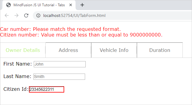
In this blog post we will create a form that spans over several tabs. Each tab contains input fields for a specific type of information. There are placeholders and restrictions for each input field. If the provided data is not correct we display a guiding message and select the first tab that has wrong data. All incorrect fields are outlined with red.

I. General Settings

We will use two files for our form – one is a web page and the other a JavaScript file that will hold all JavaScript code for the sample. They both are names TabForm.

In the web page we add references to the css file that holds the theme we’ve chosen:

<link rel="stylesheet" type="text/css" href="themes/light.css">

This is the CSS for the light theme of the MindFusion JavaScript UI controls. There are various themes provided out-of-the-box with the library and you can choose another one.

Then, at the bottom of the web page, before the closing BODY tag we add references to the three JavaScript files that we want to use:

<div style="position: absolute; top: 0px; left: 0; right: 0; bottom: 0;">
    <div id="host">
    </div>
</div>

The first two of them point to the libraries of the UI controls: MindFusion.Common and MindFusion.UI. The other is a reference to the JS code-behind file.

In order to render the TabControl we need a DIV element. So, we create one and give it an id – that is important:

We also add a paragraph with an id and red stroke – it will render text, that describes the error fields and the validation message for each one – if the user has provided wrong data.

II. Creating the Tab Control and the Tab Pages

In the code-behind file we first add mappings to the two namespaces we want to use:

var ui = MindFusion.UI;
var d = MindFusion.Drawing

Then we create an instance of the TabControl in code this way:

// Create a new TabControl.
var host = new ui.TabControl(document.getElementById("host"));
host.width = new ui.Unit(70, ui.UnitType.Percent);
host.height = new ui.Unit(70, ui.UnitType.Percent);
host.theme = "light";

We use the id of the DIV element in the constructor of the TabControl Then we use the theme property to refer to the theme that we want to use. The value of the theme property should be the same as the name of the CSS ile that we referenced in the web page. It can point to a custom theme that you have created as long as the names of the file and the property value match.

We create the first TabPage as an instance of the TabPage class:

// Create four templated tab pages and add them to the host's tabs collection.
var tab1 = new ui.TabPage("Owner Details");
// The HTML of the specified page will be set as the innerHTML of a scrollable div inside the tab content element.
tab1.templateUrl = "page1.html";
host.tabs.add(tab1);

We provide the string that will render in the title of the TabPage in the constructor. Then we set the content that the TabPage will have as a url to the web page that contains it e.g. the TabPage loads a content from a page specified with templateUrl Here is the code for the first page:


In terms of HTML, we have provided each input element with an id, a placeholder value and the necessary restrictions that will validate its content. We strictly use and follow the Validation API of JavaScript, which you can check here: https://www.w3schools.com/js/js_validation_api.asp and here https://developer.mozilla.org/en-US/docs/Web/Guide/HTML/HTML5/Constraint_validation.

III. Data Submission and Validation

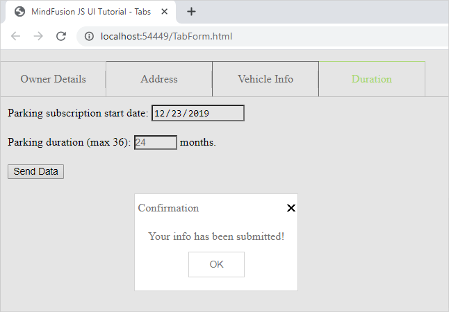
On the last tab of the form, we have placed a submit button:

We wire the event handler of the click action for this button in the contentLoad event of the fourth tab, where the button is:

tab4.contentLoad.addEventListener(tabLoad);
..........................
..........................
function tabLoad(sender, args) {

    let current_datetime = new Date();
    let formatted_date = current_datetime.getFullYear() + "-" + (current_datetime.getMonth() + 1) + "-" + current_datetime.getDate();
    sender.element.querySelector("#start").value = formatted_date;
    sender.element.querySelector("#submit").addEventListener("click", function () {
    submitData(sender);
    });
}

In the event handler we get the current date and format it the way the default DateTime picker HTML control expects to get it. We get each input control through its id and the querySelector of the HTML Document object. The sender in this case is the fourth tab or tab4.

The method that validates the content is submitData:

function submitData(sender) {
    var txt = "";

    var inputObj = tab4.element.querySelector("#start");

    if (!inputObj.checkValidity()) {
        txt += inputObj.name + ": ";
        txt += inputObj.validationMessage + "
";
        inputObj.style["border-color"] = "red";
        host.selectedItem = tab4;
        dataIsCorrect = false;
    } else
        inputObj.style["border-color"] = "gray";
        ....................................

We use querySelector once again to get the input fields on each page one by one. For each one we see if the validity check has failed. If yes, we outline this field in red and append the validation message to a text variable.

We walk through all tabs and all input fields in this same manner and in reverse order. Our aim is that the first tab with error gets selected, even if there are errors in fields further in the form.

Note that if the field is OK we set its border to the default color. This way we reset the appearance of fields that were previously wrong but the user has corrected.

Finally, we assign the text to the content of the paragraph that renders text in red:

...............................
document.getElementById("error").innerHTML = txt;  

    if (txt.length === 0)
        confirmData();

If no errors have been detected – that means the error text is an empty string – we submit the data. The data submission is handled by the confirmData method:

function confirmData() {

    //first tab
    tab1.element.querySelector("#fname").value = "";
    tab1.element.querySelector("#lname").value = "";
    tab1.element.querySelector("#citizen_id").value = "";
    ........................................
    ........................................
     //fourth tab
    tab4.element.querySelector("#duration").value = "";
    let current_datetime = new Date();
    let formatted_date = current_datetime.getFullYear() + "-" + (current_datetime.getMonth() + 1) + "-" + current_datetime.getDate();
    tab4.element.querySelector("#start").value = formatted_date;

    ui.Dialogs.showInfoDialog("Confirmation", "Your info has been submitted!", null, host.element, host.theme);

}

We reset the values of all input fields and we show an instance of MindFusion InfoDialog to inform the user that their data has been successfully collected.

You can download the source code of the sample and all MindFusion themes and libraries used from this link:

https://mindfusion.eu/samples/javascript/ui/TabForm.zip

You can ask technical question about MindFusion JavaScript developer tools at the online forum at https://mindfusion.eu/Forum/YaBB.pl.

About MindFusion JavaScript UI Tools: MindFusion UI libraries are a set of smart, easy to use and customize JavaScript UI components. Each control boasts an intuitive API, detailed documentation and various samples that demonstrate its use. The rich feature set, multiple appearance options and numerous events make the UI controls powerful tools that greatly facilitate the programmers when building interactive JavaScript applications. MindFusion UI for JavaScript is part of MindFusion JavaScript Pack. You can read details at https://mindfusion.eu/javascript-pack.html.

Cost Meter Gauge in JavaScript

In this post we will look at the steps we need to make if we want to create this beautiful gauge below:
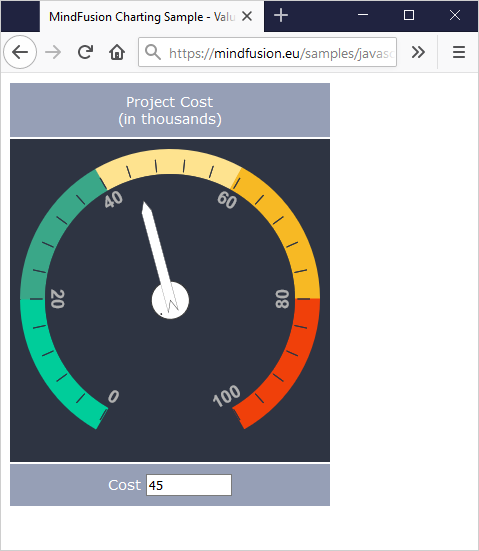
The gauge is done with MindFusion Charts and Gauges for JavaScript library. You can download the sample together with all needed libraries from this link.

I. Project Setup

We will build the gauge using the OvalGauge library from MindFusion JS Charts and Gauges control. We add two references, needed for the control to work properly:

<script type="text/javascript" src="Scripts/MindFusion.Common.js"></script>
<script type="text/javascript" src="Scripts/MindFusion.Gauges.js"></script>

We have placed those files in a Scripts folder. We will write the JavaScript code for the gauge in a separate file, which we call ValueGauge.js. This file is at the same directory where the web page is. We add a reference to it as well:

<script type="text/javascript" src="ValueGauge.js"></script>

The web page with our sample contains a table. We use the table to place the control together with a text box. The text box is not needed, but we will use it to give the user the option to set the value of the gauge by typing it not only by dragging the pointer.

<table cellpadding="10">
    <tbody>
        <tr>
            <td>Project Cost (in thousands)</td>
        </tr>
        <tr>
            <td><canvas id="value_meter" width="300" height="300"></canvas></td>
        </tr>
        <tr>
            <td>Cost <input id="cost" style="width: 80px"></td>
        </tr>
    </tbody>
</table>

The gauge will be rendered through an HTML Canvas element. The location and size of the Canvas determine the location and the size of the gauge. It is important that we add an id the Canvas – this way we can reference it in the JavaScript code page, which will be necessary.

II. The Control

Now we start editing the ValueGauge.js file and there we first add mappings to the namespaces of Mindusion.Gauges.js that we will use:

/// 
var Gauges = MindFusion.Gauges;

var d = MindFusion.Drawing;
var OvalScale = Gauges.OvalScale;
var Length = Gauges.Length;
var LengthType = Gauges.LengthType;
var Thickness = Gauges.Thickness;
var Alignment = Gauges.Alignment;
var LabelRotation = Gauges.LabelRotation;
var TickShape = Gauges.TickShape;
var PointerShape = Gauges.PointerShape;

The first line is a reference to the Intellisense file that allows us to use code completion of the API members, if supported by our JavaScript IDE.

Now we need to get the DOM Element that corresponds to the gauge Canvas and use it to create an instance of the OvalGauge class:

var value_meter = Gauges.OvalGauge.create(document.getElementById('value_meter'), false);

III. Gauge Scales

Gauge scales depend on the type of the gauge. For oval gauges we use OvalScale The OvalScale needs to be associated with a gauge and here is how we create it:

var valueScale = new Gauges.OvalScale(value_meter);
valueScale.setMinValue(0);
valueScale.setMaxValue(100);
valueScale.setStartAngle(120);
valueScale.setEndAngle(420);

The OvalScale class offers the full set of properties needed to customize the scale. We use the setMinValue and setMaxValue methods to specify the value range o the gauge. The setStartAngle and setEndAngle specify the arc of the gauge and we set them to 120 and 420 respectively. You see that the arc is 300 degrees, which is less than a full circle – exactly how we want it to be.

We continue our customization by setting the fill and stroke of the scale. We actually do not want the default scale to be rendered at all, so we use setFill and setStroke to specify transparent colors:

valueScale.setFill('Transparent');
valueScale.setStroke('Transparent');
valueScale.setMargin(new Gauges.Thickness(0.075, 0.075, 0.075, 0.075, true));

Now we can continue with the ticks. Each gauge can have major, middle and minor ticks. Those ticks are not rendered by default.

var majorSettings = valueScale.majorTickSettings;
majorSettings.setTickShape(Gauges.TickShape.Line);
majorSettings.setTickWidth(new Gauges.Length(10, Gauges.LengthType.Relative));
majorSettings.setTickHeight(new Gauges.Length(10, Gauges.LengthType.Relative));
majorSettings.setFontSize(new Length(14, LengthType.Relative));
majorSettings.setNumberPrecision(0);
majorSettings.setFill('rgb(46, 52, 66)');
majorSettings.setStroke('rgb(46, 52, 66)');
majorSettings.setLabelForeground('rgb(175, 175, 175)');
majorSettings.setLabelAlignment(Alignment.InnerCenter);
majorSettings.setLabelRotation(LabelRotation.Auto);
majorSettings.setLabelOffset(new Length(6, LengthType.Relative));
majorSettings.setStep(20);
majorSettings.setTickAlignment (Alignment.OuterOutside);

We start the customization with the majorTickSettings They will render labels and want to have one tick with a tep of 20. So, we use setStep to specify 20 as an interval and use setTickWidth and setTickHeight to set the size of the ticks. Those properties can be set to an absolute or relative value – see the LengthType enumeration. We also need to change the default shape of the pointer – we use TickShape rest of the settings are intuitive – setFill and setStroke specify how the ticks are colored. We also use setLabelAlignment to position the labels outside the ticks. setTickAlignment is also an important property -it allows us to change the alignment of the ticks, so they can be drawn inside the scale.

The TickSettings object is similar to MajorTickSettings

var middleSettings = valueScale.middleTickSettings;
middleSettings.setTickShape(TickShape.Line);
middleSettings.setTickWidth(new Gauges.Length(10, Gauges.LengthType.Relative));
middleSettings.setTickHeight(new Gauges.Length(10, Gauges.LengthType.Relative));
middleSettings.setTickAlignment (Alignment.OuterOutside);
middleSettings.setShowTicks(true);
middleSettings.setShowLabels(false);
middleSettings.setFill('rgb(46, 52, 66)');
middleSettings.setStroke('rgb(46, 52, 66)');
middleSettings.setCount(5);

We should note here that setShowLabels is false because we want the labels to appear only at intervals of 20. We also use setCount to specify how many ticks we want between each two adjacent major ticks. The rest of the settings are the same as for MajorTickSettings.

IV. Custom Painting

The painting of the colored sections at the edge of the gauge is custom code. The gauges library provides various events that allow the developer to replace the default gauge drawing with custom drawing – see the Events section of the OvalGauge class.

In our sample we will handle two events:

value_meter.addEventListener(Gauges.Events.prepaintBackground, onPrepaintBackground.bind(this));
value_meter.addEventListener(Gauges.Events.prepaintForeground, onPrepaintForeground.bind(this));

prepaintBackground is raised before the background is painted. We can cancel the default painting or add some custom drawing to it. The same is true for prepaintForeground

function onPrepaintBackground(sender, args)
{
	args.setCancelDefaultPainting(true);

	var context = args.getContext();
	var element = args.getElement();
	var bounds = new d.Rect(0, 0, element.getRenderSize().width, element.getRenderSize().height);
        ..................................
}

In the prepaintBackground event handler we first get the handler to the CanvasRenderingContext2D instance. Then we get the bounds of the painted element. This is the inside of the gauge. Each o the colored segments is pained as an arc. We do not create a path figure to fill – instead we set a very thick lineWidth of the stroke:

context.lineWidth = 25;
var correction = context.lineWidth / 2;
	
//light green segment
context.beginPath();
context.strokeStyle = 'rgb(0, 205, 154)';
context.arc(bounds.center().x, bounds.center().y, bounds.width / 2-correction, 0.665*Math.PI, 1*Math.PI, false);	
context.stroke();

We go on painting this way all colored sections of the gauge, only changing the start and end angles. When we are ready we paint the inside of the gauge. We do it with a full arc:

context.beginPath();
bounds.x += 25;
bounds.y += 25;
bounds.width -= 50;
bounds.height -= 50;
context.fillStyle = '#2e3442';

context.arc(bounds.center().x, bounds.center().y, bounds.width / 2, 0*Math.PI, 2*Math.PI, false);
context.fill();

The complete drawing is done inside the prepaintBackground event handler. So, in the prepaintForeground handler we only need to cancel the default painting:

function onPrepaintForeground(sender, args)
{
    args.setCancelDefaultPainting(true);

};

V. The Gauge Pointer

We need to add a Pointer to the OvalScale of the gauge instance if we want to show one:

var pointer = new Gauges.Pointer();
pointer.setFill('white');
pointer.setStroke("#333333");

pointer.setPointerWidth(new Gauges.Length(90, Gauges.LengthType.Relative));
pointer.setPointerHeight(new Gauges.Length(20, Gauges.LengthType.Relative));

pointer.setShape(Gauges.PointerShape.Needle2);
pointer.setIsInteractive(true);

valueScale.addPointer(pointer);

The size of the pointer is also set in LengthType units. This allows us to have the same pointer size relative to the size of the gauge even if we change the size of the Canvas. We use the PointerShape enumeration to specify the type of pointer we want and then we make it interactive with setIsInteractive As an addition to the default needle of the pointer we want to render a circle at the base of the pointer. We do it with custom drawing:

value_meter.addEventListener(Gauges.Events.prepaintPointer, onPrepaintPointer.bind(this));

First we need to handle the prepaintPointer event. In the event handling code we do the drawing:

function onPrepaintPointer(sender, args)
{	
	//args.setCancelDefaultPainting(true);

	var context = args.getContext();
	var element = args.getElement();
	var size = element.getRenderSize();
	var psize = new d.Size(0.2 * size.width, size.height);

	context.save();
	context.transform.apply(context, element.transform.matrix());

	context.beginPath();
	context.arc(psize.width / 2, psize.height / 2, psize.height*0.75, 0, 2 * Math.PI, false);
	var fill = element.getFill();
	context.fillStyle = Gauges.Utils.getBrush(context, fill, new d.Rect(0, 0, size.width, size.height), false);
	context.fill();
	context.strokeStyle = '#333333';
	context.stroke();

	context.restore();
};

Note that in this case we do not cancel the default painting – we will add to it, rather than replace it. Then we get the CanvasRenderingContext2D and size of the rendered element. What is new here is the transform of the CanvasRenderingContext2D object to the center of the gauge. Then we get the Brush that is used to paint the rest of the pointer and use it to fill the custom part as well. We can set the brush directly, but we prefer to take it from the base element – the Pointer This way if we change settings of the Pointer the color of the custom drawn circle will change automatically as well.

VI. Data Binding

What we would like to do now is bind a change in the text field to the value of the gauge scale. We add a method that does it:

function valueChanged(id)
{
	if (isNaN(this.value)) return;
	var gauge = Gauges.OvalGauge.find(id);
	var pointer = gauge.scales[0].pointers[0];
	pointer.setValue(+this.value);
};

When we call the valueChanged method with the instance of the OvalGauge as an argument, we can get its pointer and set its value to the value of ‘this’. We call the valueChanged in such way, that the ‘this’ reference will be the text field:

var cost = document.getElementById('cost');
cost.onchange = valueChanged.bind(cost, ['value_meter']);

Now when the value changes, the event handler takes the pointer and set its value to the value the user has types.

That is the end of this tutorial. You can download the source code of the sample, together with all MindFusion libraries used from the following link:

Download Value Gauge in JavaScript Source Code

You can use the discussion forum to post your questions, comments and recommendations about the sample or MindFusion charts and gauges.

About MindFusion JavaScript Gauges: A set of two gauge controls: oval and rectangular, with the option to add unlimited nuber of scales and gauges. All gauge elements support complete customization of their appearance. Custom drawing is also possible, where you can replace the default rendering of the gauge element or add to it. The gauge controls include a variety of samples that offer beautiful implementations of the most popular applications of gauges: thermometer, car dashboard, functions, compass, clock, cost meter and more.
Gauges for JavaScript is part of MindFusion charts and Dashboards for JavaScript. Details at https://mindfusion.eu/javascript-chart.html.
Custom Nodes in WPF Diagram

Here we will look how to define custom diagram nodes in the WPF diagram control, how to style them, how to make their properties appear in the property grid and how to save and load them with the diagram’s saveToXml and loadFromXml methods.

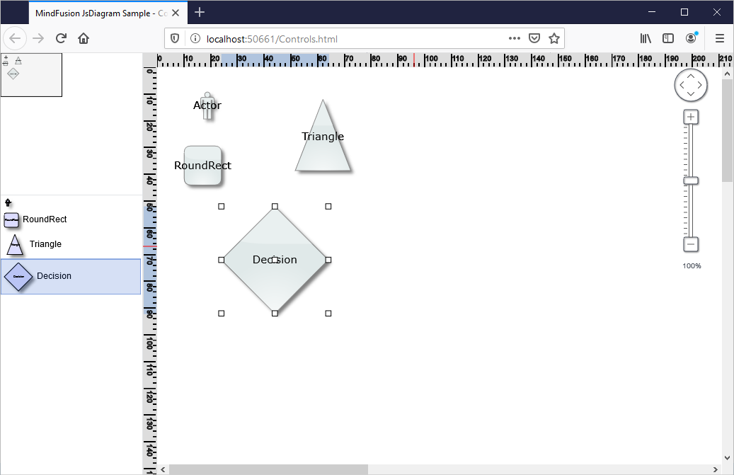
Here is a screenshot of our SubjectNode custom node class that is used in an application for a school curriculum:

I. XAML Template

You will need to add a XAML template for the node us you are creating a custom node because you want to have special-looking nodes. Let’s create a node that has 3 text fields and a background. We will declare the template for this node that we call SubjectNode in XAML this way:

<style targettype="local:SubjectNode">
    <Setter Property="Template">
      <Setter.Value>
        <DataTemplate DataType="local:SubjectNode">
          <Grid>

            <Rectangle
		Stroke="{Binding Stroke}"
		Fill="{Binding Background}" />

            <Grid>              

               <StackPanel Margin="4,8,0,0"  Orientation="Vertical" Grid.Column="1">
                <TextBlock Text="{Binding Subject}" FontWeight="800" Foreground="Black" />
                <TextBlock Text="{Binding Teacher}" Foreground="Blue" />
                <TextBlock Text="{Binding Remarks}" FontSize="9" Foreground="Black" />
              </StackPanel>
            </Grid>

          </Grid>
        </DataTemplate>
      </Setter.Value>
    </Setter>
  </style>

That goes in the contents of <ResourceDictionary>…..</ResourceDictionary> in the xaml file where you store this resourrce dictionary.

You see here that we use a gird as the principal layout container. There we add a rectangle, whose Fill property is bound to a property called Background in the SubjectNode. Next we have another grid that holds a StackPanel. The stack panel is with vertical orientation and it arranges the three TextBlock-s for the three custom fields of the node.

II. Declaring the Custom Node Class

When you create a custom node you need to inherit the TemplatedNode class. In the static construcotr you should call OverrideMetadata on the DefaultStyleKeyProperty to make it use the template that we’ve declared in XAML:

public class SubjectNode : TemplatedNode
{
	static SubjectNode()
	{
		DefaultStyleKeyProperty.OverrideMetadata(
			typeof(SubjectNode), new FrameworkPropertyMetadata(typeof(SubjectNode)));
}

public SubjectNode()
{			
}

Then we declare a constructor without any parameters that is required for the node to be created in XAML. If you want users to be able to create instance of the SubjectNode through drag and drop, you need to declare one more constructor:

	// Required for creating nodes by dragging them from the NodeListView
public SubjectNode(SubjectNode prototype) : base(prototype)
{
	Subject = prototype.Subject;
	Teacher = prototype.Teacher;
	Remarks = prototype.Remarks;
}

III. Properties

We declare the properties that we want: Subject, TeacherName, Remarks and Background as dependency properties the standard way:

public Brush Background
{
	get { return (Brush)GetValue(BackgroundProperty); }
	set { SetValue(BackgroundProperty, value); }
}

public static readonly DependencyProperty BackgroundProperty = DependencyProperty.Register(
	"Background",
	typeof(Brush),
	typeof(SubjectNode),
	new PropertyMetadata(new SolidColorBrush(Color.FromRgb(223, 235, 250))));

and for the text properties:

public string Remarks
{
	get { return (string)GetValue(RemarksProperty); }
	set { SetValue(RemarksProperty, value); }
}

public static readonly DependencyProperty RemarksProperty = DependencyProperty.Register(
	"Remarks",
	typeof(string),
	typeof(SubjectNode),
	new PropertyMetadata(""));

If we want the properties to be listed in a property grid we need to add a new class that inherits from DiagramNodeProperties. In it we do nothing but list the custom properties together with their type:

public class SubjectNodeProperties : DiagramNodeProperties
{
        internal string Subject;
	internal string Teacher;
	internal string Remarks;
	internal Brush Background;
} 

IV. More Options

Standard diagram nodes support undo and redo as well serialization out of the box. If you want your custom class to support those features as well you need to implement a few more methods. The methods to support undo/redo are SaveProperties and RestoreProperties. They take an instance of the DiagramItemProperties class that allows you to transfer data between the instance of the current node and its DiagramItemProperties instance that store the values of the node’s properties:

protected override void RestoreProperties(DiagramItemProperties props)
{
	base.RestoreProperties(props);
	var state = (SubjectNodeProperties)props;
	Subject = state.Subject;
	Teacher = state.Teacher;
	Remarks = state.Remarks;
	Background = state.Background;
}

protected override void SaveToXml(XmlElement xmlElement, XmlPersistContext context)
{
	base.SaveToXml(xmlElement, context);
	context.WriteString(Subject, "Subject", xmlElement);
	context.WriteString(Teacher, "Teacher", xmlElement);
	context.WriteString(Remarks, "Remarks", xmlElement);
	context.WriteBrush(Background, "Background", xmlElement);
}

The Diagram uses XML for serialization, so if you want your node to be saved and loaded correctly through the Diagram‘s saveToXml and loadFromXml methods you should implement SaveToXml and LoadFromXml. There you write the values o the custom properties of SubjectNode to XML elements and read them from XML elements as well:

protected override void SaveToXml(XmlElement xmlElement, XmlPersistContext context)
{
	base.SaveToXml(xmlElement, context);
	context.WriteString(Subject, "Subject", xmlElement);
	context.WriteString(Teacher, "Teacher", xmlElement);
	context.WriteString(Remarks, "Remarks", xmlElement);
	context.WriteBrush(Background, "Background", xmlElement);
}

protected override void LoadFromXml(XmlElement xmlElement, XmlPersistContext context)
{
	base.LoadFromXml(xmlElement, context);
	Subject = context.ReadString("Subject", xmlElement);
	Teacher = context.ReadString("Teacher", xmlElement);
	Remarks = context.ReadString("Remarks", xmlElement);
	Background = context.ReadBrush("Background", xmlElement);
}

You can download the sample that uses custom SubjectNode from https://mindfusion.eu/samples/wpf/diagram/Curriculum.zip

About Diagramming for WPF: This is the right tool to create flowcharts in WPF that always meet your requirements. The library offers more than 100 predefined node shapes, extensive event set and more than 15 exporters and importers. Each diagram that you build has a completely customizable look through styles, themes and appearance properties for each part of the flowchart. The numerous samples and detailed documentation help you learn quickly how to integrate the component into your own application. You can download the trial version, which has no feature restrictions and does not expire from the WPF Diagram Page on MindFusion website.

New Release for the Free JS Chart Library

MindFusion Free JS Chart has a new release with the following new features:

– All Series can accept now simple JavaScript array-s as arguments instead of Collections.List instances
– The ToolTip class is greatly extended with many new properties that allow you to customize the apparance and position of tooltips
– The Color.knownColors field lists all standard CSS color names
– Brush and Pen instances can be created with simple strings that specify the HTML code of the color as argument instead of Color objects.
– The yLabelAlignment property of BiaxialChart specifies horizontal alignment of Y-axis labels.
– Texts are now properly underlined when FontStyle.Underline is set.

Free JS Chart is MindFusion charting library that is offered free of charge for commercial use. No attribution is required.

More about MindFusion Free JS Chart at https://mindfusion.eu/free-js-chart.html