Part I: Overview of chart elements, the dashboard, plot and axes.
Part II : Bar series and their drawing, rendering of custom labels with AnnotationRenderer-s.
In this blog post we will build a horizontal stacked bar chart in Java. To build the chart we use the Java chart library. We want to add a few custom elements to the chart and that’s why we will use the Dashboard control that gives us complete control over the chart elements that we use and how to arrange them.
I. Chart Elements
We use the following chart elements:
- a Dashboard control as the base Component.
- a TextComponent for the title.
- a GridPanel for the axes and the plot.
- two AxisRenderer instances for each axis.
- a BarStackRenderer control that draws the bars.
- two AnnotationRenderer instances that draw the custom labels to the left and the top.
- a Plot control that holds the BarRenderer and the AnnotationRenderer-s.
The image below gives you a visual presentation on how the components used are arranged:
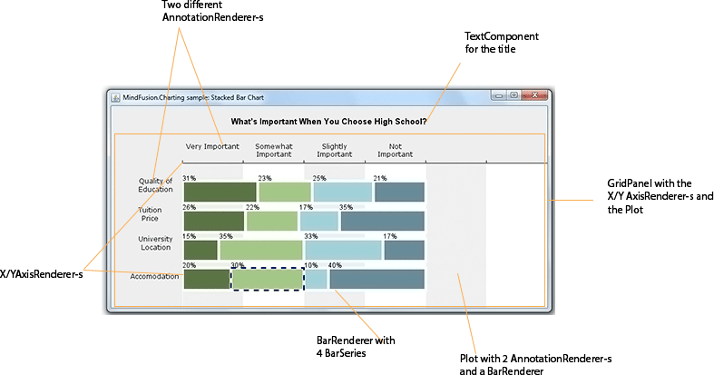
The chart elements that build this stacked bar chart
The GridPanel has two rows and two columns. On the first row is the XAxisRenderer , that renders the X-axis, on the second row is the YAxisRenderer and the Plot with the BarStackRenderer .
II. The Dashboard
First, we create the Dashboard and add some styling to it with a Theme . The Theme class allows us to specify all appearance settings of a chart. We set only those that we want to use: the grid, the font:
Dashboard board = new Dashboard();

// set up appearance
Theme theme = board.getTheme();
theme.setPlotBorderStrokeThickness(0);
theme.setTitleBrush(new SolidBrush(Color.black));
theme.setGridColor1(Color.white);
theme.setGridColor2(new Color(240, 240, 240));
theme.setGridLineColor(new Color(255, 255, 255));
We add the TextComponent for the title and the GridPanel to the LayoutPanel of the Dashboard . The LayoutPanel is a vertical StackPanel and it arranges the elements exactly as we want them to appear:
board.getLayoutPanel().getChildren().add(title);
board.getLayoutPanel().getChildren().add(panel);

getContentPane().setLayout(new BorderLayout());
getContentPane().add(board, BorderLayout.CENTER);
We make sure the ContentPane of the JFrame that our Swing application uses applies the BorderLayout on the Dashboard and places it in the center which means it will stretch automatically when the user changes the size of the JFrame.
III. The Plot
The plot for the Chart is a Plot2D control. It will hold the BarRenderer and the two AnnotationRenderer -s. First, we set some general options: that the plot allows span, that it stretches in both directions and it will render a vertical grid.
//create the Plot2D
Plot2D out = new Plot2D();
out.setAllowPan(true);
out.setHighlightStrokeDashStyle(DashStyle.Dash);
out.setHorizontalAlignment(LayoutAlignment.Stretch);
out.setVerticalAlignment(LayoutAlignment.Stretch);
out.setGridType(GridType.Vertical);
Then we go on with the styling options. The colors for the bars are set by a SeriesStyle class. We use an instance of the PerSeriesStyle which assings one brush and one fill for all elements in a single Series. We also set the HighlightStroke, which is the Brush that is used to highlight the bar that is selected:
List fills = fill();
List strokes = stroke();
out.setBackground(new SolidBrush(Color.white));
out.setVerticalScroll(true);
out.setSeriesStyle(new PerSeriesStyle(fills, strokes, Arrays.asList(5.0), null));
out.setHighlightStroke(new SolidBrush(new Color(0, 0, 99)));
Finally we indicate the location of the plot in the GridPanel (more about the grid later):
//position in the grid
out.setGridColumn(1);
out.setGridRow(1);
IV. Axes
The axes are two – X and Y. The Y axis is present, but not visible. The X-axis is visible, aligned to the top and does not draw labels. The Axis are instances of the Axis class. They both use AxisRenderer instances to be drawn:
xAxis = new Axis();
xAxis.setMinValue(0.0);
xAxis.setMaxValue(300.0);
xAxis.setInterval(50);
xAxis.setTitle("");
The intervals of the axis are important because they determine the location of the grid stripes. The Axis sets some apperance properties like brush and font for the labels.
//the xAxisRenderer is bound to the xAxis
xAxisRenderer = new XAxisRenderer(xAxis);
xAxisRenderer.setAxisStroke(new SolidBrush(Colors.Black));
xAxisRenderer.setAxisStrokeThickness(1.0);
xAxisRenderer.setLabelFontSize(12.0);
xAxisRenderer.setLabelBrush(new SolidBrush(Colors.Black));
Then comes the importnat part: we must tell this Axis that its labels come from an AnnotationRenderer , that it must not draw its intervals and that the labels are drawn above, rather than below the axis line:
//axis labels will be rendered by an AnnotationRenderer
xAxisRenderer.setLabelsSource(annotationRenderer1);
xAxisRenderer.setShowCoordinates(false);
xAxisRenderer.setPlotBottomSide(false);
Finally, we specify its location and stretch settings:
//stretch this horizontal axis
xAxisRenderer.setHorizontalAlignment(LayoutAlignment.Stretch);

//position in the Grid
xAxisRenderer.setGridColumn(1);
xAxisRenderer.setGridRow(0);
The Y-axis is similar to the X-axis, so we won’t describe its settings here. Here is the final chart:
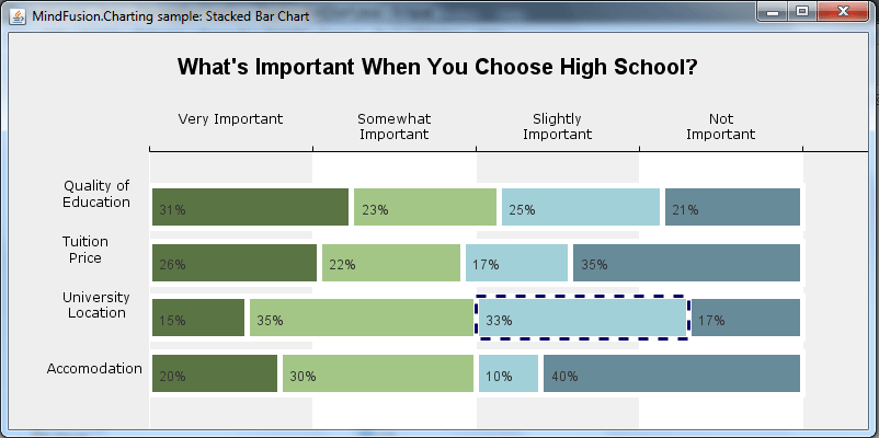
Poll chart in Java Swing
This is the end of the Part I of this tutorial. In part II we’ll cover the BarRenderer with the BarSeries and the AnnotationRenderer-s. We will also briefly discuss the GridPanel.
You can download the complete source code of the sample from here:
Download The Stacked Bar Chart in Java Sample
About Charting for Java: MindFusion.Charting for Java Swing is a multipurpose graphics library that lets you create and customize a large variety of chart types: bar, column, pie, doughnut, radar, polar etc., candlestick financial charts, gauges and dashboards with dynamic layout of their components. The library boasts a smart API which lets you combine and arrange multiple lots, axes, legends, images and other chart components. The chart appearance can be customized on multiple levels – from properties applied on a single element to global themes reused by all charts and series. Charts use a uniform Series interface for reading data and labels. You can implement the interface and create custom Series that matches your data source. Written in pure Java, this tool provides every type of Java Swing application with powerful charting capabilities. Read more about the component from here.