Custom Diagram Nodes With Clipped Images

In this blog post we will create an org chart diagram that uses custom nodes for each employee. The diagram will be created with the Diagramming for JavaScript library. For the nodes we use the CompositeNode class, which enables us to create diagram nodes whose appearance can be defined via composition of components and layout containers.

Click on the image below to run the sample:

Custom Composite Nodes with Clipped Images

I. References and HTML Settings

The first thing that we’ll do is create a web page for the sample and add the references to the necessary JavaScript files. In the section of the page we provide a reference to the following jQuery files:

<script src="common/jquery.min.js"></script>
<script src="common/jquery-ui.min.js"></script>

At the end of the HTML page, just before the closing tag we place references to the two JavaScript files used by the Diagramming library:

<script src="MindFusion.Common.js"></script>
<script src="MindFusion.Diagramming.js"></script>

Our sample has its JS code in a separate file called Script.js. We place a reference to it as well:

<script src="Script.js"></script>

The diagram library needs an HTML Canvas to draw itself onto. We add one in the middle of the web page:

<div style="width: 100%; height: 100%; overflow: auto;">
<canvas id="diagram" width="2100" height="2100">
This page requires a browser that supports HTML 5 Canvas element.
</canvas>
</div>

II. The OrgChartNode

In the Script.js file we first add mappings to some enums and classes that we’ll use from the diagram library:

var Diagram = MindFusion.Diagramming.Diagram;
var CompositeNode = MindFusion.Diagramming.CompositeNode;
var Behavior = MindFusion.Diagramming.Behavior;

var Alignment = MindFusion.Drawing.Alignment;
var Rect = MindFusion.Drawing.Rect;

Now we call the classFromTemplate method of CompositeNode that generates a node class using a JSON template that we’ll provide:

var OrgChartNode = CompositeNode.classFromTemplate("OrgChartNode",
{
component: "GridPanel",
rowDefinitions: ["*"],
columnDefinitions: ["22", "*"],
...............

In this code we indicate the panel that will be used by the CompositeNode is a GridPanel. Then we declare two lists that set the width and height of the grid rows and columns. The number of members in each array indicate how many rows/columns the grid has. In our case we have one row that takes all place and two columns: one is with fixed with of 22 pixels, the other takes the rest of the available space.

The JSON definition of the CompositeNode continues with an array with the children:

children:
[
{
component: "Rect",
name: "Background",
pen: "black",
brush: "white",
columnSpan: 2
},
{
component: "Image",
name: "Image",
autoProperty: true,
location: "ceo.png",
margin: "1",
imageAlign: "Fit"
},

The first child uses a Rect component that we call “Background”. It is rendered with a white brush, has a black outline and spans on two columns e.g. it fills all available space or each node.

The second child is an image. Note the row:

autoProperty: true

That means that we want to be able to access this component as a property. In such cases the library generates automatic set/get methods using the name of the component. In our sample they will be setImage / getImage.

The third child is a StackPanel component. This is the container for the text labels next to the node. This child has its own collection of children nodes:

component: "StackPanel",
orientation: "Vertical",
gridColumn: 1,
margin: "1",
verticalAlignment: "Near",
children:
[
{
component: "Text",
name: "Title",
autoProperty: true,
text: "title",
font: "Arial bold"
},
{
component: "Text",
name: "FullName",
autoProperty: true,
text: "full name",
pen: "blue",
padding: "1,0,1,0"
},
{
component: "Text",
name: "Details",
autoProperty: true,
text: "details",
font: "Arial 3"
}

The children of this new StackPanel are text components, which are called Title, FullName and Details. They have their autoProperty set to true, which means we can access their value through automatic setter and getter methods.

III. The Diagram and the Nodes

in the read() function of the document we create an instance of the Diagram class using a reference to the canvas we’ve created in section I.

// create a Diagram component that wraps the "diagram" canvas
diagram = Diagram.create($("#diagram")[0]);

Then we enable interactive drawing of custom nodes by calling setCustomNodeType and Then we enable interactive drawing of custom nodes by calling setCustomNodeType and setBehavior:

// enable drawing of custom nodes interactively
diagram.setCustomNodeType(OrgChartNode);
diagram.setBehavior(Behavior.Custom);

The behavior o the diagram is set to Custom, which means that when the user starts drawing nodes the library shall draw nodes specified by CustomNodeType. The setCustomNodeType method tells the diagram that these custom nodes are of type OrgChartNode.

Now it is really easy and intuitive to create nodes:

var node1 = new OrgChartNode(diagram);
node1.setBounds(new Rect(25, 15, 60, 25));
node1.setTitle("CEO");
node1.setFullName("John Smith");
node1.setDetails(
"Our beloved leader. \r\n" +
"The CEO of this great corporation.");
node1.setImage("ceo.png");
diagram.addItem(node1);

We create a few more nodes using the same code and we bind them in a hierarchy. The links among the nodes are created by calling the Diagram Factory createDiagramLink method of the diagram Factory class:

diagram.getFactory().createDiagramLink(node1, node2);
diagram.getFactory().createDiagramLink(node1, node3);
diagram.getFactory().createDiagramLink(node1, node4);
diagram.getFactory().createDiagramLink(node4, node5);

IV. Rounded Images

We want to add now a custom feature to the node – instead of drawing the image as a rectangle we want to clip it and show it as an ellipse. We’ll do this by using a method that replaces the standard setImage method.

The new method is called createImageClip and takes as parameters two objects: one is the image URL and the other is the node that uses this image.

function createImageClip(path, node)
{
var canvas = document.createElement('canvas'),
ctx = canvas.getContext('2d'),
img = document.createElement('img');
..............

We create two HTMLElements – canvas and image, and we get the 2D context of the Canvas. Then, in an event handler of the onload event of the image we clip the canvas to an area defined by a Path. The path reads the size of the image and creates a full arc e.g. a circle inside that rectangle. Then the context draws the image and the new canvas is set as an image to the node using the setImage method:

img.src = path;
img.onload = function ()
{
canvas.width = img.width;
canvas.height = img.height;
var halfSize = img.width / 2;
ctx.save();
ctx.beginPath();
ctx.arc(halfSize, halfSize, halfSize, 0, Math.PI * 2, true);
ctx.closePath();
ctx.clip();

ctx.drawImage(img, 0, 0, img.width, img.height);

node.setImage(canvas.toDataURL());
};

You can use this approach to create clippings of images with variable shape.

Now instead of calling:

node1.setImage("ceo.png");

we call our custom method this way:

createImageClip("ceo.png", node1);

We do this for all nodes in the org chart.

That’s the end of this tutorial. You can download the sample together with all JavaScript libraries used from this link:

Custom Nodes With Image Clipping in JavaScript: Sample Download

Find out more about Diagramming for JavaScript at https://mindfusion.eu/javascript-diagram.html

Fishbone (Ishikawa) Diagram in WPF

In this blog post we will use the WPF Diagram component to build a fishbone diagram as described in the Wikipedia “Ishikawa diagram” article cited below:

“Ishikawa diagrams (also called fishbone diagrams, herringbone diagrams, cause-and-effect diagrams, or Fishikawa) are causal diagrams created by Kaoru Ishikawa that show the causes of a specific event.

Common uses of the Ishikawa diagram are product design and quality defect prevention to identify potential factors causing an overall effect. Each cause or reason for imperfection is a source of variation. Causes are usually grouped into major categories to identify and classify these sources of variation.” Read more on https://en.wikipedia.org/wiki/Ishikawa_diagram

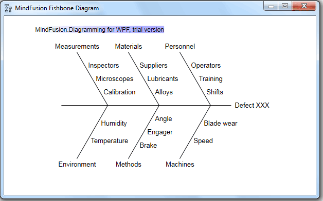
This tutorial will demonstrate how easy it is to create the same diagram using the WPF diagram library and writing several lines of code. This is the final diagram:

Ishikawa (fishbone) diagram in WPF with MindFusion WPF Diagram library

Ishikawa (fishbone) diagram in WPF with MindFusion WPF Diagram library

I. General Settings

We create an empty WPF project in Visual Studio called “Fishbone”. There we create an Assemblies folder where we place the necessary dll-s:

  • MindFusion.Common.dll
  • MindFusion.Diagramming.Wpf.dll

Then in the MainWindow.xaml file we create a mapping to the Diagramming namespace:

<window x:class="Fishbone.MainWindow" xmlns="http://schemas.microsoft.com/winfx/2006/xaml/presentation" xmlns:x="http://schemas.microsoft.com/winfx/2006/xaml" xmlns:diag="http://mindfusion.eu/diagramming/wpf" title="MindFusion Fishbone Diagram" height="387" width="622">
</window>

Then we create the diagram inside the default Grid WPF control:

<grid>
 <diag:fishbonediagram x:name="fdiag">
 </diag:fishbonediagram>
</grid>

The code creates a new instance of the FishboneDiagram* class with the name “fdiag”. We can use this name to access the object in code.

II. Diagram Data

The FishboneDiagram class exposes an ItemsSource property that provides data for the diagram. The data is an object that contains the label for the main Clause and a list with the labels of the subclauses. We create a special class called FBClause that will represent each fishbone:

public class FBCause
	{
		public FBCause()
		{
			SubCauses = new List();
		}
		public string Label { get; set; }
		public List SubCauses { get; set; }
	}

Next, we create the necessary fishbones this way:

var c1 = new FBCause { Label = "Measurements" };
c1.SubCauses = new List { "Inspectors", "Microscopes", "Calibration" };
…………

Once we are done with all fishbones, we create the model, which will serve as data source for the fdiag object:

var model = new List { c1, c2, c3, c4, c5, c6 };

III. Building the Diagram

Now that the data is ready, we can assign it to the ItemsSource property of the FishboneDiagram class:

fdiag.ItemsSource = model;

We will use the LabelPath and SubCausesPath properties to bind the respective fields of our FBClause objects to the correct data properties of FishboneDiagram:

fdiag.LabelPath = "Label";
fdiag.SubCausesPath = "SubCauses";

If the subclauses of your model were objects instead of strings as in our FBClause class you should use the SubLabelPath property to set the name of the field that will provide data for the subclause labels.

Finally we call the diagram’s ResizeToFitItems method to make sure all fishbones will be visible:

fdiag.ResizeToFitItems(30);

Compile and run the sample and you will see a perfect fishbone diagram.
That’s the end of our tutorial, you can download the sample together with all necessary dll-s from this link:

Download MindFusion Fishbone (Ishikawa) Diagram in WPF Sample

* The FishboneDiagram class will be officially released with the next version of the WPF Diagram Tool.

About Diagramming for WPF: This is the right tool to create flowcharts in WPF that always meet your requirements. The library offers more than 100 predefined node shapes, extensive event set and more than 15 exporters and importers. Each diagram that you build has a completely customizable look through styles, themes and appearance properties for each part of the flowchart. The numerous samples and detailed documentation help you learn quickly how to integrate the component into your own application. You can download the trial version, which has no feature restrictions and does not expire from the WPF Diagram Page on MindFusion website.

Logic Model Software Demo

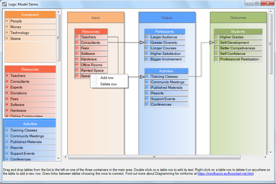
The logic model is a tool that helps managers evaluate the effectiveness of a program. The tool allows the user to list the input, output and outcomes of the process.

Logic Model Software Demo

Logic Model Software Demo

In our sample we have used the WinForms Diagram Control to create a sample software that lets users:

  • drag and drop tables that represent popular items in each of the three sections of the logic mode: input, output and outcomes;
  • edit the tables: add and delete rows, edit the text on rows;
  • connect table rows to illustrate the process flow.

I. Project Setup

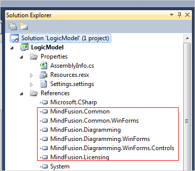
We create a new project in Visual Studio and name it “LogicModel”. We add references to the following diagramming libraries:

MindFusion Libraries Used by the Logic Model Software

MindFusion Libraries Used by the Logic Model Software

After that we drag and drop the NodeListView control from the Toolbox and set its IconSize property to Size(50,50). This property tells the control how big the items in the NodeListView should be rendered.

nodeListView1.IconSize = new System.Drawing.Size(50, 50)

Then we drag and drop a DiagramView object that creates automatically a Diagram instance that represents the diagram. Here we need to set the AllowDrop and AllowInplaceEdit properties to “true”. This means the diagram can create new nodes from the items in the NodeListView that are dropped onto it. Then it allows the user to edit the nodes e.g. modify the text in the table cells:

this.diagramView1.AllowDrop = true;
this.diagramView1.AllowInplaceEdit = true;

Last but not least we set the Resize mode of the DiagramView to Fill, which means it will occupy all available space when the user changes the size of the application window.

II. The NodeListView

It holds TableNode instances that represent items in the logic model. Let’s look at a simple table. The first table called “Investment”. Here are the first three lines of code for it:

//the table with resources
TableNode tbResources = new TableNode();
tbResources.RedimTable(2, 4);
tbResources.Caption = "Investment";

The RedimTable method changes the number of rows and columns of the TableNode to be the ones specified as arguments. Each of the tables in the logic model has two columns – one for a bullet and one for the label. The count of rows varies.

Then we edit the text that is rendered by this TableNode:

tbResources[1, 0].Text = "People";
tbResources[1, 1].Text = "Money";
tbResources[1, 2].Text = "Technology";
tbResources[1, 3].Text = "Space";

Now is time for some styling. We set the Pen for the table, the pen for the caption and the CaptionBackBrush:

tbResources.Pen = new MindFusion.Drawing.Pen(Color.FromArgb(192, 192, 192));

tbResources.CaptionBrush = new MindFusion.Drawing.SolidBrush(Color.White);
tbResources.CaptionBackBrush = new MindFusion.Drawing.SolidBrush(Color.FromArgb(247, 150, 70));

Then we set the background of the rest of the TableNode:

tbResources.Brush = new LinearGradientBrush(Color.FromArgb(252, 213, 181), Color.FromArgb(248, 234, 223));

Each diagram item has a Tag property. This useful property holds any information you find useful. It is of type Object and you can use it to store data used by your node. In our application we use the Tag property of a TableNode to store the URL to the bullet rendered before each of its labels:

//keep the bullet as a tag
tbResources.Tag = Image.FromFile("../../Resources/orange.png");
//set an orange bullet before each label

for (int i = 0; i < tbResources.Rows.Count; i++)
     {
        tbResources[0, i].Image = Image.FromFile("../../Resources/orange.png");
        //save the row index as a tag for cells with text
        tbResources[1, i].Tag = i;
     }

Then we use the Tag property of the TableNode.Cell objects to store their row index. We will use it later when we handle events.

Finally, let’s not forget to add the new TableNode to the NodeListView:

nodeListView1.AddNode(tbResources);

The other tables are created in a similar way.

III. The Containers

The three rectangles where users drop tables are ContainerNode-s. These are special kinds of DiagramNode -s that can hold other nodes. Once placed into them, the containing nodes move with the container. Containers can resize automatically to fit all items but in our case we will forbid this.

Here is the code that creates the third container – “Outcomes”:

//the last container
ContainerNode cOutcomes = diagram1.Factory.CreateContainerNode(0, 0, 20, 20);
cOutcomes.Tag = 2;
cOutcomes.Caption = "Outcomes";

Note that we use again the Tag property this time to keep the index of the container – first, second or third e.g. 0, 1 or 2. Then we add some styling using the Pen, CaptionBrush, CaptionBackBrush and Brush properties to define the background and border of the container and its caption:

cOutcomes.Pen = new MindFusion.Drawing.Pen(Color.FromArgb(80, 80, 80));
cOutcomes.CaptionBrush = new MindFusion.Drawing.SolidBrush(Color.FromArgb(80, 80, 80));
cOutcomes.CaptionBackBrush = new MindFusion.Drawing.SolidBrush(Color.FromArgb(168, 192, 120));
cOutcomes.Brush = new LinearGradientBrush(Color.FromArgb(209, 224, 180), Color.FromArgb(235, 238, 229));

Then we set some properties that define how the ContainerNode responds to new items being added or removed:

cOutcomes.AllowAddChildren = true;
//do not allow the container to change size or be folded
cOutcomes.AutoGrow = false;
cOutcomes.AutoShrink = false;
cOutcomes.Foldable = false;

We let the container accept new children and do not allow the user to fold, which means to collapse it.

The containers are sized relatively to the client area of the DiagramView:

//resize the containers according to the current size of the diagramView
private void resizeContainers()
  {
    //convert the size of the rectangle from client measure units to diagram units
    RectangleF viewRect = diagramView1.ClientToDoc(diagramView1.ClientRectangle);
   ...
}

First we convert the size of the DiagramView to diagram units calling the ClientToDoc method. Then we need to find the ContainerNode -s of the diagram and arrange them next to each other. When we do this we use the Tag property of each container that tells us which is the order of the container and where we should pace it:

//identify the containers
foreach (DiagramNode node in diagram1.Nodes)
     {
       ContainerNode c = node as ContainerNode;

       if (c != null)
       {
          //get the index that tells us if this is the first, second or third container
          int index = (int)c.Tag;
          //relocate the container rectangle based on its index
          c.Bounds = new RectangleF(viewRect.Left + viewRect.Width * (0.02F + index * 0.34F),
          viewRect.Top + viewRect.Height * 0.02F, viewRect.Width * 0.27F, viewRect.Height * 0.96F);
       }
    }

We call this method each time the DiagramView is resized by handling the ClientSizeChanged event:

//raised when the size of the ClientRectangle has changed.
private void diagramView1_ClientSizeChanged(object sender, EventArgs e)
  {
    //adjust the size of the containeres
     resizeContainers();
     ...
  }

IV. Diagram Events

We handle the NodeCreated diagram event each time the user drops a new node from the NodeListView onto any of the ContainerNode-s:

this.diagram1.NodeCreated += new System.EventHandler(this.diagram1_NodeCreated);

The method that handles the event should do three important things: 1) resize the new TableNode so all text fits into it; 2)assign to each cell its correct Tag (e.g. row index) and 3) find the ContainerNode onto which the TableNode was placed and add it to it. Here is the first part of the method:

//raised when the user has dropped a new TableNode
private void diagram1_NodeCreated(object sender, NodeEventArgs e)
  {            
     TableNode tNode = e.Node as TableNode;

    if (tNode != null)
    {
        //adjust the node size
        resizeNode(tNode);
        //arrange the tags for the table cells
        arrangeTags(tNode);
                   
     }

The resizeNode and arrangeTags methods adjust the size of the TableNode and assign to each cell in the second column of the node its row index as a Tag. We won’t list the methods here, you can check them in the source code available for download.

We find the ContainerNode, if any onto which the TableNode was placed by checking if its top left corner is inside the container:

//find out the container onto which the node was dropped, if any
foreach (DiagramNode diagramNode in diagram1.Nodes)
  {
    if (diagramNode.ContainsPoint(e.Node.Bounds.Location))
    {
       ContainerNode container = diagramNode as ContainerNode;
       if (container != null)
       {                       
         //add the new node to its container
         container.Add(tNode);
                       
         break;
       }
 }
}

If it is within the container we add the node.

V. Context Menu

The context menu is rendered at right mouse click. We handle the CellClicked event of a diagram to show it:

//tracks when the user clicks on a table cell
diagram1.CellClicked += new EventHandler(diagram1_CellClicked);

We also declare a global TableNode.Cell clickedCell variable that keeps track of the clicked cell. We will use the data later:

//keeps the cell the user has clicked on
TableNode.Cell clickedCell = null;

In the diagram1_CellClicked event we check if the right mouse button was clicked and then show a ContextMenuStrip object:

//handles the cellClicked event
void diagram1_CellClicked(object sender, CellEventArgs e)
  {
    //if the user has clicked with the right mouse button
    if(e.MouseButton == MouseButton.Right)
      {
        //we should keep track of the clicked cell
        clickedCell = e.Cell;
        //and show the context menu
        cMenu.Show(Cursor.Position);
              
       }
  }

We handle the ItemClicked event of the ContextMenuStrip:

if (clickedCell != null)
   {
      TableNode tNode = clickedCell.Table;

      //if the user has selected to add a row
      if (e.ClickedItem.Text.Equals("Add row"))
         {
            //add a row
            tNode.AddRow();
            //assign the image URL kept as a tag to the first cell in the new row
            tNode[0, tNode.Rows.Count - 1].Image =
                 tNode.Tag as Image;
            //type in some dummy text in the text cell
            tNode[1, tNode.Rows.Count - 1].Text = "[edit text]";               
        }
..............
}

In the first part of the method we handle the case when the user has chosen to add a new row. The new row is inserted at the end of the table with the AddRow method. We use the Tag property of the TableNode which points to the location of the bullet for this table and we render it to the first cell of the new row.
If the user wants to delete a row we show first a warning message. Here we render the name of the detected row to be deleted. If the user agrees we get the index of the row using its Tag and we remove it from the TableNode:

 else if (e.ClickedItem.Text.Equals("Delete row"))
      {
          cMenu.Close();

          //display a warning, which shows which row is about to be deleted
          string message = "Do you want to delete row " + clickedCell.Text + "?";
          string caption = "Confirm Delete";
          MessageBoxButtons buttons = MessageBoxButtons.YesNo;
          DialogResult result;

          // Displays the MessageBox.
          result = MessageBox.Show(message, caption, buttons);
          //if the user has decided to delete the row
          if (result == System.Windows.Forms.DialogResult.Yes)
            {
                                        
             //get the index of the row that is to be deleted
             int rowIndex = (int)clickedCell.Tag;                        
             tNode.DeleteRow(rowIndex);                        
                        
           }   
...
}

Both actions of delete and insert of a new row require the indices of the table rows to be rearranged and the size of the table to be adjusted. We call:

//adjust the node size
resizeNode(tNode);
//arrange the table tags
arrangeTags(tNode);

VI. Links

Users can draw links between rows of the tables. To achieve this we first change the default Behavior of the DiagramView :

this.diagramView1.Behavior = MindFusion.Diagramming.Behavior.LinkTables;

Then we add some styling for the links:

//styling the links
diagram1.LinkShape = LinkShape.Cascading;
diagram1.LinkCascadeOrientation = MindFusion.Diagramming.Orientation.Horizontal;
diagram1.LinkHeadShape = ArrowHeads.Triangle;
diagram1.LinkHeadShapeSize = 4;

Here we define the shape of the links as “Cascading” and we change the default LinkHeadShape and LinkHeadShapeSize properties. Further styling of the links is done with a Theme and a DiagramLinkStyle:

//create a theme to apply additional link styling
Theme theme = new Theme();
DiagramLinkStyle style = new DiagramLinkStyle();
style.Brush = new MindFusion.Drawing.SolidBrush(Color.FromArgb(192, 192, 192));
style.Stroke = new MindFusion.Drawing.SolidBrush(Color.FromArgb(80, 80, 80));
theme.RegisterStyle(typeof(DiagramLink), style);
diagram1.Theme = theme;

There we specify the Brush for the links and the Stroke. When new links are created we want them to have 3 segments because this looks good. So, we handle the LinkCreated event to specify this:

this.diagram1.LinkCreated += new System.EventHandler(this.diagram1_LinkCreated);

..................

//raised when the user draws a link between two tableNode-s.
private void diagram1_LinkCreated(object sender, LinkEventArgs e)
  {
    //the link should have 3 segments
    e.Link.SegmentCount = 3;
  }    

With this our Logic Mode demo application is ready. The complete code for the application with all necessary libraries of the diagramming component is available for free direct download download from here:

Download the Logic Model Demo Application Source Code

About MindFusion.Diagramming for WinForms: A programming component that provides any WinForms application with a full set of features for creating and customizing all types of diagrams, flowcharts, schemes, hierarchies, trees, graphs etc. The control provides numerous ways to save and load a diagram, six auxiliary controls and more than 15 automatic graph layout algorithms. Diagram elements include scrollable tables, container nodes, multi-segment arrows, custom diagram item types and many more. Further details here.

Diagramming for WinForms is a royalty-free component, clients get 12 month upgrade subscription when buying a license. The source code is also available for purchase. Visit the buy page for a list with the current license prices.

JavaScript Database Designer with SQL Generator

We are going to use the JS flowchart library as a database design tool. We will create DB tables, add rows, connect the tables and generate SQL statements that would create the tables.

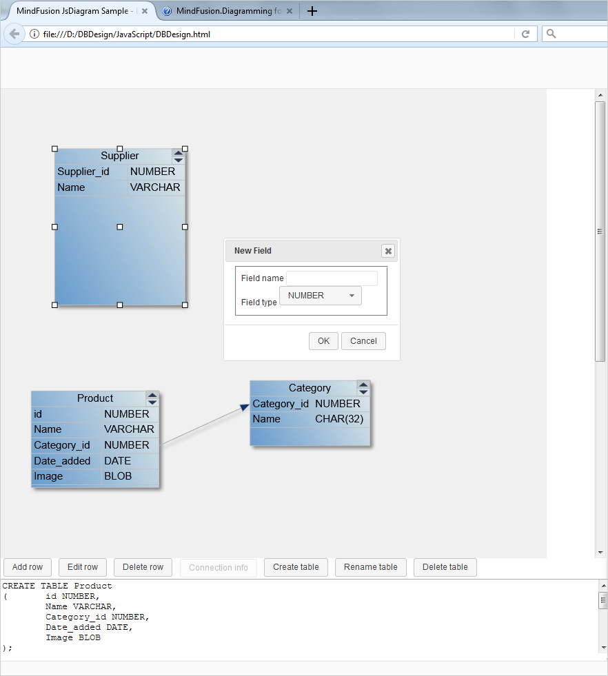
Here is a screenshot of the application:

Database Designer Application with SQL Generator

Database Designer Application with SQL Generator

I. Project Setup

We need two JavaScript libraries for the flowchart:

  • MindFusion.Common.js
  • MindFusion.Diagramming.js

We copy them in the work folder of the project, where we will put the HTML and the JavaScript code behind. Then we create an HTML file and name it DBDesign.html. There we will reference the two JavaScript libraries:

<a href="http://MindFusion.Common.js">http://MindFusion.Common.js</a>
<a href="http://MindFusion.Diagramming.js">http://MindFusion.Diagramming.js</a>

We reference those two libraries at the end of the HTML file, just before the closing tag. This way we are sure that the majority of the browsers will load the scripts correct.

We need an HTML 5 Canvas element for the diagram to draw itself onto and we create one inside a <div> tag:

<div style=”position: absolute; width: 100%; height: 100%; overflow: auto;”>
<canvas id=”diagram” width=”2100″ height=”2100″>
This page requires a browser that supports HTML 5 Canvas element.
</canvas>
</div>

It’s important to set and id for the Canvas element, that’s how we will get it in the JavaScript code behind file.

We create the JS file to be used by this project as DBDesign.js and we place it in the same directory as the two other JS files. We add a reference to it in the HTML page:

<a href="http://DBDesign.js">http://DBDesign.js</a>

II. UI Controls

The DBDesigner has a line of controls at the bottoms that provide menus – add/edit/delete row, create/delete/rename table and a button for connection info. We create them as buttons:

<div id="controls" style="height: 150px" left:="" 0;="" right:="" 401px;"="">
   <input type="button" id="btnAddRow" value="Add row" style="margin-left: 5px; margin-bottom: 2px;">
   <input type="button" id="btnEditRow" value="Edit row" style="margin-left: 5px; margin-bottom: 2px;">
   <input type="button" id="btnDeleteRow" value="Delete row" style="margin-left: 5px; margin-bottom: 2px;">
…..
</div>

We add a textarea for the generated SQL and we close the div:

<textarea id="generatedSql" style="height: 120px;width: 100%"></textarea>

When the user presses one of those buttons we show a dialog. The dialogs are forms. Here is the form that renames a table:

<div id="renameTable-dialog" title="Rename Table">
  <form>

<fieldset>
  	 <label for="renameTableCaption">Table name</label>
</fieldset>

	</form>
</div>

III. General Diagram Settings

Let’s start coding the JavaScript methods for the DBDesign application. We use the document.ready method to initialize the Diagram:

var Diagram = MindFusion.Diagramming.Diagram;

var diagram;

$(document).ready(function () {
   // create a Diagram component that wraps the "diagram" canvas
   diagram = MindFusion.AbstractionLayer.createControl(Diagram, null, null, null, $("#diagram")[0]);
……….

});


We use the id of the diagram Canvas that we set in the web page and now create the diagram control. Once we have it we set some properties to it:

// set some Diagram properties.
diagram.setBehavior(Behavior.LinkTables);
diagram.setAllowSelfLoops(false);
diagram.setBackBrush('#F0F0F0');
diagram.setLinkHeadShape('Triangle');
diagram.setLinkHeadShapeSize(4);
diagram.getSelection().allowMultipleSelection = false;


We change the default Behavior of the diagram control to “LinkTables”, which means users would be able to connect table rows. We stop users from creating self loops on tables and add some styling: the back brush is set to light gray, the head shape of links is ‘Triangle’ and we forbid the users to select multiple objects.

The styling of the diagram is done through themes. We create a theme and add to it a style for the table nodes:

// set the Diagram style.
var theme = new Theme();

var tableNodeStyle = new Style();
tableNodeStyle.setBrush({ type: 'LinearGradientBrush', color1: 'rgb(224, 233, 233)', color2: 'rgb(102, 154, 204)', angle: 30 });
tableNodeStyle.setTextColor({ type: 'SolidBrush', color: 'rgb(45, 57, 86)' });
tableNodeStyle.setStroke('rgb(192, 192, 192)');


The tableNodeStyle sets the brush, text color and stroke for the tables. Let’s tell the theme object that this is the style for table nodes:

theme.styles['std:TableNode'] = tableNodeStyle;

And let’s tell the diagram control that it has a theme:

diagram.setTheme(theme);


Link styling is done in the same way and you can find the code in the *.zip file that is available for download.

IV. Events

Handling events is the most important part of this application. We have events raised by the diagram elements and we have events that are raised by the JavaScript buttons. Let’s start with the js buttons. When the web page is loaded there is a single button active from the row of buttons available at the bottom of the page – “Create table”. In the document.ready() method we wire the button with an event:

$('#btnCreateTable').button().click(function (event) { createTable(); });


This event calls the createTable method that generates a TableNode instance:

function createTable() {
	// create a new table with the specified extent
	var table = diagram.getFactory().createTableNode(
				15 + tableCount * 3, 15 + tableCount * 4, 50, 60);
	table.setText("Table" + tableCount++);
	table.redimTable(2, 0);
	table.setScrollable(true);
	table.setConnectionStyle(ConnectionStyle.Rows);

	// set the first column to resize with the table
	table.getColumn(0).columnStyle = ColumnStyle.AutoWidth;

	generateSQL();
}


The createTableNode method accepts as arguments the x and y coordinates of the new TableNode and its width and height. We create initially the table with two columns and no rows. By default the tables can be scrolled and the links connect table rows.

The generateSQL method is a simple one – it just creates an SQL table. You can expand the sample with more complicated SQL statements but in our case we just create a table with the columns that were set to the TableNode:

function generateSQL() {
   var text = '';

   // enumerate all tables in the current diagram
   ArrayList.forEach(diagram.nodes, function (table) {
   text += "CREATE TABLE " + table.getText() + "\r\n(";

   // enumerate all rows of a table
   for (var r = 0; r < table.cells.rows; ++r) {
   // get text of cells in current row
   text += "\t" + table.getCell(0, r).getText() + " " + table.getCell(1, r).getText();
   if (r < table.cells.rows - 1)
	 text += ",\r\n";
   }
	text += "\r\n);\r\n\r\n";
   });

  $('#generatedSql')[0].innerHTML = text;
}

When the SQL text is generated we assign it to the textarea instance that we created.

V. Diagram Events

Here we will talk about the events fired by the diagram control. Once a table is created the users can double click on it to create new rows, edit or delete existing rows. This happens when we handle the nodeDoubleClicked event:

diagram.addEventListener(Events.nodeDoubleClicked, function (sender, args) {
	if (tblClicked != args.getNode()) {
		tblClicked = args.getNode();
	}
….

});


Here we identify the table that is clicked and then we have to decide which dialogue to show:

if (tblClicked) {
		var cellClicked = tblClicked.cellFromPoint(args.getMousePosition());
		if (cellClicked) {
			rowClicked = cellClicked.row;
			editRowOpen();
		}
		else if (tblClicked.hitTestManipulators(args.getMousePosition()) == null) {
		if (args.getMousePosition().y <= tblClicked.getBounds().y + tblClicked.getCaptionHeight())
			renameTableOpen();
			else
			addRowOpen();
		    }
		}


If an existing cell is clicked we open the editRow form. If the caption of the table was clicked we open the form for rename of a table. If none of those, we open the form that adds a new row.

Let’s look how the addRow dialogue opens:

function addRowOpen() {
  var table = tblClicked || diagram.getActiveItem();

  if (!table || !AbstractionLayer.isInstanceOfType(TableNode, table))
	return;

   addRowDialog.dialog("open");
}


the method calls the dialog method of addRowDialog. At the beginning of the js file we have declared a variable:

var addRowDialog = null


Then we create the addRowDialog object:

addRowDialog = $("#addRow-dialog").dialog({
		autoOpen: false,
		resizable: false,
		height: 'auto',
		width: 250,
		modal: false,
		buttons: {
			"OK": addRow,
			Cancel: function () {
				addRowDialog.dialog("close");
			}
		},
		close: function () {
			addRowType.val("NUMBER");
			addRowType.selectmenu("refresh");
			addRowForm[0].reset();
		}
	});
	addRowForm = addRowDialog.find("form").on("submit", function (event) {
		event.preventDefault();
		addRow();
	});


Here we create the dialog that has auto height, width of 250 and two buttons: OK and Cancel. The Cancel button closes the dialog. When the user has pressed OK the form is submitted and the addRow method is called.

The form that shows is defined in the HTML page and looks like that:

div id="addRow-dialog" title="New Field">
		<form>

<fieldset>
			<label for="addRow-fieldName">
				Field name</label>
			
			<label for="addRow-fieldType">
				Field type</label>
			
				NUMBER
				CHAR(32)
				DATE
				VARCHAR
				BLOB
			
</fieldset>

		</form>
</div>

The addRow method gets the clicked table and gets the two cells at the last row. It gets the text that was chosen in the dialog and assigns it to the cells. Then the dialog is closed and the SQL is generated once again.

function addRow() {
	var table = tblClicked || diagram.getActiveItem();

	if (!table || !AbstractionLayer.isInstanceOfType(TableNode, table))
		return;

	table.addRow();

	var lastRow = table.cells.rows - 1;

	// use the cell indexer to access cells by their column and row
	table.getCell(0, lastRow).setText(addRowName[0].value);
	table.getCell(1, lastRow).setText(addRowType[0].value);

	// close the dialog
	addRowDialog.dialog("close");

	// refresh SQL definition
	generateSQL();
}


And that’s the end for this tutorial. You can download the sample together with the necessary JavaScript libraries from this link:

Download the JavaScript Database Designer Application

Find out more about MindFusion JavaScript Diagram Library at https://mindfusion.eu/javascript-diagram.html

Photo Album in WPF with the Diagram Control

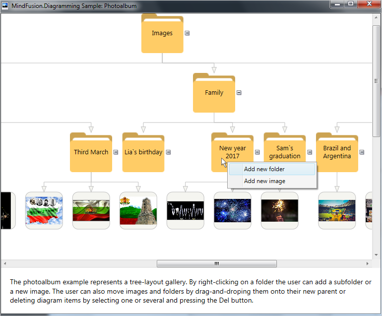
In this blog post we will build a photo album application. The application shows pictures organized in folders and allows the user to add new pictures, new folders as well add/delete/rearrange the photos that are already added to the folders.

Here is a screenshot of the application:

Photo Album with the WPF Diagram Control

Photo Album with the WPF Diagram Control

The app is built with the diagramming for WPF component.

I. General Settings

We create a new WPF application in Visual Studio. There, in the main window, the Window.Resources section we add a new item – a context menu:

 <contextmenu x:key="ContextMenu">
         <menuitem x:name="FolderMenuItem" header="Add new folder" click="AddFolderMenuItem_Click">
         <menuitem x:name="ImageMenuItem" header="Add new image" click="AddImageMenuItem_Click">
 </menuitem></menuitem></contextmenu>

The context menu shows up every time we right-click on a node.

We leave the default Grid layout panel and add there a ScrollViewer. The ScrollViewer would hold the diagram. Let’s add a XAML mapping to the Diagram class in the Window element:

xmlns:diag="http://mindfusion.eu/diagramming/wpf" xmlns:common="http://mindfusion.eu/common/wpf" 

We need a reference to the common namespace as well because the Diagram class uses it. Now, in the ScrollViewer we can add the markup for the Diagram:

<diag:diagram x:name="diagram" bounds="0, 0, 1000, 1000"  DefaultShape="Ellipse" aligntogrid="False" behavior="Modify" NodeModified="diagram_NodeModified" NodeClicked="diagram_NodeClicked">
</diag:diagram>

The application needs reference to the following MindFusion.Diagramming libraries:

  • MindFusion.Diagramming.Wpf
  • MindFusion.Common.Wpf
  • MindFusion.Licensing

II. Styling

In the code-behind file we create a Theme and add two Style-s to it: one for the links and one for the nodes.

 //create a new theme
 Theme theme = new Theme();

 //create a style for the links
 Style linkStyle = new Style();
 linkStyle.Setters.Add(new Setter(DiagramLink.BrushProperty, new SolidColorBrush(Color.FromRgb(245, 245, 240))));
 linkStyle.Setters.Add(new Setter(DiagramLink.StrokeProperty, new SolidColorBrush(Color.FromRgb(191, 191, 191))));
 linkStyle.Setters.Add(new Setter(DiagramLink.HeadStrokeProperty, new SolidColorBrush(Color.FromRgb(191, 191, 191))));
 //register the style with the theme
 theme.RegisterStyle(typeof(DiagramLink), linkStyle);

The link style sets the brush and stroke for the links as well the stroke for the link’s head. The brush is used to fill the head shape of the link. Finally we register the style with the theme. Here is what the node style looks like:

//create a style for the nodes
Style nodeStyle = new Style();
nodeStyle.Setters.Add(new Setter(ShapeNode.StrokeProperty, new SolidColorBrush(Color.FromRgb(191, 191, 191))));
nodeStyle.Setters.Add(new Setter(ShapeNode.FontFamilyProperty, new FontFamily("Lato")));
//register the style with the theme
theme.RegisterStyle(typeof(ShapeNode), nodeStyle);

We specify the stroke that would outline each node and the font that would be used when labels on nodes are painted. The final step is to assign the new Theme to the Theme property of the diagram:

 //assign the theme
  diagram.Theme = theme;

We also change the default head shape of the link and its size:

 //set link styling
 diagram.LinkHeadShapeSize = 12;
 diagram.LinkHeadShape = ArrowHeads.Triangle;

III. Create Diagram Items

When you run the application it shows a diagram that is a tree with folders and images. We will create this diagram in code. First, we create a new array that would hold the names of the folders:

string[] labels = new string[] {"Images", "Events", "Family", "Tourism",
                "Autoexibition 2014 Detroit", "Depeche Mode Concert 2016", "Third March",
                "Lia`s birthday", "New year 2017", "Sam`s graduation",
                "Brazil and Argentina", "Italy 2013", "Summer 2017"};
             

Then we must create a node for each label:

 //create the initial nodes for the album
 for(int i = 0; i < labels.Length; i++)
   {
     var node = CreateFolder(labels[i]);
     diagram.Nodes.Add(node);
   }

Each node is created by calling the CreateFolder method. This method creates and styles a DiagramNode. It sets a Folder image as background for the node and adjusts its text alignment. The node is drawn transparent:

 //creates a new folder with the specified text.
 private ShapeNode CreateFolder(string text)
    {
       var node = new ShapeNode();
       node.Text = text;
       node.Tag = "Folder";
       node.Transparent = true;
       node.TextAlignment = TextAlignment.Center;
       node.TextVerticalAlignment = AlignmentY.Center;
       node.Expandable = true;
       BitmapImage image = this.FindResource("Folder") as BitmapImage;
       node.Image = image;
       node.ResizeToFitImage();
       return node;
     }

Note that we use the Tag property of a DiagramItem to assign the text “Folder”. We will use this identification string later in the sample, to recognize that the user has clicked on a folder.
The image is declared as a resource in XAML, in the Window.Resources section:

<bitmapimage x:key="Folder" urisource="Folder.png">
</bitmapimage>

Each major folder has subfolders and they contain images. The subfolders with images are located in the Images directory. We declare a global variable that points to the Images folder:

 private const string path = @".\Images";

Then we need to cycle through all directories in “Images” and create subfolders for them.

 int length = 0;
 // reads the initial subfolders for the album 
 string[] subfolders = System.IO.Directory.GetDirectories(path);
 string[] folders = new string[9];

Once we have the subfolders we must cycle through their subfolders as well because each one has several subfolders in it. Those second level subfolders actually contain the images:

 //goes one level deeper into the hierarchy
 for (int i = 0; i < subfolders.Length; i++)
    {
       string[] subsubfolders = System.IO.Directory.GetDirectories(subfolders[i]);
       for(int j = 0; j < subsubfolders.Length; j++)
       {
          folders[length] = subsubfolders[j];
          length++;
        }
    }

Once we’ve created nodes for each folder it is time to create the nodes that represent the images:

 //loads the images for each folder
 for(int i = 0; i < folders.Length; i++)
    {
      string[] filenames = System.IO.Directory.GetFiles(folders[i]);
      LoadImages(filenames, diagram.Nodes.GetAt(i + 4) as ShapeNode);
    }

We go through all folders that actually contain images and use a new method LoadImages to create DiagramNode-s for each image file. The LoadImages method needs the names of the files that would be places in the children nodes and the parent node:

private void LoadImages(string[] filenames, DiagramNode parent)
  {
     for (int i = 0; i < filenames.Length; i++)
     {
         var node = CreateImage(filenames[i]);
         diagram.Nodes.Add(node);
         diagram.Factory.CreateDiagramLink(parent, node);
      }
   }

The method creates an Image node and adds it to the collection of diagram nodes accessible through the diagram.Nodes property. hen it creates a link from the parent to the new node. Note that when we create diagram items through the diagram.Factory helper object they are added automatically to the respective nodes or links collections. Now let’s look at the CreateImage method:

private ShapeNode CreateImage(string path)
  {
      var node = new ShapeNode();
      //customize the node appearance
      node.Shape = Shapes.RoundRect;
      node.Brush = new SolidColorBrush(Color.FromRgb(245, 245, 240));
      node.Tag = "";
      //assign the image
      Uri imageUri = new Uri(path, UriKind.Relative);
      BitmapImage image = new BitmapImage(imageUri);
      node.Image = image;
      return node;
   }

The method creates a node and applies some styling to it. It gets the relative Uri to the image and assigns it to the node.Image property.

The last thing to do is to create links between the three major subfolders and the root folder:

//create links between the root and all subfolders
diagram.Factory.CreateDiagramLink(diagram.Nodes.GetAt(0) as ShapeNode, diagram.Nodes.GetAt(1) as ShapeNode);
diagram.Factory.CreateDiagramLink(diagram.Nodes.GetAt(0) as ShapeNode, diagram.Nodes.GetAt(2) as ShapeNode);
diagram.Factory.CreateDiagramLink(diagram.Nodes.GetAt(0) as ShapeNode, diagram.Nodes.GetAt(3) as ShapeNode);

Then we have to create links between those subfolders and their subfolders in similar way:

diagram.Factory.CreateDiagramLink(diagram.Nodes.GetAt(1) as ShapeNode, diagram.Nodes.GetAt(4) as ShapeNode);
diagram.Factory.CreateDiagramLink(diagram.Nodes.GetAt(1) as ShapeNode, diagram.Nodes.GetAt(5) as ShapeNode);
..........

IV. Arrange the Diagram

We use the TreeLayout algorithm to arrange our nodes in the right order. This layout is the perfect match for what we want – a hierarchy of nodes that is exactly a tree.

private void Rearrange()
  {
     if (layout == null)
     {
        layout = new TreeLayout(diagram.Nodes.GetAt(0),
        TreeLayoutType.Centered,
        false,
        TreeLayoutLinkType.Cascading3, TreeLayoutDirections.TopToBottom,
        40, 20, true, new Size(15, 15));
      }
      layout.Arrange(diagram);
   }

The TreeLayout like all other automatic layouts available in MindFusion diagramming controls is pretty easy to use. It requires the call of a single Arrange method that takes as a parameter the instance of the diagram being arranged. The constructor lets you customize the layout, in our case we use this TreeLayout constructor. The constructor requires the root node, the TreeLayoutType, the next argument specifies if links are reversed, then comes the TreeLayoutLinkType, the TreeLayoutDirections and several numbers that indicate level distance, node distance and whether root position is kept. The last argument is the margins between the tree and the diagram’s bounding rectangle.

We call the Rearrange method every time we modify the diagram – when nodes are added/deleted or modified.

V. Events

We handle the NodeClicked event, which we use to show the context menu:

private void diagram_NodeClicked(object sender, NodeEventArgs e)
   {
      //gets the node that was clicked
      SelectedNode = e.Node as ShapeNode;
      if (e.MouseButton == MindFusion.Diagramming.Wpf.MouseButton.Right && SelectedNode.Tag.ToString().Length > 0)
       {
         //renders the context menu
         ContextMenu cm = this.FindResource("ContextMenu") as ContextMenu;
         cm.Placement = System.Windows.Controls.Primitives.PlacementMode.Mouse;
         cm.IsOpen = true;
        }
    }

The important part in this code is to get the selected node. We will need it to specify the parent node for any new folders or image nodes that we create. Then, based on the menu selected by the user we either create a new folder node or a new image node calling the CreateFolder or CreateImage method that we listed above.

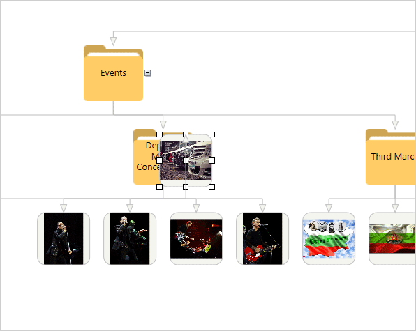
What happens when the user modifies a node? That happens when the user drags a node from one folder into another folder. In this case the diagram link between the former parent and the node is deleted and a new one is created – between the new parent and the node:

private void diagram_NodeModified(object sender, NodeEventArgs e)
 {
   //gets the nodes at the specified mouse position
   if (diagram.GetNodesAt(e.MousePosition).Count != 1)
    {
      ShapeNode child = e.Node as ShapeNode;
      ShapeNode parent = null;
      bool parentIsFolder = false;
     
      foreach (ShapeNode node in diagram.GetNodesAt(e.MousePosition))
           {
               //check if the node is a folder
               if (node.Tag.ToString().Length > 0 && node != child)
               {
                   parent = node;
                   parentIsFolder = true;
               }
           }
           //removes the current link between the node and its parent
           if (parentIsFolder)
           {
               if (child.IncomingLinks.GetAt(0) as DiagramLink != null)
                   diagram.Links.Remove(child.IncomingLinks.GetAt(0) as DiagramLink);
           }
           //creates a new link
           diagram.Factory.CreateDiagramLink(parent, child);
       }
          Rearrange();
      }

Remember that we have assigned “Folder” to the Tag property of all nodes that are folders. We use this to identify them and to move the node from one folder to the other.

And with this our tutorial is over, here is a screenshot from the final application:

Photo Album App with the WPF Diagram: User Interaction

Photo Album App with the WPF Diagram: User Interaction

The link to download the sample is below:

Download Wpf Diagramming Sample: Photoalbum

About Diagramming for WPF: This is the right tool to create flowcharts in WPF that always meet your requirements. The library offers more than 100 predefined node shapes, extensive event set and more than 15 exporters and importers. Each diagram that you build has a completely customizable look through styles, themes and appearance properties for each part of the flowchart. The numerous samples and detailed documentation help you learn quickly how to integrate the component into your own application. You can download the trial version, which has no feature restrictions and does not expire from the WPF Diagram Page on MindFusion website.