In this post we’ll explore visualization of graph processing algorithms using MindFusion.Diagramming API. The sample Visual Studio project will show animated depth-first and breadth-first search algorithms for graph traversal, but same approach can be applied for visualizing processes in any systems representable as graph data structures, such as message transmission in networks, progress of tasks in workflows, and so on. You can download the complete project here:
The code will show several techniques you might also find useful in other contexts:
- build diagram programmatically from model data
- use styles to temporarily apply several appearance attributes as a single unit
- synchronize diagram with data coming from a worker thread
Let’s start by creating our (very simple) model classes, Graph and Vertex in this case, where connections in the graph will be stored using standard adjacency lists representation:
class Graph
{
	public List Vertices = new List();
}

class Vertex
{
	public List Neighbors = new List();
	public bool Visited;
	public int Index;
	public int SearchOrder;
}
Next, create a method that builds a diagram from the model objects. The mappings will be saved in a dictionary for later access.
private Dictionary<vertex, shapenode=""> nodes;
readonly RectangleF defaultSize = new RectangleF(0, 0, 10, 10);

///
/// Create diagram elements from graph with adjacency lists representation
///
void DiagramFromGraph(Graph g)
{
	diagram.ClearAll();

	// map graph vertices to diagram nodes
	nodes = new Dictionary<vertex, shapenode="">();

	// create a node for each vertex
	foreach (var v in g.Vertices)
	{
		var node = diagram.Factory.CreateShapeNode(defaultSize);
		node.Tag = v;
		nodes[v] = node;
	}

	// create links for adjacencies
	foreach (var v1 in g.Vertices)
	{
		foreach (var v2 in v1.Neighbors)
		{
			// only in one direction
			if (v1.Index < v2.Index)
				diagram.Factory.CreateDiagramLink(nodes[v1], nodes[v2]);
		}
	}

	// arrange the nodes
	new AnnealLayout { Randomize = false }.Arrange(diagram);

	// search starts from selected node
	diagram.Nodes[0].Selected = true;
}
</vertex,></vertex,>
Now create a sample graph and its corresponding drawing which we’ll use to show search progress:
void OnFormLoad(object sender, EventArgs e)
{
	// create sample graph to traverse
	var graph = new Graph();
	graph.GenerateRandom(20, 25);
	DiagramFromGraph(graph);
}

public void GenerateRandom(int v, int e)
{
    var rnd = new Random(42);
    for (int i = 0; i < v; i++)
        Vertices.Add(new Vertex { Index = i});
    int c = 0;
    while (e > 0)
    {
        var v1 = Vertices[c];
        var v2 = Vertices[rnd.Next(v)];
        if (v1 == v2 || v1.Neighbors.Contains(v2))
            continue;
        v1.Neighbors.Add(v2);
        v2.Neighbors.Add(v1);
        c = (c + 1) % v;
        e--;
    }
}
Add two styles we’ll use to show search progress. The first one is for vertices visited by the search algorithm, and the second one is applied temporarily when the algorithm back-tracks:
readonly ShapeNodeStyle visitedNodeStyle = new ShapeNodeStyle
   	{
   		Brush = new MindFusion.Drawing.SolidBrush(Color.Green)
   	};

readonly ShapeNodeStyle backtrackNodeStyle = new ShapeNodeStyle
	{
		Brush = new MindFusion.Drawing.SolidBrush(Color.DarkGreen),
		Stroke = new MindFusion.Drawing.SolidBrush(Color.Red),
		StrokeThickness = 1 // mm
	};
We’ll invoke the following methods from the search algorithm threads to show which vertices have just been processed:
void ShowProgress(Vertex v)
{
	// invoke in UI thread
	diagramView.Invoke(new System.Action(() =>
	{
		// update node style
		var node = nodes[v];
		node.Text = v.SearchOrder.ToString();
		node.Style = visitedNodeStyle;

		if (backtrackNode != null)
			backtrackNode.Style = visitedNodeStyle;
		backtrackNode = null;
	}));
	Thread.Sleep(animationDelay);
}

void ShowBacktrack(Vertex v)
{
	// invoke in UI thread
	diagramView.Invoke(new System.Action(() =>
	{
		if (backtrackNode != null)
			backtrackNode.Style = visitedNodeStyle;

		// update node style
		var node = nodes[v];
		node.Style = backtrackNodeStyle;
		backtrackNode = node;
	}));
	Thread.Sleep(animationDelay);
}

DiagramNode backtrackNode;
int animationDelay = 1000;
We now have everything ready for showing animated progress of graph algorithms. Add a form button that will run a sample depth-first search, add a click event handler called OnDepthFirstSearch, and handle it like this:
void OnDepthFirstSearch(object sender, EventArgs e)
{
	// do not search if there's no node selected
	var startNode = diagram.ActiveItem as DiagramNode;
	if (startNode == null)
		return;

	// search buttons disabled while current search thread runs
	btnDFS.Enabled = btnBFS.Enabled = false;

	// init data structures for new search
	ResetSearch();

	// get vertex corresponding to selected node
	var startVertex = (Vertex) startNode.Tag;

	// start depth-first search in a new thread
	currentSearch = new Thread(() =>
		DepthFirstSearch(startVertex, 0));
	currentSearch.Start();
}

int DepthFirstSearch(Vertex current, int order)
{
	// mark vertex as visited
	current.Visited = true;
	current.SearchOrder = order;

	// redraw its node from UI thread
	ShowProgress(current);

	// visit adjacent nodes
	foreach (var neighbor in current.Neighbors)
	{
		if (!neighbor.Visited)
		{
			// descend recursively
			order = DepthFirstSearch(neighbor, order + 1);

			// show in UI thread we are going back
			ShowBacktrack(current);
		}
	}

	if (current.SearchOrder == 0)
	{
		// enable search buttons
		SearchComplete();
	}

	return order;
}
Add a second button that will run breadth-first search thread:
private void OnBreadthFirstSearch(object sender, EventArgs e)
{
    // do not search if there's no node selected
    var startNode = diagram.ActiveItem as DiagramNode;
    if (startNode == null)
        return;

    // search buttons disabled while current search thread runs
    btnDFS.Enabled = btnBFS.Enabled = false;

    // init data structures for new search
    ResetSearch();

    // get vertex corresponding to selected node
    var startVertex = (Vertex)startNode.Tag;

    // start breadth-first search in a new thread
    currentSearch = new Thread(() =>
        BreadthFirstSearch(startVertex));
    currentSearch.Start();
}

void BreadthFirstSearch(Vertex start)
{
    int order = 0;

    // enqueue first vertex and mark as visited
    var queue = new Queue();
    queue.Enqueue(start);
    start.Visited = true;
    start.SearchOrder = order++;

    // while there are vertices in queue
    while (queue.Count > 0)
    {
        var current = queue.Dequeue();

        // show dequeued node
        ShowBacktrack(current);

        // add its neighbours to queue
        foreach (var neighbor in current.Neighbors)
        {
            if (!neighbor.Visited)
            {
                queue.Enqueue(neighbor);
                neighbor.Visited = true;
                neighbor.SearchOrder = order++;

                // show queued node
                ShowProgress(neighbor);
            }
        }
    }

    SearchComplete();
}
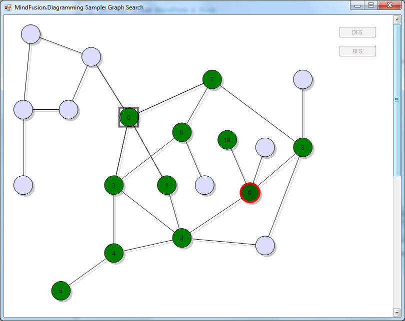
If you run the application now and click one of the search buttons, you should see this screen showing the algorithm progress, with current back-track position represented by a red border:
The code above uses MindFusion’s .NET API and can be used with Windows Forms, WPF, Silverlight and ASP.NET diagramming components. The Java API for Android and desktop Swing application will look similar, with setter method calls instead of property assignments.
You can download the trial version of any MindFusion.Diagramming component from this page.
Enjoy!