In this step-by-step guide we will create a spreadsheet in WPF, which represents a template with the monthly bills.
I. Setup of the Project.
We create a new WPF project and add the following dlls:
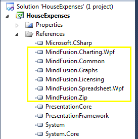
Spreadsheet for WPF: referenced dll-s.
Then, in XAML, we map the spreadsheet namespace to the prefix “ss”:
xmlns:ss="http://mindfusion.eu/spreadsheet/wpf"
Finally, we create a WorkbookView and Workbook instances, which we’ll use later in code.
 <ss:WorkbookView x:Name="workbookView">
            <ss:Workbook x:Name="workbook" />
        </ss:WorkbookView>
II. Header.
The next step is to add a sheet to our workbook like this:
            var activeSheet = workbook.Worksheets.Add();
            workbookView.ActiveWorksheet = activeSheet;
            activeSheet.BeginInit();
Now, we can start to build the actual house bills template. First, we define the global formatting for the worksheet:
var globalStyle = activeSheet.CellRanges[0, 0,
     activeSheet.Columns.Count - 1, activeSheet.Rows.Count - 1].Style;
            globalStyle.FontName = "Tahoma";
            globalStyle.FontSize = 10;
We get all cells from the active sheet and set the font name and font size, which we’ll be used when we edit them.
Then, we define the header of the bills template.
     //initialize header label and style
      var heading = activeSheet.CellRanges["A3:H3"];
      heading.Merge();
      activeSheet.Rows[2].Height = "40pt";
      activeSheet.Columns[0, 8].Width = "80pt";
      activeSheet.Cells["A3"].Data = "Bills for March, 2016";
The header is at the second row and spans from the first to the eighth cell e.g. from A3 to H3. We merge the cells and increase the height. We also increase the width of the first eight columns because we want larger cells to fit the bill content. Last but not least we set the label. The label is assigned to the first cell of the merged cells.
Next, we’ll do some styling of the font and label of the title:
      var headingStyle = heading.Style;
      headingStyle.FontSize = 14;
      headingStyle.FontBold = true;
      headingStyle.VerticalAlignment = MindFusion.Spreadsheet.Wpf.VerticalAlignment.Middle;
      headingStyle.PaddingLeft = "5pt";
      headingStyle.TextBrush = Brushes.LightSlateGray;
Here we get the Style object of the header, increase the font size and set the font style to bold, vertically align the title in the middle and add some padding to it. We use a slate gray brush for the heading. The underscore is done using two BorderBottom properties:
        headingStyle.BorderBottomBrush = Brushes.DarkGreen;
        headingStyle.BorderBottomSize = "2pt";
III. Description Block.
The description block is made of six cells:
string[] headerLabels = new string[] { "Description", "Start Date",
 "Due Date", "Amount", "Date Paid", "Remarks" };
            for (int i = 0; i < headerLabels.Length; i++)
                activeSheet.Cells[i, 4].Data = headerLabels[i];
Each cell describes certain data we’ll need for the house bills table. We want to apply some formatting to indicate this is a header row. We make the font bold and italic, align text in the middle, add a top border and gray background:
         heading = activeSheet.CellRanges["A5:H5"];
         headingStyle = heading.Style;
         headingStyle.HorizontalAlignment =
MindFusion.Spreadsheet.Wpf.HorizontalAlignment.Center;
         headingStyle.Background = Brushes.LightGray;
         headingStyle.BorderTopBrush = Brushes.Gray;
         headingStyle.BorderTopSize = "1pt";
         headingStyle.FontItalic = true;
         headingStyle.FontBold = true;
         headingStyle.FontSize = 10;
The description column will hold presumably more text and we merge three cells for it:
      //merge the cells with the description
      for (int i = 4; i < 15; i++)
        {
           var description = activeSheet.CellRanges[5, i, 7, i];
           description.Merge();
        }
Some of our cells show DateTime values. We want to format the data to show entries like “12-January-2016”. Here is how this is done:
       //format cells that hold date values
       activeSheet.CellRanges["B6:C15"].Style.Format = "dd-mmmm-yy";
       activeSheet.CellRanges["E6:E15"].Style.Format = "dd-mmmm-yy";
IV. Formulas.
We want to have a cell that sums all the current bills to give us an overview how much we have to pay this month. We’ll use the SUM function, which is just one of the many functions Spreadsheet for WPF supports – you can check the list here.
      activeSheet.Cells["D17"].Data = "=SUM(D6:D15)";
      activeSheet.Cells["D17"].Style.Format = "$##.##";
V. Conditional Formatting.
The last feature we want to add is to paint in red those bills whose sum is for more than 100 USD. That is done with conditional formatting:
      var billsStyle = activeSheet.CellRanges[3, 5, 3, 14].Style;
      billsStyle.Format = "$##.##";
      var format1 = billsStyle.ConditionalFormats.Add();
      format1.Type =
         MindFusion.Spreadsheet.Wpf.ConditionalFormatType.CellValue;
      format1.Operator =
         MindFusion.Spreadsheet.Wpf.ComparisonOperator.GreaterThan;
      format1.Second = "100";
      format1.Style.TextBrush = Brushes.Red;
We select the cells that render the sums and add a new IConditionalFormat object. It users the operator “greater than” and changes the text brush to red if the data of the cells gets higher than 100.
This is the final type of customization we’ve performed on this workbook. We call
activeSheet.EndInit();
to signalize that initialization for this worksheet is over. Here is the result:
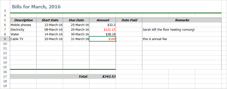
Spreadsheet for WPF Sample: Bills Template
The sample is available for download from this link:
WPF Spreadsheet Control: House Expenses Template
The control’s libraries are included in the archive.
Technical support is available at the discussion board, per e-mail or at the help desk. We are happy to assist you.
About WPF Spreadsheet control from MindFusion: A native WPF component, which provides every single feature you’ll need to create an Excel-like spreadsheet in your own application in a matter of hours. The control is packed with a versatile chart library, which let’s you enhance your spreadsheets with compelling graphs of any type. The various user interaction options fit perfectly with the high demands of today’s application of performance and flexibility. Achieving the desired look and feel is easily accomplished with the efficient style system and the numerous appearance properties. The control provides a line of auxiliary forms, which enable programmers to easily edit and organize the spreadsheet data for the best and fastest possible results.
WPF Spreadsheet control is part of MindFusion WPF Pack of components – the tools that make WPF development fast and easy. Details here.


 MindFusion.Charting for WPF
 MindFusion.Diagramming for WPF
 MindFusion.Mapping for WPF
 MindFusion.Reporting for WPF
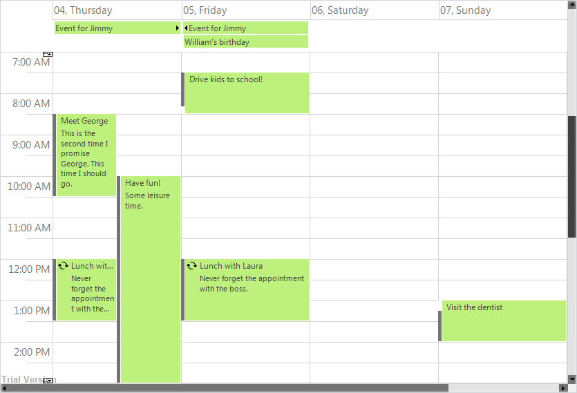
 MindFusion.Scheduling for WPF