MindFusion.Diagramming for Java Swing, V4.0.2 has just been released. The new features are mostly requested by the users, we have also fixed several bugs. Here are the details:
ContainerNode improvements
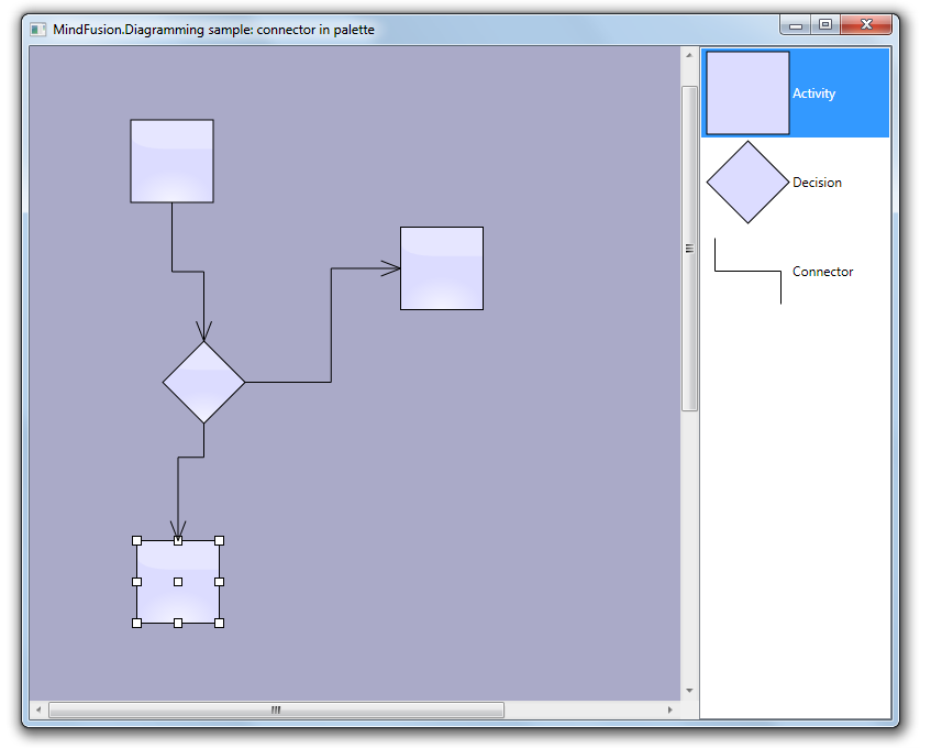
- JDiagram now draws child nodes by their container. When containers overlap, the children of the lower container can no longer appear above the children of the upper container;
- You can use the new ClipChildren property to specify whether child items are clipped to the boundaries of the container;
- When you drop nodes into a container, the ZIndex property is not changed automatically;
- and more.
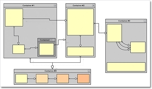
Container nodes
Miscellaneous
- The placement of link labels at shorter link segments is improved.
- The new DiagramLink.intersects method checks whether two links intersect.
- You can use the hitTest method to determine whether a diagram item or any of its child items contain the specified point.
- The getFlatItemList method returns a list of all TreeViewNode items.
- as well other new properties and methods – check the complete list here.
Labels at diagram links
You can download the control and test yourself its performance and functionality. Here is a direct link to the trial version:
Download MindFusion.Diagramming for Java Swing, V4.0.2
Technical support
Your questions about the library or any other of our components are welcomed by our support team. You can write at the forum, help desk or at support@mindfusion.eu.
About Diagramming for Java Swing: MindFusion.Diagramming for Java Swing provides your Java application with all necessary functionality to create and customize a diagram. The library is very easy to integrate and program. There are numerous utility methods, rich event set, more than 80 predefined shapes. The tool supports a variety of ways to render or export the diagram, advanced node types like TreeView nodes, hierarchical nodes, tables, container nodes and many more. There are 15 automatic layouts, various input / output options and fully customizable appearance. A detailed list with JDiagram’s features is uploaded here. You can check the online demo to see some of the functionality implemented.
Diagramming for Java Swing is royalty free, there are no distribution fees. Licenses depend on the count of developers using the tool – check here the prices.