MindFusion.Gauges: Creating a Stopwatch

This blog will demonstrate how to create a simple stopwatch based on the OvalGauge component (part of MindFusion.Charting for WinForms and MindFusion.Pack for WinForms).

Introduction
We start off by creating a new Windows Forms Application in Visual Studio and adding an OvalGauge control to the main form. Set the gauge’s Dock property to Fill and its Name to “stopwatch”.

Setting up the scales
The stopwatch will contain two scales – a bigger one, which should display the seconds, and a smaller one – for the minutes. The minute scale will be positioned in the upper half of the gauge area. The scales can be created and configured in design-time – through the property grid – or in code. In the Property grid navigate to the Scales property of the OvalGauge control and click the ‘…’ button or hit F4 to open the OvalScale Collection Editor. In this editor, add two scales by pressing the ‘Add’ button. Edit the following properties of the second scale:

Name = "SecondsScale"
StartAngle = -90
EndAngle = 270
StartWidth = 0
EndWidth = 0
Stroke = Color=Black, Width=0

MinorTickSettings.ShowTicks = True
MinorTickSettings.Count = 4
MinorTickSettings.Stroke = Color=(85, 85, 85), Width=0
MinorTickSettings.TickShape = Line
MinorTickSettings.TickWidth = 5%
MinorTickSettings.TickAlignment = OuterInside

MiddleTickSettings.ShowLabels = False
MiddleTickSettings.Count = 5
MiddleTickSettings.Stroke = Color=(0, 0, 0), Width=0
MiddleTickSettings.TickShape = Line
MiddleTickSettings.TickWidth = 8%
MiddleTickSettings.TickAlignment = OuterInside

MajorTickSettings.Count = 12
MajorTickSettings.FontFamily = "Calibri"
MajorTickSettings.FontSize = 20%
MajorTickSettings.FontStyle = Regular
MajorTickSettings.LabelOffset = 9%
MajorTickSettings.LabelRotation = None
MajorTickSettings.ShowMaxValueTick = Never
MajorTickSettings.Stroke = Color=(0, 0, 0), Width=2
MajorTickSettings.TickShape = Line
MajorTickSettings.TickWidth = 12%
MajorTickSettings.TickAlignment = OuterInside

In addition, add four custom intervals to the MajorTickSettings.CustomIntervals collection, representing the intervals [0-0], [15-15], [30-30], and [45-45] respectively. Set the Fill property of each custom interval to (187, 31, 33). These objects indicate that the labels inside the corresponding intervals will be colored in red.

For simplicity, the properties of the minute scale are omitted. They are similar to those of the second scale, the main difference being that the minute scale is positioned and sized through the ScaleRelativeCenter and ScaleRelativeRadius properties.

Adding pointers

In the OvalScale Collection Editor dialog add a pointer to each of the two scales. To do this, select the scale, navigate to the Pointers property in the grid and press the ‘…’ button or F4. This will open the Pointer Collection Editor dialog. Name the pointer of the minute scale “MinutesPointer” and the one in the second scale – “SecondsPointer”. We will use these names later in code to identify and search for the pointers. Set the width of the two pointers to 30% and 20% respectively. Then close all editors. We will custom draw the pointers so there is no need to specify any more properties.

To draw the pointers, handle the PrepaintPointer event of the OvalGauge class. This event is raised for each pointer in the gauge individually before the pointer is painted by the control. The event can be used to cancel the default pointer drawing by setting the CancelDefaultPainting to true. A simplified version of the event handler that paints the two pointers is listed below.

private void stopwatch_PrepaintPointer(object sender, PrepaintEventArgs e)
{
    e.CancelDefaultPainting = true;

    Brush fill = new SolidBrush(Color.FromArgb(175, 8, 9));

    GraphicsState state = e.Graphics.Save();
    e.Graphics.SmoothingMode = SmoothingMode.AntiAlias;
    e.Graphics.ScaleTransform(e.Element.RenderSize.Width, e.Element.RenderSize.Height);

    if (e.Element.Name == "SecondsPointer")
    {
         var polygon = new PointF[]
         {
             new PointF(0.1f, 0.35f),
             new PointF(1, 0.45f),
             new PointF(1, 0.55f),
             new PointF(0.1f, 0.65f)
         };
         var ellipse1 = new RectangleF(0, 0, 0.2f, 1f);

        // Draw the pointer itself
        e.Graphics.FillPolygon(fill, polygon);
        e.Graphics.FillEllipse(fill, ellipse1);
    }
    else if (e.Element.Name == "MinutesPointer")
    {
        var polygon = new PointF[]
        {
            new PointF(0.15f, 0.35f),
            new PointF(1, 0.45f),
            new PointF(1, 0.55f),
            new PointF(0.15f, 0.65f)
        };
        var ellipse1 = new RectangleF(0, 0, 0.3f, 1f);

        e.Graphics.FillPolygon(fill, polygon);
        e.Graphics.FillEllipse(fill, ellipse1);
    }

    e.Graphics.Restore(state);
    fill.Dispose();
}

Activating the stopwatch

Now we need means to start, stop, and reset the stopwatch. First, declare two member variables in the form – startTime and elapsedTime, of type DateTime and TimeSpan respectively. The first variable will store the time when the stopwatch was most recently started. The second variable will store the total elapsed time.

Go to the Visual Studio designer, select the form, navigate to the Padding property and change its value to “0, 0, 0, 50”. The gauge will shrink, leaving some space at the bottom. Add two buttons to the form, below the gauge, and set their texts to “Start” and “Reset” respectively. In addition to the buttons, add a Timer component to the form. When the stopwatch is started, we will use this timer to update the pointers. Handle the Click events of the two buttons. The first button will start/stop the stopwatch. The second button will reset the stopwatch. Here is the event handlers of the two buttons:

private void button1_Click(object sender, EventArgs e)
{
    if (timer1.Enabled)
    {
        UpdateTime();
        UpdatePointers();

        timer1.Stop();
        button1.Text = "Start";
    }
    else
    {
        button1.Text = "Stop";
        startTime = DateTime.Now;
        timer1.Start();
    }
}

private void button3_Click(object sender, EventArgs e)
{
   elapsedTime = TimeSpan.Zero;
   UpdatePointers();
}

Depending on the current state of the application, the first button will either start or stop the timer. The second button will set the elapsed time to 0:00, effectively resetting the stopwatch. Both buttons rely on the method UpdatePointers, which adjusts the gauge pointers according to the currently elapsed time. This method uses the GetElementByName method of the gauge to access the pointers by name and update their values:

private void UpdatePointers()
{
    var minutesPointer = (Pointer)stopwatch.GetElementByName("MinutesPointer");
    var secondsPointer = (Pointer)stopwatch.GetElementByName("SecondsPointer");
    minutesPointer.Value = (float)elapsedTime.TotalMinutes;
    secondsPointer.Value = (float)Math.Round((float)(elapsedTime.TotalSeconds % 60), 1);
}

Finally, handle the Tick event of the timer.

private void timer1_Tick(object sender, EventArgs e)
{
    UpdateTime();
    UpdatePointers();
}

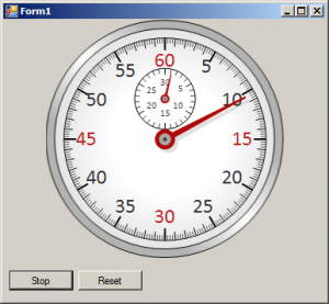
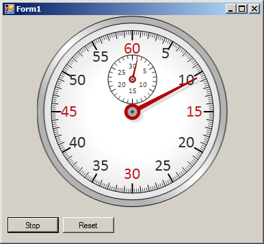
The image below illustrates the running stopwatch:

gauge-stopwatch

The source code of the sample is available for download from here:
https://mindfusion.eu/_samples/GaugesStopwatch.zip

The MindFusion.Charting for WinForms component can be downloaded from here:
https://www.mindfusion.eu/ChartWinFormsTrial.zip

About MindFusion.Charting for WinForms: A professional programming component for WinForms, which lets you create remarkable charts and gauges fast and easy. The tool supports all major chart types – line, pie, radar and bar – and numerous variations of them – column, area, bubble, polar, doughnut etc, as well as oval and linear gauges.

MindFusion.WinForms Pack, 2015.R1

Licensing
MindFusion no longer supports separate trial and licensed build-s for its components. Instead, you should call MindFusion.Licensing.LicenseManager.AddLicense(yourLicenseKey) from within your application to stop displaying trial labels. The license key is listed at the Keys&Downloads page in your client account.

MindFusion WinForms charting controlCharting

Custom Formatting of Labels
You can set custom format to numeric labels in all chart types. The format uses the .net custom format
strings.

Sorting of Bars
Bars in the charting control can be sorted from within each series/cluster in ascending or descending order. You can also sort the series/clusters – by the sum of their values or the max value. If you set SortColor, the bar brushes and pens will be sorted along the bars as well.

MindFusion WinForms Charting Control: Sorting of bars

Miscellaneous

  • Bars are now outlined with the consecutive pen from the ChartPens collection rather than the AxisPen.
  • Drawing of line and area charts has greatly been improved – the control now draws only the visible portion of the chart rather than the whole chart, which was clipped to the visible rectangle.
  • AreaOpacity property added to radar charts.
  • AxesOnTop property in radar charts sets the order of drawing for the graphic and the axes.
  • and more.

MindFusion WinForms diagramming control Diagramming

Map nodes
The diagramming control has a new MapNode class that represents nodes that can render geographical maps.
Currently map nodes can display the content of Esri shapefile files.

Tree map layout
Tree maps represent hierarchies by nesting child nodes within their parents, where the areas of leaf nodes are proportional to their Weight values. Unlike other layout algorithms, TreeMapLayout expects hierarchies to be defined via grouping or containment (see AttachTo method and ContainerNode class), and will ignore any links in the diagram.

MindFusion WinForms diagramming control: the tree map layout.

The tree map layout.

Decision flowchart layout
The DecisionLayout arranges simple flowcharts consisting of decision boxes with up to three outgoing links per node and activity boxes with a single outgoing link per node. The nodes are arranged in columns and rows, whose distance depends on the HorizontalPadding and VerticalPadding property values.

More new features:

  • Improved arrowhead rendering
  • Import diagrams from *.SVG files
  • Improvements in the Visio2013Exporter
  • and many more… read a full list here.

MindFusion WinForms spreadsheet controlSpreadsheet

Grouping and Outlining
You can now group rows and columns. To group or ungroup a range of rows or columns, use the Group or Ungroup methods of the RowRange and ColumnRange classes.

Formatted text support
The spreadsheet control can now import, display and export texts with mixed formatting. Formatted texts can also be created programmatically by assigning a FormattedText instance to the Data property of cells.

Improved in-place editing
Trat yourself to the new Excel-like editing features that are now part of the spreadsheet component. When you type a new formula pressing the arrow keys will result in navigation within the worksheet (instead of adjusting the caret position) and the selected cell or cell ranges will be inserted as a reference in the currently edited formula.

New Events
MindFusion WPF Spreadsheet control offers a host of new events, which are now part of the WorkbookView
and WorksheetView classes:

  • Header interaction notification events – ColumnsMoved, ColumnsResized, RowsMoved, and RowsResized.
  • Group interaction events – ColumnGroupCollapsed, ColumnGroupExpanded, ColumnOutlineLevelToggled, RowGroupCollapsed, RowGroupExpanded, and RowOutlineLevelToggled.
  • Custom drawing events – DrawColumn and DrawRow.

New Functions
The core calculation engine of the spreadsheet control now offers 22 new functions, including a full set of database functions, such as DGET, DSUM, and so on. The Function Reference section in the online help offers further details.

MindFusion WinForms spreadsheet control: database functions

Miscellaneous

  • Worksheets can be moved and copied to another workbook through the new Move and Copy methods.
  • The new EnableFormulaEvaluation property can be used to disable formula evaluation across the workbook.
  • New ShowActiveCell and ShowSelection properties added to the WorkbookView and WorksheetView classes.

The trial version is available for direct download from this link:

Download MindFusion.WinForms Pack 2015.R1

If you run into problems with any of the components, please let us know. We shall be glad to assist you. MindFusion is proud with its excellent technical support – the majority of the questions are answered within hours of receiving them.

About MindFusion.WinForms Pack: A set of five WinForms programming components that provide your application with a rich choice of diagramming, charting, scheduling, mapping, reporting and gauge features. The tools are very easy to implement and use. They boast intuitive API and various step-by-step tutorials to get you started. Both online and offline documentation is available.

A sample browser presents you with all the samples for each control to let you easily navigate to what you need. You can check some of the features of each component right now if you look at the online demos:

Visit the features – page of the components for more information about their capabilities:

You can check the prices and licensing scheme here. All components are royalty-free.

Real-time Chart: Amplification Plot

MindFusion.RealTimeCharting for WPF assembly lets you visualize huge (and by that we mean huge) amounts of data with no special load on the machine it runs on. We drew inspiration from a popular chart in molecular biology – Real-time PCR, which:

can provide a simple and elegant method for determining the amount of a target sequence or gene that is present in a sample.

More on the topic here.

Since we self-generate our data, the result graphics are not that much the real thing but they demonstrate the algorithm of building the chart pretty well. Let’s start:

1. Create the chart

Drag the RealTimeChart from the toolbox or add a reference to the MindFusion.RealTimeCharting.Wpf assembly. The chart has no initial data so we start with a simple X-axis on the screen. We name our chart “rtChart”.

2. Customizing the X-axis

The X-axis is accessible via the rtChart.XAxis property. It exposes many appearance settings, from which we start with Interval, Length and Origin – they will define our axis. When data accumulates, the initial axis labels shall be replaced with their updated values.

   rtChart.XAxis.Title = "Cycle";
   rtChart.XAxis.Interval = 2;
   rtChart.XAxis.Length = 50;
   rtChart.XAxis.Origin = 0;
   rtChart.XAxis.LabelFormat = "0";
   rtChart.XAxis.PinLabels = false;

It’s worth noting that we don’t pin labels e.g. they will move along the axis as new data is added. We need no trailing zeros, so the LabelFormat is “0”.

3. The Y-axes

There is no limit on how many Y-axis we will create. In our sample we will use two: one at each side of the chart plot area. We need two instances of the Axis class, which we add to YAxisCollection and Y2AxisCollection respectively. Before we add them, we set their appearance. We want tick marks and rotated title. Note that we align the second axis (Y2) to the right.

   Axis yAxis = new Axis();
   yAxis.Origin = 0.0;
   yAxis.Length = 1;
   yAxis.Interval = 0.1;
   yAxis.Title = "ΔRn";
   yAxis.TitleRotationAngle = -90.0;
   yAxis.TitleFontFamily = new FontFamily("Verdana");
   yAxis.LabelFontFamily = new FontFamily("Verdana");
   yAxis.TickLength = 5;
   yAxis.TitleOffset = 10;
   rtChart.YAxisCollection.Add(yAxis);          

   yAxis = new Axis();
   yAxis.Origin = 0.0;
   yAxis.Length = 100;
   yAxis.Interval = 10;
   yAxis.Title = "Fluorescene";
   yAxis.TitleRotationAngle = -90.0;
   yAxis.TitleFontFamily = new FontFamily("Verdana");
   yAxis.LabelFontFamily = new FontFamily("Verdana");
   yAxis.TickLength = 5;
   yAxis.TitleOffset = 10;
   yAxis.LabelHorizontalAlignment = HorizontalAlignment.Right;
   rtChart.Y2AxisCollection.Add(yAxis);

4. Chart series

We need four series – two of them will be bound to Y and two – to Y2. It’s important to note that axes must be initialized before the series, because each series is associated with a given Y-axis when created.

Each chart series is an instance of the Series class. We want to show scatters at each series – for that we use the ScatterType property. Since we plan to show a legend, it’s important to set the Title of each series – because this title will be used as a legend label. Here is sample code for the first series:

  series1 = new Series(rtChart.YAxisCollection[0])
  {
      Stroke = new SolidColorBrush(Colors.Green),
      ScatterStroke = new SolidColorBrush(Colors.Green),
      Fill = new SolidColorBrush(Colors.Green),
      ScatterType = ScatterType.Diamond,
      Title = "Sample 1",
      TitleFontFamily = new FontFamily("Verdana"),
      TitleFontSize = 12

   };

    .......
   rtChart.SeriesCollection.Add(series1);

5. Data

Data is added directly to the Series.Data property. You can add a batch of points or one point at a time. The property requires that you add a Point e.g. you must set the X and Y values simultaneously:

Point[] points1 = new Point[clusterSize];

//generate some dummy data
...

series1.Data.AddRange(points1);
rtChart.Commit(minNewX);

Don’t forget to call the Commit() method in one of its overloads – it signals to the chart that new data has been added and refresh is needed.

6. Final adjustments

We want a legend and we turn on ShowLegend. The initial result is a legend in 4 rows, which does not look beautifully on our chart. We plat for a while with LegendWidth and LegendHeight and come up with a satisfactory outlook for our legend – in two columns, centered below the plot area.

Adding a tooltip is also easy – we set ShowFallbackTooltip to true. Since the chart might have numerous Y-axis we must choose, which axis the tooltip is bound to. In our case it’s the first one:

    rtChart.TooltipVisibility = Visibility.Visible;
    rtChart.ShowFallbackTooltip = true;
    rtChart.TooltipAxis = rtChart.YAxisCollection[0];

    rtChart.ShowLegend = true;
    rtChart.LegendHeight = 70;

We adjust the grid according to the data we have:

    rtChart.MajorGridSizeY = 50;
    rtChart.MajorGridSizeX = 2;

7. That’s it

Here is the final result:

Real-time chart: amplification plot sample.

Real-time chart: amplification plot sample.

Of course, there are many other settings and possibilities in the control. You can download the sample and expand its functionality and appearance:

Real-time Chart – Amplification Plot Sample Download

MindFusion.RealTimeCharting for WPF is part of MindFusion.Charting for WPF component, which also includes MindFusion.Gauges for WPF. Check the trial version for more practical, beautiful and easy to build charts and gauges.

About MindFusion.RealTimeCharting for WPF: A WPF programming component, which has been designed and developed to render real-time charts with huge amounts of data in a fast and efficient manner. The component uses innovative approach to draw the chart graphics, which forgoes the traditional constructing of a tree with the visual elements in WPF. This way CPU load remains minimal and graphics of tens of thousands of points are rendered with impressive speed. The tool supports unlimited number of Y and Y2 axes, legend, tooltip, background image, grid and more.

About MindFusion.Charting for Wpf: A programming component that combines powerful charting capabilities with an elegant API and easy use. Among the features of the control are fully customizable grid, positive and negative values on all chart axes, 3D charts, gauges and many more – read a detailed list here.

The control provides detailed documentation and various samples that demonstrate how to customize every type of chart. It supports a wide range of 2D and 3D charts including bar, line, radar, bubble pie etc. You can add tooltips, define themes, perform hit testing, zoom and more.

Diagramming for Windows Forms, V6.3.1

MindFusion has just released a new version of its popular Diagramming for WinForms component. Here are details about the new features:

Improved arrowhead rendering
Arrowhead rendering has been improved as you can see in following new vs. old version image.

  • arrowheads are rendered as a single path when possible and several arrowhead Shape definitions has been changed to implement mitered joints when HeadPen is set to a thick pen.
  • the point where end segments connect to arrowheads can be specified via the Shape.LinkSegmentInset property. Shape definitions from the Arrowheads class set it to suitable default value. This allows using transparent or semi-transparent brushes without seeing the link line drawn behind arrowheads.
  • arrowhead shadows are no longer filled if the link’s EffectiveBrush is null or fully transparent.
New vs. old arrowheads

New vs. old arrowheads

Miscellaneous

  • VisioExporter export speed has been improved greatly for large diagrams.
  • For consistence with MindFusion libraries for other platforms, BackBrush in default diagram style has been changed to white brush.
  • Improved DiagramLink rendering speed.
  • Multiple-resize of rotated nodes fixed to apply same offsets in nodes’ local coordinate system.
  • Fixed KeepInsideParent constraint for rotated parent nodes.

You can download the trial version from the link below:

Diagramming for WinForms, V6.3.1

If you have questions or run into problems using the component you can use the Diagramming for WinForms forum, the help desk or write us at support@mindfusion.eu. Our support team will be pleased to help you.

About MindFusion.Diagramming for WinForms: A programming component that provides any WinForms application with a full set of features for creating and customizing all types of diagrams, flowcharts, schemes, hierarchies, trees, graphs etc. The control provides numerous ways to save and load a diagram, six auxiliary controls and more than 12 automatic graph layout algorithms. Diagram elements include scrollable tables, container nodes, multi-segment arrows, custom diagram item types and many more. Further details here.

Diagramming for WinForms is a royalty-free component, clients get 12 month upgrade subscription when buying a license. The source code is also available for purchase. Visit the buy page for a list with the current license prices.

Diagramming for Silverlight, V3.1

The new release of Diagramming for Silverlight provides two new layouts and a few other new features. Here is an overview:

Tree map layout
Tree maps represent hierarchies by nesting child nodes within their parents, where the areas of leaf nodes are proportional to their Weight values. Unlike other layout algorithms, TreeMapLayout expects hierarchies to be defined via grouping or containment (see AttachTo method and ContainerNode class), and will ignore any links in the diagram. The diagram area covered by the topmost nodes in a hierarchy is specified via the LayoutArea property. By default, the layout tries to keep the ratio of node sides as close as possible to one.

The tree map layout.

The tree map layout.

Decision flowchart layout
DecisionLayout arranges simple flowcharts consisting of decision boxes with up to three outgoing links per node and activity boxes with a single outgoing link per node. The nodes are arranged in columns and rows, whose distance depends on the HorizontalPadding and VerticalPadding property values. When links share the same row or column, they are placed at a distance specified via LinkPadding. The layout arranges nodes recursively starting from StartNode.

The decision layout.

The decision layout.

Miscellaneous
~ Layout algorithms now automatically resize diagram’s Bounds if it’s not large enough to fit the arranged content.
~ LinkLabels are now copied by DiagramLink copy constructor and clipboard methods.
~ ContainerNode now displays a caption bar when its Shape is set to Rectangle or RoundRect.

You can download the trial version directly from the link below:

Download DiagramLite 3.0.1 Trial Version

Feel free to contact us with any questions about Diagramming for Silverlight or any other of our products – please use the forum, email support@mindfusion.eu or the help desk. We strive to provide competent and detailed answers to all support inquiries within hours of receiving them.

About MindFusion.Diagramming for Silverlight: A programming component specially designed and developed to provide web developers with a fast and easy way to create diagrams, graphs, schemes, hierarchies, charts and many more. The impressive feature set of the control ranges from predefined node shapes to custom nodes and thirteen automatic layouts. The style and appearance of all diagram elements are completely customizable, the numerous samples provide programmers with plenty of example code to look from.

The control boasts intuitive API that is documented in details in the help file provided with the installation. There are also step-by-step tutorials and various guides. You can check the features
list here to find out more about the
capabilities of the tool. An online demo is also available. The prices are per developer, source code is also available. Learn more about the licensing scheme here.