MindFusion is proud to present you the beta version of Charting for WinForms, V4.0. MindFusion has entirely redesigned the control to create the most agile, lean and smart charting tool on the market. Below is a brief synopsis of the new chart for WinForms component.
New data model
Data that should be drawn in charts is read through an interface called Series, whose instances can be assigned to the Series properties of Chart and SeriesRenderer classes. You could implement this interface in your own model classes to avoid duplicating data. The library includes several pre-defined series classes that let you specify data via IList or array objects. For example, BarSeries lets you specify lists of values, inner labels and top labels, and PointSeries lets you specify data as a list of points.
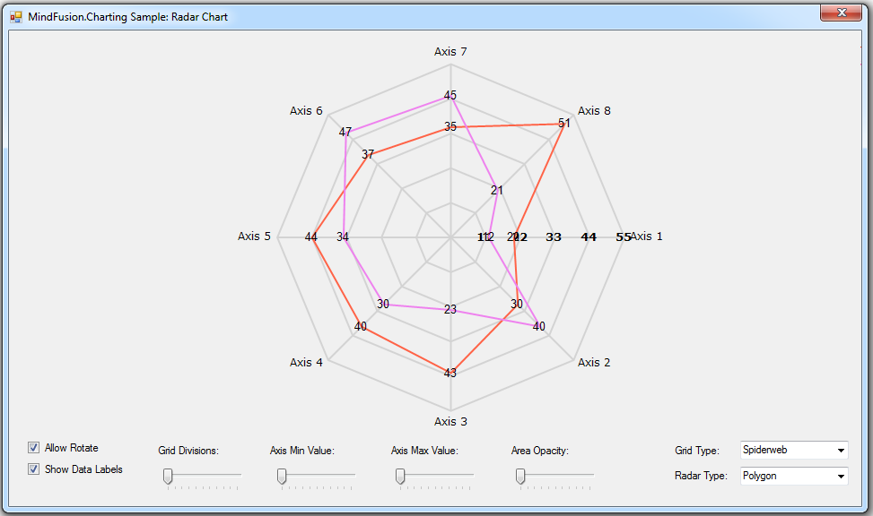
Radar chart with multiple series.
New rendering model
Chart graphics are drawn inside Plot components by SeriesRenderer -derived objects. Each plot can contain multiple series renderers from same or different types. For example, you can draw area, line and bar graphics in same plot by adding AreaRenderer, LineRenderer and BarRenderer objects to its SeriesRenderers collection. Concrete Chart classes automatically generate a series renderer of appropriate type for their Series.
Dashboard
The Dashboard control can contain multiple plots, axes, legends, images, gauges and text blocks arranged in dynamic layout. Individual components can be added to dashboard’s default RootPanel or LayoutPanel containers, or for more complex layouts add intermediary panels such as GridPanel and StackPanel to the default ones.
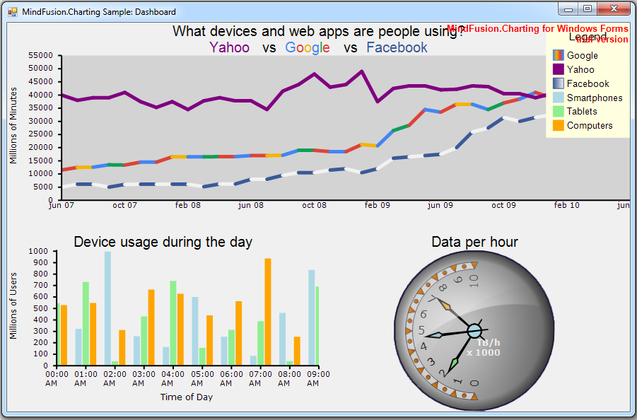
The new WinForms Chart has a built-in dashboard control.
Print and export
The Dashboard control and Chart controls that derive from it expose Print and PrintPreview methods for printing on paper. Call the ExportImage and CreateImage methods to generate bitmap image of the dashboard. The ExportPdf method exports the chart to a PDF (Portable Document Format) file. The ExportSvg method exports the chart to an SVG (Scalable Vector Graphics) file.
Styling
Values of appearance properties can come from several places in the component hierarchy. SeriesRenderer -derived objects can use attributes from their local SeriesStyle, from plot’s SeriesStyle, or from the *Series properties in current Theme. Component classes use either their local properties or ones defined in the theme. By default, appearance properties in SeriesRenderer and Component classes have null values, which makes the drawing code use values from the theme.
You can download the beta version directly from the link below. The archive file contains the control’s libraries, samples in C# and documentation.
Download Chart for WinForms, V4.0 Beta Version
Your feedback is valuable for us. Please use the forum or e-mail support@mindfusion.eu. to share your opinion, ask questions or submit a problem.
About Chart for WinForms: This is a smart WinForms dashboard control that lets you add the perfect chart or gauge to your application in a few easy steps. The control provides an elegant data model, which supports equally well arrays, xml, any .NET data source, lists or any other data model class, that you create by implementing the Series interface.
MindFusion WinForms Chart boasts an innovative rendering model, where each chart graphics is drawn by its own SeriesRenderer on a Plot. Each Plot supports unlimited number of chart or gauge series of any type. Plots, together with axes, legends, gauges, images, and text blocks can be combined in a Dashboard with the built-in dashboard control. Styling the chart is done on various levels – from appearance properties in each SeriesRenderer to more general settings in the Component classes. The control supports themes and comes with a set of stylish themes, which you can customize as you wish or create new ones from scratch.
Persisting the chart is possible in several ways – printing, export to PDF or to Svg images – all of them performed with a single method call.
The newly designed chart control is offered with unchanged prices and license scheme – check it here.