We use here MindFusion JavaScript library for Charts and Gauges to build this horizontal stacked bar chart that renders custom tooltips:

Run the sample from this link.
You can download the source code together with the libraries used from the link at the bottom of the post.
I. General Setup
We split our chart in two files – one is the web page that hosts an HTML Canvas element that will render the chart. The other file is a JavaScript code-behind file that contains the code for the chart.
We need to add reference to two JavaScript library files that provide the charting and drawing functionality that we need:
MindFusion.Common.js
MindFusion.Charting.js
We place them in a Scripts folder at the same level as our web page and JavaScript code behind file.
<script type="text/javascript" src="Scripts/MindFusion.Common.js"></script>
<script type="text/javascript" src="Scripts/MindFusion.Charting.js"></script>
We also add a reference to the code-behind file that we call StackedBarChart.js:
<script type="text/javascript" src="StackedBarChart.js"></script>
Now we need to create an HTML Canvas element and we must provide it with an id so we can reference it in our JS code:
<canvas id="barChart" width="600px" height="400px"></canvas>
The size of the Canvas determines the size of the chart.
II. Chart Instance and General Settings
We add some namespace mappings that allow us to reference classes from the Chart library in a more consice manner:
var Charting = MindFusion.Charting;
var Controls = MindFusion.Charting.Controls;
var Collections = MindFusion.Charting.Collections;
var Drawing = MindFusion.Charting.Drawing;
var GridType = MindFusion.Charting.GridType;
var ToolTip = Charting.ToolTip;
Then we create an instance of the BarChart control. We need to get the Dom Element that corresponds to the Canvas that we’ve prepared for the chart:
var chartEl = document.getElementById('barChart');
chartEl.width = chartEl.offsetParent.clientWidth;
chartEl.height = chartEl.offsetParent.clientHeight;
var chart = new Controls.BarChart(chartEl, Charting.BarLayout.Stack);
The BarChart constructor supports a second argument that indicates the type of the bar chart to render.
We set the bar chart to horizontal with the horizontalBars property. We also make the bars thicker than normal – the property for this is barSpacingRatio It measures the thickness of the bars as a percente of the bar width.
chart.horizontalBars = true;
chart.barSpacingRatio = 0.2;
III. The Data Series
We want our chart to render labels as tooltips, inside the bars and also we want custom labels at the Y-axis. The predefined BarSeries class accepts 4 lists with data: one for bar data and three with labels inside the bars, at the top of the bars and at the X-axis. So, it is not an exact match for what we want to do and we need to customize it.
We will create our own custom BarSeries that we will call SeriesWithLabels. We will inherit the BarSeries class and override its constructor and getLabel members to provide the desired data for the desired type of labels.
We override the constructor by creating three new variables, which receive the data for the bars and the labels:
var SeriesWithLabels = function (barValues, innerLabels, yLabels) {
    Charting.BarSeries.apply(this, [barValues, innerLabels, yLabels]);

	this.yLabels = yLabels;
	this.innerLabels = innerLabels;
	this.values = barValues;

};

SeriesWithLabels.prototype = Object.create(Charting.BarSeries.prototype);
Note that before we do anything else in the new constructor we need to call the apply method of the BarSeries class to transfer the provided data to the base class. We also need to create a prototype of the new series and also define its constructor:
 Object.defineProperty(SeriesWithLabels.prototype, 'constructor', {
   	value: SeriesWithLabels,
   	enumerable: false,
   	writable: true
   });
Next we will override the getLabel method. This is the method that returns the correct label according to the requested label kind and the index of the label. We said we want to support inner labels, tooltips and Y-axis labels. So, we make sure our implementation of getLabel returns exactly those labels:
SeriesWithLabels.prototype.getLabel = function (index, kind) {
    if ((kind & Charting.LabelKinds.YAxisLabel) != 0 && this.yLabels)
        return this.yLabels.items()[index];

    if ((kind & Charting.LabelKinds.InnerLabel) != 0 && this.innerLabels)
        return this.innerLabels.items()[index];

	if ((kind & Charting.LabelKinds.ToolTip) != 0)
        return getPercentLabel(index, this);

    return "";
};
Getting the correct inner and top label is easy – we just return the label at the requested position. What is more work is building the tooltip. We want our tooltip to calculate the portion of the part in the stacked bar the mouse currently is over, to the entire bar. This means we need to calculate the data of all bar portions, which is a combination of the values at the requested position in all three bar series. We do this calculation in a separate method called getPercentLabel.
Before we get to the getPercentLabel method let’s create 3 instances of our custom SeriesWithLabels class:
var labels = new Collections.List([
	"POSITION", "SALARY", "LOCATION", "COLLEAGUES", "WORKTIME"
]);

// create sample data series
var series1 = new SeriesWithLabels(new Collections.List([123, 212, 220, 115, 0.01]), new Collections.List([123, 212, 220, 115, 0]), labels);
var series2 = new SeriesWithLabels(new Collections.List([53, 132, 42, 105, 80]), new Collections.List([53, 132, 42, 105, 80]), null);
var series3 = new SeriesWithLabels(new Collections.List([224, 56, 138, 180, 320]), new Collections.List([224, 56, 138, 180, 320]), null);
The third argument in the SeriesWithLabels constructor is the lists with labels at the Y-axis. We need just one list with labels and we set it with the first series. The other series take null as their third argument.
We need to create a collection with the series and assign it to the series property of the chart:
var series = new Collections.ObservableCollection(new Array(series1, series2, series3));
chart.series = series;
There is a special property called supportedLabels that is member of Series and tells the chart, what type of labels this Series needs to draw. In our case we need to indicate that the first series renders labels at the Y-axis, the inner labels and tooltips. The other two series render inner labels and tooltips:
series1.supportedLabels = Charting.LabelKinds.YAxisLabel | Charting.LabelKinds.InnerLabel | Charting.LabelKinds.ToolTip;
series2.supportedLabels = Charting.LabelKinds.InnerLabel | Charting.LabelKinds.ToolTip;
series3.supportedLabels = Charting.LabelKinds.InnerLabel | Charting.LabelKinds.ToolTip;
Now let’s get back to the method that calculates the tooltip:
function getPercentLabel(index, series)
{
	var value1 = series1.values.items()[index];
	var value2 = series2.values.items()[index];
	var value3 = series3.values.items()[index];

	var theValue = series.values.items()[index];
	var result = theValue/(value1+value2+value3) * 100;

	return Number(result).toFixed(0) + "%";
};
In it we calculate the sum of all data that is rendered by the stacked bar at the specified index. Then we convert the data to percent and format it to have no numbers after the decimal point. That gives us a little inacurracy sometimes, when the value gets rounded to the next number and the sum of all percents actually is 101. You might want to change the formatting to toFixed(2) if you want to see the exact number rendered.
IV. Axes and Tooltip
By default the X-axis shows a title and both axes render the auto scale for the data of the chart. We need to hide the scale and we also hide the ticks that are rendered at the interval values:
chart.xAxis.title = "";
chart.yAxis.title = "";
chart.showXCoordinates = false;
chart.showYCoordinates = false;
chart.showXTicks = false;
chart.showYTicks = false;
We don’t want our chart to render axes at all, so we will draw them with the color of the chart background. You can also draw them with a transparent brush:
chart.theme.axisStroke = new Drawing.Brush(Drawing.Color.knownColors.White);
The tooltip renders automatically when the user hovers a bar. We can customize it with the properties of the static Tooltip class:
ToolTip.brush = new Drawing.Brush("#fafafa");
ToolTip.pen = new Drawing.Pen("#9caac6");
ToolTip.textBrush = new Drawing.Brush("#5050c0");
ToolTip.horizontalPadding = 6;
ToolTip.verticalPadding = 4;
ToolTip.horizontalOffset = 76;
ToolTip.verticalOffset = 34;
ToolTip.font = new Charting.Drawing.Font("Verdana", 12);
We add some padding to the tooltip text and increase its font size. We also render the tooltip with a little offset that will place it inside the bar, ater the inner label.
V. Styling and Legend
Styling o the charts is done through instances of SeriesStyle derived classes. The instance is assigned to the seriesStyle property of the Chart In our case we want to color each bar in three sections. That means the portion of the bar that corresponds to the same series is colored in the same color for all its members. That kind of styling is supported by the PerSeriesStyle class. It accepts a list with brushes and strokes and paints all elements of the series corresponding to the index of the brush in the list with this brush:
// create bar brushes
var thirdBrush = new Drawing.Brush("#97b5b5");
var secondBrush = new Drawing.Brush("#5a79a5");
var firstBrush = new Drawing.Brush("#003466");

// assign one brush per series
var brushes = new Collections.List([firstBrush, secondBrush, thirdBrush]);
chart.plot.seriesStyle = new Charting.PerSeriesStyle(brushes, brushes);
The theme property is the main property for styling the chart. The Theme class exposes fields for customizing the appearance of all chart elements. We first adjust the font and size of the axis labels – remember we have labels only at the Y-axis:
chart.theme.axisTitleFontSize = 14;
chart.theme.axisLabelsFontSize = 11;
chart.theme.axisTitleFontName = "Verdana";
chart.theme.axisLabelsFontName = "Verdana";
chart.theme.axisLabelsFontSize = 14;
chart.theme.axisStroke = new Drawing.Brush(Drawing.Color.knownColors.White);
The labels inside the bars are called data labels and there are dataLabels*** properties that regulate their appearance:
chart.theme.dataLabelsFontName = "Verdana";
chart.theme.dataLabelsFontSize = 14;
chart.theme.dataLabelsBrush = new Drawing.Brush("#ffffff");
The dataLabelsBrush is also used when the legend labels are rendered. In order to make them visible we need to set a darker background for the legend:
chart.theme.legendBackground = new Drawing.Brush("#cccccc");
chart.theme.legendBorderStroke = new Drawing.Brush("#cecece");
The labels inside the legend are taken from the title property of the Series instances:
series.item(0).title = "CAREER START";
series.item(1).title = "MIDDLE OF CAREER";
series.item(2).title = "CAREER END";
Finally we should not forget to call the draw method that actually renders the chart:
chart.draw();
With this our costimization of the chart is done. You can download the source code of the sample and the MindFusion JavaScript libraries used from this link:
Download the Horizontal Stacked Bar Chart Sample: Source Code and Libraries
About Charting for JavaScript: MindFusion library for interactive charts and gauges. It supports all common chart types including 3D bar charts. Charts can have a grid, a legend, unlimitd number of axes and series. Scroll, zoom and pan are supported out of the box. You can easily create your own chart series by implementing the Series interface.
The gauges library is part of Charting for JavaScript. It supports oval and linear gauge with several types of labels and ticks. Various samples show you how the implement the gauges to create and customize all popular gauge types: car dashboard, clock, thermometer, compass etc. Learn more about Charting and Gauges for JavaScript at https://mindfusion.eu/javascript-chart.html.
 MindFusion.Charting
 MindFusion.Diagramming
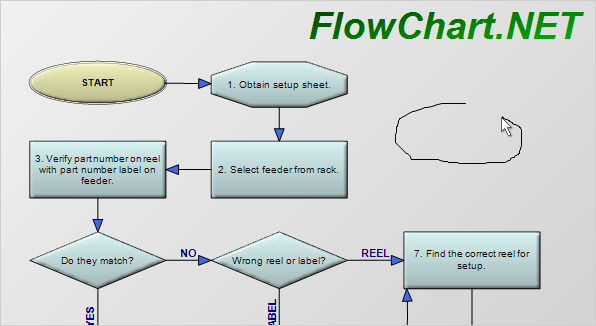
 MindFusion Virtual Keyboard
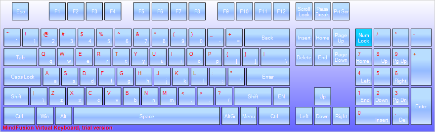
 MindFusion.Reporting
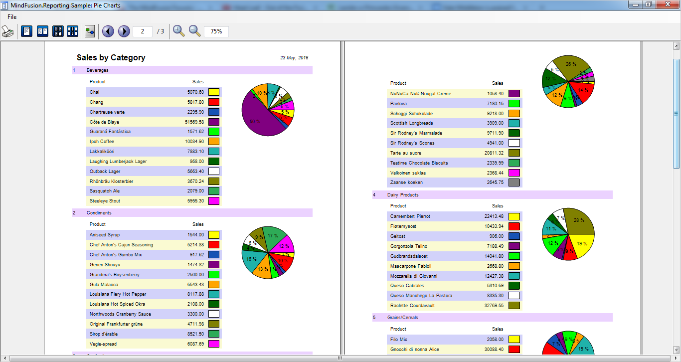
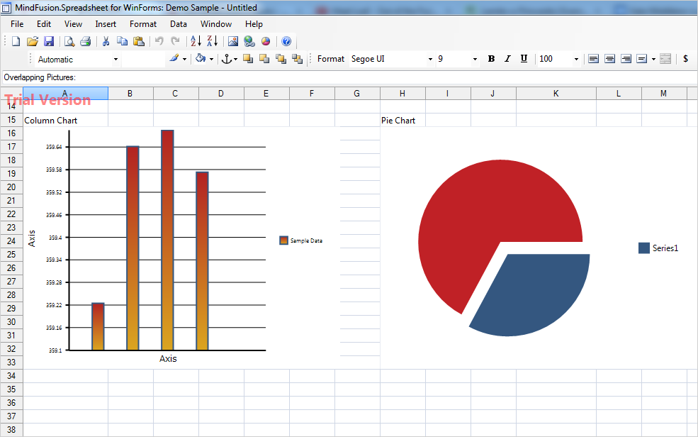
 MindFusion.Spreadsheet