This post shows how to add custom graphics to a chart by inheriting the SeriesRenderer class. We’ll use it to show marker lines on top of an area chart, which could be used to emphasize important values (e.g. dates on a timeline).


This post shows how to add custom graphics to a chart by inheriting the SeriesRenderer class. We’ll use it to show marker lines on top of an area chart, which could be used to emphasize important values (e.g. dates on a timeline).
In this blog post we are going to walk through the steps necessary to build the beautiful doughnut chart that you see at the image below:
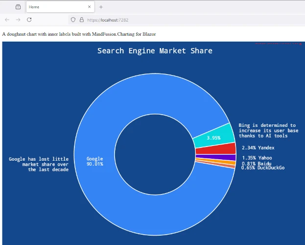
We are going to use MindFusion Charting library for Blazor and Visual Studio as the IDE for the project.
In this blog post we will look in short at the steps to build this JavaScript area chart with custom grid:

The line chart uses DateTimeSeries for the data and a standard GridType for the major grid lines. The auxiliary grid lines among them are made with custom drawing: we will discuss in details the code for that.
The sample uses MindFusion Charting library for JavaScript, which also supports TypeScript.
You can see the sample online at https://mindfusion.eu/samples/javascript/chart/CustomGrid/DateTimeSeries.html
In this blog post we will create DiagramNode instances that render a chart. The charts get resized according to the size of the node. We will use two MindFusion libraries for JavaScript – Charting and Diagramming. You can run the sample online from this link:

I. Project Setup
We will use a web page that will hold the HTML Canvas element that we need in order to render the diagram:
<div style="width: 100%; height: 100%; overflow: scroll;">
    <canvas id="diagram" width="2100" height="2100" style="background:#f0f0f0;">
        This page requires a browser that supports HTML 5 Canvas element.
    </canvas>
</div>
We give the diagram’s Canavs big width and height and we also provide an id. The id is important because we will need to access the Canvas from code.
We add the scripts that we need in order to use the Charting and Diagramming libraries:
<script src="Scripts/MindFusion.Common.js" type="text/javascript"></script>
<script src="Scripts/MindFusion.Diagramming.js" type="text/javascript"></script>
<script src="Scripts/MindFusion.Charting.js" type="text/javascript"></script>
We add the references at the end of the web page, just before the closing BODY tag. We also need to add a reference to a JavaScript file that will hold the code for our sample. We name it “PieNode.js”.
II. The Diagram
In the code-behind file we create a diagram instance. We use the DOMContentLoaded event to initialize our diagram:
document.addEventListener("DOMContentLoaded", function ()
{
// create a Diagram component that wraps the "diagram" canvas
diagram = MindFusion.Diagramming.Diagram.create(document.getElementById("diagram"));
diagram.setBehavior(MindFusion.Diagramming.Behavior.LinkShapes);
diagram.setLinkHeadShapeSize(2);
diagram.setBounds(new Rect(0, 0, 2000, 2000));

// draw a pie when the user creates a node
diagram.addEventListener(Events.nodeCreated, onNodeCreated);

});
The Behavior enumeration lists various modes of behavior for the diagram. We choose Behavior.LinkShapes, which creates nodes, when the mouse is dragged
over an empty area and connects the nodes if the mouse is dragged from an existing node. We set tbe bounds of the diagram to a big Rect which guarantees that the user can draw nodes anywhere on the visible area. When the user draws towards the edge of the browser, the diagram control expands automatically.
Finally, we add an event handler for the nodeCreated event.
//nodeCreated event handler
function onNodeCreated(sender, args)
{
	var node = args.getNode();

	var nBounds = node.getBounds ();
	var topLeftCoord = diagram.docToClient(nBounds.topLeft());
	var bottomRightCoord = diagram.docToClient(nBounds.bottomRight());
	.......................................................
}
At first we get the node that was created. Then we need to get its actual size, for which we use the docToClient method that converts between diagram and browser measure units. We get the two coordinates of the node’s bounding rectangle.
We create then a Canvas, which takes the size of the node’s rectangle:
............................................
.....................................................
var pieChartCanvas = document.createElement('canvas');
pieChartCanvas.width = bottomRightCoord.x - topLeftCoord.x;
pieChartCanvas.height = bottomRightCoord.y - topLeftCoord.y;
We then add this temp canvas to the body of the web page and call a method “createPie” where we draw the pie chart. Once the chart is drawn we get the URL of the image and set is to the node with the setImageLocation method. We remove the Canvas from the tree with the elements because we want to use for the next node.
//create a temporary Canvas for the pie chart
//to draw itself upon
document.body.appendChild(pieChartCanvas);
createPie(pieChartCanvas);
var pieImageLocation = pieChartCanvas.toDataURL();
node.setImageLocation(pieImageLocation);
document.body.removeChild(pieChartCanvas);
III. The Chart
We create a pie chart in the Canvas provided to the createPie method:
//draw a pie chart on the provided canvas
function createPie(pieChartCanvas)
{
	var pieChart = new Controls.PieChart(pieChartCanvas);
	pieChart.startAngle = 45;
	pieChart.showLegend = false;
	pieChart.title = "Sales";
	pieChart.titleMargin = new Charting.Margins(0, 10, 0, 0);
	pieChart.chartPadding = 3;
...........................
We set some appearance properties to make the chart look the way we want – change the start angle of the pie, add a title and title margin, hide the legend. Then we create a PieSeries which holds the data and the labels of the pie. We assign the PieSeries to the series property of the pie chart:
// create sample data
var values = new Collections.List([20.00, 30.00, 15.00, 40.00]);
pieChart.series = new Charting.PieSeries(
	values,
	new Collections.List(["20", "30", "15", "40"]),
null);
We style the chart with an instance of the PerElementSeriesStyle class, which colors all elements of a Series with the consequtive Brush and stroke from its brushes and strokes collections. Then we adjust the dataLabelsFontSize to match the size of the canvas. We make the labels be drawn with a white brush using the dataLabelsBrush property. Finally we call draw to render the pie.
var brushes = new Collections.List(
		[
			new Drawing.Brush("#0455BF"),
			new Drawing.Brush("#033E8C"),
			new Drawing.Brush("#F24405"),
			new Drawing.Brush("#F21905")
		]);

	var seriesBrushes = new Collections.List();
	seriesBrushes.add(brushes);

	var strokes = new Collections.List(
		[
			new Drawing.Brush("#c0c0c0")
		]);

	var seriesStrokes = new Collections.List();
	seriesStrokes.add(strokes);

	pieChart.plot.seriesStyle = new Charting.PerElementSeriesStyle(seriesBrushes, seriesStrokes);
	pieChart.theme.highlightStroke = new Drawing.Brush("#000063");
	pieChart.theme.dataLabelsFontSize = pieChartCanvas.height/20;
	pieChart.theme.dataLabelsBrush = new Drawing.Brush("#FFFFFF");

	pieChart.draw();
And with that the sample is ready. You can download the source code together with all MindFusion JavaScript libraries used from:
https://mindfusion.eu/samples/javascript/diagram/PieNodes.zip
About Diagramming for JavaScript: This native JavaScript library provides developers with the ability to create and customize any type of diagram, decision tree, flowchart, class hierarchy, graph, genealogy tree and more. The control offers rich event set, numerous customization options, animations, graph operations, styling and themes. You have more than 100 predefined nodes, table nodes and more than 15 automatic layout algorithms. Learn more about Diagramming for JavaScript at https://mindfusion.eu/javascript-diagram.html.
About Charting for JavaScript: MindFusion library for interactive charts and gauges. It supports all common chart types including 3D bar charts. Charts can have a grid, a legend, unlimited number of axes and series. Scroll, zoom and pan are supported out of the box. You can easily create your own chart series by implementing the Series interface.
The gauges library is part of Charting for JavaScript. It supports oval and linear gauge with several types of labels and ticks. Various samples show you how the implement the gauges to create and customize all popular gauge types: car dashboard, clock, thermometer, compass etc. Learn more about Charting and Gauges for JavaScript at https://mindfusion.eu/javascript-chart.html.
In this blog post we will use the Charting for JavaScript library to create the chart that you see below:

This is a combination chart has one line series and two bar series drawn in stacks. We will use the Dashboard control to combine the building elements of the chart: data series, legend, axes, title and plot.
I. HTML Setup
We need an HTML Canvas element for the chart to draw itsself onto. It is important that we give it an id. The Canvas element will render the chart and its position and size will determine where and how big the chart will be drawn.
<canvas id="dashboard" style="width: 100%; height: 100%; display: block;"></canvas>
The Dashboard control needs the MindFusion.Charting.js library. We also need the MindFusion.Drawing module for presentation classes like brushes, pens etc. We include reference to these files at the end of the web page, before the closing BODY tag:
<a href="http://Scripts/MindFusion.Common.js">http://Scripts/MindFusion.Common.js</a>
<a href="http://Scripts/MindFusion.Charting.js">http://Scripts/MindFusion.Charting.js</a>
The two library JavaScript files are in a subfolder called Scripts. We prefer to keep the JavaScript code for the combination chart separate from the web page and we include one final JS reference:
<a href="http://CombinationChart.js">http://CombinationChart.js</a>
This is the code-behind file where we will write all code that creates and customizes the combination chart.
II. Creating the Dashboard and General Chart Settings
We add mappings to the chart and drawing namespaces that we want to use. If your IDE supports Intellisense you can also add a reference to the Intellisense file.
///
var Charting = MindFusion.Charting;

var Controls = Charting.Controls;
var Collections = Charting.Collections;
var Drawing = Charting.Drawing;
var Components = Charting.Components;
The Dashboard class requires and HTML element in the constructor. We get the Canvas from the web page with the help of its id:
// create the dashboard
var dashboardEl = document.getElementById('dashboard');
dashboardEl.width = dashboardEl.offsetParent.clientWidth;
dashboardEl.height = dashboardEl.offsetParent.clientHeight;
var dashboard = new Controls.Dashboard(dashboardEl);
The Dashboard control is a container for all elements of a dashboard. In order to render a chart, we need a Plot element that can visualize data. We create an instance of the Plot2D class:
var plot = new Charting.Plot2D();
plot.gridType = Charting.GridType.Horizontal;
plot.gridColor1 = plot.gridColor2 = new Drawing.Color.fromArgb(200, 243, 244, 254);
Then we specify that the plot will render a horizontal grid with light gray grid lines. Each Plot2D has a seriesRenderers property that stores all -SeriesRenderer -s that are responsible for drawing correctly the data series according to their type – LineSeries BarSeries PieSeries etc. More about that later.
III. Data Series and Renderers
Each data series is represented by a class that corresponds to its type. MindFusion Charting for JavaScript has a variety of ISeries classes, some of whom can be used in different chart types. We will first use the BarSeries class to create one of the series that render bars:
// data for first bar series
var barSeries1 = new Charting.BarSeries(
		new Collections.List([9, 11, 13, 18, 19, 22, 23, 26, 29, 32, 33, 36, 41, 46, 49, 55, 57, 58, 61, 63]), //y
		null, null,
		new Collections.List(["1999", "2000", "2001", "2002", "2003", "2004", "2005", "2006", "2007", "2008", "2009", "2010", "2011", "2012",
		"2012", "2013", "2014", "2015", "2016", "2017", "2018"]));
The BarSeries constructor requires several arguments. The first one is the data list, the second are lists with the top and inner labels, which we do not use. The last parameter are the labels for the X-axis and we set here the desired labels.
Then we set the title property of the BarSeries – it is important because it will render as a legend item.
barSeries1.title = "Total amount of goods sold";
We create then another series for the top row of bars. We don’t need any labels any more so we use now a simple Series2D instance:
var barSeries2 = new Charting.Series2D(
		new Collections.List([1, 2, 3, 4, 5, 6, 7, 8, 9, 10, 11, 12, 13, 14, 15, 16, 17, 18, 19, 20]),//x
		new Collections.List([3, 4, 5, 5, 7, 8, 7, 6, 8, 15, 17, 21, 19, 18, 17, 16, 17, 19, 20, 22]),//y
		null);

barSeries2.title = "Extra production to meet demand";
The series need a SeriesRenderer that can draw them. There are different SeriesRenderer -s for the different types of series. The different SeriesRenderer instances support different ISeries classes.
In our case we want a stack bar chart and we use the BarStackRenderer . Each SeriesRenderer accepts a list with the Series instances it must render. Here is the code for the stack bars:
// draw bars
var barRenderer = new Charting.BarStackRenderer(new Collections.ObservableCollection([barSeries1, barSeries2]));
barRenderer.seriesStyle = new Charting.PerSeriesStyle (new Collections.List([new Drawing.Brush("#230A59"), new Drawing.Brush("#3E38F2")]));
barRenderer.barSpacingRatio = 0.7;
The different SeriesRenderer instances have different sets of properties that allow you to customize how the data series will be drawn. Here we use the barSpacingRatio to specify the thickness of the stack bars.
As we mentioned earlier, the Plot2D class has a seriesRenderers property where we can add the different SeriesRenderer -s that we want to show. We add the BarStackRenderer add graphics to plot
plot.seriesRenderers.add(barRenderer);
The procedure is the same for the line chart. We create another Series2D instance:
// sample data for line graphics
var lineSeries = new Charting.Series2D(
				new Collections.List([0, 1, 2, 3, 4, 5, 6, 7, 8, 9, 10, 11, 12, 13, 14, 15, 16, 17, 18, 19]),//x
				new Collections.List([7, 9, 12, 15, 18, 23, 24, 27, 35, 41, 46, 49, 53, 55, 58,  61, 63, 66, 67, 69 ]),//right-y
				null);
lineSeries.title = "Peak demand";
We give it a title and create a LineRenderer that will render this series:
// draw lines
var lineRenderer = new Charting.LineRenderer(
				new Collections.ObservableCollection([lineSeries]));
lineRenderer.seriesStyle = new Charting.UniformSeriesStyle(new Drawing.Brush("#ffffff"), new Drawing.Brush("#ffffff"), 6);
Finally we add the LineRenderer to the seriesRenderers collection of the Plot2D instance.
plot.seriesRenderers.add(lineRenderer);
You might have noticed that we also set the seriesStyle property in both the BarStackRenderer and the LineRenderer classes. This is the property that specifies how the chart series will be painted. There are different classes that derive from SeriesStyle All of them concern a different pattern of applying brushes and pens to the element of a Series We use here an instance of the PerSeriesStyle class that accepts lists with brushes and strokes and applies one consequtive brush and stroke to all elements in the corresponding Series . The LineRenderer uses the UniformSeriesStyle , which accepts just two Brush instances as arguments and applies them to fill and stroke all elements in all Series instances in the SeriesRenderer .
IV. The Axes
The chart axes are instances of the Axis class. We use their min , max and interval properties to specify the numeric data of each of the two axes that our dashboard will have – X and Y:
// create axes
var xAxis = new Charting.Axis();
xAxis.interval = 0;
xAxis.minValue = -1;
xAxis.maxValue = 20;
xAxis.title = "";

// create axes
var yAxis = new Charting.Axis();
yAxis.interval = 10;
yAxis.minValue = 0;
yAxis.maxValue = 100;
yAxis.title = "Cost of goods in mlns of USD";
Then we specify to the Plot2D that the Axis instances we created are its X and Y axes:
plot.yAxis = yAxis;
plot.xAxis = xAxis;
As you might have guessed, the Axis need Renderer-s to render them. They are called respectively XAxisRenderer and YAxisRenderer .
// create renderers for the two axes
var xAxisRenderer = new Charting.XAxisRenderer(xAxis);
xAxisRenderer.margin = new Charting.Margins(0, 0, 0, 10);
xAxisRenderer.labelsSource = plot;
xAxisRenderer.showCoordinates = false;


var yAxisRenderer = new Charting.YAxisRenderer(yAxis);
yAxisRenderer.margin = new Charting.Margins(10, 0, 0, 0);
The renderers have various properties for specifying how the axes will be rendered. We use margin to add some space around the two axes.
Finally, we use the layoutBuilder property of the Dashboard class to create a GridPanel that will correctly measure and arrange all building blocks of our cobination chart:
dashboard.layoutBuilder.createAndAddPlotAndAxes(
		plot, null,
		[yAxisRenderer],
		[ xAxisRenderer ],
		null);
V. The Legend
As we said, the legend items are taken from the title property of each Series . We use a LegendRenderer to render the legend and set some of its properties:
// add legend
var legendRenderer = new Charting.LegendRenderer();
legendRenderer.content = new Collections.ObservableCollection([barRenderer, lineRenderer]);
legendRenderer.background = new Drawing.Brush("#d0d3fb");
legendRenderer.borderStroke = new Drawing.Brush("#BDBFAA");
legendRenderer.showTitle = false;
legendRenderer.horizontalAlignment = Components.LayoutAlignment.Far;
The content property of LegendRenderer allows us to specify a collection of SeriesRenderer instances. This way we can have one legend for series of different kinds. We don’t need a title for our legend, so we set showTitle to false.
The LegendRenderer requires no special positioning in the dashboard layout, so we simple add it to the rootPanel of the Dashboard and let it handle its easure and placement:
dashboard.rootPanel.children.add(legendRenderer);
VI. The Title and Subtitle
The title is an instance of the TextComponent class:
var tc = new Components.TextComponent();
tc.text = "STEADY GROWTH";
tc.fontSize = 20.4;
tc.horizontalAlignment = Components.LayoutAlignment.Near;
tc.margin = new Charting.Margins(100, 10, 0, 0);
dashboard.layoutPanel.children.add(tc);
It has various appearance properties. Just like the LegendRenderer the TextComponent can be added directly to the children of the layoutPanel.
Now that we’ve made all arrangements for the chart let’s not forget to call the draw method that will render the chart on the screen:
dashboard.draw();
That was everything. You can see an online demo of the chart here.
You can download the full source code of this combination chart in JavaScript together with all used libraries from here:
Combination Chart in JavaScript Full Code
About Charting for JavaScript: MindFusion library for interactive charts and gauges. It supports all common chart types including 3D bar charts. Charts can have a grid, a legend, unlimitd number of axes and series. Scroll, zoom and pan are supported out of the box. You can easily create your own chart series by implementing the Series interface.
The gauges library is part of Charting for JavaScript. It supports oval and linear gauge with several types of labels and ticks. Various samples show you how the implement the gauges to create and customize all popular gauge types: car dashboard, clock, thermometer, compass etc. Learn more about Charting and Gauges for JavaScript at https://mindfusion.eu/javascript-chart.html.