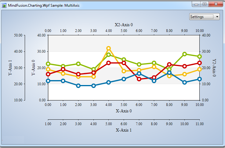
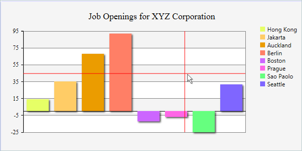
In this post we will create a bar chart with multiple series and two Y-axes. We will do this exclusively in XAML, with the only exception a small code snippet that assigns one of the Y-axis to one of the bar series.
I. Setup of the Project.
We create a new WPF project. The necessary libraries are MindFusion.Charting.Wpf and MindFusion.Licensing. You can add them manually or drag the Bar chart control from the Visual Studio toolbox. In both cases your Window tag should have:
xmlns:my="clr-namespace:MindFusion.Charting.Wpf;assembly=MindFusion.Charting.Wpf"
Then we create the bar chart. If you’ve dragged the bar chart control the XAML code has been auto generated.
<my:barchart bartype="Vertical" title="Product Statistics" name="barChart">
</my:barchart>
II. The Axes
The chart has two Y-axes. We create a new AxesCollection and assign it to the YAxes property:
<my:barchart.yaxes>
     <my:axescollection>
         <my:axis horlabelalignment="Left" titleoffset="10" minvalue="0" maxvalue="80" tick="2" title="Cost of Raw Materials" titlerotationangle="270" interval="8" labeltype="AutoScale">
          </my:axis>
  </my:axescollection>
</my:barchart.yaxes>
Let’s explain the code above line by line. First, the HorLabelAlignment property specifies how the labels will be aligned relative to the axis. If this was an Y2-axis, we would need to set the property to “Right”. Since this is an Y-axis and we want the labels to appear left to the axis, we align them “Let”. The TitleOffset, TitleRotationANgle and Title properties all specify how the label appears – it has an offset of 10 pixels measured from the longest label at the axis (if present). It is rotated so that it doesn’t take much space and its value is “Cost of Raw Materials”.
The MinValue, MaxValue and Interval properties define the axis – it’s start and end values and the span between each pair of adjacent intervals. Tick specifies the length of the ticks – the small lines drawn at each interval point. You can hide them by setting the Tick property to 0.
Finally, the LabelType property. It takes one of the LabelType enumeration values and sets what kind of labels will be drawn at the axis. This Y-axis will show the scale labels.
Then, we add the code for the second Y-axis. We just place the following XAML:
<my:axis horlabelalignment="Left" labels="{StaticResource YLabels}" titleoffset="10" minvalue="0" maxvalue="10" title="Marketing Costs" titlerotationangle="270" interval="1" tick="2" customlabelposition="AutoScalePoints" labeltype="CustomText">
     </my:axis>
Most of the properties are the same as with the previous axis. The first difference is the value of the LabelType property. “Custom Text” means we will provide the labels for the axis. We create them as a static resource of strings:
<x:array x:key="YLabels" type="sys:String">
        <sys:string>0%</sys:string>
        <sys:string>7%</sys:string>
        <sys:string>6.5%</sys:string>
        <sys:string>6.3%</sys:string>
        <sys:string>6.2%</sys:string>
        <sys:string>5.8%</sys:string>
        <sys:string>5.5%</sys:string>
        <sys:string>5.1%</sys:string>
        <sys:string>4.9%</sys:string>
        <sys:string>4.5%</sys:string>
        <sys:string>4.2%</sys:string>
     </x:array>
Then we assign them to the Labels property. The CustomLabelPosition defines where the labels will be drawn – at the position of the data points of the series, bound to this axis or at the intervals of the auto scale. In this case we render the labels at the auto scale points.
The X-axis is defined similarly:
<my:barchart.xaxes>
     <my:axescollection>
       <my:axis labels="{StaticResource XLabels}" titleoffset="10" minvalue="0" maxvalue="6" title="Month" interval="1" customlabelposition="ChartDataPoints" labeltype="CustomText">
       </my:axis>
      </my:axescollection>
   </my:barchart.xaxes>
The notable difference here is that we want the labels to appear at the location of chart data. That is why we will need to add a few lines of code later. But now let’s move to the series.
III. The Series
The series in this sample are two. Here is the markup for the first one:
<my:barseries xdata="1, 2, 3, 4, 5, 6" ydata="23, 34, 12, 45, 77, 19" fills="{StaticResource BrushCollection1}" title="Shoes" tooltiptype="ChartData">
     <my:barseries.effect>
           <dropshadoweffect shadowdepth="3" opacity="0.7">
     </dropshadoweffect></my:barseries.effect>
   </my:barseries>
The series are added directly within the tag, because Series is the default content property of the chart control. The Title, though not visible at the series itself is important for the legend as we will see later. The fills for the series are a collection of brushes, which we have defined as a static resource just like we defined the labels. The data for the series is set with the XData and YData properties. We add a visual effect to make the chart more appealing.
The second series is similar to this one, so we won’t deal with it now.
IV. The Legend
The control supports unlimited number of legends. They are of two types – SeriesLegend and ChartLegend. In our case we use the ChartLegend. This legend defines the legend labels and brushes based on a list of ChartSeries, that were assigned to it. Both types of legends are ItemsControl-s.
<my:barchart.legends>
  <my:chartlegend x:name="Legend" background="#FFFAFAFA" my:layoutpanel.dock="Bottom" orientation="Horizontal" horizontalalignment="Center" margin="5" cornerradius="5" borderthickness="1" borderbrush="#FFCECEFF" itemssource="{Binding ElementName=barChart}">
     <my:chartlegend.effect>
          <dropshadoweffect shadowdepth="3" opacity="0.7">
     </dropshadoweffect></my:chartlegend.effect>
   </my:chartlegend>
 </my:barchart.legends>
As you can see, the ItemsSource for the legend is the chart. This means it takes all ChartSeries, which are the default content property of the chart and renders their labels.
V. Binding the X-Axis to a ChartSeries
As you might remember the custom labels at the X-axis are bound to the location of the chart data. This means, we must tell the ChartSeries that it should use exactly the X-axis where we want the labels to appear. This is done with the ChartSeries.XAxis property. We do this in the code behind file.
   if (barChart.XAxes.Count > 0 && barChart.Series.Count > 0)
    {
       Axis xAxis = barChart.XAxes[0];
       BarSeries series = (BarSeries)barChart.Series[0];

       series.XAxis = xAxis;
    }
And this is everything. Here is the final chart:
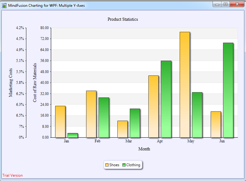
WPF Chart Control: Bar Chart With Multiple Axes