Different-size Icons in the Js Diagram NodeListView

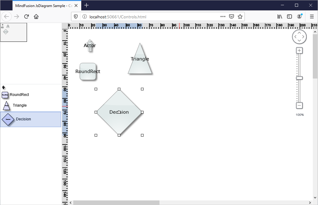
In this blog post we will learn how to add a NodeListView control to a Diagram and how to set its ShapeNode -s to a different size. When ShapeNode -s are dragged from the NodeListView the instances that will be created are proprtional in size to the size of the ShapeNode that was dragged. Here is a screenshot of the final application:

I. General Settings

We create an HTML page and add to it references to the MindFusion JavaScript files that represent the diagramming library:

<script src="MindFusion.Common.js" type="text/javascript"></script>
<script src="MindFusion.Diagramming.js" type="text/javascript"></script>
<script src="Controls.js" type="text/javascript"></script>

The last reference is to the Controls JavaScript file, where the code for the application is located.

Then we create two Canvas-es: one is for the NodeListView and the other is for the Diagram The NodeListView component is bound to the canvas element below:

<div style="width: 200px; height: 100%; overflow-y: auto; overflow-x: hidden; position: absolute; top: 201px; left: 0px; right: 0px; bottom: 0px;">
    <canvas id="nodeList" width="200"></canvas>
</div>
......
<!-- The Diagram component is bound to the canvas element below -->
<div style="position: absolute; left: 0px; top: 0px; right: 0px; bottom: 0px; overflow: auto;"> <canvas id="diagram" width="2100" height="2100">
This page requires a browser that supports HTML 5 Canvas element.
</canvas>
</div>

Both the Diagram and NodeListView controls require Canvas elements to render themselves onto.

II. Initializing the Controls

We create the Diagram using the id that we’ve provided to its Canvas in the web page:

// create a Diagram component that wraps the "diagram" canvas
diagram = Diagram.create(document.getElementById("diagram"));
diagram.setBounds(new MindFusion.Drawing.Rect(0, 0, 500, 500));

We set a bigger size to the diagram in order to make it fill the web page.

We create the NodeListView instance the same way we created the diagram:

// create a NodeListView component that wraps the "nodeList" canvas
var nodeList = MindFusion.Diagramming.NodeListView.create(document.getElementById("nodeList"));
nodeList.setTargetView(document.getElementById("diagram"));

Now we need to add the settings that will make the ShapeNode -s different in size when rendered onto the list:

nodeList.setIconSize(null);

The setIconSize method is used to specify the default size of nodes in the NodeListView When we set the size to null, the control draws each node in the NodeListView with the size that was assigned to it:

function initNodeList(nodeList, diagram)
{
    // add some nodes to the NodeListView
    var shapes = ["Actor", "RoundRect", "Triangle", "Decision"];
    for (var i = 0; i < shapes.length; ++i)
    {
        var node = new MindFusion.Diagramming.ShapeNode(diagram);
        node.setText(shapes[i]);
        node.setShape(shapes[i]);
        node.setBounds(new MindFusion.Drawing.Rect(0, 0, (i+1)*10, (i+1)*10));
        nodeList.addNode(node, shapes[i]);
    }
}

Here we increase the size of wach ShapeNode with 10 points on each itereation. This makes the icons with various size but does not create them with different size when dropped on the diagram. In order to do this we must set:

nodeList.setDefaultNodeSize (null);

setDefaultNodeSize specifies the size of those nodes that are created when a ShapeNode is dropped on the Diagram area. By setting this size to null we tell the control to read the size of the new ShapeNode from the instance in the NodeListView control.

With that our sample is ready. You can download the source code from this link:

JavaScript NodeListView with Various Size Nodes: Download Sample

About Diagramming for JavaScript: This native JavaScript library provides developers with the ability to create and customize any type of diagram, decision tree, flowchart, class hierarchy, graph, genealogy tree and more. The control offers rich event set, numerous customization options, animations, graph operations, styling and themes. You have more than 100 predefined nodes, table nodes and more than 15 automatic layout algorithms. Learn more about Diagramming for JavaScript at https://mindfusion.eu/javascript-diagram.html.

JavaScript Diagram with Chart Nodes

In this blog post we will create DiagramNode instances that render a chart. The charts get resized according to the size of the node. We will use two MindFusion libraries for JavaScript – Charting and Diagramming. You can run the sample online from this link:

I. Project Setup

We will use a web page that will hold the HTML Canvas element that we need in order to render the diagram:

<div style="width: 100%; height: 100%; overflow: scroll;">
    <canvas id="diagram" width="2100" height="2100" style="background:#f0f0f0;">
        This page requires a browser that supports HTML 5 Canvas element.
    </canvas>
</div>

We give the diagram’s Canavs big width and height and we also provide an id. The id is important because we will need to access the Canvas from code.

We add the scripts that we need in order to use the Charting and Diagramming libraries:

<script src="Scripts/MindFusion.Common.js" type="text/javascript"></script>
<script src="Scripts/MindFusion.Diagramming.js" type="text/javascript"></script>
<script src="Scripts/MindFusion.Charting.js" type="text/javascript"></script>

We add the references at the end of the web page, just before the closing BODY tag. We also need to add a reference to a JavaScript file that will hold the code for our sample. We name it “PieNode.js”.

II. The Diagram

In the code-behind file we create a diagram instance. We use the DOMContentLoaded event to initialize our diagram:

document.addEventListener("DOMContentLoaded", function ()
{
// create a Diagram component that wraps the "diagram" canvas
diagram = MindFusion.Diagramming.Diagram.create(document.getElementById("diagram"));
diagram.setBehavior(MindFusion.Diagramming.Behavior.LinkShapes);
diagram.setLinkHeadShapeSize(2);
diagram.setBounds(new Rect(0, 0, 2000, 2000));

// draw a pie when the user creates a node
diagram.addEventListener(Events.nodeCreated, onNodeCreated);

});

The Behavior enumeration lists various modes of behavior for the diagram. We choose Behavior.LinkShapes, which creates nodes, when the mouse is dragged
over an empty area and connects the nodes if the mouse is dragged from an existing node. We set tbe bounds of the diagram to a big Rect which guarantees that the user can draw nodes anywhere on the visible area. When the user draws towards the edge of the browser, the diagram control expands automatically.

Finally, we add an event handler for the nodeCreated event.

//nodeCreated event handler
function onNodeCreated(sender, args)
{
	var node = args.getNode();
	
	var nBounds = node.getBounds ();
	var topLeftCoord = diagram.docToClient(nBounds.topLeft());
	var bottomRightCoord = diagram.docToClient(nBounds.bottomRight());
	.......................................................
}

At first we get the node that was created. Then we need to get its actual size, for which we use the docToClient method that converts between diagram and browser measure units. We get the two coordinates of the node’s bounding rectangle.

We create then a Canvas, which takes the size of the node’s rectangle:

............................................
.....................................................
var pieChartCanvas = document.createElement('canvas');
pieChartCanvas.width = bottomRightCoord.x - topLeftCoord.x;
pieChartCanvas.height = bottomRightCoord.y - topLeftCoord.y;

We then add this temp canvas to the body of the web page and call a method “createPie” where we draw the pie chart. Once the chart is drawn we get the URL of the image and set is to the node with the setImageLocation method. We remove the Canvas from the tree with the elements because we want to use for the next node.

//create a temporary Canvas for the pie chart
//to draw itself upon
document.body.appendChild(pieChartCanvas);
createPie(pieChartCanvas);
var pieImageLocation = pieChartCanvas.toDataURL();
node.setImageLocation(pieImageLocation);
document.body.removeChild(pieChartCanvas);

III. The Chart

We create a pie chart in the Canvas provided to the createPie method:

//draw a pie chart on the provided canvas
function createPie(pieChartCanvas)
{
	var pieChart = new Controls.PieChart(pieChartCanvas);
	pieChart.startAngle = 45;			
	pieChart.showLegend = false;
	pieChart.title = "Sales";
	pieChart.titleMargin = new Charting.Margins(0, 10, 0, 0);
	pieChart.chartPadding = 3;
...........................

We set some appearance properties to make the chart look the way we want – change the start angle of the pie, add a title and title margin, hide the legend. Then we create a PieSeries which holds the data and the labels of the pie. We assign the PieSeries to the series property of the pie chart:

// create sample data
var values = new Collections.List([20.00, 30.00, 15.00, 40.00]);
pieChart.series = new Charting.PieSeries(
	values,
	new Collections.List(["20", "30", "15", "40"]),
null);

We style the chart with an instance of the PerElementSeriesStyle class, which colors all elements of a Series with the consequtive Brush and stroke from its brushes and strokes collections. Then we adjust the dataLabelsFontSize to match the size of the canvas. We make the labels be drawn with a white brush using the dataLabelsBrush property. Finally we call draw to render the pie.

var brushes = new Collections.List(
		[
			new Drawing.Brush("#0455BF"),
			new Drawing.Brush("#033E8C"),
			new Drawing.Brush("#F24405"),
			new Drawing.Brush("#F21905")
		]);

	var seriesBrushes = new Collections.List();
	seriesBrushes.add(brushes);

	var strokes = new Collections.List(
		[
			new Drawing.Brush("#c0c0c0")
		]);

	var seriesStrokes = new Collections.List();
	seriesStrokes.add(strokes);

	pieChart.plot.seriesStyle = new Charting.PerElementSeriesStyle(seriesBrushes, seriesStrokes);
	pieChart.theme.highlightStroke = new Drawing.Brush("#000063");
	pieChart.theme.dataLabelsFontSize = pieChartCanvas.height/20;
	pieChart.theme.dataLabelsBrush = new Drawing.Brush("#FFFFFF");

	pieChart.draw();

And with that the sample is ready. You can download the source code together with all MindFusion JavaScript libraries used from:

https://mindfusion.eu/samples/javascript/diagram/PieNodes.zip

About Diagramming for JavaScript: This native JavaScript library provides developers with the ability to create and customize any type of diagram, decision tree, flowchart, class hierarchy, graph, genealogy tree and more. The control offers rich event set, numerous customization options, animations, graph operations, styling and themes. You have more than 100 predefined nodes, table nodes and more than 15 automatic layout algorithms. Learn more about Diagramming for JavaScript at https://mindfusion.eu/javascript-diagram.html.
About Charting for JavaScript: MindFusion library for interactive charts and gauges. It supports all common chart types including 3D bar charts. Charts can have a grid, a legend, unlimited number of axes and series. Scroll, zoom and pan are supported out of the box. You can easily create your own chart series by implementing the Series interface.
The gauges library is part of Charting for JavaScript. It supports oval and linear gauge with several types of labels and ticks. Various samples show you how the implement the gauges to create and customize all popular gauge types: car dashboard, clock, thermometer, compass etc. Learn more about Charting and Gauges for JavaScript at https://mindfusion.eu/javascript-chart.html.

Custom Nodes in WPF Diagram

Here we will look how to define custom diagram nodes in the WPF diagram control, how to style them, how to make their properties appear in the property grid and how to save and load them with the diagram’s saveToXml and loadFromXml methods.

Here is a screenshot of our SubjectNode custom node class that is used in an application for a school curriculum:

I. XAML Template

You will need to add a XAML template for the node us you are creating a custom node because you want to have special-looking nodes. Let’s create a node that has 3 text fields and a background. We will declare the template for this node that we call SubjectNode in XAML this way:

<style targettype="local:SubjectNode">
    <Setter Property="Template">
      <Setter.Value>
        <DataTemplate DataType="local:SubjectNode">
          <Grid>

            <Rectangle
		Stroke="{Binding Stroke}"
		Fill="{Binding Background}" />

            <Grid>              

               <StackPanel Margin="4,8,0,0"  Orientation="Vertical" Grid.Column="1">
                <TextBlock Text="{Binding Subject}" FontWeight="800" Foreground="Black" />
                <TextBlock Text="{Binding Teacher}" Foreground="Blue" />
                <TextBlock Text="{Binding Remarks}" FontSize="9" Foreground="Black" />
              </StackPanel>
            </Grid>

          </Grid>
        </DataTemplate>
      </Setter.Value>
    </Setter>
  </style>

That goes in the contents of <ResourceDictionary>…..</ResourceDictionary> in the xaml file where you store this resourrce dictionary.

You see here that we use a gird as the principal layout container. There we add a rectangle, whose Fill property is bound to a property called Background in the SubjectNode. Next we have another grid that holds a StackPanel. The stack panel is with vertical orientation and it arranges the three TextBlock-s for the three custom fields of the node.

II. Declaring the Custom Node Class

When you create a custom node you need to inherit the TemplatedNode class. In the static construcotr you should call OverrideMetadata on the DefaultStyleKeyProperty to make it use the template that we’ve declared in XAML:

public class SubjectNode : TemplatedNode
{
	static SubjectNode()
	{
		DefaultStyleKeyProperty.OverrideMetadata(
			typeof(SubjectNode), new FrameworkPropertyMetadata(typeof(SubjectNode)));
}

public SubjectNode()
{			
}

Then we declare a constructor without any parameters that is required for the node to be created in XAML. If you want users to be able to create instance of the SubjectNode through drag and drop, you need to declare one more constructor:

	// Required for creating nodes by dragging them from the NodeListView
public SubjectNode(SubjectNode prototype) : base(prototype)
{
	Subject = prototype.Subject;
	Teacher = prototype.Teacher;
	Remarks = prototype.Remarks;
}

III. Properties

We declare the properties that we want: Subject, TeacherName, Remarks and Background as dependency properties the standard way:

public Brush Background
{
	get { return (Brush)GetValue(BackgroundProperty); }
	set { SetValue(BackgroundProperty, value); }
}

public static readonly DependencyProperty BackgroundProperty = DependencyProperty.Register(
	"Background",
	typeof(Brush),
	typeof(SubjectNode),
	new PropertyMetadata(new SolidColorBrush(Color.FromRgb(223, 235, 250))));

and for the text properties:

public string Remarks
{
	get { return (string)GetValue(RemarksProperty); }
	set { SetValue(RemarksProperty, value); }
}

public static readonly DependencyProperty RemarksProperty = DependencyProperty.Register(
	"Remarks",
	typeof(string),
	typeof(SubjectNode),
	new PropertyMetadata(""));

If we want the properties to be listed in a property grid we need to add a new class that inherits from DiagramNodeProperties. In it we do nothing but list the custom properties together with their type:

public class SubjectNodeProperties : DiagramNodeProperties
{
        internal string Subject;
	internal string Teacher;
	internal string Remarks;
	internal Brush Background;
} 

IV. More Options

Standard diagram nodes support undo and redo as well serialization out of the box. If you want your custom class to support those features as well you need to implement a few more methods. The methods to support undo/redo are SaveProperties and RestoreProperties. They take an instance of the DiagramItemProperties class that allows you to transfer data between the instance of the current node and its DiagramItemProperties instance that store the values of the node’s properties:

protected override void RestoreProperties(DiagramItemProperties props)
{
	base.RestoreProperties(props);
	var state = (SubjectNodeProperties)props;
	Subject = state.Subject;
	Teacher = state.Teacher;
	Remarks = state.Remarks;
	Background = state.Background;
}

protected override void SaveToXml(XmlElement xmlElement, XmlPersistContext context)
{
	base.SaveToXml(xmlElement, context);
	context.WriteString(Subject, "Subject", xmlElement);
	context.WriteString(Teacher, "Teacher", xmlElement);
	context.WriteString(Remarks, "Remarks", xmlElement);
	context.WriteBrush(Background, "Background", xmlElement);
}

The Diagram uses XML for serialization, so if you want your node to be saved and loaded correctly through the Diagram‘s saveToXml and loadFromXml methods you should implement SaveToXml and LoadFromXml. There you write the values o the custom properties of SubjectNode to XML elements and read them from XML elements as well:

protected override void SaveToXml(XmlElement xmlElement, XmlPersistContext context)
{
	base.SaveToXml(xmlElement, context);
	context.WriteString(Subject, "Subject", xmlElement);
	context.WriteString(Teacher, "Teacher", xmlElement);
	context.WriteString(Remarks, "Remarks", xmlElement);
	context.WriteBrush(Background, "Background", xmlElement);
}

protected override void LoadFromXml(XmlElement xmlElement, XmlPersistContext context)
{
	base.LoadFromXml(xmlElement, context);
	Subject = context.ReadString("Subject", xmlElement);
	Teacher = context.ReadString("Teacher", xmlElement);
	Remarks = context.ReadString("Remarks", xmlElement);
	Background = context.ReadBrush("Background", xmlElement);
}

You can download the sample that uses custom SubjectNode from https://mindfusion.eu/samples/wpf/diagram/Curriculum.zip

About Diagramming for WPF: This is the right tool to create flowcharts in WPF that always meet your requirements. The library offers more than 100 predefined node shapes, extensive event set and more than 15 exporters and importers. Each diagram that you build has a completely customizable look through styles, themes and appearance properties for each part of the flowchart. The numerous samples and detailed documentation help you learn quickly how to integrate the component into your own application. You can download the trial version, which has no feature restrictions and does not expire from the WPF Diagram Page on MindFusion website.

Custom Diagram Nodes With Clipped Images

In this blog post we will create an org chart diagram that uses custom nodes for each employee. The diagram will be created with the Diagramming for JavaScript library. For the nodes we use the CompositeNode class, which enables us to create diagram nodes whose appearance can be defined via composition of components and layout containers.

Click on the image below to run the sample:

Custom Composite Nodes with Clipped Images

I. References and HTML Settings

The first thing that we’ll do is create a web page for the sample and add the references to the necessary JavaScript files. In the section of the page we provide a reference to the following jQuery files:

<script src="common/jquery.min.js"></script>
<script src="common/jquery-ui.min.js"></script>

At the end of the HTML page, just before the closing tag we place references to the two JavaScript files used by the Diagramming library:

<script src="MindFusion.Common.js"></script>
<script src="MindFusion.Diagramming.js"></script>

Our sample has its JS code in a separate file called Script.js. We place a reference to it as well:

<script src="Script.js"></script>

The diagram library needs an HTML Canvas to draw itself onto. We add one in the middle of the web page:

<div style="width: 100%; height: 100%; overflow: auto;">
<canvas id="diagram" width="2100" height="2100">
This page requires a browser that supports HTML 5 Canvas element.
</canvas>
</div>

II. The OrgChartNode

In the Script.js file we first add mappings to some enums and classes that we’ll use from the diagram library:

var Diagram = MindFusion.Diagramming.Diagram;
var CompositeNode = MindFusion.Diagramming.CompositeNode;
var Behavior = MindFusion.Diagramming.Behavior;

var Alignment = MindFusion.Drawing.Alignment;
var Rect = MindFusion.Drawing.Rect;

Now we call the classFromTemplate method of CompositeNode that generates a node class using a JSON template that we’ll provide:

var OrgChartNode = CompositeNode.classFromTemplate("OrgChartNode",
{
component: "GridPanel",
rowDefinitions: ["*"],
columnDefinitions: ["22", "*"],
...............

In this code we indicate the panel that will be used by the CompositeNode is a GridPanel. Then we declare two lists that set the width and height of the grid rows and columns. The number of members in each array indicate how many rows/columns the grid has. In our case we have one row that takes all place and two columns: one is with fixed with of 22 pixels, the other takes the rest of the available space.

The JSON definition of the CompositeNode continues with an array with the children:

children:
[
{
component: "Rect",
name: "Background",
pen: "black",
brush: "white",
columnSpan: 2
},
{
component: "Image",
name: "Image",
autoProperty: true,
location: "ceo.png",
margin: "1",
imageAlign: "Fit"
},

The first child uses a Rect component that we call “Background”. It is rendered with a white brush, has a black outline and spans on two columns e.g. it fills all available space or each node.

The second child is an image. Note the row:

autoProperty: true

That means that we want to be able to access this component as a property. In such cases the library generates automatic set/get methods using the name of the component. In our sample they will be setImage / getImage.

The third child is a StackPanel component. This is the container for the text labels next to the node. This child has its own collection of children nodes:

component: "StackPanel",
orientation: "Vertical",
gridColumn: 1,
margin: "1",
verticalAlignment: "Near",
children:
[
{
component: "Text",
name: "Title",
autoProperty: true,
text: "title",
font: "Arial bold"
},
{
component: "Text",
name: "FullName",
autoProperty: true,
text: "full name",
pen: "blue",
padding: "1,0,1,0"
},
{
component: "Text",
name: "Details",
autoProperty: true,
text: "details",
font: "Arial 3"
}

The children of this new StackPanel are text components, which are called Title, FullName and Details. They have their autoProperty set to true, which means we can access their value through automatic setter and getter methods.

III. The Diagram and the Nodes

in the read() function of the document we create an instance of the Diagram class using a reference to the canvas we’ve created in section I.

// create a Diagram component that wraps the "diagram" canvas
diagram = Diagram.create($("#diagram")[0]);

Then we enable interactive drawing of custom nodes by calling setCustomNodeType and Then we enable interactive drawing of custom nodes by calling setCustomNodeType and setBehavior:

// enable drawing of custom nodes interactively
diagram.setCustomNodeType(OrgChartNode);
diagram.setBehavior(Behavior.Custom);

The behavior o the diagram is set to Custom, which means that when the user starts drawing nodes the library shall draw nodes specified by CustomNodeType. The setCustomNodeType method tells the diagram that these custom nodes are of type OrgChartNode.

Now it is really easy and intuitive to create nodes:

var node1 = new OrgChartNode(diagram);
node1.setBounds(new Rect(25, 15, 60, 25));
node1.setTitle("CEO");
node1.setFullName("John Smith");
node1.setDetails(
"Our beloved leader. \r\n" +
"The CEO of this great corporation.");
node1.setImage("ceo.png");
diagram.addItem(node1);

We create a few more nodes using the same code and we bind them in a hierarchy. The links among the nodes are created by calling the Diagram Factory createDiagramLink method of the diagram Factory class:

diagram.getFactory().createDiagramLink(node1, node2);
diagram.getFactory().createDiagramLink(node1, node3);
diagram.getFactory().createDiagramLink(node1, node4);
diagram.getFactory().createDiagramLink(node4, node5);

IV. Rounded Images

We want to add now a custom feature to the node – instead of drawing the image as a rectangle we want to clip it and show it as an ellipse. We’ll do this by using a method that replaces the standard setImage method.

The new method is called createImageClip and takes as parameters two objects: one is the image URL and the other is the node that uses this image.

function createImageClip(path, node)
{
var canvas = document.createElement('canvas'),
ctx = canvas.getContext('2d'),
img = document.createElement('img');
..............

We create two HTMLElements – canvas and image, and we get the 2D context of the Canvas. Then, in an event handler of the onload event of the image we clip the canvas to an area defined by a Path. The path reads the size of the image and creates a full arc e.g. a circle inside that rectangle. Then the context draws the image and the new canvas is set as an image to the node using the setImage method:

img.src = path;
img.onload = function ()
{
canvas.width = img.width;
canvas.height = img.height;
var halfSize = img.width / 2;
ctx.save();
ctx.beginPath();
ctx.arc(halfSize, halfSize, halfSize, 0, Math.PI * 2, true);
ctx.closePath();
ctx.clip();

ctx.drawImage(img, 0, 0, img.width, img.height);

node.setImage(canvas.toDataURL());
};

You can use this approach to create clippings of images with variable shape.

Now instead of calling:

node1.setImage("ceo.png");

we call our custom method this way:

createImageClip("ceo.png", node1);

We do this for all nodes in the org chart.

That’s the end of this tutorial. You can download the sample together with all JavaScript libraries used from this link:

Custom Nodes With Image Clipping in JavaScript: Sample Download

Find out more about Diagramming for JavaScript at https://mindfusion.eu/javascript-diagram.html

Fishbone (Ishikawa) Diagram in WPF

In this blog post we will use the WPF Diagram component to build a fishbone diagram as described in the Wikipedia “Ishikawa diagram” article cited below:

“Ishikawa diagrams (also called fishbone diagrams, herringbone diagrams, cause-and-effect diagrams, or Fishikawa) are causal diagrams created by Kaoru Ishikawa that show the causes of a specific event.

Common uses of the Ishikawa diagram are product design and quality defect prevention to identify potential factors causing an overall effect. Each cause or reason for imperfection is a source of variation. Causes are usually grouped into major categories to identify and classify these sources of variation.” Read more on https://en.wikipedia.org/wiki/Ishikawa_diagram

This tutorial will demonstrate how easy it is to create the same diagram using the WPF diagram library and writing several lines of code. This is the final diagram:

Ishikawa (fishbone) diagram in WPF with MindFusion WPF Diagram library

Ishikawa (fishbone) diagram in WPF with MindFusion WPF Diagram library

I. General Settings

We create an empty WPF project in Visual Studio called “Fishbone”. There we create an Assemblies folder where we place the necessary dll-s:

  • MindFusion.Common.dll
  • MindFusion.Diagramming.Wpf.dll

Then in the MainWindow.xaml file we create a mapping to the Diagramming namespace:

<window x:class="Fishbone.MainWindow" xmlns="http://schemas.microsoft.com/winfx/2006/xaml/presentation" xmlns:x="http://schemas.microsoft.com/winfx/2006/xaml" xmlns:diag="http://mindfusion.eu/diagramming/wpf" title="MindFusion Fishbone Diagram" height="387" width="622">
</window>

Then we create the diagram inside the default Grid WPF control:

<grid>
 <diag:fishbonediagram x:name="fdiag">
 </diag:fishbonediagram>
</grid>

The code creates a new instance of the FishboneDiagram* class with the name “fdiag”. We can use this name to access the object in code.

II. Diagram Data

The FishboneDiagram class exposes an ItemsSource property that provides data for the diagram. The data is an object that contains the label for the main Clause and a list with the labels of the subclauses. We create a special class called FBClause that will represent each fishbone:

public class FBCause
	{
		public FBCause()
		{
			SubCauses = new List();
		}
		public string Label { get; set; }
		public List SubCauses { get; set; }
	}

Next, we create the necessary fishbones this way:

var c1 = new FBCause { Label = "Measurements" };
c1.SubCauses = new List { "Inspectors", "Microscopes", "Calibration" };
…………

Once we are done with all fishbones, we create the model, which will serve as data source for the fdiag object:

var model = new List { c1, c2, c3, c4, c5, c6 };

III. Building the Diagram

Now that the data is ready, we can assign it to the ItemsSource property of the FishboneDiagram class:

fdiag.ItemsSource = model;

We will use the LabelPath and SubCausesPath properties to bind the respective fields of our FBClause objects to the correct data properties of FishboneDiagram:

fdiag.LabelPath = "Label";
fdiag.SubCausesPath = "SubCauses";

If the subclauses of your model were objects instead of strings as in our FBClause class you should use the SubLabelPath property to set the name of the field that will provide data for the subclause labels.

Finally we call the diagram’s ResizeToFitItems method to make sure all fishbones will be visible:

fdiag.ResizeToFitItems(30);

Compile and run the sample and you will see a perfect fishbone diagram.
That’s the end of our tutorial, you can download the sample together with all necessary dll-s from this link:

Download MindFusion Fishbone (Ishikawa) Diagram in WPF Sample

* The FishboneDiagram class will be officially released with the next version of the WPF Diagram Tool.

About Diagramming for WPF: This is the right tool to create flowcharts in WPF that always meet your requirements. The library offers more than 100 predefined node shapes, extensive event set and more than 15 exporters and importers. Each diagram that you build has a completely customizable look through styles, themes and appearance properties for each part of the flowchart. The numerous samples and detailed documentation help you learn quickly how to integrate the component into your own application. You can download the trial version, which has no feature restrictions and does not expire from the WPF Diagram Page on MindFusion website.