In this blog post we will bind to an MS SQL database called bookings. There we will select all data from a table named booking_data. The data is DateTime values. We will use the values to change the background of corresponding calendar cells in a simple Java application. The Java application renders a single-month calendar built with MindFusion Scheduler for Java library.
I. MS SQL EXPRESS Server Configuration
We download and install MS SQL EXPRESS server from https://www.microsoft.com/en-us/sql-server/sql-server-downloads. The installation also includes an application called “Sql Server Configuration Manager”. We start that application and click on the “SQL Services” tab. There we need to make sure that two services are running:
- SQL Server
- SQL Server Browser
You start these services by pressing the arrows in the toolbar at the top. If you cannot do this you need to change the Start Mode for this service. Double click it and in the Properties dialog that appears click on the “Service” tab. There you will find the “Start Mode” property and change it to “Manual”. Once you’ve done this you can start, stop or pause the service from the toolbar icons.
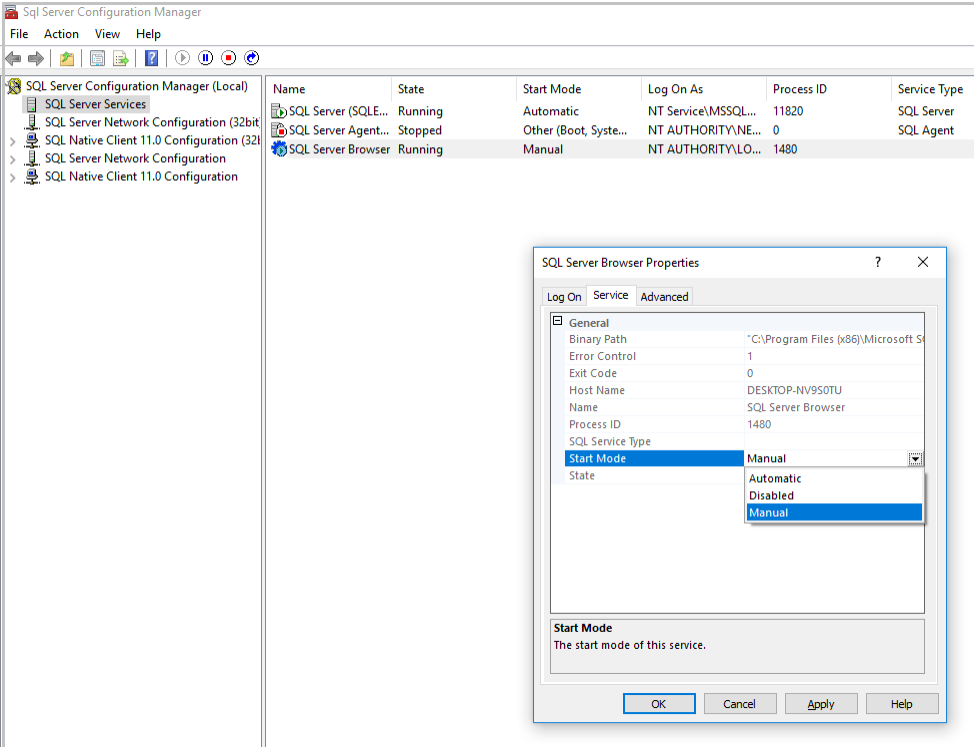
In order to start an SQL Server Service you might have to change its Start Mode to “Manual”.
Then we click on the “SQL Native Client” node and we select the “Client Protocols” tab. We make sure the TCP/IP Protocol is enabled.
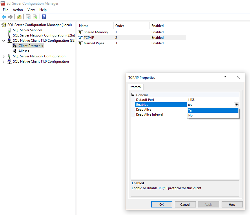
Make sure the TCP/IP protocol is enabled for the JDBC connection to succeed
The next step is to download Microsoft SQL Server Management Studio from https://docs.microsoft.com/en-us/sql/ssms/download-sql-server-management-studio-ssms?view=sql-server-2017
Once we install it and start it we can create a new database called bookings. We right click on the Databases menu and choose “New Database”. We call it “bookings”. Then we expand the tree under “bookings” and right click on the “Tables” node. A window opens where we can define the columns for our new table. We add two columns:
- id of type integer, which we set at primary key by right-clicking on it.
- booked_date of type DateTime which will hold the dates that are booked.
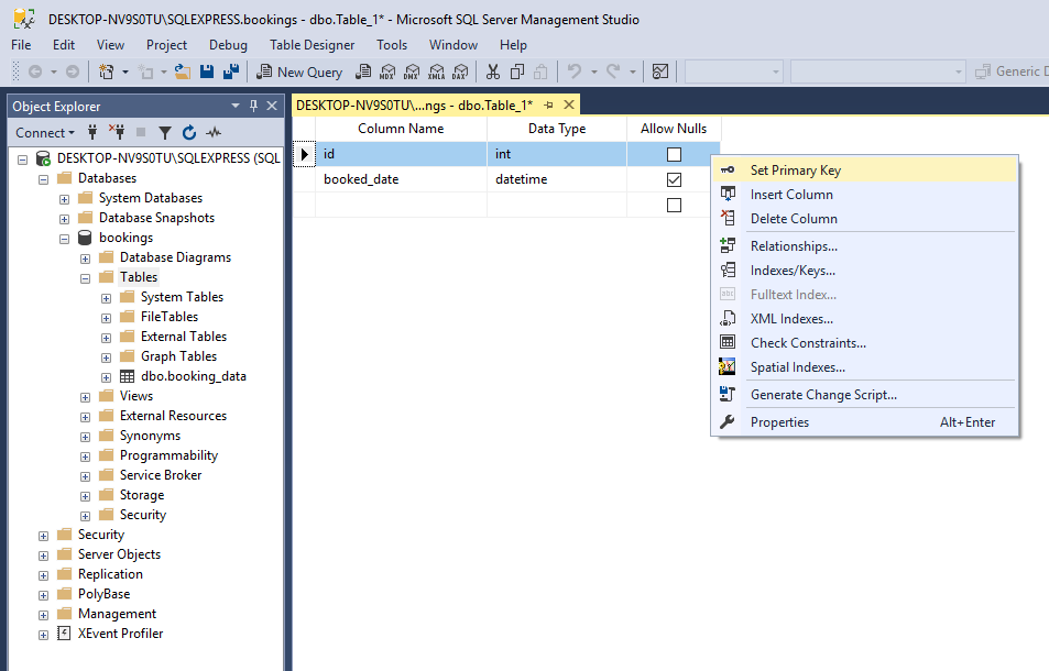
MS SQL Server management Studio: the dialog for defining a new table
After we are done we choose save and at this point we can provide a name for our table. We call it booking_data. With the table defined we right-click on it and choose “Edit Top 200 Rows”. There we add just three days (Jan 16th, Jan 22nd, Jan 26th) all of which in the current month. The data is auto-saved.
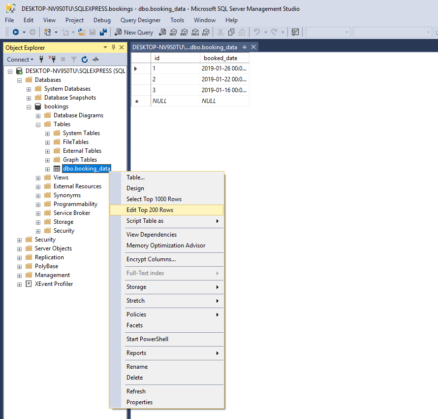
MS SQL Server Management Studio: here is how you edit the table data
The next step is to create a new user that will connect to this database. We click the “Security” node on the navigation tree and then “Logins”. Right-click and we choose “New Login”. In the dialog that opens we provide username and password. In order to do that we need to have the Login method set to “SQL Server authentication”. In the next tab “Server Roles” the new user must have “public” role. Then in “User Mapping” we tick the “bookings” database. In the Securables tab in the “Grant” grant column for the user we tick the “Connect SQL” permission. Then we close the dialog.
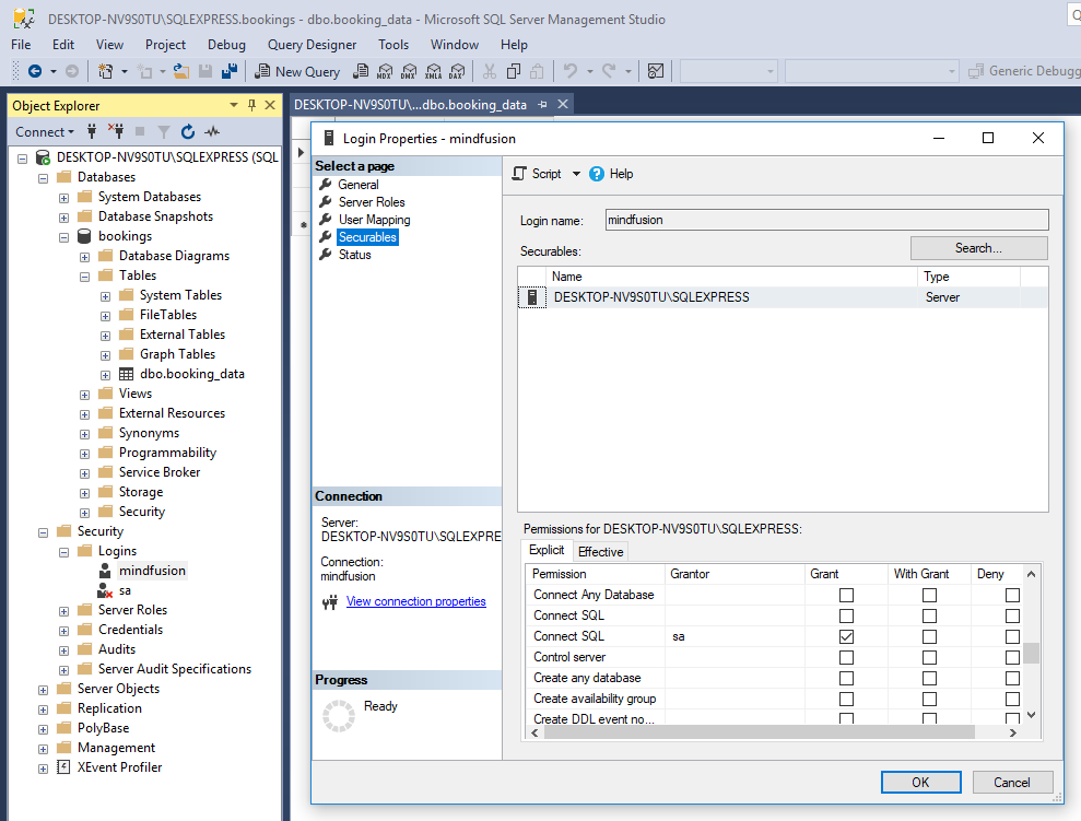
Grant the new user the right to perform an SQL connection.
We get back to the bookings database and right-click on it. We choose “Properties” and from the dialog we click on the “Permissions” menu. There we select the user we’ve just created and in the Grant column of the underlying table we grant her the “Select” permission.
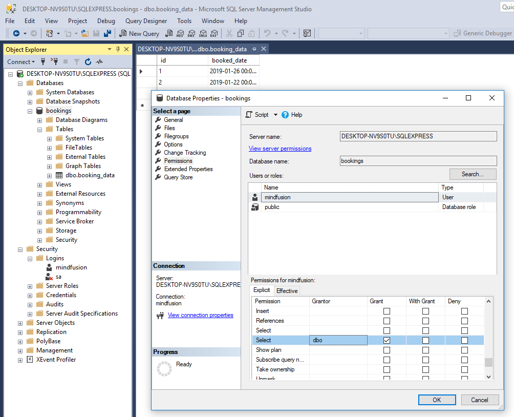
Grant the DB user ‘Select’ permission to perform the required SQL query
With that the setup of our server and user is ready.
II. JDBC Driver & MS SQL Express Connection Properties
We download Microsoft’s JDBC Driver for MS SQL Server from this link: https://docs.microsoft.com/en-us/sql/connect/jdbc/microsoft-jdbc-driver-for-sql-server?view=sql-server-2017 and extract it. Next we create a new Java project. For this project we’ve used IntelliJ IDEA but any other Java IDE will do. In the project tree to the right we create a subfolder that we call “libs”. There we copy the jar of JDBC driver from the folder where we extracted it. Microsoft provides two versions of the driver depending on the JRE that you use. In our case we choose the version for JRE 10, which is called mssql-jdbc-7.0.0.jre10.jar. Next we right-click on the name of our project and select “Open Module Properties”. In the dialog we choose the “Modules” menu and there we click on the “Dependencies” tab and select the mssql-jdbc-7.0.0.jre10.jar module.
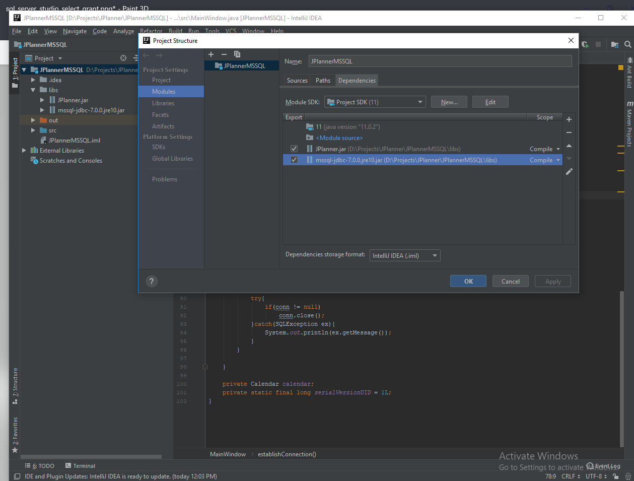
Configuring the IntelliJ Project to include the JDBC driver module
We click on the src folder of the project and add a new class, which we call MainWindow.java. In it we write the method establishConnection. This method is responsible for connecting to the MS SQL database “bookings”. Here is the code that makes the connection:
private void establishConnection() throws ClassNotFoundException
{

Connection conn = null;
PreparedStatement pst;

try {
// db parameters
String sql = "SELECT booked_date FROM booking_data";

String userName = "mindfusion";
String password = "mf123";

String url = "jdbc:sqlserver://DESKTOP-NV9S0TU\\SQLEXPRESS;databaseName=bookings;";

Class.forName("com.microsoft.sqlserver.jdbc.SQLServerDriver");
conn = DriverManager.getConnection(url, userName, password);

pst = conn.prepareStatement(sql);
ResultSet rs = pst.executeQuery();
If you’ve followed strictly the steps we’ve outlined so far at this point you would successfully connect to your MS SQL Server with the credentials you’ve set up following the guide so far.
III. The Schedule Application
We download MindFusion Java Swing Scheduler from https://mindfusion.eu/java-scheduler.html and unzip it. We copy JPlanner.jar in the libs folder of the project and add it as a project dependency from the “Open Module Settings” menu. Then we define a Calendar variable and assign it to a new instance of the Calendar class.
public MainWindow() throws ClassNotFoundException
{
setDefaultCloseOperation(EXIT_ON_CLOSE);
setSize(368, 362);
setTitle("MindFusion.Scheduling Sample: Minimal Application");

calendar = new Calendar();
calendar.setTheme(ThemeType.Light);
..................
..................
..................

establishConnection();
}

private Calendar calendar;
At the end of the method we call establishConnection and connect to the MS SQL Server.
IV. Styling the Calendar Dates
The aim of our sample application shall be to color those cells of the calendar that correspond to the dates we’ve read from the database. In order to do this we use the DateStyle class that sets some useful appearance properties to a range of cells that are specified with the setFrom and setTo methods. We use setBrush to change the background of the cell.
while (rs.next()) {
System.out.println(rs.getString("booked_date"));
Date date = rs.getDate("booked_date");

DateStyle dStyle = new DateStyle();
dStyle.setFrom(new DateTime(date));
dStyle.setTo(new DateTime(date));
Style style = new Style();
style.setBrush(new SolidBrush(Color.pink));
dStyle.setStyle(style);

calendar.getDayStyles().add(dStyle);

}
Finally we add the style to the DayStyles collection of the calendar.
Here is the final application:
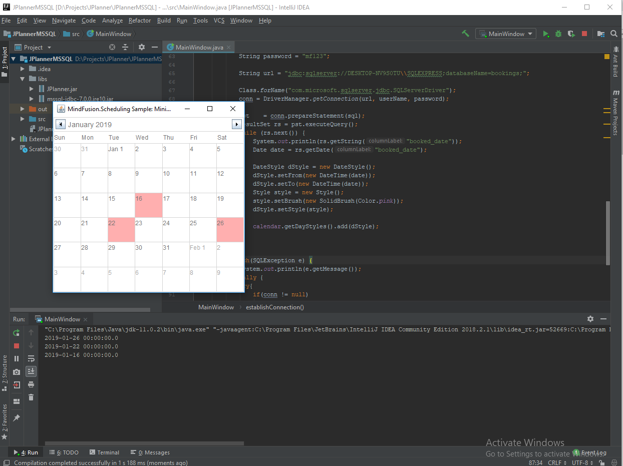
MindFusion Java Swing application with the Scheduling library and MS SQL Server
You can download the project together with the MS SQL Server JDBC driver library and the scheduling library from this link:
Download JPlanner Sample Application That Uses MS SQL Server JDBC Connection
About MindFusion Scheduling for Java Swing: The library provides extensive feature-set for creating and customizing all sorts of calendars, task lists, time-management tables, resource allocation tables and other. It boasts various options for customizing appearance and numerous events for handling user actions. The distribution archive includes a lot of samples and extensive documentation. Learn more at https://mindfusion.eu/java-scheduler.html