JavaScript Database Designer with SQL Generator

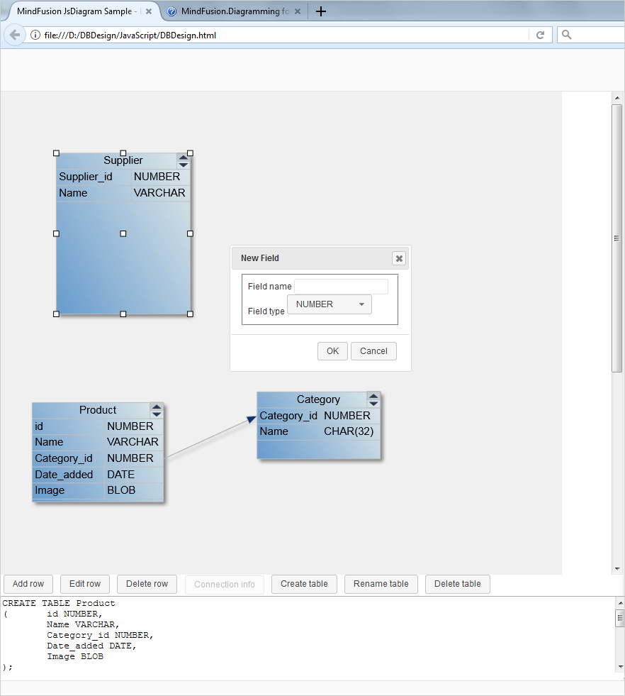
We are going to use the JS flowchart library as a database design tool. We will create DB tables, add rows, connect the tables and generate SQL statements that would create the tables.

Here is a screenshot of the application:

Database Designer Application with SQL Generator

Database Designer Application with SQL Generator

I. Project Setup

We need two JavaScript libraries for the flowchart:

  • MindFusion.Common.js
  • MindFusion.Diagramming.js

We copy them in the work folder of the project, where we will put the HTML and the JavaScript code behind. Then we create an HTML file and name it DBDesign.html. There we will reference the two JavaScript libraries:

<a href="http://MindFusion.Common.js">http://MindFusion.Common.js</a>
<a href="http://MindFusion.Diagramming.js">http://MindFusion.Diagramming.js</a>

We reference those two libraries at the end of the HTML file, just before the closing tag. This way we are sure that the majority of the browsers will load the scripts correct.

We need an HTML 5 Canvas element for the diagram to draw itself onto and we create one inside a <div> tag:

<div style=”position: absolute; width: 100%; height: 100%; overflow: auto;”>
<canvas id=”diagram” width=”2100″ height=”2100″>
This page requires a browser that supports HTML 5 Canvas element.
</canvas>
</div>

It’s important to set and id for the Canvas element, that’s how we will get it in the JavaScript code behind file.

We create the JS file to be used by this project as DBDesign.js and we place it in the same directory as the two other JS files. We add a reference to it in the HTML page:

<a href="http://DBDesign.js">http://DBDesign.js</a>

II. UI Controls

The DBDesigner has a line of controls at the bottoms that provide menus – add/edit/delete row, create/delete/rename table and a button for connection info. We create them as buttons:

<div id="controls" style="height: 150px" left:="" 0;="" right:="" 401px;"="">
   <input type="button" id="btnAddRow" value="Add row" style="margin-left: 5px; margin-bottom: 2px;">
   <input type="button" id="btnEditRow" value="Edit row" style="margin-left: 5px; margin-bottom: 2px;">
   <input type="button" id="btnDeleteRow" value="Delete row" style="margin-left: 5px; margin-bottom: 2px;">
…..
</div>

We add a textarea for the generated SQL and we close the div:

<textarea id="generatedSql" style="height: 120px;width: 100%"></textarea>

When the user presses one of those buttons we show a dialog. The dialogs are forms. Here is the form that renames a table:

<div id="renameTable-dialog" title="Rename Table">
  <form>

<fieldset>
  	 <label for="renameTableCaption">Table name</label>
</fieldset>

	</form>
</div>

III. General Diagram Settings

Let’s start coding the JavaScript methods for the DBDesign application. We use the document.ready method to initialize the Diagram:

var Diagram = MindFusion.Diagramming.Diagram;

var diagram;

$(document).ready(function () {
   // create a Diagram component that wraps the "diagram" canvas
   diagram = MindFusion.AbstractionLayer.createControl(Diagram, null, null, null, $("#diagram")[0]);
……….

});


We use the id of the diagram Canvas that we set in the web page and now create the diagram control. Once we have it we set some properties to it:

// set some Diagram properties.
diagram.setBehavior(Behavior.LinkTables);
diagram.setAllowSelfLoops(false);
diagram.setBackBrush('#F0F0F0');
diagram.setLinkHeadShape('Triangle');
diagram.setLinkHeadShapeSize(4);
diagram.getSelection().allowMultipleSelection = false;


We change the default Behavior of the diagram control to “LinkTables”, which means users would be able to connect table rows. We stop users from creating self loops on tables and add some styling: the back brush is set to light gray, the head shape of links is ‘Triangle’ and we forbid the users to select multiple objects.

The styling of the diagram is done through themes. We create a theme and add to it a style for the table nodes:

// set the Diagram style.
var theme = new Theme();

var tableNodeStyle = new Style();
tableNodeStyle.setBrush({ type: 'LinearGradientBrush', color1: 'rgb(224, 233, 233)', color2: 'rgb(102, 154, 204)', angle: 30 });
tableNodeStyle.setTextColor({ type: 'SolidBrush', color: 'rgb(45, 57, 86)' });
tableNodeStyle.setStroke('rgb(192, 192, 192)');


The tableNodeStyle sets the brush, text color and stroke for the tables. Let’s tell the theme object that this is the style for table nodes:

theme.styles['std:TableNode'] = tableNodeStyle;

And let’s tell the diagram control that it has a theme:

diagram.setTheme(theme);


Link styling is done in the same way and you can find the code in the *.zip file that is available for download.

IV. Events

Handling events is the most important part of this application. We have events raised by the diagram elements and we have events that are raised by the JavaScript buttons. Let’s start with the js buttons. When the web page is loaded there is a single button active from the row of buttons available at the bottom of the page – “Create table”. In the document.ready() method we wire the button with an event:

$('#btnCreateTable').button().click(function (event) { createTable(); });


This event calls the createTable method that generates a TableNode instance:

function createTable() {
	// create a new table with the specified extent
	var table = diagram.getFactory().createTableNode(
				15 + tableCount * 3, 15 + tableCount * 4, 50, 60);
	table.setText("Table" + tableCount++);
	table.redimTable(2, 0);
	table.setScrollable(true);
	table.setConnectionStyle(ConnectionStyle.Rows);

	// set the first column to resize with the table
	table.getColumn(0).columnStyle = ColumnStyle.AutoWidth;

	generateSQL();
}


The createTableNode method accepts as arguments the x and y coordinates of the new TableNode and its width and height. We create initially the table with two columns and no rows. By default the tables can be scrolled and the links connect table rows.

The generateSQL method is a simple one – it just creates an SQL table. You can expand the sample with more complicated SQL statements but in our case we just create a table with the columns that were set to the TableNode:

function generateSQL() {
   var text = '';

   // enumerate all tables in the current diagram
   ArrayList.forEach(diagram.nodes, function (table) {
   text += "CREATE TABLE " + table.getText() + "\r\n(";

   // enumerate all rows of a table
   for (var r = 0; r < table.cells.rows; ++r) {
   // get text of cells in current row
   text += "\t" + table.getCell(0, r).getText() + " " + table.getCell(1, r).getText();
   if (r < table.cells.rows - 1)
	 text += ",\r\n";
   }
	text += "\r\n);\r\n\r\n";
   });

  $('#generatedSql')[0].innerHTML = text;
}

When the SQL text is generated we assign it to the textarea instance that we created.

V. Diagram Events

Here we will talk about the events fired by the diagram control. Once a table is created the users can double click on it to create new rows, edit or delete existing rows. This happens when we handle the nodeDoubleClicked event:

diagram.addEventListener(Events.nodeDoubleClicked, function (sender, args) {
	if (tblClicked != args.getNode()) {
		tblClicked = args.getNode();
	}
….

});


Here we identify the table that is clicked and then we have to decide which dialogue to show:

if (tblClicked) {
		var cellClicked = tblClicked.cellFromPoint(args.getMousePosition());
		if (cellClicked) {
			rowClicked = cellClicked.row;
			editRowOpen();
		}
		else if (tblClicked.hitTestManipulators(args.getMousePosition()) == null) {
		if (args.getMousePosition().y <= tblClicked.getBounds().y + tblClicked.getCaptionHeight())
			renameTableOpen();
			else
			addRowOpen();
		    }
		}


If an existing cell is clicked we open the editRow form. If the caption of the table was clicked we open the form for rename of a table. If none of those, we open the form that adds a new row.

Let’s look how the addRow dialogue opens:

function addRowOpen() {
  var table = tblClicked || diagram.getActiveItem();

  if (!table || !AbstractionLayer.isInstanceOfType(TableNode, table))
	return;

   addRowDialog.dialog("open");
}


the method calls the dialog method of addRowDialog. At the beginning of the js file we have declared a variable:

var addRowDialog = null


Then we create the addRowDialog object:

addRowDialog = $("#addRow-dialog").dialog({
		autoOpen: false,
		resizable: false,
		height: 'auto',
		width: 250,
		modal: false,
		buttons: {
			"OK": addRow,
			Cancel: function () {
				addRowDialog.dialog("close");
			}
		},
		close: function () {
			addRowType.val("NUMBER");
			addRowType.selectmenu("refresh");
			addRowForm[0].reset();
		}
	});
	addRowForm = addRowDialog.find("form").on("submit", function (event) {
		event.preventDefault();
		addRow();
	});


Here we create the dialog that has auto height, width of 250 and two buttons: OK and Cancel. The Cancel button closes the dialog. When the user has pressed OK the form is submitted and the addRow method is called.

The form that shows is defined in the HTML page and looks like that:

div id="addRow-dialog" title="New Field">
		<form>

<fieldset>
			<label for="addRow-fieldName">
				Field name</label>
			
			<label for="addRow-fieldType">
				Field type</label>
			
				NUMBER
				CHAR(32)
				DATE
				VARCHAR
				BLOB
			
</fieldset>

		</form>
</div>

The addRow method gets the clicked table and gets the two cells at the last row. It gets the text that was chosen in the dialog and assigns it to the cells. Then the dialog is closed and the SQL is generated once again.

function addRow() {
	var table = tblClicked || diagram.getActiveItem();

	if (!table || !AbstractionLayer.isInstanceOfType(TableNode, table))
		return;

	table.addRow();

	var lastRow = table.cells.rows - 1;

	// use the cell indexer to access cells by their column and row
	table.getCell(0, lastRow).setText(addRowName[0].value);
	table.getCell(1, lastRow).setText(addRowType[0].value);

	// close the dialog
	addRowDialog.dialog("close");

	// refresh SQL definition
	generateSQL();
}


And that’s the end for this tutorial. You can download the sample together with the necessary JavaScript libraries from this link:

Download the JavaScript Database Designer Application

Find out more about MindFusion JavaScript Diagram Library at https://mindfusion.eu/javascript-diagram.html

Spreadsheet Localization

In this blog post we will demonstrate how to customize the spreadsheet control so users can input in another language. We build a budget table whose data is in Korean. We will also use the latest localization capabilities of the component to add some auxiliary forms, which UI is also in Korean.

The sample uses WPF but the same methods of the control are available in Spreadsheet for WinForms.

A spreadsheet in Korean

A spreadsheet in Korean

I. General Settings

We create a new WPF project in Visual Studio and name it “BudgetAllocation”. You can drag and drop the WorkbookView control from the Toolbox if you have installed the Spreadsheet for WPF component or the WPF Pack. Another option is to add the required dll-s manually:

  • MindFusion.Spreadsheet.Wpf
  • MindFusion.Licensing
  • MindFusion.Common

In the XAML tag we add a mapping to the Spreadsheet control:

xmlns:ss="http://mindfusion.eu/spreadsheet/wpf"

Then, in the XAML file we create an instance of the MindFusion.Spreadsheet.Wpf.WorkbookView that holds a MindFusion.Spreadsheet.Wpf.Workbook:

<ss:WorkbookView x:Name=”workbookView”>
<ss:Workbook x:Name=”workbook” />
</ss:WorkbookView>

The next step is to add a new Worksheet to the Workbook and make it the active sheet:

 
var activeSheet = workbook.Worksheets.Add();
workbookView.ActiveWorksheet = activeSheet;
activeSheet.BeginInit();
......
activeSheet.EndInit();

With that we have completed the general settings for the project and is time to pay attention to the localization.

II. Localization

Spreadsheet for WPF can be localized to support different language through external XML files and the Locale property of the Workbook class. In our sample we will use Korean. First, let’s tell the control that we want to type in Korean:

workbook.Locale = new CultureInfo("ko-KR"); 

We need to change the default Font for the spreadsheet to one that does support Korean, we’ve chosen Malgun Gothic:

var globalStyle = activeSheet.CellRanges[0, 0, activeSheet.Columns.Count - 1, activeSheet.Rows.Count - 1].Style;
globalStyle.FontName = "Malgun Gothic";

The next step is to localize the UI of all forms that might appear when the user interacts with the spreadsheet. That happens through an XML file that we load and assign to the workbook:

 var file = @"../../Localization/Localization.KR.xml";
       if (file != null && File.Exists(file))
            workbook.SetLocalizationInfo(file);

The component provides ready to be used UI localization files for 6 of the most common languages in the world. In our case we use the file for Korean. You will find those files in a subfolder called Localization on your hard driver, in the installation folder of the control.

Once we’ve finished localizing the spreadsheet it’s time to add some data:

III. Data

Specifying data for each cell is very easy, it is made through the Data property of the Cell instance:

activeSheet.Cells["A2"].Data = "비율로서의 자금 분배";

A cell can contain a formula, and it is specified this way:

activeSheet.Cells["F4"].Data = "=SUM(B4:E4)";

IV. Appearance

The different cells and cell ranges in our spreadsheet have different formats and we set them through the Style property:

activeSheet.Cells["A3"].Style.FontBold = true;
activeSheet.Cells["A3"].Style.Background = new SolidColorBrush(Color.FromRgb(240, 240, 240));
activeSheet.Cells["A3"].Style.BorderBottomBrush = new SolidColorBrush(Color.FromRgb(220, 220, 220));
activeSheet.Cells["A3"].Style.BorderRightBrush = new SolidColorBrush(Color.FromRgb(220, 220, 220));

You can style a range of cells as well:

var heading = activeSheet.CellRanges["A2:G2"];

var headingStyle = heading.Style;
headingStyle.FontBold = true;
headingStyle.VerticalAlignment = MindFusion.Spreadsheet.Wpf.VerticalAlignment.Middle;
....

Cells can be merged:

heading.Merge();

Cells that render numbers can be formatted according to your needs:

var salesStyle = activeSheet.CellRanges[1, 5, 4, 5].Style;
salesStyle.FontBold = true;
salesStyle.Format = "#,##0.00;(#,##0.00)";

For some cells we use conditional formatting – that means we style them differently based on their data value:

// Set a conditional format
var format1 = salesStyle.ConditionalFormats.Add();
format1.Type = ConditionalFormatType.CellValue;
format1.Operator = ComparisonOperator.LessThan;
format1.First = "35";
format1.Style.Background = new SolidColorBrush(Color.FromArgb(255, 255, 120, 85));
format1.Style.Background.Freeze();

In this case we raise alert by painting red those cells whose value is less than 35 in cells that have column index 1 to 4 and row index 5.

V. Context Menu

We add a context menu to the Workbook control in XAML this way:

<ss:WorkbookView.ContextMenu>
<ContextMenu MenuItem.Click=”ContextMenu_Click”>
<MenuItem Header=”Delete Cells Form…” />
<MenuItem Header=”Insert Cells Form…” />
<MenuItem Header=”Worksheet Rename Form…” />
</ContextMenu>
</ss:WorkbookView.ContextMenu>

The ContextMenu has 3 items that allow the user to delete or insert cells as well to rename the worksheet. Let’s look at the event handler of the Click event:

//handle clicks on the context menu
private void ContextMenu_Click(object sender, RoutedEventArgs e)
   {
       var menu = sender as ContextMenu;
       var index = menu.Items.IndexOf(e.OriginalSource);

       switch (index)
       {
           case 0:
               {
                    new DeleteCellsForm(workbook).ShowDialog();
                    break;
                 }
            case 1:
                 {
                     new InsertCellsForm(workbook).ShowDialog();
                     break;
                 }
             case 2:
                 {
                     new WorksheetRenameForm(workbook, "New name").ShowDialog();
                     break;
                 }
          }
    }

We recognize the menu item that was clicked based on its index. After that we show the appropriate form. The InsertCellsForm, DeleteCellsForm and WorksheetRenameForm are all found in the MindFusion.Spreadsheet.Wpf.StandardForms namespace and we have to add a reference to the MindFusion.Spreadsheet.Wpf.StandardForms.dll. Once we do that, since we’ve set the localization info to point to a Korean file, those forms also show in Korean:

Spreadsheet UI in Korean

Spreadsheet UI in Korean

With that our sample is ready. You can download the full source code together with the localization file and the necessary component libraries from here:

Download Spreadsheet Localization Sample in WPF

About Spreadsheet for WPF: A native WPF component that allows developer to add to their applications functionality similar to those of Microsoft Excel. The diverse features of the component include smart API, rich styling options, support for numerous import/export formats, custom DB functions, formula and charts. Find out more about MindFusion Spreadsheet for WPF here.

Photo Album in WPF with the Diagram Control

In this blog post we will build a photo album application. The application shows pictures organized in folders and allows the user to add new pictures, new folders as well add/delete/rearrange the photos that are already added to the folders.

Here is a screenshot of the application:

Photo Album with the WPF Diagram Control

Photo Album with the WPF Diagram Control

The app is built with the diagramming for WPF component.

I. General Settings

We create a new WPF application in Visual Studio. There, in the main window, the Window.Resources section we add a new item – a context menu:

 <contextmenu x:key="ContextMenu">
         <menuitem x:name="FolderMenuItem" header="Add new folder" click="AddFolderMenuItem_Click">
         <menuitem x:name="ImageMenuItem" header="Add new image" click="AddImageMenuItem_Click">
 </menuitem></menuitem></contextmenu>

The context menu shows up every time we right-click on a node.

We leave the default Grid layout panel and add there a ScrollViewer. The ScrollViewer would hold the diagram. Let’s add a XAML mapping to the Diagram class in the Window element:

xmlns:diag="http://mindfusion.eu/diagramming/wpf" xmlns:common="http://mindfusion.eu/common/wpf" 

We need a reference to the common namespace as well because the Diagram class uses it. Now, in the ScrollViewer we can add the markup for the Diagram:

<diag:diagram x:name="diagram" bounds="0, 0, 1000, 1000"  DefaultShape="Ellipse" aligntogrid="False" behavior="Modify" NodeModified="diagram_NodeModified" NodeClicked="diagram_NodeClicked">
</diag:diagram>

The application needs reference to the following MindFusion.Diagramming libraries:

  • MindFusion.Diagramming.Wpf
  • MindFusion.Common.Wpf
  • MindFusion.Licensing

II. Styling

In the code-behind file we create a Theme and add two Style-s to it: one for the links and one for the nodes.

 //create a new theme
 Theme theme = new Theme();

 //create a style for the links
 Style linkStyle = new Style();
 linkStyle.Setters.Add(new Setter(DiagramLink.BrushProperty, new SolidColorBrush(Color.FromRgb(245, 245, 240))));
 linkStyle.Setters.Add(new Setter(DiagramLink.StrokeProperty, new SolidColorBrush(Color.FromRgb(191, 191, 191))));
 linkStyle.Setters.Add(new Setter(DiagramLink.HeadStrokeProperty, new SolidColorBrush(Color.FromRgb(191, 191, 191))));
 //register the style with the theme
 theme.RegisterStyle(typeof(DiagramLink), linkStyle);

The link style sets the brush and stroke for the links as well the stroke for the link’s head. The brush is used to fill the head shape of the link. Finally we register the style with the theme. Here is what the node style looks like:

//create a style for the nodes
Style nodeStyle = new Style();
nodeStyle.Setters.Add(new Setter(ShapeNode.StrokeProperty, new SolidColorBrush(Color.FromRgb(191, 191, 191))));
nodeStyle.Setters.Add(new Setter(ShapeNode.FontFamilyProperty, new FontFamily("Lato")));
//register the style with the theme
theme.RegisterStyle(typeof(ShapeNode), nodeStyle);

We specify the stroke that would outline each node and the font that would be used when labels on nodes are painted. The final step is to assign the new Theme to the Theme property of the diagram:

 //assign the theme
  diagram.Theme = theme;

We also change the default head shape of the link and its size:

 //set link styling
 diagram.LinkHeadShapeSize = 12;
 diagram.LinkHeadShape = ArrowHeads.Triangle;

III. Create Diagram Items

When you run the application it shows a diagram that is a tree with folders and images. We will create this diagram in code. First, we create a new array that would hold the names of the folders:

string[] labels = new string[] {"Images", "Events", "Family", "Tourism",
                "Autoexibition 2014 Detroit", "Depeche Mode Concert 2016", "Third March",
                "Lia`s birthday", "New year 2017", "Sam`s graduation",
                "Brazil and Argentina", "Italy 2013", "Summer 2017"};
             

Then we must create a node for each label:

 //create the initial nodes for the album
 for(int i = 0; i < labels.Length; i++)
   {
     var node = CreateFolder(labels[i]);
     diagram.Nodes.Add(node);
   }

Each node is created by calling the CreateFolder method. This method creates and styles a DiagramNode. It sets a Folder image as background for the node and adjusts its text alignment. The node is drawn transparent:

 //creates a new folder with the specified text.
 private ShapeNode CreateFolder(string text)
    {
       var node = new ShapeNode();
       node.Text = text;
       node.Tag = "Folder";
       node.Transparent = true;
       node.TextAlignment = TextAlignment.Center;
       node.TextVerticalAlignment = AlignmentY.Center;
       node.Expandable = true;
       BitmapImage image = this.FindResource("Folder") as BitmapImage;
       node.Image = image;
       node.ResizeToFitImage();
       return node;
     }

Note that we use the Tag property of a DiagramItem to assign the text “Folder”. We will use this identification string later in the sample, to recognize that the user has clicked on a folder.
The image is declared as a resource in XAML, in the Window.Resources section:

<bitmapimage x:key="Folder" urisource="Folder.png">
</bitmapimage>

Each major folder has subfolders and they contain images. The subfolders with images are located in the Images directory. We declare a global variable that points to the Images folder:

 private const string path = @".\Images";

Then we need to cycle through all directories in “Images” and create subfolders for them.

 int length = 0;
 // reads the initial subfolders for the album 
 string[] subfolders = System.IO.Directory.GetDirectories(path);
 string[] folders = new string[9];

Once we have the subfolders we must cycle through their subfolders as well because each one has several subfolders in it. Those second level subfolders actually contain the images:

 //goes one level deeper into the hierarchy
 for (int i = 0; i < subfolders.Length; i++)
    {
       string[] subsubfolders = System.IO.Directory.GetDirectories(subfolders[i]);
       for(int j = 0; j < subsubfolders.Length; j++)
       {
          folders[length] = subsubfolders[j];
          length++;
        }
    }

Once we’ve created nodes for each folder it is time to create the nodes that represent the images:

 //loads the images for each folder
 for(int i = 0; i < folders.Length; i++)
    {
      string[] filenames = System.IO.Directory.GetFiles(folders[i]);
      LoadImages(filenames, diagram.Nodes.GetAt(i + 4) as ShapeNode);
    }

We go through all folders that actually contain images and use a new method LoadImages to create DiagramNode-s for each image file. The LoadImages method needs the names of the files that would be places in the children nodes and the parent node:

private void LoadImages(string[] filenames, DiagramNode parent)
  {
     for (int i = 0; i < filenames.Length; i++)
     {
         var node = CreateImage(filenames[i]);
         diagram.Nodes.Add(node);
         diagram.Factory.CreateDiagramLink(parent, node);
      }
   }

The method creates an Image node and adds it to the collection of diagram nodes accessible through the diagram.Nodes property. hen it creates a link from the parent to the new node. Note that when we create diagram items through the diagram.Factory helper object they are added automatically to the respective nodes or links collections. Now let’s look at the CreateImage method:

private ShapeNode CreateImage(string path)
  {
      var node = new ShapeNode();
      //customize the node appearance
      node.Shape = Shapes.RoundRect;
      node.Brush = new SolidColorBrush(Color.FromRgb(245, 245, 240));
      node.Tag = "";
      //assign the image
      Uri imageUri = new Uri(path, UriKind.Relative);
      BitmapImage image = new BitmapImage(imageUri);
      node.Image = image;
      return node;
   }

The method creates a node and applies some styling to it. It gets the relative Uri to the image and assigns it to the node.Image property.

The last thing to do is to create links between the three major subfolders and the root folder:

//create links between the root and all subfolders
diagram.Factory.CreateDiagramLink(diagram.Nodes.GetAt(0) as ShapeNode, diagram.Nodes.GetAt(1) as ShapeNode);
diagram.Factory.CreateDiagramLink(diagram.Nodes.GetAt(0) as ShapeNode, diagram.Nodes.GetAt(2) as ShapeNode);
diagram.Factory.CreateDiagramLink(diagram.Nodes.GetAt(0) as ShapeNode, diagram.Nodes.GetAt(3) as ShapeNode);

Then we have to create links between those subfolders and their subfolders in similar way:

diagram.Factory.CreateDiagramLink(diagram.Nodes.GetAt(1) as ShapeNode, diagram.Nodes.GetAt(4) as ShapeNode);
diagram.Factory.CreateDiagramLink(diagram.Nodes.GetAt(1) as ShapeNode, diagram.Nodes.GetAt(5) as ShapeNode);
..........

IV. Arrange the Diagram

We use the TreeLayout algorithm to arrange our nodes in the right order. This layout is the perfect match for what we want – a hierarchy of nodes that is exactly a tree.

private void Rearrange()
  {
     if (layout == null)
     {
        layout = new TreeLayout(diagram.Nodes.GetAt(0),
        TreeLayoutType.Centered,
        false,
        TreeLayoutLinkType.Cascading3, TreeLayoutDirections.TopToBottom,
        40, 20, true, new Size(15, 15));
      }
      layout.Arrange(diagram);
   }

The TreeLayout like all other automatic layouts available in MindFusion diagramming controls is pretty easy to use. It requires the call of a single Arrange method that takes as a parameter the instance of the diagram being arranged. The constructor lets you customize the layout, in our case we use this TreeLayout constructor. The constructor requires the root node, the TreeLayoutType, the next argument specifies if links are reversed, then comes the TreeLayoutLinkType, the TreeLayoutDirections and several numbers that indicate level distance, node distance and whether root position is kept. The last argument is the margins between the tree and the diagram’s bounding rectangle.

We call the Rearrange method every time we modify the diagram – when nodes are added/deleted or modified.

V. Events

We handle the NodeClicked event, which we use to show the context menu:

private void diagram_NodeClicked(object sender, NodeEventArgs e)
   {
      //gets the node that was clicked
      SelectedNode = e.Node as ShapeNode;
      if (e.MouseButton == MindFusion.Diagramming.Wpf.MouseButton.Right && SelectedNode.Tag.ToString().Length > 0)
       {
         //renders the context menu
         ContextMenu cm = this.FindResource("ContextMenu") as ContextMenu;
         cm.Placement = System.Windows.Controls.Primitives.PlacementMode.Mouse;
         cm.IsOpen = true;
        }
    }

The important part in this code is to get the selected node. We will need it to specify the parent node for any new folders or image nodes that we create. Then, based on the menu selected by the user we either create a new folder node or a new image node calling the CreateFolder or CreateImage method that we listed above.

What happens when the user modifies a node? That happens when the user drags a node from one folder into another folder. In this case the diagram link between the former parent and the node is deleted and a new one is created – between the new parent and the node:

private void diagram_NodeModified(object sender, NodeEventArgs e)
 {
   //gets the nodes at the specified mouse position
   if (diagram.GetNodesAt(e.MousePosition).Count != 1)
    {
      ShapeNode child = e.Node as ShapeNode;
      ShapeNode parent = null;
      bool parentIsFolder = false;
     
      foreach (ShapeNode node in diagram.GetNodesAt(e.MousePosition))
           {
               //check if the node is a folder
               if (node.Tag.ToString().Length > 0 && node != child)
               {
                   parent = node;
                   parentIsFolder = true;
               }
           }
           //removes the current link between the node and its parent
           if (parentIsFolder)
           {
               if (child.IncomingLinks.GetAt(0) as DiagramLink != null)
                   diagram.Links.Remove(child.IncomingLinks.GetAt(0) as DiagramLink);
           }
           //creates a new link
           diagram.Factory.CreateDiagramLink(parent, child);
       }
          Rearrange();
      }

Remember that we have assigned “Folder” to the Tag property of all nodes that are folders. We use this to identify them and to move the node from one folder to the other.

And with this our tutorial is over, here is a screenshot from the final application:

Photo Album App with the WPF Diagram: User Interaction

Photo Album App with the WPF Diagram: User Interaction

The link to download the sample is below:

Download Wpf Diagramming Sample: Photoalbum

About Diagramming for WPF: This is the right tool to create flowcharts in WPF that always meet your requirements. The library offers more than 100 predefined node shapes, extensive event set and more than 15 exporters and importers. Each diagram that you build has a completely customizable look through styles, themes and appearance properties for each part of the flowchart. The numerous samples and detailed documentation help you learn quickly how to integrate the component into your own application. You can download the trial version, which has no feature restrictions and does not expire from the WPF Diagram Page on MindFusion website.

Org Chart in JavaScript with the Diagram Library

In this blog post we will use the Js Diagram library to create a beautiful organizational chart, where people from the company are represented with the hierarchy links between them. Each employee has a photo, name, position, boss and section for comments. The links between them demonstrate the hierarchy.

Run the sample from https://mindfusion.eu/samples/javascript/diagram/OrgChart/OrgChartEditor.html

I. Application Setup

We create a new folder for the project and there we copy the scripts that the sample uses. They are predominantly jQuery scripts, which you can also link from the jQuery CDN website.

Org Chart in JavaScript: Directory Structure

Org Chart in JavaScript: Directory Structure

The samples.css and samples.js scripts are used by all MindFusion JavaScript samples and are not relevant to your application. They layout and style the HTML content.

We need to create two files for this application – an HTML page and a JavaScript file that will be used by it. We create OrgChartEditor.html and link the following scripts and a CSS file in the section:

<a href="http://common/jquery.min.js">http://common/jquery.min.js</a>
<a href="http://common/jquery-ui.min.js">http://common/jquery-ui.min.js</a>

Then we create an empty (for now) js file that will hold the code-behind for the web page. It is called OrgChartEditor.js. We must reference it, from the HTML but we will do that at the end, before the closing tag. That is done because some browsers might not load correctly the scripts if they are initialize before the HTML code for the canvas.

<a href="http://MindFusion.Common.js">http://MindFusion.Common.js</a>
<a href="http://MindFusion.Diagramming.js">http://MindFusion.Diagramming.js</a>
<a href="http://OrgChartEditor.js">http://OrgChartEditor.js</a>

As you see, we have copied MindFusion.Common.js and MindFusion.Diagramming.js in the directory of the web page. There we have also saved OrgChartEditor.js.

The diagram uses an HTML Canvas to render itself. We create one on the web page:

<!-- The Diagram component is bound to the canvas element below -->
<div style="width: 100%; height: 100%; overflow: auto;">
	<canvas id="diagram" width="2100" height="2100">
		This page requires a browser that supports HTML 5 Canvas element.
	</canvas>
</div>

Note that the element has an id. That’s important because we will reference it in the code behind file.

II. The OrgChartNode.

Each employee on the diagram is represented by a special node – the OrgChartNode. This node is a customized TableNode.

// creates a table node with the default settings
var OrgChartNode = function (parent, boss)
{
       AbstractionLayer.initializeBase(OrgChartNode, this, [parent]);

       this.childNodes = [];

	// set up table cells
	this.redimTable(3, 4);
	this.getCell(1, 3).setColumnSpan(2);
	this.getCell(0, 0).setRowSpan(4);
	this.getCell(1, 1).setText("Title:");
	this.getCell(1, 1).setFont(
            new Font("Verdana", 3.5, true /*bold*/, false /*italic*/));
	this.getCell(1, 2).setFont(
            new Font("Verdana", 3.5, true /*bold*/, false /*italic*/));
	this.getCell(1, 0).setFont(
            new Font("Verdana", 3.5, true /*bold*/, false /*italic*/));
	this.getCell(1, 3).setFont(
            new Font("Verdana", 3, false /*bold*/, false /*italic*/));
	this.configureCells();

Each OrgChartNode has a parent and a boss. The CEO, which is the topmost node in the hierarchy has no boss. The OrgChartNode is a TableNode with 3 columns and four rows. Cell(0,0) is reserved for the image of the employee. It spans 4 rows.

The cells in the second column with index 1 are for labels: title, name, id and comments. We style them with bold font.

The prototype of the OrgChartNode gets or sets the properties which deal with the data we need for each employee. We set the fields for each new node and update the existing canvas elements. We define an updateCanvasElements method that calls the updateCanvasElements of the parent class to mark the changes. We also declare setter/getter methods for each OrgChartNode field:

OrgChartNode.prototype =
{
	// updates the existing elements
	updateCanvasElements: function (node)
	{
		this.setFields();
		AbstractionLayer.callBaseMethod(OrgChartNode, this, 'updateCanvasElements');
	},

        // gets the title of the employee
	getTitle: function ()
	{
		return this.title;
	},
        // sets the title of the employee
	setTitle: function (value)
	{
		if (this.title !== value)
		{
			this.title = value;
			this.invalidate();
		}
	},

When we set a new value we invalidate the canvas so that the changes can be rendered correctly on the screen.

// assigns the employee data to the table cells
setFields: function()
{
    // hide the caption and place the employee names on row 0 
    this.setCaptionHeight(0);
    this.getCell(1,0).setText("Name:")
    this.getCell(2,0).setText(this.fullName);
    ….
    ….
    …..
    // rearrange the org hierarchy
    this.setHierarchy();
    this.setColor();
},

The setFields method takes the data from the OrgChartNode fields and assigns it to the correct cells of the table. It also assigns the correct boss of the employee. In our samples bosses are assigned automatically and cannot be edited by the user. This is done by the setHierarchy method:

// rebuilds the hierarchy
setHierarchy: function ()
{
    // the ceo has no boss
    if (this.boss == undefined)
	{
	   this.hierarchy = 0;
	}
	else
	 {
             // first level of executives under the boss
	     if (this.boss.hierarchy == undefined)
	     {
		  this.hierarchy = 1;
	     }
	     else
	     {
	         // increase the depth of the hierarchy
		 this.hierarchy = this.boss.hierarchy + 1;
		 this.boss.addChild(this);
		}
	  }
         
         // rearrange the hierarchy
	 for (var i = 0; i < this.childNodes; i++)
		this.childNodes[i].setHierarchy();
		this.setColor();
},

The setColor method assigns the right color for the background of the table. Different levels in the hierarchy are distinguished by different colors. The top level – the CEO – is read.

III. Interaction

The org chart allows the users to do a lot of things: edit certain table cells, delete and create nodes, create and delete links, move and drag the nodes. This is done by handling a lot of events that the diagram library exposes.

First, we set the Behavior property of the diagram to “Custom”. This means we will define how the library responds to user actions. This is done because none of the predefined Behavior modes answer the specific needs of our application:

diagram.setBehavior(Behavior.Custom);

Then we start handling events. First, we handle the Clicked event:

diagram.addEventListener(Event.clicked, function (diagram, eventArgs)
{
     // check which mouse button was clicked
     var button = eventArgs.getMouseButton();
     var position = eventArgs.getMousePosition();

     ….
});

We handle differently clicks with the right and left mouse buttons. If it is the right mouse button we should create a new OrgChartNode:

// click with the right mouse button creates a node
if (button === 2)
{
	var node = new OrgChartNode(diagram, undefined);
	node.setBounds(new Rect(position.x, position.y, 20, 20));
	node.resize();

	// adds the node to the diagram items
	diagram.addItem(node);

	// rearrange the diagram
	diagram.arrangeAnimated(tree);
}

Initially, the node has no boss, it will be determined once we link it to the rest of the org chart.

Let’s see what happens when the users clicks on a node:

diagram.addEventListener(Event.nodeClicked, onNodeClicked);

We handle the nodeClicked event with the onNodeClicked method:

// raised when the user clicks on a node
function onNodeClicked(diagram, eventArgs)
{
	// checks if the user has clicked with the left mouse button (0)
	var button = eventArgs.getMouseButton();
	if (button === 0)
		editNode(diagram, eventArgs);

        //click with the right mouse button creates a node
        else if (button === 2)
        createNode(diagram, eventArgs);
}

When the node is clicked with the left mouse button – we edit it. When it is clicked with the right one – we create a new node, linked to it, one level deeper into the hierarchy.

// called when the user edits a table
function editNode(diagram, eventArgs)
{
     var cellEditor = eventArgs.getNode().cellFromPoint(eventArgs.getMousePosition());

     // the table node to edit
     var tableNode = eventArgs.getNode();
     ...
     ...
}

We use the cellFromPoint method to identify the cell that was clicked. The cells that cannot be edited – the ones that render the labels – have no cellEditor.

// cells that cannot be edited have no cellEditor assigned
if (cellEditor.cell != undefined)
       if(cellEditor.cell.editable == true)
	   edit = true;

If the cell can be edited we check which is the cell and what type of content it renders:

// if the cell can be edited
if (edit)
{
	diagram.beginEdit(eventArgs.getNode(),eventArgs.getMousePosition());
	$("diagram_inplaceInput").attr("placeholder", "url");

	cellEditor.cell.onEdited = function (diagram, tableCell)
	{
		if (edit)
		{
			if (cellEditor.cell.image)
			{
				// read and assign the URL of the new image
				if (tableCell.getNewText() != undefined &&
					tableCell.getNewText() != "" &&
					tableCell.getNewText != "undefined")
				{
				tableNode.setImageLocation(tableCell.getNewText());
				cellEditor.cell.text.height = 0;
				cellEditor.cell.text.text = "";
				}
			}
              .....
}

In the code above we check to see if the image location is correctly set and if so – we read the new image from the url and render it in the cell.

Handling the other events is easier, let’s look at the event fired when cell text is edited:

//add an eventListener for the cellTextEdited event
diagram.addEventListener(Event.cellTextEdited, function (diagram, cellArgs)
{
   cellArgs.getCell().onEdited(diagram, cellArgs);
});

Here we just call the onEdited method of the cell that is edited, which we explained above. The samples handles this way a lot of events: nodeDeleted, linkCreated, nodeModified and many more. You can check them in the source code provided with the sample.

IV. Diagram Layout

The org chart uses the predefined TreeLayout to arrange the diagram. It is ideal for hierarchical types of charts because it neatly arranges all nodes from a given level in a row/column based on the direction set.

// we apply the tree layout to arrange the diagram
tree = new MindFusion.Graphs.TreeLayout();

// customize the tree layout
tree.direction = MindFusion.Graphs.LayoutDirection.TopToBottom;
tree.linkType = MindFusion.Graphs.TreeLayoutLinkType.Cascading;

The TreeLayout is animated:

// rearrange the diagram
diagram.arrangeAnimated(tree); 

It is called not only at the beginning but also each time a new node is created or deleted, link is created and/or deleted as well when link or node is edited.

V. New Nodes

Finally, let’s see how nodes are created in code:

var ctoNode = new OrgChartNode(diagram, ceoNode);
ctoNode.setBounds(new Rect(25, 55, 60, 25));
ctoNode.setBoss(ceoNode);
ctoNode.setTitle("CTO");
ctoNode.setFullName("Bob Smith");
ctoNode.setImageLocation("cto.png");
ctoNode.setComment("A great person!");
ctoNode.resize();
diagram.addItem(ctoNode);

New nodes, as you already know are created by the user with a right mouse button click on any node. If a link is deleted, the node is detached from the hierarchy and the user should drop it over an existing node to indicate its place in the hierarchy.

With this we finish our sample. We have presented you with the most important information on how this org chart in JavaScript is created. You can download the complete source code of the sample from this link:

Download MindFusion JavaScript Organizational Chart Sample

The sample is also available on GitHub at https://github.com/MindFusionComponents/JavaScript-Diagram-Samples/tree/master/OrgChart

The sample is available online at https://mindfusion.eu/samples/javascript/diagram/OrgChart/OrgChartEditor.html

Find out more about MindFusion JavaScript Diagram Library at https://mindfusion.eu/javascript-diagram.html

A JavaScript Application for Server Load Monitoring (Continued)

We continue the ServerLoad tutorial with the diagram.

I. Create and Style The Diagram

We create a new JavaScript file named diagram.js in the Scripts folder of the project and reference it in the HTML.

<a href="http://Scripts/MindFusion.Diagramming.js">http://Scripts/MindFusion.Diagramming.js</a>

Now, in this file we make some namespace mapping to access easy the classes we need:

var Diagram = MindFusion.Diagramming.Diagram;
var DiagramLink = MindFusion.Diagramming.DiagramLink;
var ShapeNode = MindFusion.Diagramming.ShapeNode;
var Style = MindFusion.Diagramming.Style;
var DashStyle = MindFusion.Drawing.DashStyle;
var Alignment = MindFusion.Diagramming.Alignment;

var Rect = MindFusion.Drawing.Rect;
var LayeredLayout = MindFusion.Graphs.LayeredLayout;
var LayoutDirection = MindFusion.Graphs.LayoutDirection;

// a shortcut to the Events class
var Events = MindFusion.Diagramming.Events;

The code for the diagram does not need to be in a single method call, so we’ll use the document.ready event handler:

$(document).ready(function () {

// create a Diagram component that wraps the "diagram" canvas
diagram = MindFusion.AbstractionLayer.createControl(Diagram, null, null, null, $("#diagram")[0]);
//set both base and head link shape size
diagram.setLinkHeadShapeSize(2);
diagram.setLinkBaseShapeSize(2);
diagram.setLinkBaseShape(MindFusion.Diagramming.Shape.fromId("Arrow"));
................

});

As with the line chart, we create a diagram object using the canvas id from the html page. Then we make some link customization: we set the base and head shape with setBaseShape and setHeadShape to “Arrow” to indicate that data flows in two directions between servers.

Now let’s use a Style instance to set the stroke, text color and font name. Then we set the link style this way:

//customize the link appearance
var linkStyle = new Style();
linkStyle.setStroke("#c0c0c0");
linkStyle.setTextColor("#585A5C");
linkStyle.setFontName("Verdana");
linkStyle.setFontSize(3);
diagram.setStyle(linkStyle);

When users click on the diagram it is important not to allow them to create new links and nodes. That’s why we use setBehavior to change the default way the diagram responds to user actions:

//diagram items can only be selected
diagram.setBehavior(MindFusion.Diagramming.Behavior.SelectOnly);

We create the graph in the buildDiagram method. First, we call clearAll to remove all diagram items to make sure only nodes we’ve created are visible:

//generate diagram nodes
function buildDiagram() {
 diagram.clearAll();

};

II. Diagram Items

Let’s create the diagram nodes. We use png icons we’ve saved in an “icons” folder in the website. The background of each node is transparent ( setTransparent ), which means only the image will be visible. Then we add the node to the items of the diagram:

var rect = new Rect(0, 0, 15, 15);

var node = new ShapeNode(diagram);
node.setBounds(rect);
//the web server
node.setImageLocation("icons/web_server.png");
node.setTransparent(true);
diagram.addItem(node);

We create similar nodes for the data server, the clients and the network servers. The links are created with the DiagramLink class. The constructor takes the origin and target node of the link as parameters. We set an setId to the links, which is important and we add a label :

//add a link between the client and the server
var link = new DiagramLink(
       diagram, node, diagram.nodes[0]);
//same as the title of a given chart series
link.setId("Client" + i);
link.addLabel("Client" + i);
diagram.addItem(link);

Let’s not forget to emphasize the two links that correspond to the two series that are initially emphasized on the chart:

//bolden the two major links
diagram.links[5].setStrokeThickness(2.0);
diagram.links[8].setStrokeThickness(2.0);

III. Layout

We’ve created the diagram items but we need to arrange them. We use the LayeredLayout algorithm:

//the layeredLayout arranges the diagram properly - into layers
function applyLayeredLayout() {
    var layout = new LayeredLayout();
    layout.direction = LayoutDirection.TopToBottom;
    layout.siftingRounds = 0;
    layout.nodeDistance = 20;
    layout.layerDistance = 20;
    diagram.arrange(layout);
    diagram.resizeToFitItems();
}

As you see it is very easy to apply a layout with the diagramming control. You just create an instance of the layout, set the properties of your choice and call arrange (). In our case we need the layout direction to be LayoutDirection.TopToBottom We also adjust the nodeDistance and layerDistance and set the number of siftingRounds (attempts to unwind split links) to 0.

IV. Events

The diagram is meant to be interactive. We use the linkSelected and clicked events to handle selection of links and click on an area of the diagram, unoccupied by any items.

// add listeners
diagram.addEventListener(Events.linkSelected, onLinkSelected);
diagram.addEventListener(Events.clicked, onClicked);

When a link is selected, we need to emphasize the line graphic that corresponds to this link. We also emphasize the link itself. In addition, we must adjust the stroke and thickness of the other line graphs and diagram links. We do this in the onLinkSelected method:

//handle the linkSelected event
function onLinkSelected(sender, args) {

    //get the style of the series
    var seriesStyle = lineChart.plot.seriesStyle;
    seriesStyle.strokeThicknesses.clear();

    //thicken just the selected series, the others should be transparent
    for (var j = 0; j < lineChart.series.count() ; j++) {
        seriesStyle.strokeThicknesses.add(0.15);
        diagram.links[j].setStrokeThickness(1.0);
    }
.....
}


First we get the series style and then we use setStrokeThickness to reset the thickness of diagram links and series to their default values. After we’ve done that we need to get the selected links and emphasize them:

//bolden all selected links in the diagram as well
for (var m = 0; m < diagram.selection.links.length; m++) {
     var clickedLinkId = diagram.selection.links[m].getId();
     diagram.selection.links[m].setStrokeThickness(3.0);

When we’ve done that we need to find the series that correspond to these links and emphasize them as well:

//find the series that correspond to the selected links
for (var i = 0; i < lineChart.series.count() ; i++) {
      var _series = lineChart.series.item(i);


      //adjust the stroke thicknesses
      if (_series.title == clickedLinkId) {

          seriesStyle.strokeThicknesses.removeAt(i);
          seriesStyle.strokeThicknesses.insert(i, 3);
      }

   }

All this is followed by a call to the draw method that repaints the chart.

//repaint the chart
lineChart.draw();

The next event handler – the onClicked method resets the thicknesses to their default values:

//reset the chart thicknesses
function onClicked(sender, args) {
    resetThicknesses();

}

This is done in the resetThicknesses method, which uses the seriesStyle field of the line chart:

/* bolden the two major series, the others should be very thin.
bolden the two major diaglinks as well. */
function resetThicknesses() {
   var seriesStyle = lineChart.plot.seriesStyle;
   seriesStyle.strokeThicknesses.clear();

   for (var j = 0; j < 5; j++) {
      seriesStyle.strokeThicknesses.add(0.15);
      diagram.links[j].setStrokeThickness(1.0);
   }
.......
}


V. Tyre Separators

The diagram is divided into three parts by three separator lines. These lines are unconnected DiagramLink instances that have no head and base shape and have a custom position for the label. We use absolute positioning to locate the arrows. To do this we need to know the current size of the diagram:

//add the separators for the tyres
//first get the size of the diagram
var width = diagram.getBounds().width;
var height = diagram.getBounds().height;

Then the separator link is created with both origin and destination node being null:

//separator for the Clients tyre
//the link starts from the left edge and eds to the right edge of the digram
var link = new DiagramLink(
		diagram, new MindFusion.Drawing.Point(2, (height / 3.5)),
        new MindFusion.Drawing.Point(width, (height / 3.5)));
link.setShadowOffsetX(0);
link.setShadowOffsetY(0);
link.setStrokeDashStyle(DashStyle.Dash);
link.setStroke("#DCDCDC");
//remove the shapes at both ends
link.setHeadShape(null);
link.setBaseShape(null);
//do not allow this link to be selected
link.setLocked(true);
//move the link label to the right
var linkLabel = link.addLabel("Clients");
linkLabel.setControlPointPosition(1, -5, 0);
diagram.addItem(link);

Note that we’ve used the setLocked property of the link and have set it to true. This means the link cannot participate in user interaction – it can’t be selected, moved, resized. That’s what we want.

And with this our sample server load application is ready. Once again, here is how it looks:

Server Load Application in JavaScript

Server Load Application in JavaScript

Run The Application

Use this link to download the full sample with all necessary libraries and scripts.

Download Source Code

You can also fork it from GitHub.

Visit the web pages of the diagramming and charting (with gauges) JavaScript libraries to learn more about these tools. Visit the MindFusion forums if you need technical support or want to ask further questions about MindFusion developer tools.