MindFusion has released a new version of its Silverlight controls suite. There are new features in many of the controls, here are details:
Visual Studio 2012 Support
New assemblies for all components targeting Silverlight 5 are available. Additionally all samples provide versions for Visual Studio 2012.
 MindFusion.Charting
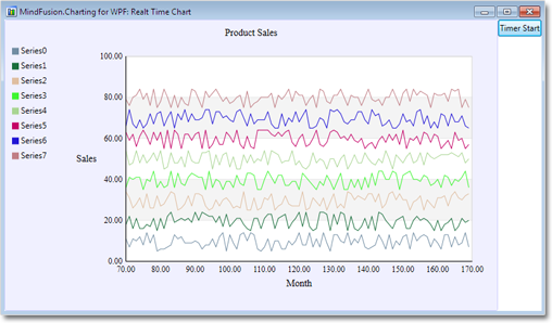
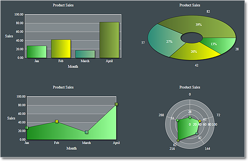
Radar and Polar charts
The Silverlight charting control adds a brand new types of charts – radar and polar charts. They support unlimited number of data series, 4 label types at the inner and outer axes, spiderweb, scatters and many more.

Radar chart
Hit testing
The new HitTest method returns a list of all ChartElement objects, which contain the specified point. Each chart type has its own ChartElement-derived class, which exposes properties for the hit object – data, labels, value etc.
Visual Effects
All chart types support the System.Windows.Media.Effects.DropShadowEffect and System.Windows.Media.Effects.Blur effect. Use the Effect property to specify the chosen effect.
 MindFusion.Diagramming
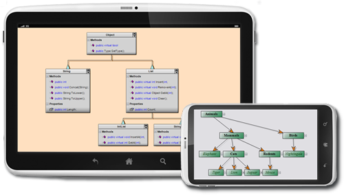
Node Effects
You can apply to nodes two visual effects, represented by the GlassEffect and AeroEffect classes. Effects can be added, removed or modified at any time and this will immediately reflect on the diagram. Effects of different types can be applied simultaneously.
Themes and Theme Editor
A theme in DiagramLite is a set of styles, each associated with a specific item type. When the theme is applied to a diagram, the styles registered in the theme affect all objects of their associated type. Styles are associated with item types within the theme through the RegisterStyle method. The package also includes a Theme Editor tool that provides simple visual environment for theme creation and modification. There are also several predefined themes available in the Themes subfolder of the installation root folder.
Diagram documents and tabbed views
The DiagramDocument class represents a collection of diagram pages or sheets, represented by DiagramPage objects. New pages can be added to the document and existing pages can be removed and reordered via the Pages collection.
The new TabbedDiagramView can be used to display DiagramDocument objects. The view displays a tab for each page in the document. You can change the active page, add and remove pages as well rearrange them by dragging with the mouse.
One-way graph Layout
The OneWayLayout class ensures that links enter into nodes from the same general direction and exit them from the opposite side. If the graph contains cycles, some links bend around the nodes to keep the enter/exit direction consistent. The algorithm aims to minimize the number of such links.
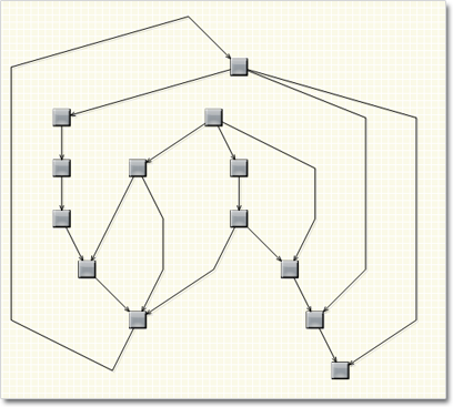
One Way Graph Layout
Multiple labels per link
The LinkLabel class allows multiple captions to be displayed for a single DiagramLink object. Link labels provide a set of properties allowing full customization of their display and positioning. The labels support automatic arrangement.
Layers
Items can now be assigned to layers, and layers can be hidden, locked or moved up/down in the Z order as a group. Set the LayerIndex property of items to associate them with layers in the Diagram.Layers collection. The Layer objects provide Visible, Locked and ZIndex properties, which affect all items in the respective layer. Layers also expose a Title property shown in the LayerListView control.
Layer list control
The LayerListView control provides user interface for working with Layer objects. The control displays a list of all layers in a specified Diagram with a title and an overview area, and also allows editing of layer’s Title, Visible and Locked properties and choosing the Diagram’s currently active layer.
Magnifier
The new magnifier tool lets you interactively zoom in (or out) portions of the diagram by holding down a modifier key or pressing a mouse button. The magnifier’s zoom factor and size are
customizable.
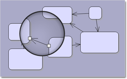
The Magnifier Tool
 MindFusion.Reporting
Side-By-Side Containers
You can arrange items in the report parallelly by putting them inside the new SideBySideContainer report item. One of the uses is to display two (or more) data ranges next to each other.
Miscellaneous
- New DefaultEncoding property in PdfExporter;
- New Median aggregate function;

A sample report
 MindFusion.Scheduling
Improved item presenter
The ItemPresenter class now provides the start and end time of the represented item fragment through the new StartTime and EndTime properties. In addition, derived classes can override the new OnStartTimeChanged, OnEndTimeChanged, and OnItemPropertyChanged methods to get notified when the StartTime or EndTime properties change or when any property of the underlying item changes.
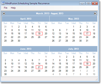
Improved recurrence
The Recurrennce class exposes a new event – ValidateOccurrence, which can be used to validate and customize the occurrences of a recurrence pattern.

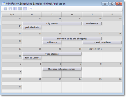
A sample schedule
You can read further details about the release at the forum. A trial version is available for download from here:
Download MindFusion Silverlight Pack R1.2013
Technical Support
You are welcomed to post your questions at the forum section of the respective product. You can also use the help desk or the support e-mail. MindFusion puts special effort in providing fast and competent technical support to everyone using our products.
About MindFusion.Silverlight Pack: A set of advanced Silverlight components that help you build your business application easy and on time. The tools provide you with a complete set of features for creating, editing and rendering complex flowcharts, charts, diagrams, calendars, maps, schedules and reports. A set of gauges and UI elements is also included. Each component offers various samples, tutorials and detailed documentation. The controls offer simple and intuitive API, completely customizable appearance, numerous input/output options and a rich event set. Each tool has been thoroughly tested to guarantee that you and your application get the high quality and performance you deserve.
