Multi Series Line Chart With Custom ToolTips in JavaScript

In this blog post we will build a line chart with 4 different series and custom labels on both axes. The chart renders tooltips with custom formatting. You can see the chart online here:

I. Initial Setup

We start by creating a blank HTML page and there we initialize the HTML Canvas element that will be needed by the Js Chart library.

<canvas id="chart" style="width: 100%; height: 100%; display: block;">

You can initialize the canvas as you want – there are no special requirements as to the size, position, scroll settings or anything else. What is important is that you add an id for that canvas – it will be used by the chart library. At the bottom of the page, right before the closing BODY tag we add a reference to the charting JavaScript files that represent the chart library:

<script type="text/javascript" src="Scripts/MindFusion.Common.js"></script>
<script type="text/javascript" src="Scripts/MindFusion.Charting.js"></script>

We also add a reference to another JavaScript file called LineChartTooltips.js. We haven’t created it yet, but this will be the file that will hold the JavaScript code for our chart.

<script type="text/javascript" src="LineChartTooltips.js">

II. Initializing the Line Chart In the LineChartTooltips JavaScript file we first include a reference to the Intellisense file so we can use code completion.

/// <reference path="Scripts/jspack-vsdoc.js"></reference>

Then we add mappings to the namespaces that we want to use:

var Controls = Charting.Controls;
var Collections = Charting.Collections;
var DateTimeSeries = Charting.DateTimeSeries;
var Drawing = Charting.Drawing;
var ToolTip = Charting.ToolTip;

Now we create the JavaScript chart object. We need a reference to the HTML canvas element, which we get using its id:

var chartEl = document.getElementById('chart');
chartEl.width = chartEl.offsetParent.clientWidth;
chartEl.height = chartEl.offsetParent.clientHeight;

We use the clientWidth and clientHeight properties of the offsetElement for the chart to give the chart its size.

Next we create the LineChart control and set its title and subtitle.

// create the chart
var lineChart = new Controls.LineChart(chartEl);
lineChart.title = "Women as a percentage in all S&E occupations";
lineChart.subtitle = "1993-2010";

III. Labels

The labels for the X and Y axes are set with two lists:

var xlabels = new Collections.List([
    "1993", "1995", "1997", "1999", "2003", "2006",
    "2008", "2010"]);

var ylabels = new Collections.List([
    "0%", "10%", "20%", "30%", "40%", "50%",
    "60%", "70%"]);

By default the labels at the axes are the intervals. We can replace them with the labels of a given chart series by using the supportedLabels property. This property tells the control at which chart element the labels of the series should be rendered – X or Y axis, tooltip, data labels etc. The members are from the LabelKinds enumeration.

The LineChart control uses series that support X and Y values. The best match is the Series2D class. This class supports one list with labels, which are always drawn at the data points. The easiest thing for us to do is to customize the Series2D and make it accept two lists with labels, which we will show them on both axes. Here is how we create the custom class by inheriting from Series2D

SeriesWithAxisLabels = function (xValues, yValues, xLabels, yLabels) {
    this.yLabels = yLabels;
    Charting.Series2D.apply(this, [xValues, yValues, xLabels]);
};

SeriesWithAxisLabels.prototype = Object.create(Charting.Series2D.prototype);

Our custom class is called SeriesWithAxisLabels. It accepts two lists with labels in the constructor. With one of them we call the constructor of the base class. The other we assign to a new property called yLabels.

Now we need to override the getLabel method and return the right label for the X and Y axis.

SeriesWithAxisLabels.prototype.getLabel = function (index, kind) {
    if ((kind & Charting.LabelKinds.XAxisLabel) != 0 && this.labels)
        return this.labels.items()[index];

    if ((kind & Charting.LabelKinds.YAxisLabel) != 0 && this.yLabels)
        return this.yLabels.items()[index];
   
    return "";
};

The getLabel method is responsible for providing the correct label according to the kind of labels that is requested. Here we check if we are asked for a label at the X or Y axis and return the label with the correct index from the xLabels or yLabels arrays. Here is how we create that series, which serves only to provide labels for the axes:

var series0 = new SeriesWithAxisLabels(
    new Collections.List([1, 2, 3, 4, 5, 6, 7, 8]),
    new Collections.List([0, 10, 20, 30, 40, 50, 60, 70]),
    xlabels, ylabels
);
series0.supportedLabels = Charting.LabelKinds.XAxisLabel | Charting.LabelKinds.YAxisLabel;
lineChart.series.add(series0);

Note that the data for the X and Y values of series0 corresponds to the positions on the axes where the labels should be rendered.

IV. Data

The data for the chart is provided by two series. They are also of type Series2D However, we do not want them to render the labels at the data points, which is their default behaviour. We would customize once again the Series2D class and make the labels be used for tooltips and not the data points.

We define a new SeriesWithToolTip class that overrides Series2D

SeriesWithToolTip = function (xValues, yValues, labels) { 
    Charting.Series2D.apply(this, [xValues, yValues, labels]);
};

SeriesWithToolTip.prototype = Object.create(Charting.Series2D.prototype);

The difference is the getLabel method. When asked for a label for the tooltip it returns the label at the given position from the series’ labels list:

SeriesWithToolTip.prototype.getLabel = function (index, kind) {
    if ((kind & Charting.LabelKinds.ToolTip) != 0 && this.labels)
        return this.labels.items()[index];   

    return Charting.Series2D.prototype.getLabel.apply(this, [index, kind]);
};

We create a data series from the SeriesWithToolTip kind this way:

//first series
var series1 = new SeriesWithToolTip(
    new Collections.List([1, 2, 3, 4, 5, 6, 7, 8]),
    new Collections.List([21.3, 21.5, 21.7, 23, 26.3, 26.1, 26.3, 27.5])
);

series1.title = "All S&E occupations";
var tooltips = new Collections.List();

for (let step = 0; step < series1.yData.count(); step++) {
    tooltips.add(series1.title + " for " + xlabels.items()[step] + ": " +
        series1.yData.items()[step] + "%");
}
series1.labels = tooltips;
series1.supportedLabels = Charting.LabelKinds.ToolTip;
lineChart.series.add(series1);

We generate the tooltip in a list, because we want the text to combine data from the xLabels and its yData list.

V. Styling the Chart

the JavaScript Chart library supports several styles to be applied on the chart depending on what you want to achieve. In our case the best choice is the PerSeriesStyle class, which colours all the elements of a Series with the subsequent brush from its strokes and fills collections.

// create line brushes
var firstBrush = new Drawing.Brush("transparent");
var secondBrush = new Drawing.Brush("#EA3F36");
var thirdBrush = new Drawing.Brush("#1A3D95"); 
var fourthBrush = new Drawing.Brush("#717173");
var fifthBrush = new Drawing.Brush("#407D39");

var style = new Charting.PerSeriesStyle();
style.fills = style.strokes = new Collections.List([firstBrush, secondBrush, thirdBrush, fourthBrush, fifthBrush]);
style.strokeDashStyles = new Collections.List([Drawing.DashStyle.Dash, Drawing.DashStyle.Dash,
Drawing.DashStyle.Dash, Drawing.DashStyle.Dash, Drawing.DashStyle.Dash]);
style.strokeThicknesses = new Collections.List([2, 2, 2, 2, 2]);
lineChart.plot.seriesStyle = style;

The PerSeriesStyle class also provides us with properties to specify the DashStyle and the strokeThickness of the brushes.

The styling of the axes and the fonts is done via the properties of the Theme class. Each chart has a theme property of type Theme. You can use it to customize many properties of the chart:

lineChart.legendTitle = "";
lineChart.gridType = Charting.GridType.Horizontal;
lineChart.theme.axisTitleFontSize = 14;
lineChart.theme.axisLabelsFontSize = 12;
lineChart.theme.subtitleFontStyle = Charting.Drawing.FontStyle.Bold;
lineChart.theme.titleFontStyle = Charting.Drawing.FontStyle.Bold;
lineChart.theme.subtitleFontSize = 16;
lineChart.theme.dataLabelsFontSize = 12;

Note the dataLabelsFontSize property here. It regulates the font not only for the data labels but for the labels of the legend. That is why we set it, though we do not render data labels. There are several dataLabels properties like dataLabelsFontName, which customize different aspects of the labels at chart series and legend.

VI. Legend

You can show the legend with showLegend property, which is true by default. The legendTitle property sets the title of the legend, which we set to an epty string. The labels for each series are taken from the series’ title property:

lineChart.legendTitle = "";

series1.title = "All S&E occupations";
.................
series2.title = "Computer/mathematical scientists";
..................
series3.title = "Engineers";

We can customize the background and border of the legend through properties of the theme or the LegendRenderer:

lineChart.legendRenderer.background = new Drawing.Brush("#f2f2f2");
lineChart.legendRenderer.borderStroke = new Drawing.Brush("#c0c0c0");

VII. ToolTips

The tooltips are automatically rendered when the user hovers over a data point. We make the data points visible by setting showScatter to true:

lineChart.showScatter = true;

Then we set different properties of the TooltTip class to achieve the desired look of the tooltips:

ToolTip.brush = new Drawing.Brush("#fafafa");
ToolTip.pen = new Drawing.Pen("#9caac6");
ToolTip.textBrush = new Drawing.Brush("#717173");
ToolTip.horizontalPadding = 6;
ToolTip.verticalPadding = 4;
ToolTip.horizontalOffset = -6;
ToolTip.verticalOffset = -4;
ToolTip.font = new Charting.Drawing.Font("Arial", 12, Charting.Drawing.FontStyle.Bold);

The ToolTip class is a static class and we can set the properties directly.

At the end, we should always call draw() to see the chart correctly rendered on the screen:

lineChart.draw();

You can download the sample with the JavaScript chart libraries and the Intellisense file from this link:

https://mindfusion.eu/samples/javascript/chart/JsLineChartTooltips.zip

About Charting for JavaScript: MindFusion library for interactive charts and gauges. It supports all common chart types including 3D bar charts. Charts can have a grid, a legend, unlimitd number of axes and series. Scroll, zoom and pan are supported out of the box. You can easily create your own chart series by implementing the Series interface.
The gauges library is part of Charting for JavaScript. It supports oval and linear gauge with several types of labels and ticks. Various samples show you how the implement the gauges to create and customize all popular gauge types: car dashboard, clock, thermometer, compass etc. Learn more about Charting and Gauges for JavaScript at https://mindfusion.eu/javascript-chart.html.

Using MindFusion JavaScript Components With WordPress Elementor Plugin

In this blog post we will describe the steps that are necessary to follow if you want to use MindFusion JavaScript library with WordPress Elementor plugin.

This guide assumes you are familiar with Elementor. For clarity we will show you how to show the JavaScript Scheduler from the “First Schedule” sample. The steps can be repeated for any MindFusion JavaScript library.

I. Add HTML Tag

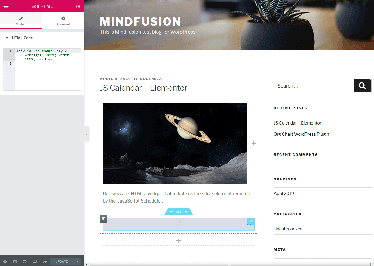
The Js Scheduler requires an element to be associated with. We create an HTML Elementor widget in the place of the web page where we want the schedule to appear. Then we write in it the HTML code that creates the calendar div:

Elementor HTML Widget

Use the <HTML> widget of Elementor to insert code for the <div> element required by MindFusion JS Scheduler

II. Copy the JavaScript and CSS Files

The First Schedule sample requires reference to two JavaScript files and a CSS file with the calendar theme.

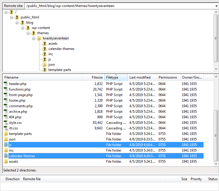
We copy the theme we will use in a new folder called “calendar-themes” into the directory of your WordPress website. This folder should be located in the subfolder that has the name of the WordPress theme you are using. This subfolder is located in the wp/content/themes/ directory. The path should be:

http://www.yoursite.any/wp-content/themes/your-theme/calendar-themes/first-theme.css

Instead of “calendar-themes” you can use any other name for your folder.

Next, copy the MindFusion.Scheduling.js and FirstSchedule.js files in a new folder called “js”, which is located at the same place where the calendar-themes folder is placed. The path should be:

http://www.yoursite.any/wp-content/themes/your-theme/js/FirstSchedule.js

http://www.yoursite.any/wp-content/themes/your-theme/js/MindFusion.Scheduling.js
WordPress directory structure

The directory structure of a WordPress blog with the newly created “js” and “calendar-themes” folders.

III. Get a Header/Footer WordPress Plugin.

Here is a list of the available options:

https://www.cminds.com/best-5-wordpress-header-footer-management-plugins/

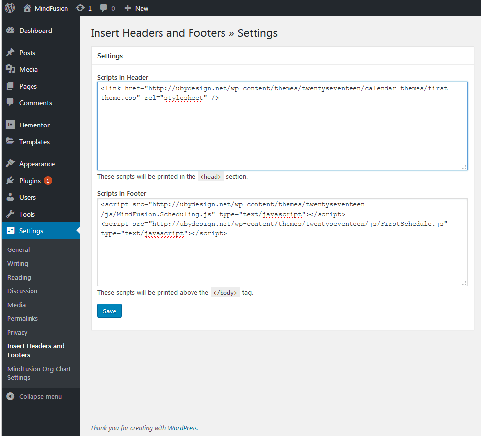
For the purpose of this tutorial we installed “Insert Headers and Footers” but any other plugin will do. After you install the chosen plugin add the reference to the scheduler themes and the JavaScript files according to the instructions of the plugin provider. In our case we did this from the WordPress Dashboard > Settings > Insert Headers and Footers menu.

There we placed in the “Scripts in Header” text box:

<link href="http://ubydesign.net/wp-content/themes/twentyseventeen/calendar-themes/first-theme.css" rel="stylesheet">

And in the “Scripts in Footer” textbox:

<script src="http://ubydesign.net/wp-content/themes/twentyseventeen/js/MindFusion.Scheduling.js" type="text/javascript"></script>
<script src="http://ubydesign.net/wp-content/themes/twentyseventeen/js/FirstSchedule.js" type="text/javascript"></script>

On our test blog we use the twentyseventeen theme. That’s how the Header/Footer settings look like:

Header/Footer settings

The header references the CSS theme of the calendar, the footer adds references to the required JavaScript files.

Learn more about MindFusion JavaScript components at: https://mindfusion.eu/products.html#javascript

For technical questions please use the MindFusion discussion board: https://mindfusion.eu/Forum/YaBB.pl

Custom Diagram Nodes With Clipped Images

In this blog post we will create an org chart diagram that uses custom nodes for each employee. The diagram will be created with the Diagramming for JavaScript library. For the nodes we use the CompositeNode class, which enables us to create diagram nodes whose appearance can be defined via composition of components and layout containers.

Click on the image below to run the sample:

Custom Composite Nodes with Clipped Images

I. References and HTML Settings

The first thing that we’ll do is create a web page for the sample and add the references to the necessary JavaScript files. In the section of the page we provide a reference to the following jQuery files:

<script src="common/jquery.min.js"></script>
<script src="common/jquery-ui.min.js"></script>

At the end of the HTML page, just before the closing tag we place references to the two JavaScript files used by the Diagramming library:

<script src="MindFusion.Common.js"></script>
<script src="MindFusion.Diagramming.js"></script>

Our sample has its JS code in a separate file called Script.js. We place a reference to it as well:

<script src="Script.js"></script>

The diagram library needs an HTML Canvas to draw itself onto. We add one in the middle of the web page:

<div style="width: 100%; height: 100%; overflow: auto;">
<canvas id="diagram" width="2100" height="2100">
This page requires a browser that supports HTML 5 Canvas element.
</canvas>
</div>

II. The OrgChartNode

In the Script.js file we first add mappings to some enums and classes that we’ll use from the diagram library:

var Diagram = MindFusion.Diagramming.Diagram;
var CompositeNode = MindFusion.Diagramming.CompositeNode;
var Behavior = MindFusion.Diagramming.Behavior;

var Alignment = MindFusion.Drawing.Alignment;
var Rect = MindFusion.Drawing.Rect;

Now we call the classFromTemplate method of CompositeNode that generates a node class using a JSON template that we’ll provide:

var OrgChartNode = CompositeNode.classFromTemplate("OrgChartNode",
{
component: "GridPanel",
rowDefinitions: ["*"],
columnDefinitions: ["22", "*"],
...............

In this code we indicate the panel that will be used by the CompositeNode is a GridPanel. Then we declare two lists that set the width and height of the grid rows and columns. The number of members in each array indicate how many rows/columns the grid has. In our case we have one row that takes all place and two columns: one is with fixed with of 22 pixels, the other takes the rest of the available space.

The JSON definition of the CompositeNode continues with an array with the children:

children:
[
{
component: "Rect",
name: "Background",
pen: "black",
brush: "white",
columnSpan: 2
},
{
component: "Image",
name: "Image",
autoProperty: true,
location: "ceo.png",
margin: "1",
imageAlign: "Fit"
},

The first child uses a Rect component that we call “Background”. It is rendered with a white brush, has a black outline and spans on two columns e.g. it fills all available space or each node.

The second child is an image. Note the row:

autoProperty: true

That means that we want to be able to access this component as a property. In such cases the library generates automatic set/get methods using the name of the component. In our sample they will be setImage / getImage.

The third child is a StackPanel component. This is the container for the text labels next to the node. This child has its own collection of children nodes:

component: "StackPanel",
orientation: "Vertical",
gridColumn: 1,
margin: "1",
verticalAlignment: "Near",
children:
[
{
component: "Text",
name: "Title",
autoProperty: true,
text: "title",
font: "Arial bold"
},
{
component: "Text",
name: "FullName",
autoProperty: true,
text: "full name",
pen: "blue",
padding: "1,0,1,0"
},
{
component: "Text",
name: "Details",
autoProperty: true,
text: "details",
font: "Arial 3"
}

The children of this new StackPanel are text components, which are called Title, FullName and Details. They have their autoProperty set to true, which means we can access their value through automatic setter and getter methods.

III. The Diagram and the Nodes

in the read() function of the document we create an instance of the Diagram class using a reference to the canvas we’ve created in section I.

// create a Diagram component that wraps the "diagram" canvas
diagram = Diagram.create($("#diagram")[0]);

Then we enable interactive drawing of custom nodes by calling setCustomNodeType and Then we enable interactive drawing of custom nodes by calling setCustomNodeType and setBehavior:

// enable drawing of custom nodes interactively
diagram.setCustomNodeType(OrgChartNode);
diagram.setBehavior(Behavior.Custom);

The behavior o the diagram is set to Custom, which means that when the user starts drawing nodes the library shall draw nodes specified by CustomNodeType. The setCustomNodeType method tells the diagram that these custom nodes are of type OrgChartNode.

Now it is really easy and intuitive to create nodes:

var node1 = new OrgChartNode(diagram);
node1.setBounds(new Rect(25, 15, 60, 25));
node1.setTitle("CEO");
node1.setFullName("John Smith");
node1.setDetails(
"Our beloved leader. \r\n" +
"The CEO of this great corporation.");
node1.setImage("ceo.png");
diagram.addItem(node1);

We create a few more nodes using the same code and we bind them in a hierarchy. The links among the nodes are created by calling the Diagram Factory createDiagramLink method of the diagram Factory class:

diagram.getFactory().createDiagramLink(node1, node2);
diagram.getFactory().createDiagramLink(node1, node3);
diagram.getFactory().createDiagramLink(node1, node4);
diagram.getFactory().createDiagramLink(node4, node5);

IV. Rounded Images

We want to add now a custom feature to the node – instead of drawing the image as a rectangle we want to clip it and show it as an ellipse. We’ll do this by using a method that replaces the standard setImage method.

The new method is called createImageClip and takes as parameters two objects: one is the image URL and the other is the node that uses this image.

function createImageClip(path, node)
{
var canvas = document.createElement('canvas'),
ctx = canvas.getContext('2d'),
img = document.createElement('img');
..............

We create two HTMLElements – canvas and image, and we get the 2D context of the Canvas. Then, in an event handler of the onload event of the image we clip the canvas to an area defined by a Path. The path reads the size of the image and creates a full arc e.g. a circle inside that rectangle. Then the context draws the image and the new canvas is set as an image to the node using the setImage method:

img.src = path;
img.onload = function ()
{
canvas.width = img.width;
canvas.height = img.height;
var halfSize = img.width / 2;
ctx.save();
ctx.beginPath();
ctx.arc(halfSize, halfSize, halfSize, 0, Math.PI * 2, true);
ctx.closePath();
ctx.clip();

ctx.drawImage(img, 0, 0, img.width, img.height);

node.setImage(canvas.toDataURL());
};

You can use this approach to create clippings of images with variable shape.

Now instead of calling:

node1.setImage("ceo.png");

we call our custom method this way:

createImageClip("ceo.png", node1);

We do this for all nodes in the org chart.

That’s the end of this tutorial. You can download the sample together with all JavaScript libraries used from this link:

Custom Nodes With Image Clipping in JavaScript: Sample Download

Find out more about Diagramming for JavaScript at https://mindfusion.eu/javascript-diagram.html

Binding the Java Planner to Microsoft SQL Server Using JDBC

In this blog post we will bind to an MS SQL database called bookings. There we will select all data from a table named booking_data. The data is DateTime values. We will use the values to change the background of corresponding calendar cells in a simple Java application. The Java application renders a single-month calendar built with MindFusion Scheduler for Java library.

I. MS SQL EXPRESS Server Configuration

We download and install MS SQL EXPRESS server from https://www.microsoft.com/en-us/sql-server/sql-server-downloads. The installation also includes an application called “Sql Server Configuration Manager”. We start that application and click on the “SQL Services” tab. There we need to make sure that two services are running:

  • SQL Server
  • SQL Server Browser

You start these services by pressing the arrows in the toolbar at the top. If you cannot do this you need to change the Start Mode for this service. Double click it and in the Properties dialog that appears click on the “Service” tab. There you will find the “Start Mode” property and change it to “Manual”. Once you’ve done this you can start, stop or pause the service from the toolbar icons.

SQL Server Config Manager: Services

In order to start an SQL Server Service you might have to change its Start Mode to “Manual”.

Then we click on the “SQL Native Client” node and we select the “Client Protocols” tab. We make sure the TCP/IP Protocol is enabled.

SQL Server Config Manager: Enable TCP/IP

Make sure the TCP/IP protocol is enabled for the JDBC connection to succeed

The next step is to download Microsoft SQL Server Management Studio from https://docs.microsoft.com/en-us/sql/ssms/download-sql-server-management-studio-ssms?view=sql-server-2017

Once we install it and start it we can create a new database called bookings. We right click on the Databases menu and choose “New Database”. We call it “bookings”. Then we expand the tree under “bookings” and right click on the “Tables” node. A window opens where we can define the columns for our new table. We add two columns:

  • id of type integer, which we set at primary key by right-clicking on it.
  • booked_date of type DateTime which will hold the dates that are booked.

Create a new table using MS SQL Server Management Studio

MS SQL Server management Studio: the dialog for defining a new table

After we are done we choose save and at this point we can provide a name for our table. We call it booking_data. With the table defined we right-click on it and choose “Edit Top 200 Rows”. There we add just three days (Jan 16th, Jan 22nd, Jan 26th) all of which in the current month. The data is auto-saved.

MS SQL Server management Studio: Table Edit

MS SQL Server Management Studio: here is how you edit the table data

The next step is to create a new user that will connect to this database. We click the “Security” node on the navigation tree and then “Logins”. Right-click and we choose “New Login”. In the dialog that opens we provide username and password. In order to do that we need to have the Login method set to “SQL Server authentication”. In the next tab “Server Roles” the new user must have “public” role. Then in “User Mapping” we tick the “bookings” database. In the Securables tab in the “Grant” grant column for the user we tick the “Connect SQL” permission. Then we close the dialog.

Grant SQL Connect to a DB User

Grant the new user the right to perform an SQL connection.

We get back to the bookings database and right-click on it. We choose “Properties” and from the dialog we click on the “Permissions” menu. There we select the user we’ve just created and in the Grant column of the underlying table we grant her the “Select” permission.

Granting User Permissions

Grant the DB user ‘Select’ permission to perform the required SQL query

With that the setup of our server and user is ready.

II. JDBC Driver & MS SQL Express Connection Properties

We download Microsoft’s JDBC Driver for MS SQL Server from this link: https://docs.microsoft.com/en-us/sql/connect/jdbc/microsoft-jdbc-driver-for-sql-server?view=sql-server-2017 and extract it. Next we create a new Java project. For this project we’ve used IntelliJ IDEA but any other Java IDE will do. In the project tree to the right we create a subfolder that we call “libs”. There we copy the jar of JDBC driver from the folder where we extracted it. Microsoft provides two versions of the driver depending on the JRE that you use. In our case we choose the version for JRE 10, which is called mssql-jdbc-7.0.0.jre10.jar. Next we right-click on the name of our project and select “Open Module Properties”. In the dialog we choose the “Modules” menu and there we click on the “Dependencies” tab and select the mssql-jdbc-7.0.0.jre10.jar module.

Configuring IntelliJ Project Modules

Configuring the IntelliJ Project to include the JDBC driver module

We click on the src folder of the project and add a new class, which we call MainWindow.java. In it we write the method establishConnection. This method is responsible for connecting to the MS SQL database “bookings”. Here is the code that makes the connection:

private void establishConnection() throws ClassNotFoundException
{

Connection conn = null;
PreparedStatement pst;

try {
// db parameters
String sql = "SELECT booked_date FROM booking_data";

String userName = "mindfusion";
String password = "mf123";

String url = "jdbc:sqlserver://DESKTOP-NV9S0TU\\SQLEXPRESS;databaseName=bookings;";

Class.forName("com.microsoft.sqlserver.jdbc.SQLServerDriver");
conn = DriverManager.getConnection(url, userName, password);

pst = conn.prepareStatement(sql);
ResultSet rs = pst.executeQuery();

If you’ve followed strictly the steps we’ve outlined so far at this point you would successfully connect to your MS SQL Server with the credentials you’ve set up following the guide so far.

III. The Schedule Application

We download MindFusion Java Swing Scheduler from https://mindfusion.eu/java-scheduler.html and unzip it. We copy JPlanner.jar in the libs folder of the project and add it as a project dependency from the “Open Module Settings” menu. Then we define a Calendar variable and assign it to a new instance of the Calendar class.

public MainWindow() throws ClassNotFoundException
{
setDefaultCloseOperation(EXIT_ON_CLOSE);
setSize(368, 362);
setTitle("MindFusion.Scheduling Sample: Minimal Application");

calendar = new Calendar();
calendar.setTheme(ThemeType.Light);
..................
..................
..................

establishConnection();
}

private Calendar calendar;

At the end of the method we call establishConnection and connect to the MS SQL Server.

IV. Styling the Calendar Dates

The aim of our sample application shall be to color those cells of the calendar that correspond to the dates we’ve read from the database. In order to do this we use the DateStyle class that sets some useful appearance properties to a range of cells that are specified with the setFrom and setTo methods. We use setBrush to change the background of the cell.

while (rs.next()) {
System.out.println(rs.getString("booked_date"));
Date date = rs.getDate("booked_date");

DateStyle dStyle = new DateStyle();
dStyle.setFrom(new DateTime(date));
dStyle.setTo(new DateTime(date));
Style style = new Style();
style.setBrush(new SolidBrush(Color.pink));
dStyle.setStyle(style);

calendar.getDayStyles().add(dStyle);

}

Finally we add the style to the DayStyles collection of the calendar.

Here is the final application:

Scheduling application in Java Swing with MS SQL Server JDBC Connection

MindFusion Java Swing application with the Scheduling library and MS SQL Server

You can download the project together with the MS SQL Server JDBC driver library and the scheduling library from this link:

Download JPlanner Sample Application That Uses MS SQL Server JDBC Connection

About MindFusion Scheduling for Java Swing: The library provides extensive feature-set for creating and customizing all sorts of calendars, task lists, time-management tables, resource allocation tables and other. It boasts various options for customizing appearance and numerous events for handling user actions. The distribution archive includes a lot of samples and extensive documentation. Learn more at https://mindfusion.eu/java-scheduler.html

Interactive Event Timetable in JavaScript

This blog post describes the main steps on how to create a schedule table, which shows the allocation of college rooms to different courses. Users can filter the courses by lecturer(s).

I. Initial Setup

We start by copying the JavaScript scheduler files that we’ll use in the directory of our project. These are:

  • MindFusion.Scheduling.js – represents the Js Scheduler library
  • MindFusion.Scheduling-vsdoc.js – provides Intellisense support
    standard.css – in a subdirectory “themes”, this is the CSS theme styling of the resource table
  • planner_lic.txt – paste your license key here to disable the trial version label.

We create then 2 more files specifically for our application:

  • ResourceView.html – the web page of the application
  • ResourceView.js – the JavaScript code that implements the dynamic features of our application.

II. The HTML Page

In the head section of our web page we first create a reference to the theme file:

<link rel="stylesheet" type="text/css" href="themes/standard.css">

At the end of the web page, just before the closing </body> tag we add a reference to the Scheduling.js file that contains the scheduling features and the ResourceView.js files that we’ll write for the application:

<script src="MindFusion.Scheduling.js" type="text/javascript"></script>
<script src="ResourceView.js" type="text/javascript"></script>

The calendar library requires an HTML <div> element, which is used to render it. We add one:

<div id="calendar" style="height: 100%; width: 100%;">&nbsp;</div>

It is important that you add an id to this <div> because we need to reference it in the JS code behind file.

III. Basic JavaScript Settings

At the top of the JavaScript code-behind file we add a reference to the Intellisense file. We also create a mapping to MindFusion.Scheduling namespace:

/// 
var p = MindFusion.Scheduling

Then we create the calendar object. We need a reference to the <div> element that will render it:

// create a new instance of the calendar
calendar = new p.Calendar(document.getElementById("calendar"));

For this sample we will use the ResourceView The currentView property specifies that. In addition, we set the count of visible cells in the calendar to 7. That is done through the resourceViewSettings property of the calendar

// set the view to ResourceView, which displays the distribution of resources over a period of time
calendar.currentView = p.CalendarView.ResourceView;

// set the number of visible cells to 7
calendar.resourceViewSettings.visibleCells = 7;

The itemSettings proeprty lets us customize the items in the schedule We use titleFormat and tooltipFormat to specify how the title and tooltip of each item will be rendered. Both properties use special format strings:

  • %s – the start date will be rendered
  • %e – the end date of the item will be rendered
  • %d – the details of the item will be rendered.

You can specify the way dates and time are formatted by adding the desired format in brackets:

// show hours on items
calendar.itemSettings.titleFormat = "%s[HH:mm] - %e[HH:mm] %h";
calendar.itemSettings.tooltipFormat = "%d";

Then we set the theme of the calendar to standard, whose css file we referenced in the web page:

calendar.theme = "standard";

and we make one more adjustment – the name of contacts will be taken from the last name of the person. Possible valies are “F”, “M” and “L” – for first, middle and last name.

calendar.contactNameFormat = "L";

IV. Resources

When the calendar initially loads there are several contacts and locations available. The objects that represent them are instances of the Contact and Location classes. After we create them we add them to the contacts and locations collections of the calendar schedule.

var resource;

// Add professor names to the schedule.contacts collection.
resource = new p.Contact();
resource.firstName = "Prof. William";
resource.lastName = "Dyer";
calendar.schedule.contacts.add(resource);

resource = new p.Location();
resource.name = "Room D";
calendar.schedule.locations.add(resource);

Now, when the user creates a new course they will see the Contact and Location in the Options pane of the “Create Item” form:

V. Items

The items are instances of the Item class. They represent the classes of the different lecturers. We use the startTime and endTime properties of Item to specify when the class takes place. The subject property gives the name of the class:

//always start with the current date
var date = p.DateTime.today();

item = new p.Item();
item.startTime = p.DateTime.addHours(date.addDays(1), 14);
item.endTime = p.DateTime.addHours(item.startTime, 1);
item.subject = "Classical Mechanics";

We use the location and contacts properties to set where the lecture takes place and who teaches it. Note that the contacts property is of type collection and we can assign several lecturers to one class:

item.location = calendar.schedule.locations.items()[0];
item.contacts.add(calendar.schedule.contacts.items()[0]);

We get the location and the contact from the schedule’s lists with locations and contacts We must also set the details of the item – they will be rendered as a tooltip, if you remember. We want the tooltip to show the two names of the lecturer and the location. Here is how we must define it:

item.details = item.contacts.items()[0].firstName + " " +
item.contacts.items()[0].lastName + " - " + item.location.name;

We must add the item to the items collection of the schedule we render the calendar render the calendar

calendar.render();

VI. Events

When users create new items we must set their details to tell the name and the location of the new class. We handle the itemCreating event to do this:

// attach handler - creating an item
calendar.itemCreating.addEventListener(handleItemCreating); 

function handleItemCreating(sender, args) {
    handleItemModified(sender, args);
    if (args.item.contacts.count() > 0) {
        //the details field is used by the tooltip
        args.item.details = args.item.contacts.items()[0].firstName + " " +
                args.item.contacts.items()[0].lastName;

        if (args.item.location != null)
            args.item.details += " - " + args.item.location.name;
    }

}

The itemCreating event provides an instance of the ItemModifyingEventArgs class as a second argument to the handler method. There we use the item property that tells us which item is being modified. We then take the desired contact and Location information from the contacts and location properties of the item.

When a new course item is dragged to another location we must change its color accordingly. We do this by handling the itemModified event.

// attach handler - modifying an item
calendar.itemModified.addEventListener(handleItemModified);

The diferent background color of the items is achieved by custom CSS classes. We use the cssClass property of the Item class. The CSS styles are defined in the <HEAD> section of the web page:

 .mfp-planner.standard .itemClass1 .mfp-item {
            background-color: 	#0c71af;
        }

.mfp-planner.standard .itemClass2 .mfp-item {
            background-color: #f81e1e;
        }
...........

The handler method checks the new location and assigns the appropriate CSS style:

function handleItemModified(sender, args)
{
    // you don't have to check any other conditions like dragging to another room, 
    // as it will stay the same color if you make other changes (other than dragging to a different room)
    if (args.item != null){
        switch (args.item.location.name) {
            case "Room A":  //we can also implement it with for
                args.item.cssClass = 'itemClass1';
                console.log("a");
                break;
            case "Room B":
                args.item.cssClass = 'itemClass2';
                break;
            case "Room C":
                args.item.cssClass = 'itemClass3';
                break;
            case "Room D":
                args.item.cssClass = 'itemClass1';
                break;
            case "Room E":
                args.item.cssClass = 'itemClass2';
                break;
            case "Room F":
                args.item.cssClass = 'itemClass3';
                break;
            default:
                args.item.cssClass = 'itemClass1';
        }
    }
}

The item property of the args parameter of the handler method provides access to the item that was modified.

VII. Filtering Professors

We want to add one last feature to our application. We want the user to be able to render courses only by a given professor.

We first add checkboxes with the names of the lecturers. Each checkbox has the same handler method for the click event:

<input id="dyer" checked="checked" name="subscribe" type="checkbox" value="Dyer>
<label for=">Prof. William Dyer

<input id="fletcher" checked="checked" name="subscribe" type="checkbox" value="Fletcher">
<label for="fletcher">Prof. Ann Fletcher</label>
...........................

The handler method needs to look at two cases. The first case is when the class is taught by a single professor. In this case we cycle through all items and make the item visible or not depending on whether the check box with the name of the professor is checked:

// if there is at least one present professor from the lecture professors, the lecture will not disappear
function handleClick(cb) {
for (var i = 0; i < calendar.schedule.items.count(); i++) {
        var item = calendar.schedule.items.items()[i]; //we iterate through every element
        if (item.contacts.count() == 1) {
            if (item.contacts.items()[0].lastName == cb.value)
                item.visible = cb.checked;
        }
      }
.......................
}

In the second case we look at courses that are taught by more than one lecturer. In this case we show the item if the checkbox with the name of at least one of the lecturers is selected:

else if (item.contacts.count() > 1) {
for (var j = 0; j < item.contacts.count() ; j++) {
                if (item.contacts.items()[j].lastName == cb.value) { // the checked/unchecked professor is in the contacts of this item
                    if (cb.checked == true) item.visible = true; // if there is a check, the item must be visible
                    else { // if there is no check, we see if there is at least one professor in the list of contacts of the item
                        item.visible = professorPresent(item);
                    }

                }
            }
        }

Finally we repaint the calendar:

// repaint the calendar
this.calendar.repaint(true);

Here the professorPresent method checks if at least one of the check boxes with professors that are present as lecturers in the item that we provide as argument are selected:

// return true if even 1 professor from the item's contacts is present, false otherwise
function professorPresent(item) {
    console.log(item.contacts.count());
    for (var j = 0; j < item.contacts.count() ; j++) {
        var checkBoxId = item.contacts.items()[j].lastName.toLowerCase();
        var checkBox = document.getElementById(checkBoxId);
        if (checkBox!= null && checkBox.checked == true) {
            return true;
        }
    }
    return false;
}

And that’s the end of this blog post. Here is a link to download the complete source code of this application:

Download The Sample Resource View Application

About MindFusion JavaScript Scheduler: MindFusion Js Scheduler is the complete solution for all applications that need to render interactive timetables, event schedules or appointment calendars. Fully responsive, highly customizable and easy to integrate, you can quickly program the JavaScript scheduling library according to your needs. Find out more at https://mindfusion.eu/javascript-scheduler.html