Diagramming for Silverlight, V3.1

The new release of Diagramming for Silverlight provides two new layouts and a few other new features. Here is an overview:

Tree map layout
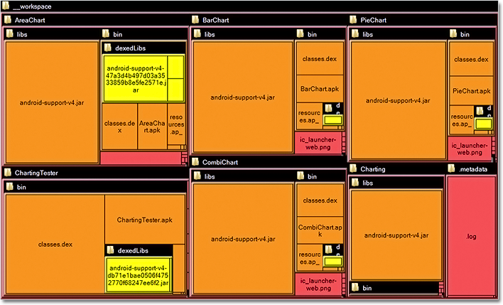
Tree maps represent hierarchies by nesting child nodes within their parents, where the areas of leaf nodes are proportional to their Weight values. Unlike other layout algorithms, TreeMapLayout expects hierarchies to be defined via grouping or containment (see AttachTo method and ContainerNode class), and will ignore any links in the diagram. The diagram area covered by the topmost nodes in a hierarchy is specified via the LayoutArea property. By default, the layout tries to keep the ratio of node sides as close as possible to one.

The tree map layout.

The tree map layout.

Decision flowchart layout
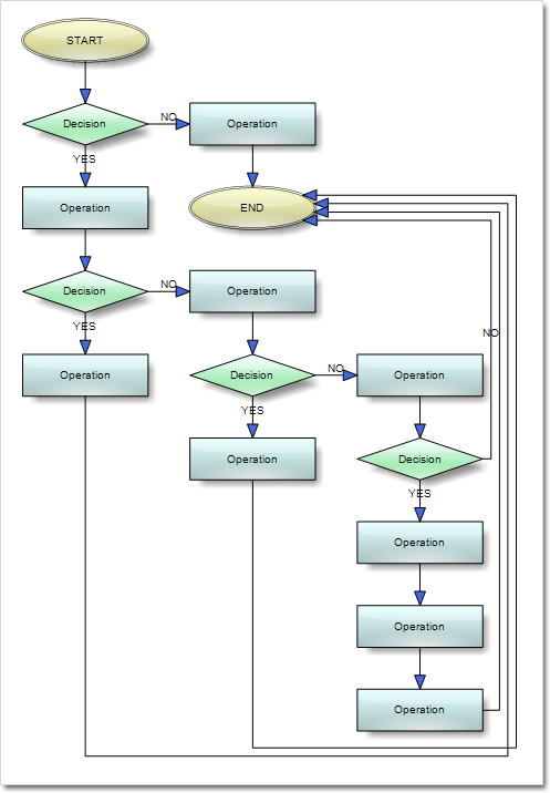
DecisionLayout arranges simple flowcharts consisting of decision boxes with up to three outgoing links per node and activity boxes with a single outgoing link per node. The nodes are arranged in columns and rows, whose distance depends on the HorizontalPadding and VerticalPadding property values. When links share the same row or column, they are placed at a distance specified via LinkPadding. The layout arranges nodes recursively starting from StartNode.

The decision layout.

The decision layout.

Miscellaneous
~ Layout algorithms now automatically resize diagram’s Bounds if it’s not large enough to fit the arranged content.
~ LinkLabels are now copied by DiagramLink copy constructor and clipboard methods.
~ ContainerNode now displays a caption bar when its Shape is set to Rectangle or RoundRect.

You can download the trial version directly from the link below:

Download DiagramLite 3.0.1 Trial Version

Feel free to contact us with any questions about Diagramming for Silverlight or any other of our products – please use the forum, email support@mindfusion.eu or the help desk. We strive to provide competent and detailed answers to all support inquiries within hours of receiving them.

About MindFusion.Diagramming for Silverlight: A programming component specially designed and developed to provide web developers with a fast and easy way to create diagrams, graphs, schemes, hierarchies, charts and many more. The impressive feature set of the control ranges from predefined node shapes to custom nodes and thirteen automatic layouts. The style and appearance of all diagram elements are completely customizable, the numerous samples provide programmers with plenty of example code to look from.

The control boasts intuitive API that is documented in details in the help file provided with the installation. There are also step-by-step tutorials and various guides. You can check the features
list here to find out more about the
capabilities of the tool. An online demo is also available. The prices are per developer, source code is also available. Learn more about the licensing scheme here.

Diagramming for Silverlight, V3.0.1

We have released a new version of the Diagramming component for Silverlight. Here is an overview of the new features:

Zoom control

The new ZoomControl class lets users interactively change the zoom level and position of a diagram. In order to use the ZoomControl, place it anywhere over the target diagram and set the target property of the control to that diagram. Use the ZoomStep and ScrollStep properties to customize the control. The control’s appearance is customized with the Fill, Stroke, CornerRadius and TickPosition properties.

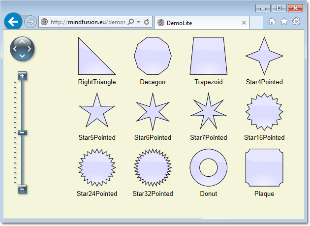
The zoom control and the new predefined node shapes.

The zoom control and the new predefined node shapes.

Miscellaneous

  • Use the new AllowRenamePages property of TabbedDiagramView to let users rename a DiagramPage interactively by clicking on its tab.
  • Several new stock shapes have been added: RightTriangle, Decagon, Trapezoid, Star4Pointed, Star5Pointed, Star6Pointed, Star7Pointed, Star16Pointed, Star24Pointed, Star32Pointed, Donut, Plaque.
  • The HandlesStyle property of nodes supports two new handle styles – RoundAndSquare and RoundAndSquare2.
  • The SetSelfLoopShape event is raised when a link becomes a self-loop. You can set a custom shape for that link.
  • and much more – find the full list here.
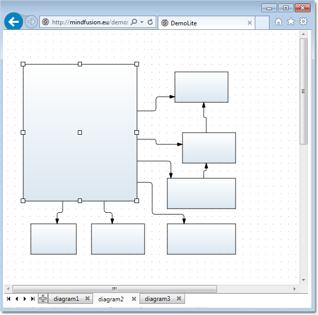
Tabbed view.

Tabbed view.

Direct download of the trial version is available from the link below:

Download DiagramLite 3.0.1 Trial Version

Feel free to contact us with any questions about Diagramming for Silverlight or any other of our products – please use the forum, email support@mindfusion.eu or the help desk. We strive to provide competent and detailed answers to all support inquiries within hours of receiving them.

About MindFusion.Diagramming for Silverlight: A programming component specially designed and developed to provide web developers with a fast and easy way to create diagrams, graphs, schemes, hierarchies, charts and many more. The impressive feature set of the control ranges from predefined node shapes to custom nodes and thirteen automatic layouts. The style and appearance of all diagram elements are completely customizable, the numerous samples provide programmers with plenty of example code to look from.

The control boasts intuitive API that is documented in details in the help file provided with the installation. There are also step-by-step tutorials and various guides. You can check the features list here to find out more about the capabilities of the tool. An online demo is also available. The prices are per developer, source code is also available. Learn more about the licensing scheme here.
Charting for Silverlight 1.2

We have released Charting for Silverlight 1.2 with the following new features:

Styles and Themes

The appearance of each chart element – axis, legend, series – is defined by a style. Each ChartTheme is a collection of styles. Charting for Silverlight 1.2 lets you:

  • create themes based on the appearance of an existing chart
  • create themes with the ThemeEditor tool
  • save themes to XML files
  • load themes from XML files
  • use a number of predefined themes.

You can read detailed instructions on how to save, load and edit themes in the “Working with Themes” tutorial.

The green theme applied at a bar chart in Silverlight.

The green theme applied at a bar chart in Silverlight.

Better Design Time Support

Charting for Silverlight lets you now edit all collection properties – like series, legends and brushes – in the property grid. In addition we have added converters that let you edit label and data collection in XAML.

Axis Intervals

The new AxisSettings.IntervalCount property lets you specify the count of intervals at the numeric axis. When IntervalCount is set, the Interval property is not considered and the axis is calculated based on AxisSettings.Min, AxisSettings.Max and AxisSettings.IntervalCount.

A bar chart with two Y-axes.

A bar chart with two Y-axes.

API Changes

There are a number of changes in the control’s API mainly the type of some properties that were collections is changed to accommodate the new design-time features. Check the “What’s New in This Release” section in the control’s documentation for further details.

You can find out more about the new release at the news page in the Charting for Silverlight section on our forum. The trial version is available for download from here:

Charting for Silverlight 1.2 Trial Version Download

You are welcome to contact us with any questions, problems or inquiries about the control or any other of our products. You can use the discussion board, the help desk or the contact form. MindFusion has always put special emphasis on providing excellent customer support and we usually answer your questions within hours of receiving them.

About MindFusion.Charting for Silverlight: A programming component that combines powerful charting capabilities with a simple API and easy use. Among the features of the control are fully customizable grid, multiple legends, positive and negative values on all chart axes, second X and second Y axis, gauges and many more – read them here.

The control provides detailed documentation and many different samples that show how to customize it. It supports all major chart types – bar, line, radar and pie, as well different modifications of them – column, doughnut, polar, area charts etc. Licenses are counted per user, distribution is royalty free. Each license guarantees full technical support. The source code is also available.

Custom items in Silverlight reports

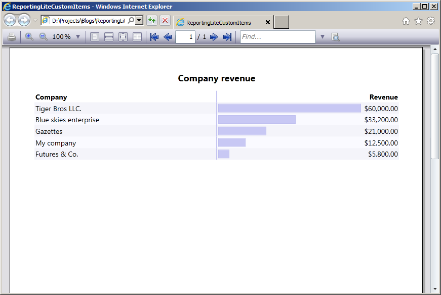
In this post we will examine how to use custom items in MindFusion reports in Silverlight. The report in question will display the revenue of several companies, sorted in descending order. The custom items will visualize the relative revenue value of each company as a graphics similar to a chart.

To start off, we will define our business objects – a CompanyInfo class with two properties – Name and Revenue, of type string and double respectively.

public class CompanyInfo
{
  public string Name { get; set; }
  public double Revenue { get; set; }
}

Then we will declare sample data – an array of several companies, sorted by revenue:

var companyInfo = new CompanyInfo[]
{
  new CompanyInfo { Name = "My company", Revenue = 12500 },
  new CompanyInfo { Name = "Blue skies enterprise", Revenue = 33200 },
  new CompanyInfo { Name = "Futures & Co.", Revenue = 5800 },
  new CompanyInfo { Name = "Gazettes", Revenue = 21000 },
  new CompanyInfo { Name = "Tiger Bros LLC.", Revenue = 60000 },
}.OrderByDescending(info => info.Revenue);

The actual report is placed inside Resource Dictionary (named MyReport.xaml). The report contains a title and a single data range with three columns – for company name, revenue graphics and revenue value respectively. The actual report is omitted for brevity, but the code of the custom item representing the revenue graphics is shown below:

<report:CustomReportItem Location="50%,0" Size="40%,6" Value="[100*Revenue/Max(&quot;Revenue&quot;)]">
  <report:CustomReportItem.Template>
    <DataTemplate>
      <Grid>
        <Grid.ColumnDefinitions>
          <ColumnDefinition Width="{Binding Converter={StaticResource gridLengthConverter}}" />
          <ColumnDefinition Width="{Binding Converter={StaticResource gridLengthConverter}, ConverterParameter='-'}" />
        <ColumnDefinition />
        <Border BorderBrush="#C0C0F0" BorderThickness="1" Background="#C8C8F4" Margin="3" />
      </Grid>
    </DataTemplate>
  </report:CustomReportItem.Template>
</report:CustomReportItem>

The value of the custom item is calculated as the percentage of the company revenue relative to the maximum revenue amongst all companies. The content of the custom item represents a grid with two columns. The first column contains the border that is used as the representation of the revenue graphics. The width of the columns is calculated according to the item value by using a custom value converter – GridLengthConverter. The GridLengthConverter basically converts the value to a GridLength object with GridUnitType set to Star.

The report is loaded from the resource dictionary using the helper Report.FromDictionary method, then setup with the data and run:

var report = Report.FromDictionary(new Uri("ReportingLiteCustomItems;component/MyReport.xaml", UriKind.Relative), "myReport");
report.DataContext = companyInfo;
report.QueryDetails += (s, e) => e.Details = companyInfo;
report.Run()

Note, that the sample handles the QueryDetails event. This is done in order to supply data to the Max aggregate function used inside the CustomReportItem.Value expression.

Finally, the report is selected inside a ReportViewer on the main form:

viewer.Document = report;

The following image shows the running sample:

The source code is available for download from here:

Download the Complete Source Code for the Sample

You can get the trial version of MindFusion.Reporting for Silverlight from this link:

Download MindFusion.Reporting for Silverlight Trial Version

Line Chart in Silverlight with Two Legends, Scatters and Custom Labels

In this post we are discussing how to build a line chart with multiple series, scatters in custom colors,
two legends and custom labels at the X-axis. We are building the chart in Silverlight, using the
MindFusion.Charting for Silverlight tool.

Data

The data for the chart is taken from an ObservableCollection, where each member represents sales for a
given month.

lineChart1.DataSource = sales;

The Axes

The Y-axis shows an auto scale. This is the default LabelType so we don’t need to change it. But we want custom title label and intervals of 100. Here is how we set this:

lineChart1.YAxisSettings.Interval = 100L;
lineChart1.YAxisSettings.TitleOffset = 10.0;
lineChart1.YAxisSettings.Title = "USD";

The X-axis requires more customization. We want to show custom labels, that’s why we must set them and change the LabelType to show them:

lineChart1.XAxisSettings.LabelType = LabelType.CustomText;
lineChart1.XAxisSettings.CustomLabelPosition = CustomLabelPosition.ChartDataPoints;

We use the XLabelPath property to bind the Month field in our DataSource to the X-labels of the chart. We also set the maximum value at the X-axis and draw pointers to the labels by setting the Tick property.


lineChart1.XAxisSettings.MaxValue = sales.Count + 1;
lineChart1.XAxisSettings.Tick = 5.0;

The Series

The data for each series comes from a specific field in the DataSource collection:

lSeries1.YDataPath = "Turnover";
lSeries2.YDataPath = "Profit";

We want to show scatters and we use the ScatterType property to set the type. By default the type is “None” and no scatters are drawn. We need to change that:

lSeries1.ScatterType = ScatterType.Diamond;
lSeries1.ScatterSize = 20;

The brushes for the scatters are set with a BrushCollection:

BrushCollection sBrushes1 = new BrushCollection();
sBrushes1.Add(new SolidColorBrush(Colors.Red));
sBrushes1.Add(new SolidColorBrush(Colors.Yellow));
sBrushes1.Add(new SolidColorBrush(Colors.Green));


lSeries1.ScatterFills = sBrushes1;

Finally, don’t forget to add your LineSeries to the chart:

lineChart1.Series.Add(lSeries1);
lineChart1.Series.Add(lSeries2);

Legends

In this chart we need two legends – one is for the scatters and one for the series. They are both of
type SeriesLegend, which gives us control over the brushes and labels used.

The legend for the scatters is docked to the bottom and is aligned in the center.

MindFusion.Charting.Silverlight.SeriesLegend legend =
new MindFusion.Charting.Silverlight.SeriesLegend();
legend.LabelsSource = new List() { "Higher than expected", "Lower than expected", "Meets expectations"};
legend.BorderBrush = new SolidColorBrush(Colors.LightGray);
LayoutPanel.SetDock(legend, Dock.Bottom);
legend.HorizontalAlignment = System.Windows.HorizontalAlignment.Center;

Here is how we set the brushes:

BrushCollection brushes = new BrushCollection();
brushes.Add(new SolidColorBrush(Colors.Green));
brushes.Add(new SolidColorBrush(Colors.Red));
brushes.Add(new SolidColorBrush(Colors.Yellow));
legend.BrushesSource = brushes;
lineChart1.Legends.Add(legend);

The code for the other legend is similar, but we dock it to the right and align it to the top:

LayoutPanel.SetDock(sLegend, Dock.Right);
sLegend.VerticalAlignment = System.Windows.VerticalAlignment.Top;

Finally, don’t forget to add the two legends to the chart:

lineChart1.Legends.Add(legend);
lineChart1.Legends.Add(sLegend);

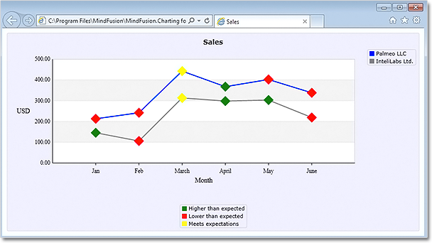
Here is the final result:

Line chart with scatters, two legends and custom labels. The platform is Silverlight.

Line chart with scatters, two legends and custom labels. The platform is Silverlight.

The source code is available for download from here:

Download the Complete Source Code for the Sample

You can get the trial version of MindFusion.Charting for Silverlight from this link:

Download MindFusion.Charting for Silverlight Trial Version