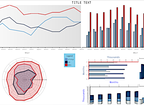
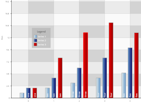
Bar Chart
A presentation of the BarChart control together with multiple UI components that allow you to change the settings and see how this affects the chart.
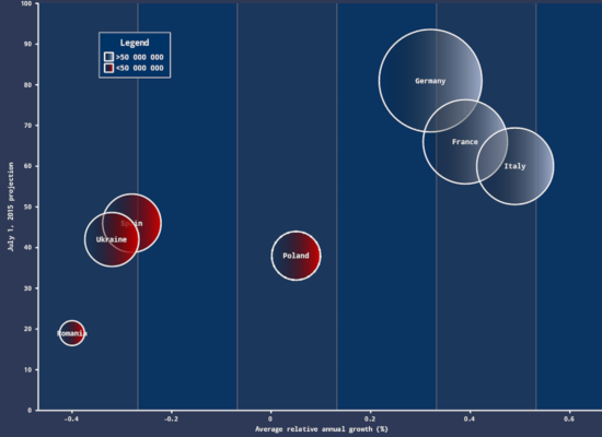
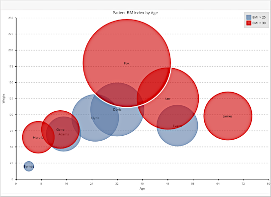
Bubble Chart
A demonstration of the BubbleChart control with a set of various UI settings that allow you to change properties of the chart and observe the effect.
Custom Data
This sample shows how a list of objects can be used directly in chart by means of custom series class that implements the Series interface.
Date Time Series
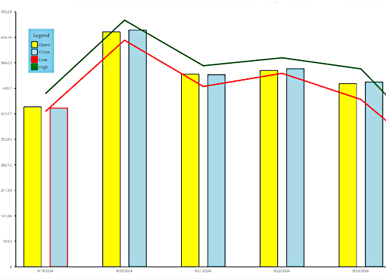
The DateTimeSeries allows you to use DateTime objects as chart data and supports various label formats.
Doughnut Chart
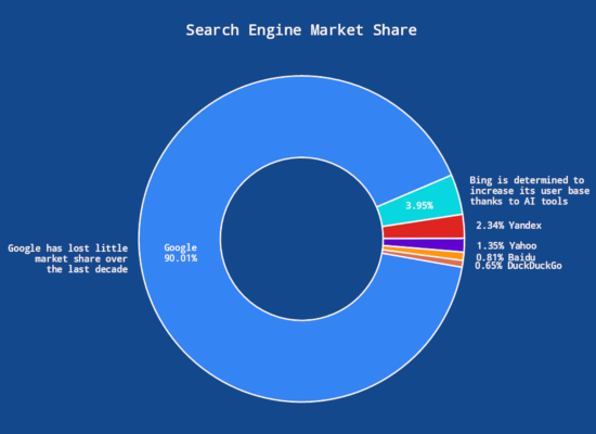
A doughnut chart that uses inner and outer labels to render more information about the data.
Funnel Chart
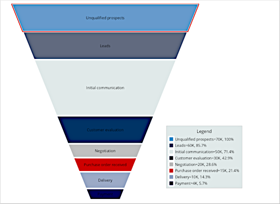
The Funnel Chart is used to illustrate the stages of a process and show the change in a given quantity metrics through the stages.
Group Labels
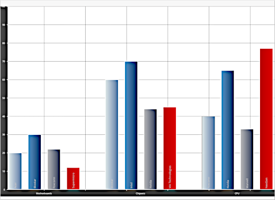
This sample shows how to display labels for bar groups by using the AnnotationRender class.
Line Chart
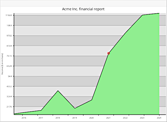
A presentation of the LineChart control with a panel of UI components that allow you to alter different settings for the chart and observe the effect.
List Binding
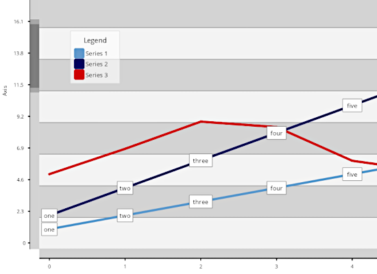
This sample shows how to bind the chart to a list of custom .NET objects by setting the list as a DataSource.
Min App
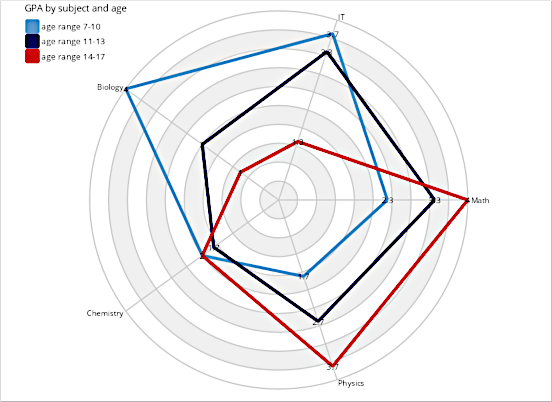
A basic chart that teaches you the most essential steps you need to take in order to render a chart in .NET Blazor
Multiple Axes
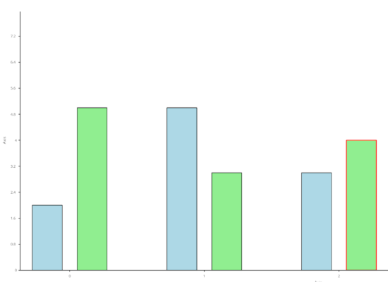
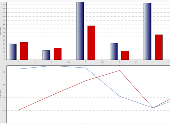
A chart that uses several Y-axes and display one line chart and a bar chart. The sample uses the Plot component and the various *Renderer classes to construct the chart.
Multiple Plots
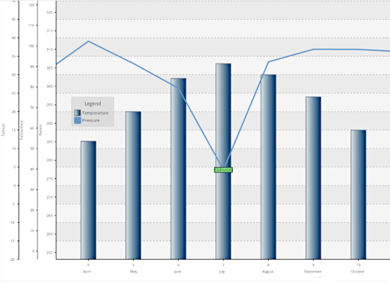
This sample teaches you how to build a dashboard containing multiple plots that share a common axis.
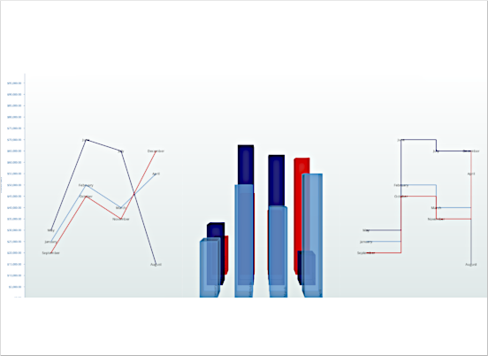
Pie Chart
A demonstration of the PieChart control with a panel of settings. You can change properties of the chart and observe the effect in real time.
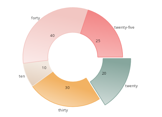
Radar Chart
A demonstration of the RadarChart control. The samples allows you to change different settings of the chart and observe the effect in real time.
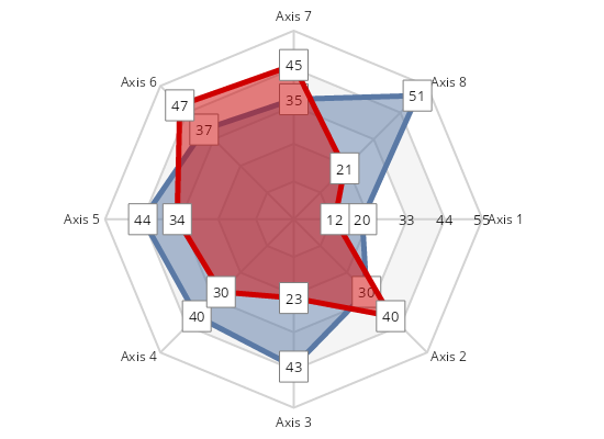
Stress Test
A demonstration of the chart settings that allow rendering huge data sets in a very fast and efficient manner.
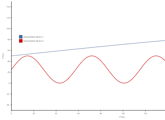
Synchronized Scroll
This example demonstrates how you can synchronize scroll positions of two plots by configuring them to use a shared Axis instance. Try panning one of the plots above and the other one will scroll too.
Tower Chart
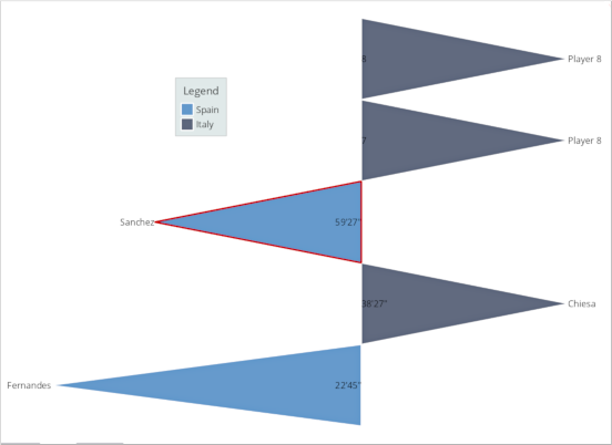
The Tower Chart illustrates the turns of two opposing parties over a given time period. It is often used to illustrate game progression in sports.
Tutorial 1 (Chart Data)
The sample teaches you how to load data into a chart and use it to create multiple series.
Tutorial 2 (Custom Series)
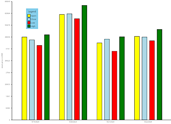
This example demonstrates how to feed custom data to a chart by implementing the Series interface, instead of copying data to built-in series classes.
Tutorial 3 (Multiple Chart Types)
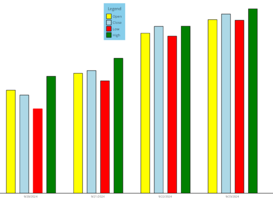
This example demonstrates how to add different types of chart graphics to the plot.
 Run
Run
 Download
