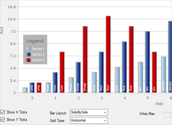
BarChart
This sample demonstrates various properties of the BarChart control. Change property values in this panel to see their effect on the chart above.
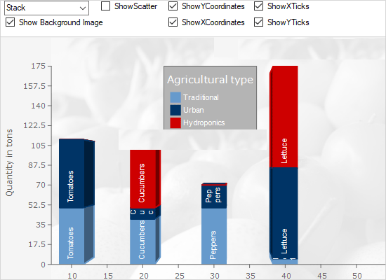
BarChart3D
A demonstration of th various properties of the 3D bar chart. You can set a background image, change axes properties, the layout of bars and more.
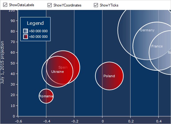
BubbleChart
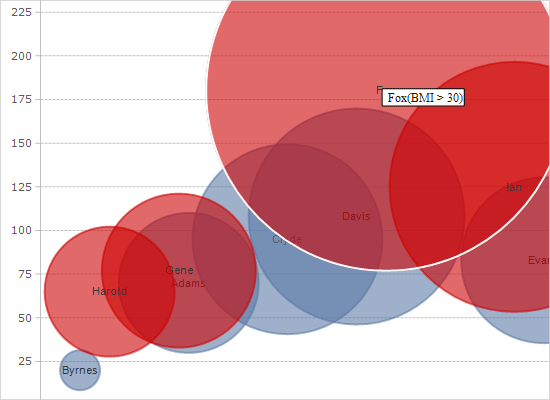
This sample demonstrates various properties of the BubbleChart control. Change property values in the tab panels to see their effect on the chart.
Candlestick Chart
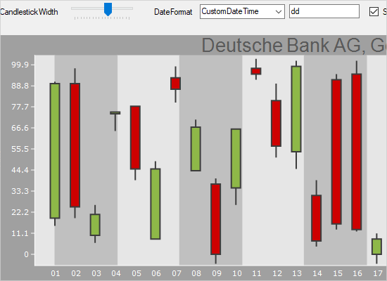
The sample demonstrates various properties of the CandlestickChart control. A panel with UI controls is placed above the chart and you can change the settings and see immediately the result.
Car Gauges
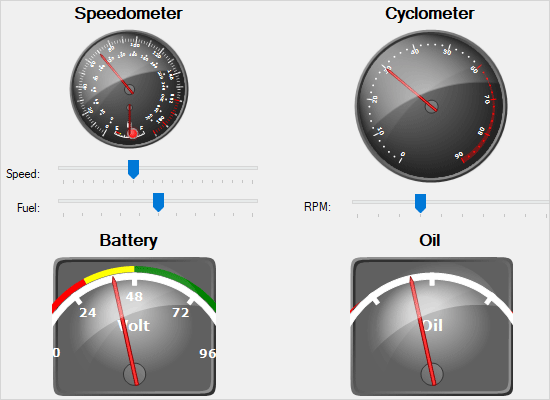
This sample illustrates a set of oval and rectangular gauge controls styled with custom templates in order to achieve the look of a car dashboard. In addition, the sample demonstrates how to embed gauges within each other.
Clock
Custom painting is applied to the oval gauge to achieve the looks of a stylish clock. A timer is used to measure the clock.

Compass
An oval gauge is customized through custom painting to achieve the effect of a beautiful compass.

Custom Data
A bubble chart that gets its data from a custom class, which implements the Series interface. The custom class is a collection of objects.
Dashboard
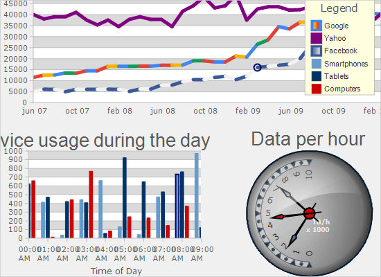
A sample dashboard with two charts, text components and a gauge. The sample demonstrates how to use the Dashboard class and LayoutBuilder to create dashboards with different layout.
DateTimeSeries
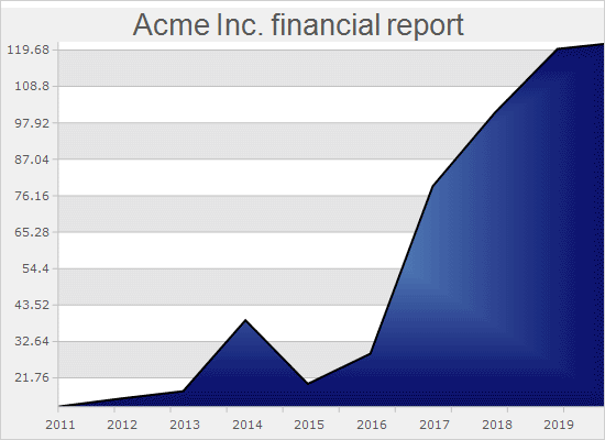
The sample demonstrates how to use the DateTimeSeries class and how to apply different formatting on the labels of the chart.
Equalizer Gauge
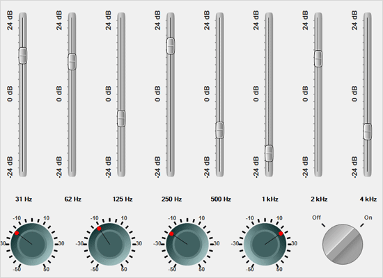
The equalizer is built of a selection of rectangular and oval gauges. Custom painting is used to make them more authentic.
Functions
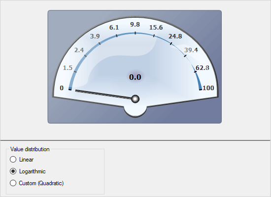
The quadratic gauge is customized through custom painting to create a scale for various functions. The FunctionType property of gauge scales is used to change the scale type.
Funnel Chart
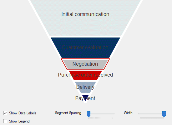
The FunnelChart control is presented here with a panel of UI controls that allow you to change different settings of the chart and observe how they affect the chart looks.
Group Labels
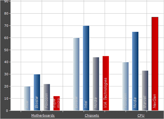
A bar chart with multiple series that uses the AnnontationRenderer class to display labels for each bar group.
Interactivity
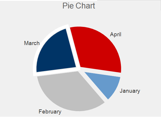
A bar and a pie chart, which you can drag and zoom using the mouse. The legend can also be moved freely around the plot area.
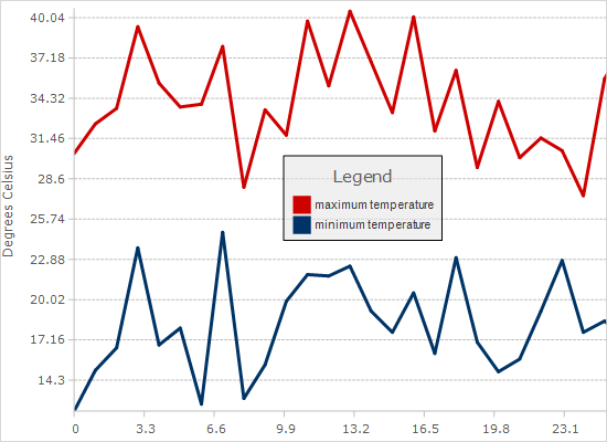
Line Chart
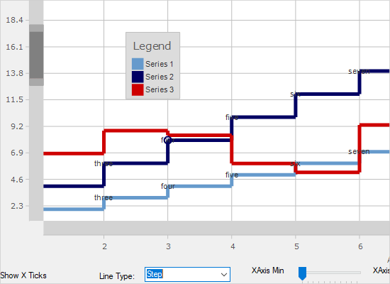
A sample line chart is demonstrated along with a panel of UI controls to customize its major settings. You can change the settings and observe how the looks of the chart is affected.
List Binding
This sample shows how to bind the chart to a list of custom .NET objects by setting the list as DataSource.
Multiple Axes
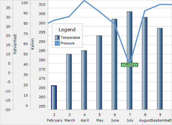
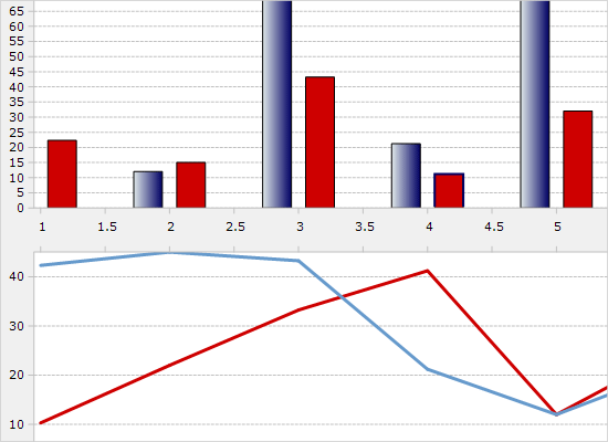
This sample teaches you how to add multiple axes to a chart. The chart is a combination one with a BarSeries and a LineSeries and an annotation.
Multiple Plots
This sample shows you how to build a dashboard containing multiple plots that share a common axis.

Oval Gauge
This sample demonstrates an out-of-the-box oval gauge without any additional styles applied to it.
Pie Chart
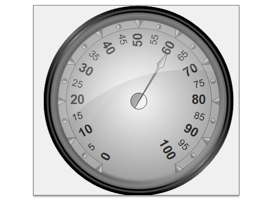
The sample shows a pie chart with a set of UI controls that allow you to change many of the chart's properties and see the effect on the chart's appearance.
Print and Export
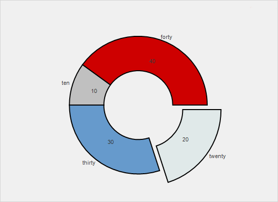
This sample demonstrates the print and export capabilities in MindFusion.Charting. Click the print button to get the chart printed. The export buttons export the chart to various file formats.
Quadratic Gauges
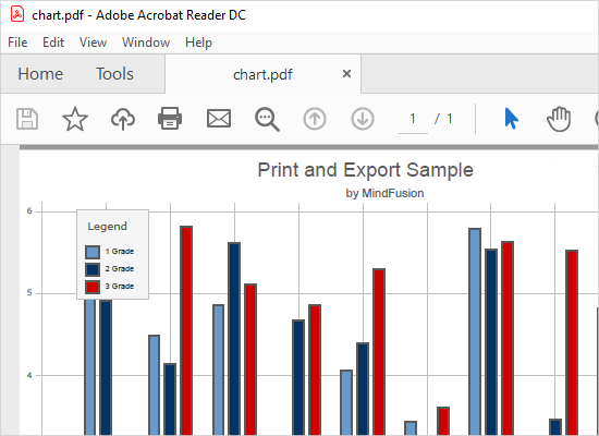
This sample demonstrates how to use the four predefined styles for quadratic oval gauges.

Radar Chart
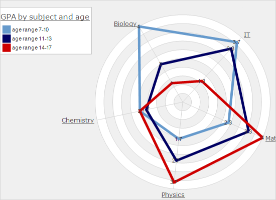
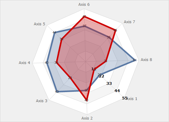
The RadarChart control is used here together with a panel of UI controls that allow you to change all major settings for radar/polar charts. You can observe how different properties affect the looks of the chart.
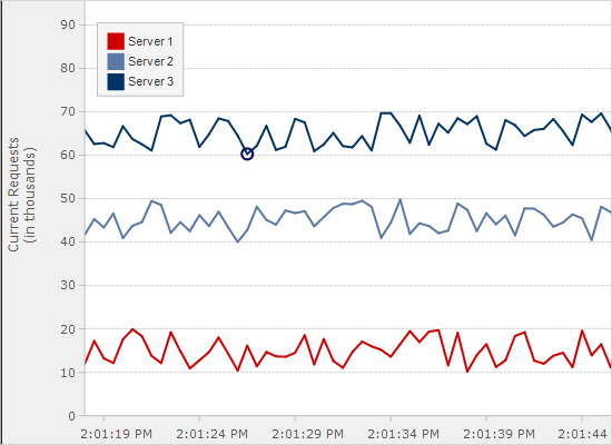
Real-time Chart
A custom series that gets updated in real time and uses DateTime values for the X-axis. The plot gets automatically scrolled when data fills the entire axis.
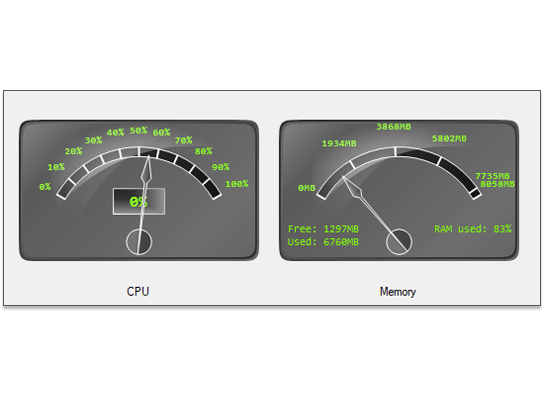
Resource Monitor
Two quadratic gauges are used here to render statistics about the use of memory and CPU of your computer. The gauges are customized through custom painting.
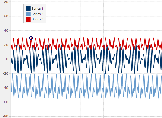
Scripted Series
The sample demonstrates the FunctionSeries class, which handles plotting of functions for a given formula. You can change the formula and see the new function's graphic for one thousand points.
Sql Binding
This example demonstrates binding to a DataTable. The chart's DataSource property is set to the dataset returned from an MSSQL Compact database. The column names to bind to are specified through XDataFields and YDataFields properties.
Stress Test
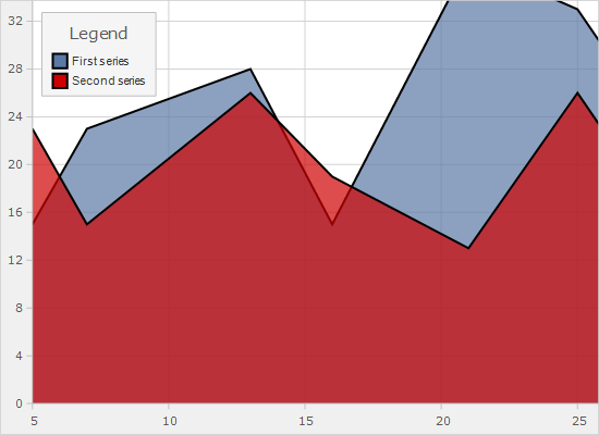
The sample shows two series each one containing 750 000 points. It also demonstrates the axis and series properties to set for maximal performance.
Synchronized Scroll
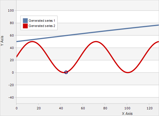
This example demonstrates how you can synchronize scroll positions of two plots by configuring them to use a shared Axis instance. When you pan one of the plots the other one scrolls too.
Thermometer
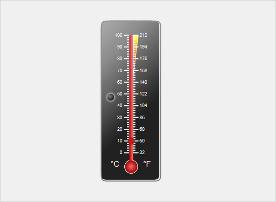
The thermometer is built from a quadratic gauge with painting for the background and several ranges and a scale.
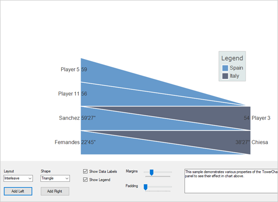
Tower Chart
The sample demonstrates the TowerChart control and lets you adjust its major settings and see the effect in real time.
Tutorial 1
This tutorial teaches you how to use different chart renderer-s to create charts of various type; how to arrange them with the layout panels and how to create a dashboard with all chart elements.

 Run
Run
 Download
