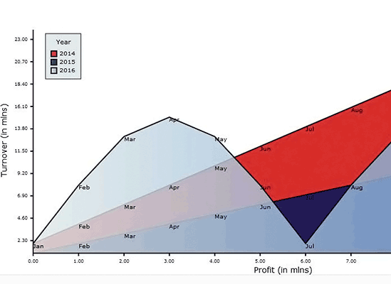
Bar Chart
Three series of bars grouped together with labels inside bars. The axes render labels and scale divisions. Contains customizable grid and a legend.
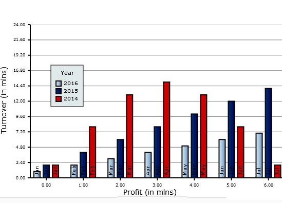
Bar Chart 3D
Groups of 3D bars, which can also be rendered as cylinders. Uses an image as a background. Axes show scale divisions and a title label. Bars have inner labels.
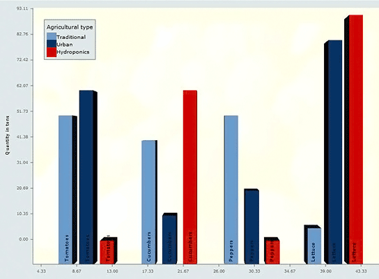
Bubble Chart
A bubble chart with two series, a vertical grid and axes with labels and scale divisions. Each bubble renders custom labels. The chart has a custom highlight stroke and a legend.
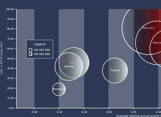
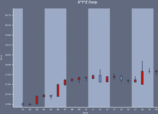
Candlestick Chart
The traditional financial chart for a period of 30 days. Candles with open, close, high and low values on a vertical grid with custom colors. The chart features labels on axes with value ticks and a title.
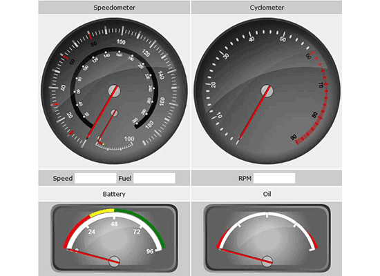
Car Gauges
A set of two oval and two linear gauges that were customized to imitate the gauges of a car. You will learn how to adjust the scales, pointers and overall appearance on both types of gauges shipped with the chart library.
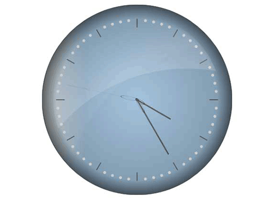
Clock
The oval gauge is customized to render a classical watch. The sample uses custom painting of the background to achieve the gradient 3D effect visible on the watch.
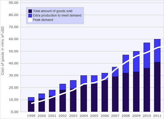
Combination Chart
The Dashboard control is used to hold two text components, a legend and a plot with 2 bar series drawn as stacked bars and one line series.
Compass
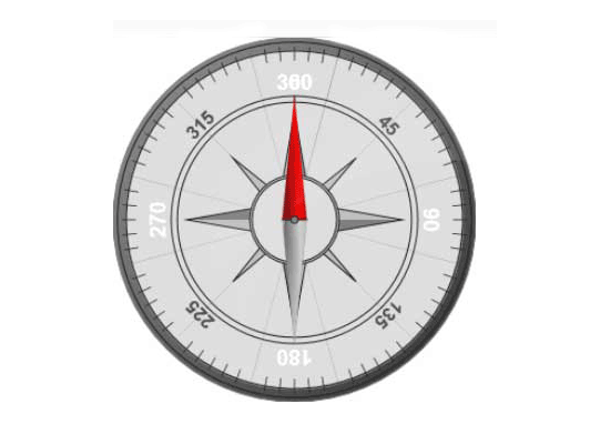
The oval gauge is used here to create a custom compass. The sample uses custom painting for all compass elements - foreground, background, scale and pointer.
Cross Hair
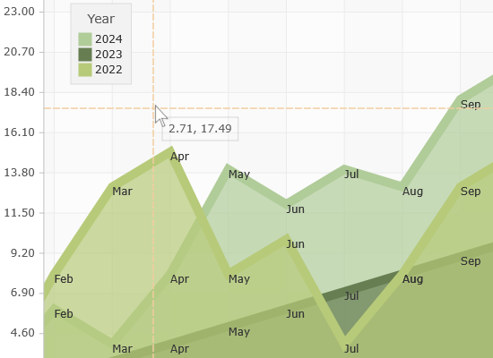
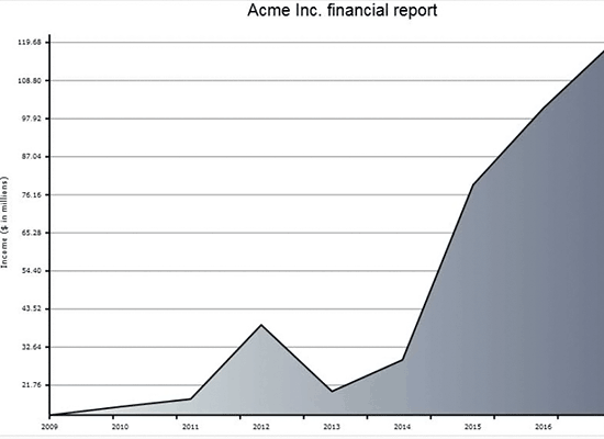
An area chart with a Cross Hair renderer that is represented by a custom class, which derives from Renderer2D.
Custom Data
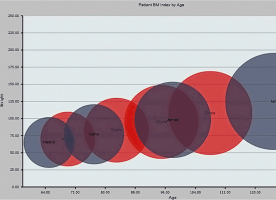
The chart uses as a data provider a collection with custom objects and the chart automatically retrieves the values for each bubble and its label.
Dashboard
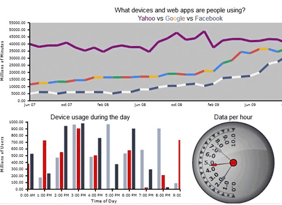
A dashboard with two types of charts and an oval gauge. All dashboard elements use custom colors. Both charts show labels on the axes. The title is rendered with a stack panel.
DateTime Series
The area chart reads its data from DateTime values and renders labels in custom DateTime format. The chart also uses a horizontal grid and a title with custom font size.
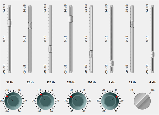
Equalizer
A combination of multiple linear and oval gauges that were customized to present an equalizer. The gauges use custom painting on both background and scales, custom colors and gradients.
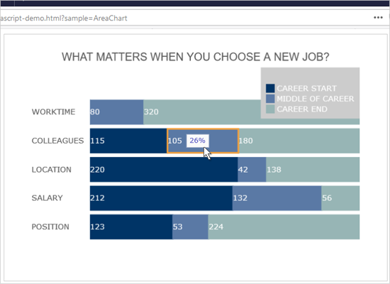
Full Bar Chart
A horizontal stacked bar chart that uses a custom series derived from BarSeries. The chart also has customized tooltips.
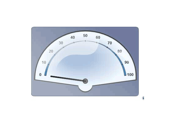
Functions
An oval gauge is customized and painted only halfway to render a scale where a function's values are displayed. The gauge uses custom painting for background, foreground and pointers.
Funnel Chart
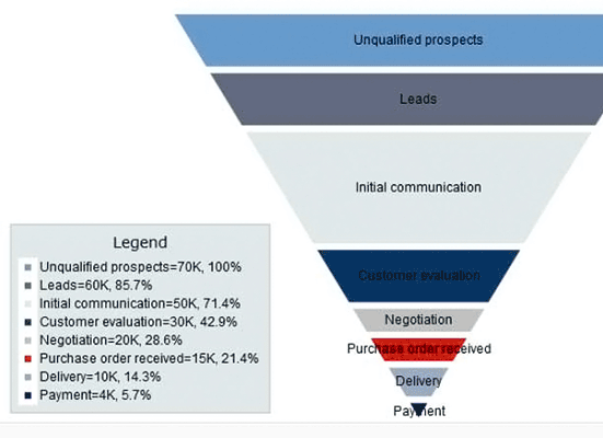
A funnel chart with labels inside chart elements and a legend. The chart uses different appearance properties to customize the colors and fonts.
Group Labels
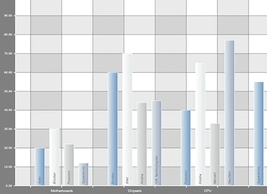
The sample uses four series with four data values and sets a label inside each bar in each series. The top labels are empty. Axes have tick marks and labels, the grid is crossed.
Interactivity
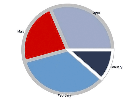
Two types of charts - a bar and a pie that demonstrate how the library responds to actions performed by the users - drag, scroll, rotation, color change.
Line Chart with Tooltips
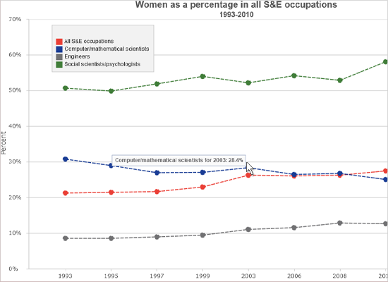
This sample shows how to build a line chart with multiple series and custom tooltips. We create two types of custom ChartSeries, which inherit from the Series2D class.
List Binding
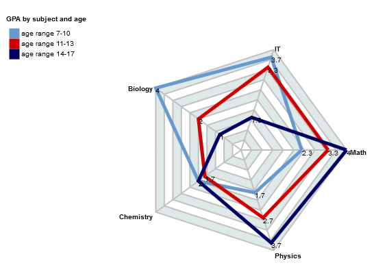
The sample uses data binding to read the values and labels for a radar chart with three series. The chart also demonstrates the major customization options for radar/polar charts.
Multiple Axes
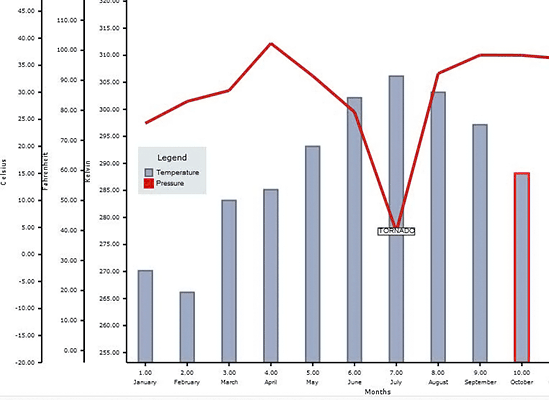
This combination chart is built by a dashboard that renders 5 different axes, a bar series and a line series. The chart also demonstrates how to use annotations - the label in the middle.
Multiple Plots
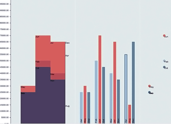
The sample uses a dashboard that holds hree different plots with three different renderers- for a step area, bar and scatter chart. Charts show labels at data points.
Nested Pie Chart
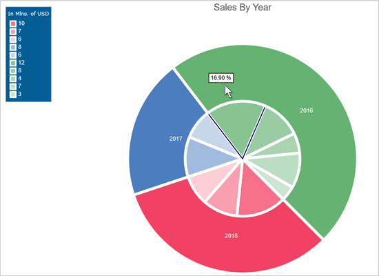
The standard PieChart control with a second PieRenderer instance that adds an outer doughnut PieSeries to the diagram.
Pie Chart
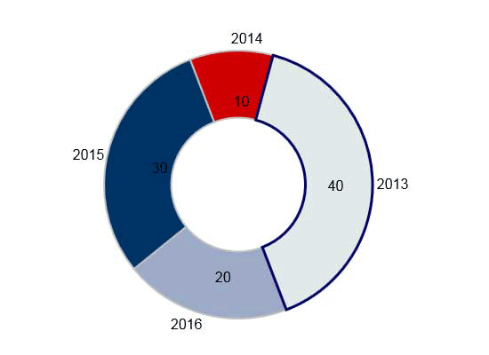
A demonstrations of the major features for the pie chart control: labels, start angle, detached pieces, colors and rotation.
Polyline Chart
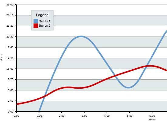
A line chart with two series that demonstrate the major features of the line chart library: line types, data labels, interpolation, customizable legend, grid and axes.
Radar Chart
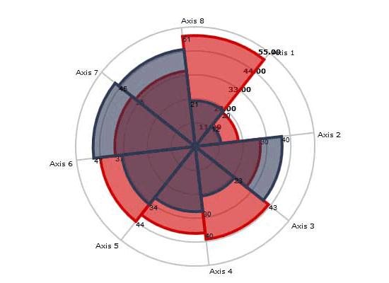
A demonstration of the major features of the radar / polar chart: available chart types, grid options, angles, rotation types of labels and axis settings.
Real-time Chart in React
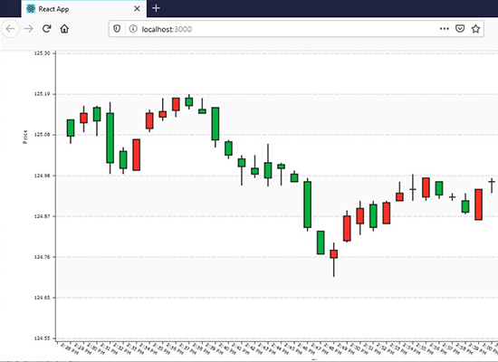
The sample shows you how to integrate the JavaScript Chart library into a native React application that renders a financial chart, which is updated on regular intervals.
Stacked Bar Chart
This is a bar chart that uses five custom data series with one data value to create a single stacked bar with custom tooltips.
Synchronized Scroll
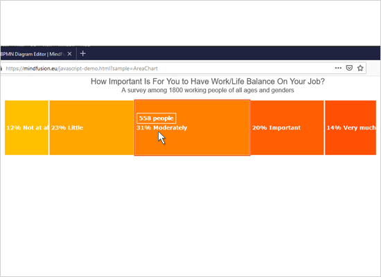
A bar and a line chart use common X-axis that allows the user to perform synchronized scroll on both charts simultaneously. The sample uses the dashboard control, two plots and two chart renderers.
Thermometer
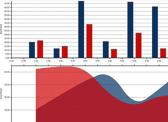
The linear gauge is used to render a thermometer with scales in both Celsius and Fahrenheit. The sample uses custom painting for the background, foreground and the gauge scales and customizes a lot of the linear gauge's appearance settings.
Value Gauge
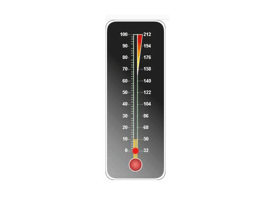
This example shows a typical dashboard gauge that tracks the cost of a project. Custom drawing is used to paint the foreground of the gauge in differently colored sections.
 Run
Run
 Download
