Charting for WebForms
Multiple chart types, dashboards and gauges in a single ASP.NET control.
Designed and developed to meet your needs.
Whether you need to create a financial chart, a complex dashboard or just a clock gauge - this WebForms library has all the data visualization features your ASP.NET application needs, even more.
Chart Types
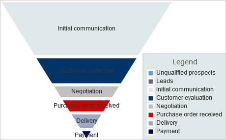
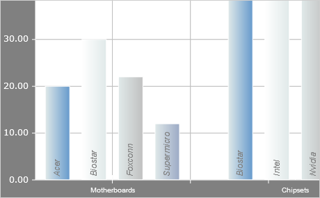
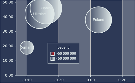
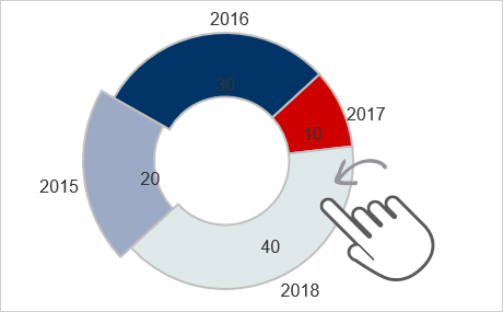
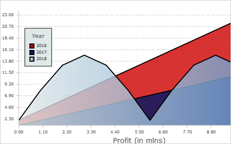
Charting for WebForms provides you with the complete set of charts you would like to build: line, area, bar, column, pie, doughnut, radar and any more. 3D bar charts are supported as well. You can also create funnel charts.
API Reference: Chart Controls
Chart Elements
The flexible API of the WebForms chart control allows you to combine and customize various chart elements - grid, legend, axes. You can add multiple legends and bind them to different chart series. Axes can be added to all 4 sides of the plot.
API Reference: Building Blocks
Dashboards
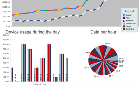
The Dashboard control is a powerful tool for building and arranging complex dashboards with various charts and gauges. You can add to your dashboards labels, images, border and two layout containers - grid and stack panel with vertical or horizontal orientation.
API Reference: Dashboard Layout | Tutorial: Dashboard Layout
Financial Charts
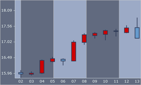
The candlestick chart control provides you with an intuitive way to render financial charts. Data is provided through a special StockPriceSeries where you can easily set the required data. The chart offers the complete set of features to customize every detail of its looks.
API Reference: Candlestick Chart Class
Data
All chart data is provided through classes that implement the Series interface. You have a set of the most used data types implemented as ready-to-use Series classes: numeric data, DateTime values, XML, data bound series and more. You can implement the Series interface in a custom class and provide data to your chart through any data source that you have.
API Reference: Data Series and Binding | Tutorial: Data Binding
User Interaction
All charts support pan and zoom with the mouse. There is a zoom widget, which you can render at the chart. Pie and radar charts can be rotated. Various events are raised to notify you of changes in data, property values or when the chart was clicked.
Styles and Themes
You can customize every element on the chart through the Theme property as well through chart styles. The control comes with multiple style classes that let you color the chart series as you wish. You can save your Theme settings and apply them in other charts.
API Reference: Styling and Themes | Tutorial: Styling Chart Series
Gauges
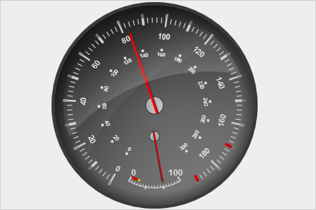
The gauge component includes two basic gauges - an oval and a rectangulat one and provides out of the box a rich set of samples that build many popular gauges: chronometer, thermometer, compass, clock, functions scale, equalizer and more. You can easily customize their looks and paste them directly in your code.

