The list below describes recent changes and additions to FlowChartX:
New in version 4.9.3
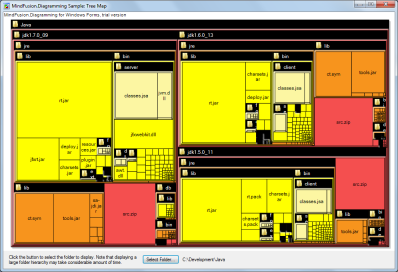
Tree map layout
( a feature of FlowChartX Pro edition)
Tree maps represent hierarchies by nesting child nodes within their parents, where the areas of leaf nodes are proportional to their Weight values. Unlike other layout algorithms, TreeMapLayout expects hierarchies to be defined via grouping or containment (see Group class and bsContainer boxes), and will ignore any links in the diagram. The diagram area covered by the topmost nodes in a hierarchy is specified via the SetLayoutArea method. By default, the layout tries to keep the ratio of node sides as close as possible to one. However this could make it hard to distinguish separate levels of the hierarchy. To alleviate that, set Squarify to false, and child nodes will be arranged either as a row or a column inside their parent node, alternating directions for each level. The drawback is that when Weight ratios differ greatly or nodes contain many children, some nodes could end up with very narrow rectangles.
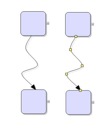
Arrow improvements
- The component no longer keeps a separate segmentCount field, removing a common source of errors. The Segments property now calculates its value from ControlPoints elements.
- The new bsSpline element of EArrowStyle enumeration draws links as interpolating splines that pass through all of their control points:
Miscellaneous
Weight property added to item classes. Apart from TreeMapLayout, it is also used by SpringLayout implementation to adjust arrow lengths.
New in version 4.9.2
Resize table columns and rows
Columns and rows of a Table node can now be resized interactively if its AllowResizeColumns or AllowResizeRows properties are enabled. In order to resize, move the mouse pointer to the border line on column's right side or row's bottom side until it shows resize cursor and start dragging. The control raises TableColumnResized and TableRowResized events when the operation completes.
License keys
There is no separate trial build of the control's libraries provided anymore. Instead, call the SetLicenseKey method of FlowChart class to disable the component's evaluation mode and stop displaying trial messages. License key strings are now listed on the Keys & Downloads page at MindFusion's customer portal. Keys for MindFusion.Diagramming Pack will now work for ActiveX control too.
Miscellaneous
New in version 4.9.1
Highlight table rows
Set the HighlightedRow property of a Table to the index of a row that should be drawn highlighted. Highlighted rows' backround is painted in RowHighlightColor. If you enable the AutoHighlightRows property, a row will be highlighted automatically when clicked.
Miscellaneous
- VisioImporter, VisioExporter and SvgExporter has been merged into the main flowchartx.dll library file, and can now be used with its 64-bit version.
- Set the BackColor property of ArrowLabel to fill the background of link labels.
- Link segments now connect to the base of arrowhead shapes instead of going all the way through them, letting you use transparent and semi-transparent fill color for arrowheads without seeing segment ends inside.
- Fixed crash in 64-bit SaveToBitmap function.
New in version 4.9
Resize multiple nodes
Now it is possible to resize multiple selected nodes simultaneously. To enable that, set the AllowMultipleResize property to true. When enabled, dragging a corner or side adjustment handle of any node resizes all nodes in the selection. The operation will be cancelled for all nodes if any of them does not accept its new size, e.g. if width or height is 0 or because of other constraints.
Decision flowchart layout
( a feature of FlowChartX Pro edition)
DecisionLayout arranges simple flowcharts consisting of decision boxes with up to three outgoing links per node and activity boxes with a single outgoing link per node. The nodes are arranged in columns and rows, whose distance depends on the HorizontalPadding and VerticalPadding property values. When links share the same row or column, they are placed at a distance specified via LinkPadding. The layout arranges nodes recursively starting from StartNode. If StartNode is not specified, the algorithm selects the root of the deepest branch of the graph's spanning tree as start node.
New in version 4.8
Multiple labels per arrow
The ArrowLabel class allows multiple captions to be displayed for a single Arrow object. Arrow labels provide a set of properties allowing full customization of their format and appearance: Text, Font, TextColor, EnableWrap, MaxWidth, Margin. The positions of labels is specified via RelativeTo, Index, HorizontalAlign, VerticalAlign, HorizontalOffset, VerticalOffset properties, where RelativeTo lets you bind labels to a specific control point or segment specified by Index, or to a percent of the arrow's Length. Labels can also be arranged automatically to avoid overlapping nodes and other labels by setting their AutoArrange property to true. The LabelFromPoint method of Arrow class lets you find the label at mouse position from events such as ArrowClicked. The AddLabel, RemoveLabel, GetLabel and GetLabelCount methods provide access to the underlying label collection.
Edit arrow text in-place
Text of arrows can now be edited interactively by the user. To enable that, set their AllowInplaceEdit property to true. To start editing, double click an Arrow or an ArrowLabel. Edit mode can also be entered by calling the BeginInplaceEdit method, specifying null as argument to edit the arrow's old-style Text property. When the user accepts entered text, the control raises ArrowTextEdited or ArrowLabelEdited event.
Miscellaneous
- Several new predefined shape templates available - RightTriangle, Decagon, Trapezoid, Star4Pointed, Star5Pointed, Star6Pointed, Star7Pointed, Star16Pointed, Star24Pointed, Star32Pointed, Donut and Plaque.
- New sstRoundAndSquare and sstRoundAndSquare2 handle styles can be assigned to the SelStyle property of nodes.
New in version 4.7
Glass and Aero effects
In GDI+ mode, FlowChartX can apply two kinds of visual effects to nodes, Glass and Aero. To apply an effect to all nodes in a flowchart, call the AddAeroEffect or AddGlassEffect method of the FlowChart class. To apply an effect to individual nodes, call the AddAeroEffect or AddGlassEffect method of Box or Table. It is possible to combine different effects or apply more than one effect of the same type by calling these methods multiple times. For more information, see the Node Effects topic.
Miscellaneous
- Specify padding distance between selected items and the selection frame via SelectionOptions.FramePadding;
- SelectionOptions.ShowItemHandles specifies whether to show handles of individual items in multiple selection;
- The Arrow.Segments property can now be set regardless of whether auto-routing is enabled or the arrow is a self-loop;
- When an arrow becomes a self-loop with a Table as target node, its end stay connected to the table's rows and the arrow shape is set to an orthogonal sequence of segments connecting the rows;
- SetSelfLoopShape event is now raised to let you set custom shape for self-loop arrows;
New in version 4.6
Ruler control
( a feature of FlowChartX Pro edition)
The Ruler control provides horizontal and vertical scales that helps users measure flowchart items. To specify which FlowChart instance is shown in the ruler, set the Document property.
The ruler tracks mouse movements and modifications being performed on an item, and displays markers over the scales indicating the current position in diagram's coordinate system. The colors of these markers can be changed using the PointerColor and ProjectionColor properties.
If EnableGuides is set to true, the ruler allows aligning several items by clicking on a scale and dragging. That displays alignment guides which follow the mouse pointer and move all selected items on their way. If no diagram elements are selected, all items are moved.
To specify what units are displayed in the scales, assign a member of the EUnit enum to the BaseUnit property, and set UnitScale to define how much the BaseUnit should be scaled.
Preserve order in TreeLayout
If the PreserveOrder property of TreeLayout is enabled, the layout object will preserve the original geometric order of child nodes when arranging them under their parent. This can be used to arrange tree branches in a specific order by first positioning them in increasing horizontal or vertical positions. Another possibility is to apply TreeLayout from ObjectModified event handlers to let users rearrange the tree branches by dragging and dropping a node.
Table footers
Table nodes can display footer text, specified via their Footer property. The height of the footer area is set via FooterHeight. It can be further customized using the FooterStyle, FooterColor and FooterFillColor properties.
Miscellaneous
- setting Behavior to bhSelectOnly allows user to only select existing items, but not modify them or draw new ones
- the last row in a Table will now be rendered clipped if it fits only partially inside the node, whereas in previous versions the row would not be rendered at all
- PrintOptions.HeaderFont specifies the font for the header of a printed page
- intermediate arrowhead shapes are now rendered for Bezier links
New in version 4.5
Fractal tree layout
( a feature of FlowChartX Pro edition)
FractalLayout is a tree layout algorithm that places child nodes symmetrically around their parent node. Nodes at the lowest level are arranged directly in a circle around their parent. At upper levels, the already arranged nodes form branches that are arranged in a circle around the new parent node. The algorithm is recursively repeated till the highest level is reached. If nodes in the tree have uniform number of children, the end result has fractal-like appearance (subsets of the graph look like scaled-down copies of the whole graph).
You can choose which node should be displayed at the center of the topmost circle by setting the Root property. If it is not specified, the algorithm automatically selects a root that leads to more balanced distribution of nodes.
LayeredLayout enhancements
- Specify start and end nodes in LayeredLayout via the StartNode and EndNode properties.
- EnforceLinkFlow specifies whether to attempt to force all links to go in the same direction. If the graph being arranged contains cycles, some of the links will still go backward.
Alignment guides
If SnapStyle is set to the new snpAlignmentGuides member of ESnapStyle, the node currently being drawn or resized is aligned to another node so that a pair of their vertical or horizontal sides become collinear. To specify the maximal distance at which nodes are aligned, set the SnapDistance property. The pair of aligned nodes is indicated visually by drawing an alignment guide using the pen specified via AlignmentGuideColor and AlignmentGuideStyle.
Miscellaneous
New in version 4.4
Simulated Annealing graph layout
( a feature of FlowChartX Pro edition)
The AnnealLayout class implements the Simulated Annealing graph layout algorithm. Simulated Annealing is a general-purpose optimization method used to solve large-scale combinatorial problems by simulating the process of heating and cooling of metal to achieve freedom from defects. Finding a nice arrangement of a graph is a combinatorial problem that can be reduced to assigning costs to graph configurations and finding the minimum cost configuration. AnnealLayout assigns costs to graph configurations by evaluating different aesthetic criteria such as distance between nodes, length of links and the number of link crossings. Thus the best configuration found will have good aesthetic properties.
Miscellaneous
New in version 4.3.1
BPMN shapes
This version adds predefined
ShapeTemplate definitions that implement the Object Management Group / Business Process Management notation. They are available as members of the
Shapes collection and have names that start with a Bpmn prefix. The new shapes and their identifiers are listed in the predefined shapes table.
Miscellaneous
New in version 4.3
Layout enhancements
- The MultipleGraphsPlacement property of layout classes specifies how multiple independent graphs in the diagram should be positioned relatively to each other.
- The SplitGraph property of layout classes specifies whether to arrange the diagram subgraphs independently from each other or arrange the graph as a whole.
Decoration objects
Decorations are lightweight objects that can be used for drawing background graphics such as frames, lane divider lines, etc. Decorations do not participate in graph or parent-child relationships with other objects in the flowchart. The only decoration type available at this time is
DecorationLine. Methods and properties corresponding to it has been added to the
FlowChart class, such as
CreateDecorationLine method,
Decorations collection,
DecorationClicked event, etc.
Container enhancements
- The LayoutStyle of bsContainer boxes can be set to lsCustom to enable custom layout of the child nodes.
- Automatic resizing of container boxes can be enabled or disabled by means of the AutoResizeContainer property.
- Containers can be explicitly resized to fit their children by calling the ResizeToFitChildren method.
Miscellaneous
- Border color of items can be made semi-transparent by setting the FrameColorAlpha property.
- Anti-aliasing can be enabled or disabled for individual boxes by setting their TextAntiAliasing property.
- Arrows can be custom-drawn by setting their CustomDraw property and handling the DrawArrow event.
- Tables can be custom-drawn by setting their CustomDraw property and handling the DrawTable event.
- Tooltips auto-pop time can be set through the ToolTipAutoPop property.
- The DocBoundsChanged event is raised when the flowchart document area is resized.
- HtmlBuilder now exports items in reverse Z order to fix hit-testing of overlapping areas in the image map.
New in version 4.2.1
CircularLayout
CircularLayout distributes nodes evenly on the circumference of a circle at positions that result in as few link crossing as possible. Set its
Radius property to specify the size of the layout circle. Use
SiftingRounds to set the number of fine-tuning crossing-reduction iterations. To apply the layout to a diagram, create a
CircularLayout instance, set its members and invoke the
ArrangeDiagram method.
Miscellaneous
- The origin or destination row of an arrow connected to a table can be changed by means of the ChangeRelation method.
- The CaptionStyle of a table can be set to tsBelow to display the caption text below the table.
- The Clone method can be used to clone flowchart items.
- The IgnoreNodeSize property of LayeredLayout specifies whether the size of nodes should be considered by the algorithm.
- The LayoutProgress event is raised regularly during execution of layout algorithms to allow tracking the layout progress.
- EnableShadows and EnableSelHandles properties added to ImageExportOptions.
New in version 4.2
Native 64-bit support
This release includes an x64 version of the control. The dynamic load library files are now called
flowchartx32.dll,
flowchartx64.dll,
fcxstd32.dll and
fcxstd64.dll, respectively for the 32 and 64-bit builds of the Pro and Standard editions.
Improved binary serialization
The bitmap data of image objects that are shared between multiple nodes is now saved just once in binary-format files. Calling
SaveToFile for flowcharts that contain multiple images should create much smaller files that older versions.
XML serialization based on MSXML6
The XML serialization code has been updated to use version 6 of MSXML (Microsoft XML Core Services). Older versions of the control used MSXML4. Accordingly, installer packages for applications that save
FlowChartX files in XML format should now include the MSXML6 installer module.
Miscellaneous
- Table cells can have distinct tool-tips that can be set through the new CellToolTip indexed property.
- The location of arrow labels can be changed through the SetTextPosition method.
- The speed of the GridLayout algorithm has been greatly improved.
- The HeaderTextStyle property of PrintOptions lets you change the alignment of the header text.
New in version 4.1.5
Styled text in tables
The
EnableStyledText property allows using HTML-like formatting tags to apply various attributes to the table caption and the text of cells. As with
Box objects, such text can be rendered only when the
CaptionStyle or the cell's text style is set to one of the following values: tsFitPolyTop, tsFitPolyCenter or tsFitPolyBottom. The formatting tags supported at this time are <b>, <i>, <u>, <sub> and <sup>.
New XML format
The
FlowChart class provides
SaveToXml and
LoadFromXml methods that implement serialization in a new XML format. This new format is supported by other MindFusion diagramming components, such as Flowchart.NET, JDiagram and WpfDiagram. It provides several improvements over the old format; for example when saving an image shared between multiple nodes, the image data is saved just once, while with the old format the image was copied for each node. The
XMLWriter and
XMLReader classes are still available for compatibility reasons, but they will be removed from the next major
FlowChartX release.
Miscellaneous
- More optimizations in the GDI+ graphics engine.
- AddAnchorPointF and GetAnchorPointF methods added for a greater precision of anchor point definitions.
- The Repaint method lets you refresh custom-drawn boxes when the data they display changes.
- BackColor property added to the Overview class.
- SwapPairsIterations property added to LayeredLayout.
- If the scrollbars are not needed because the visible region is larger than the document size, they are either hidden or disabled, as set via DisableNoScroll.
- Now RequestDelete* events are also raised when cutting items to the clipboard.
- The Route method lets you run the routing algorithm for a single Arrow.
- The RowFromPoint and ColumnFromPoint let you find which cell of a table contains the specified point.
New in version 4.1.4
Rendering improvements
- The GDI+ graphics engine has been optimized; drawing should be much faster now when it is enabled.
- Improved refresh rate when auto-scrolling.
VisioExporter improvements
- Now Visio connectors will stay connected to the cell they originally pointed to when exporting using the ExportTablesAsGroups property of VisioExporter.
- Improved mapping for the Delay and several Arrow symbols to Visio shapes.
- Better handling of text alignment.
- Better handling of table cells' properties.
- Fixed a bug where the BoxPicture would appear in exported table cells.
Miscellaneous
- FlowChart.VariantTag property added.
- Now it is safe to show message boxes or modal dialogs from handlers of mouse-up related events.
Fixed bugs
- Fixed a crash that occurred when assigning null to some FlowChart string properties.
- Fixed a bug in Symmetric tree layout that caused some nodes to be placed at wrong positions.
- Now the document is scrolled to 0,0 when the scrollbars are automatically hidden after resizing the control.
New in version 4.1.3
Fixed bugs
- Fixed a bug where fonts of existing table cells were lost when adding new rows or columns.
- Fixed a bug where ShowPageMarkers worked correctly only if MeasureUnit is set to uPixel.
- Fixed a memory leak in XMLReader.
Miscellaneous
- Improved ResizeToFitText results when running in GDI+ mode.
- For customers with a source code license - we have updated the FlowChartX C++ code so that it compiles without any modifications in Visual Studio 2005.
- We have updated a few MFC examples so that they build without errors in Visual Studio 2005.
- Settable Origin and Destination properties added to the Arrow class.
- Improved zoom feature in the print preview window.
- We had to change the signature of the Export method of SvgExporter component. As a result, the CLSID and IID identifiers for the component have been changed too.
New in version 4.1.2
Print preview improvements
- The OpenPreviewWindow method ?pens a print preview window at the specified location.
- The PrintPreview class provides properties about several aspects of the print-preview:
- The WindowHandle property gets a HWND handle to the window.
- The CurrentPage property allows specifying the current page to show in the preview window.
- The ZoomFactor property allows changing the zoom factor for the page preview image.
- The SetWindowRect method sets the location of the preview window.
Table improvements
- The CellFont property lets you assign distinct fonts to table cells.
- The ResizeToFitText method resizes all columns and rows of a table so that each table cell fits its text on a single line without clipping it.
- The GetTableAt method has been added to the FlowChart class; it finds out which table contains a specified point.
More precise hit-testing for multiple selection
In older versions, items were included in multiple selection when the items' bounding rectangles intersected the selection rectangle. That could lead to arrows with more than one segments or boxes with irregular shapes being included in the selection without the selection rectangle actually touching them. Now items are hit-tested using their exact outlines, instead only their bounding rectangles.
Base64 encoding
Now
FlowChartX uses base64 instead of hexadecimal encoding when serializing a diagram into a string (
SaveToString and
LoadFromString methods) and when serializing images in XML documents. This leads to a more compact text representation of the binary data.
Separate properties for rotating the text and picture in a box
- The RotateText property specifies whether the text in a box is rotated when the box is rotated.
- The RotateContents property specifies whether the picture in a box is rotated when the box is rotated.
 Note Note |
|---|
In the previous version 4.1.1, the RotateContents property applied to both rotating the picture and the text in the box. |
Coordinate transformation methods in ScriptHelper
Miscellaneous
- The MeasureString method allows finding out the width and height of a rectangle that will enclose a string rendered in a particular font.
- The SelectionMoved event occurs when selected diagram items are moved.
- Support for XML serialization of the Tag and UserData properties.
New in version 4.1.1
Arrow appearance enhancements
The
RoundedArrows and
RoundedArrowsRadius properties allow using arcs as joins between straight arrow segments. If
ArrowCrossings is set to acArcs, adjacent arcs drawn over an arrow's crossing points will be merged into one longer arc.
Utility methods for scripting in IE
The
LoadImageFromUrl method lets you load an image from a server via http. The
CreateFont method lets you create OLE Font objects from JavaScript or VBScript. This method avoids the IE security warnings displayed when creating instances of the "stdfont" class through VBScript
CreateObject or JavaScript new
ActiveXObject.
Improved import and export classes
Now the VisioImporter component can import UML activity diagrams. The ExportTablesAsGroups property of VisioExporter provides better support for exporting tables.
Panning enhancements
Panning can be done with the middle mouse button, as set in
MiddleButtonAction. A custom pan cursor can be set with the
SetMouseCursor method.
Additional events
The
BoxModifying,
ArrowModifying and
TableModifying events are raised while moving or resizing items. These are validation events that let you prevent the modification of items.
The RequestCreate* events can be raised after each mouse movement while creating an item, as set in EventFlags.
Miscellaneous
New in version 4.1
Shape definition improvements
- The Picture property of the ShapeTemplate class lets you associate an image with a shape definition. That image is displayed in all instances of that shape, unless the Picture property of a box is explicitly set. Shape definitions also provide a SetPictureRect method which sets where an image is displayed relatively to the bounding rectangle of a box.
- Shape decoration elements can be displayed in a different color as specified in the DecorationColor property of boxes.
- Shape decoration elements can be rendered for Transparent boxes if the respective flag in RenderFlags is set.
Enhanced arrow interactivity
- Now users may change the orientation of cascading arrows whose PrpStartOrientation is set to soAuto. That can be done by dragging the control point next to the first or last one to its opposite corner in the rectangle defined by its two adjacent segments. Depending on the value of ArrowsSplittable, the arrow orientation is changed by either inserting a new segment and changing only the orientation of the first or last segment (ArrowsSplittable is true), or by changing the orientation of all segments of the arrow (ArrowsSplittable is false).
- New arrows are routed while users draw them if the raWhileCreating flag is set in the TriggerRerouting property of RoutingOptions.
- The MergeThreshold property specifies how closely one to another users should move two control points of an arrow in order to merge segments of that arrow.
- If a cascading arrow has only two segments and ArrowsSplittable is enabled, the user can add new segment by dragging the middle control point of the arrow.
Initialization events
New initialization events have been added. They are raised when a user starts drawing an item. By handling them you can set up the appearance of the item before the user sees it on the screen. The new events are
InitializeBox,
InitializeTable and
InitializeArrow.
Routing algorithm improvements
- The Anchoring property added to RoutingOptions lets you specify whether routed arrows should be docked to the anchor points of nodes.
- The speed of the routing algorithm has been improved a bit.
- The algorithm now finds better routes in the situation where arrow's origin and destination nodes are very close one to another.
Miscellaneous
- The OrgnAnchor and DestAnchor properties of the Arrow class let you change the origin and destination anchor points programmatically.
- The AllowIncomingArrows and AllowOutgoingArrows properties of the node classes specify whether users are allowed to draw arrows to/from a node.
- The ToolTipDelay property specifies the delay before a tool tip pops up when the mouse rests over a diagram item.
- The BoxPicture and BoxPicturePos properties specify the default image that should be displayed in new boxes and the default image alignment.
- The ControlPadding property specifies how much space to leave between an ActiveX control hosted in a box and the box borders.
- The selection frame drawn for the sstMoveOnly SelStyle is now painted in the color specified in SelMnpColor.
- The LayeredLayout speed has been improved.
- Previous versions of FlowChartX could not host ActiveX controls created with the latest MFC version; now that works.
- Arrow objects now take up less memory.
- Now the Overview control can be used in HTML pages.
- The OnDataChange notification is sent through the OLE IAdviseSink interface when the diagram changes.
Fixed bugs
- The LayeredLayout could crash when SplitLayers is enabled.
- GridLayout could crash when grouped objects have their IgnoreLayout property enabled.
- The TableCellStartDrag event was not raised in some circumstances.
- Arrow crossings decorations were drawn even if arrows cross invisible arrows.
- The values of a couple of the RoutingOptions properties were uninitialized.


